- Published on
Ways To Create A Dashboard With Tailwind CSS In 60 Minutes
- What is Tailwind CSS?
- The description of Dashboard ui component
- Why use Tailwind CSS to create a Dashboard ui component?
- The preview of Dashboard ui component.
- The source code of Dashboard ui component.
- How to create a Dashboard with Tailwind CSS?
- Step 1: Set up a new project
- Step 2: Define the layout
- Step 3: Add content
- Step 4: Style the content
- Step 5: Test and refine
- Conclusion
Are you looking for a way to create a dashboard with Tailwind CSS in a short amount of time? Look no further! In this article, we will discuss the steps to create a dashboard with Tailwind CSS in just 60 minutes.
What is Tailwind CSS?
Tailwind CSS is a utility-first CSS framework that allows developers to quickly create custom designs without having to write custom CSS. It provides a set of pre-defined classes that can be used to style HTML elements. Tailwind CSS is gaining popularity among developers due to its flexibility and ease of use.
The description of Dashboard ui component
A dashboard is a user interface component that displays important information in a concise and easy-to-read format. It typically consists of charts, graphs, tables, and other visualizations that provide an overview of key performance indicators (KPIs) or other metrics.
Why use Tailwind CSS to create a Dashboard ui component?
Tailwind CSS is a great choice for creating a dashboard UI component for several reasons:
- It provides a set of pre-defined classes that can be used to style HTML elements quickly.
- It allows developers to create custom designs without having to write custom CSS.
- It is flexible and can be easily customized to fit the specific needs of a project.
- It is lightweight and does not add unnecessary bloat to a project.
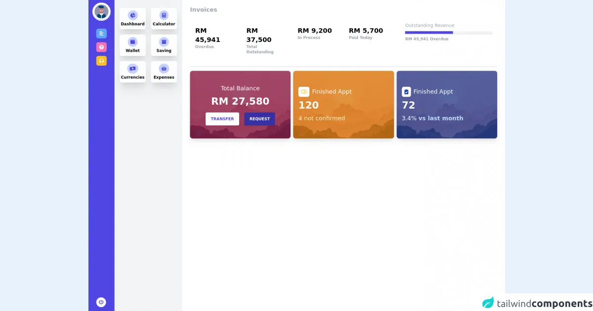
The preview of Dashboard ui component.
To give you an idea of what a dashboard UI component created with Tailwind CSS can look like, here is a preview:
Free download of the Dashboard's source code
The source code of Dashboard ui component.
Here is the source code for the dashboard UI component created with Tailwind CSS:
<head>
    <meta charset="UTF-8" />
    <meta name="viewport" content="width=device-width, initial-scale=1.0" />
    <title>Dashboard</title>
    <link href="https://fonts.googleapis.com/css2?family=Inter:wght@400;500;600;700;800&display=swap"
        rel="stylesheet" />
    <link href="https://cdnjs.cloudflare.com/ajax/libs/font-awesome/5.15.4/css/all.min.css"
        rel="stylesheet" />
    <link href="https://cdnjs.cloudflare.com/ajax/libs/animate.css/4.1.1/animate.min.css"
        rel="stylesheet" />
    <script src="https://cdn.jsdelivr.net/gh/alpinejs/[email protected]/dist/alpine.min.js" defer></script>
</head>
<body >
    <div class="flex h-screen w-full bg-gray-800 " x-data="{openMenu:1}">
        <!--Start SideBar-->
        <aside class="w-20 relative z-20 flex-shrink-0  px-2 overflow-y-auto bg-indigo-600 sm:block">
            <div class="mb-6">
                <!--Start logo -->
                <div class="flex justify-center">
                  <div class="w-14 h-14 rounded-full bg-gray-300 border-2 border-white mt-2">
                    <img
                      src="https://encrypted-tbn0.gstatic.com/images?q=tbn:ANd9GcQVxhAxJ4D7MOeTTj6kR9PBeZonW5HM7giKjTbEmR-HMBwf3G1VqGnlwpO1kWrdyIZu8_U&usqp=CAU"
                     class="rounded-full w-auto"
                    />
                  </div>
                </div>
                <!--End logo -->
                <!--Start NavItem -->
                <div>
                  <ul class="mt-6 leading-10 px-4">
                    <li class="mb-3 p-2 rounded-md flex items-center justify-center bg-blue-400 cursor-pointer"
                        @click="openMenu !== 1 ? openMenu = 1 : openMenu = null"
                      >
                      <i class="fas fa-align-left fa-sm text-white"></i>
                    </li>
                    <li class="mb-3 p-2 rounded-md flex items-center justify-center bg-pink-400 cursor-pointer">
                      <i class="fas fa-question-circle fa-sm text-white"></i>
                    </li>
                    <li class="mb-3 p-2 rounded-md flex items-center justify-center bg-yellow-400 cursor-pointer">
                      <i class="fas fa-headphones fa-sm text-white"></i>
                    </li>
                    <li class="absolute bottom-0 mb-3 p-2 rounded-full flex items-center mx-auto bg-white cursor-pointer">
                      <i class="fas fa-power-off fa-sm text-indigo-600"></i>
                    </li>
                  </ul>
                </div>
                <!--End NavItem -->
            </div>
        </aside>
        <!-- Start Open Menu -->
        <aside class="animate__animated animate__fadeInLeft w-52 relative z-0 flex-shrink-0 hidden px-4 overflow-y-auto bg-gray-100 sm:block "
               x-show="openMenu ==  1"
               @click.away="openMenu = null"
               style="display: none;">
            <div class="mb-6">
              <!--Start Sidebar for open menu -->
              <div class="grid grid-cols-1 gap-4 grid-cols-2 mt-6">
                <!-- Start Navitem -->
                <div class="p-2 flex flex-col items-center bg-white rounded-md justify-center shadow-xl cursor-pointer">
                  <div class="rounded-full p-2 bg-indigo-200 flex flex-col items-center">
                    <i class="fas fa-chart-pie fa-sm text-indigo-600"></i>
                  </div>
                  <p class="text-xs mt-1 text-center font-semibold">Dashboard</p>
                </div>
                <!-- End Navitem -->
                <!-- Start Navitem -->
                <div class="p-2 flex flex-col items-center bg-white rounded-md justify-center shadow-xl cursor-pointer">
                  <div class="rounded-full p-2 bg-indigo-200 flex flex-col items-center">
                    <i class="fas fa-calculator fa-sm text-indigo-600"></i>
                  </div>
                  <p class="text-xs mt-1 text-center font-semibold">Calculator</p>
                </div>
                <!-- End Navitem -->
                <!-- Start Navitem -->
                <div class="p-2 flex flex-col items-center bg-white rounded-md justify-center shadow-xl cursor-pointer">
                  <div class="rounded-full p-2 bg-indigo-200 flex flex-col items-center">
                    <i class="fas fa-wallet fa-sm text-indigo-600"></i>
                  </div>
                  <p class="text-xs mt-1 text-center font-semibold">Wallet</p>
                </div>
                <!-- End Navitem -->
                <!-- Start Navitem -->
                <div class="p-2 flex flex-col items-center bg-white rounded-md justify-center shadow-xl cursor-pointer">
                  <div class="rounded-full p-2 bg-indigo-200 flex flex-col items-center">
                    <i class="fas fa-archive fa-sm text-indigo-600"></i>
                  </div>
                  <p class="text-xs mt-1 text-center font-semibold">Saving</p>
                </div>
                <!-- End Navitem -->
                <!-- Start Navitem -->
                <div class="p-2 flex flex-col items-center bg-white rounded-md justify-center shadow-xl cursor-pointer">
                  <div class="rounded-full p-2 bg-indigo-200 flex flex-col items-center">
                    <i class="fas fa-money-bill-wave-alt fa-sm text-indigo-600"></i>
                  </div>
                  <p class="text-xs mt-1 text-center font-semibold">Currencies</p>
                </div>
                <!-- End Navitem -->
                 <!-- Start Navitem -->
                <div class="p-2 flex flex-col items-center bg-white rounded-md justify-center shadow-xl cursor-pointer">
                  <div class="rounded-full p-2 bg-indigo-200 flex flex-col items-center">
                    <i class="fas fa-shopping-basket fa-sm text-indigo-600"></i>
                  </div>
                  <p class="text-xs mt-1 text-center font-semibold">Expenses</p>
                </div>
                <!-- End Navitem -->
              </div>
              <!--End Sidebar for open menu -->
            </div>
        </aside>
        <!-- End Open Menu -->

        <!-- End Sidebar -->
        <div class="flex flex-col flex-1 w-full overflow-y-auto">
            <!--Start Topbar -->
            <!--End Topbar -->
          <main class="relative z-0 flex-1 pb-8 px-6 bg-white">
              <div class="grid pb-10  mt-4 ">
                  <!-- Start Content-->
                    <div class="mb-2">
                      <p class="text-lg font-semibold text-gray-400">Invoices</p>
                    </div>
                    <div class="grid grid-cols-12 gap-6 border-b-2 pb-5">
                      <div class="col-span-12 sm:col-span-12 md:col-span-8 lg:col-span-8 xxl:col-span-8">
                        <div class="grid grid-cols-1 gap-2 sm:grid-cols-2 md:grid-cols-4 lg:grid-cols-4 xl:grid-cols-4 mt-3">
                           <div class="p-4">
                              <p class="text-xl font-bold">RM 45,941</p>
                              <p class="text-xs font-semibold text-gray-400">Overdue</p>
                           </div>
                           <div class="p-4">
                              <p class="text-xl font-bold">RM 37,500</p>
                              <p class="text-xs font-semibold text-gray-400">Total Outstanding</p>
                           </div>
                           <div class="p-4">
                              <p class="text-xl font-bold">RM 9,200</p>
                              <p class="text-xs font-semibold text-gray-400">In Process</p>
                           </div>
                           <div class=" p-4">
                              <p class="text-xl font-bold">RM 5,700</p>
                              <p class="text-xs font-semibold text-gray-400">Paid Today</p>
                           </div>
                        </div>
                      </div>
                      <div class="col-span-12 sm:col-span-12 md:col-span-4 lg:col-span-4 xxl:col-span-4">
                          <div class="p-4">
                              <p class="text-sm text-gray-400">Outstanding Revenue</p>
                              <div class="shadow w-full bg-gray-100 mt-2">
                                  <div class="bg-indigo-600 text-xs leading-none py-1 text-center text-white" style="width: 55%"></div>
                               </div>
                                <p class="text-xs font-semibold text-gray-400 mt-2">RM 45,941 Overdue</p>
                           </div>
                      </div>
                    </div>
                    <div class="grid grid-cols-1 gap-2 sm:grid-cols-1 md:grid-cols-3 lg:grid-cols-3 xl:grid-cols-3 mt-3">
                      <div class="relative w-full h-52 bg-cover bg-center group rounded-lg overflow-hidden shadow-lg transition duration-300 ease-in-out"
                        style="background-image: url('https://images-wixmp-ed30a86b8c4ca887773594c2.wixmp.com/f/f868ecef-4b4a-4ddf-8239-83b2568b3a6b/de7hhu3-3eae646a-9b2e-4e42-84a4-532bff43f397.jpg?token=eyJ0eXAiOiJKV1QiLCJhbGciOiJIUzI1NiJ9.eyJzdWIiOiJ1cm46YXBwOjdlMGQxODg5ODIyNjQzNzNhNWYwZDQxNWVhMGQyNmUwIiwiaXNzIjoidXJuOmFwcDo3ZTBkMTg4OTgyMjY0MzczYTVmMGQ0MTVlYTBkMjZlMCIsIm9iaiI6W1t7InBhdGgiOiJcL2ZcL2Y4NjhlY2VmLTRiNGEtNGRkZi04MjM5LTgzYjI1NjhiM2E2YlwvZGU3aGh1My0zZWFlNjQ2YS05YjJlLTRlNDItODRhNC01MzJiZmY0M2YzOTcuanBnIn1dXSwiYXVkIjpbInVybjpzZXJ2aWNlOmZpbGUuZG93bmxvYWQiXX0.R0h-BS0osJSrsb1iws4-KE43bUXHMFvu5PvNfoaoi8o');">
                          <div class="absolute inset-0 bg-pink-900 bg-opacity-75 transition duration-300 ease-in-out"></div>
                          <div class="relative w-full h-full px-4 sm:px-6 lg:px-4 flex items-center justify-center">
                            <div>
                              <h3 class="text-center text-white text-lg">
                                   Total Balance
                              </h3>
                              <h3 class="text-center text-white text-3xl mt-2 font-bold">
                                   RM 27,580
                              </h3>
                              <div class="flex space-x-4 mt-4">
                                 <button class="block uppercase mx-auto shadow bg-white text-indigo-600 focus:shadow-outline
                                  focus:outline-none text-white text-xs py-3 px-4 rounded font-bold">
                                  Transfer
                                </button>
                                <button class="block uppercase mx-auto shadow bg-indigo-800 hover:bg-indigo-700 focus:shadow-outline
                                   focus:outline-none text-white text-xs py-3 px-4 rounded font-bold">
                                  Request
                                </button>
                              </div>
                            </div>
                          </div>
                      </div>
                       <div class="relative w-full h-52 bg-cover bg-center group rounded-lg overflow-hidden shadow-lg transition duration-300 ease-in-out"
                        style="background-image: url('https://images-wixmp-ed30a86b8c4ca887773594c2.wixmp.com/f/f868ecef-4b4a-4ddf-8239-83b2568b3a6b/de7hhu3-3eae646a-9b2e-4e42-84a4-532bff43f397.jpg?token=eyJ0eXAiOiJKV1QiLCJhbGciOiJIUzI1NiJ9.eyJzdWIiOiJ1cm46YXBwOjdlMGQxODg5ODIyNjQzNzNhNWYwZDQxNWVhMGQyNmUwIiwiaXNzIjoidXJuOmFwcDo3ZTBkMTg4OTgyMjY0MzczYTVmMGQ0MTVlYTBkMjZlMCIsIm9iaiI6W1t7InBhdGgiOiJcL2ZcL2Y4NjhlY2VmLTRiNGEtNGRkZi04MjM5LTgzYjI1NjhiM2E2YlwvZGU3aGh1My0zZWFlNjQ2YS05YjJlLTRlNDItODRhNC01MzJiZmY0M2YzOTcuanBnIn1dXSwiYXVkIjpbInVybjpzZXJ2aWNlOmZpbGUuZG93bmxvYWQiXX0.R0h-BS0osJSrsb1iws4-KE43bUXHMFvu5PvNfoaoi8o');">
                          <div class="absolute inset-0 bg-yellow-600 bg-opacity-75 transition duration-300 ease-in-out"></div>
                            <div class="relative w-full h-full px-4 sm:px-6 lg:px-4 flex items-center">
                            <div>
                              <div class="text-white text-lg flex space-x-2 items-center">
                                <div class="bg-white rounded-md p-2 flex items-center">
                                  <i class="fas fa-toggle-off fa-sm text-yellow-300"></i>
                                </div>
                                <p>Finished Appt</p>
                              </div>
                              <h3 class="text-white text-3xl mt-2 font-bold">
                                  120
                              </h3>
                               <h3 class="text-white text-lg mt-2 text-yellow-100 ">
                                  4 not confirmed
                              </h3>
                            </div>
                          </div>
                      </div>
                       <div class="relative w-full h-52 bg-cover bg-center group rounded-lg overflow-hidden shadow-lg transition duration-300 ease-in-out"
                        style="background-image: url('https://images-wixmp-ed30a86b8c4ca887773594c2.wixmp.com/f/f868ecef-4b4a-4ddf-8239-83b2568b3a6b/de7hhu3-3eae646a-9b2e-4e42-84a4-532bff43f397.jpg?token=eyJ0eXAiOiJKV1QiLCJhbGciOiJIUzI1NiJ9.eyJzdWIiOiJ1cm46YXBwOjdlMGQxODg5ODIyNjQzNzNhNWYwZDQxNWVhMGQyNmUwIiwiaXNzIjoidXJuOmFwcDo3ZTBkMTg4OTgyMjY0MzczYTVmMGQ0MTVlYTBkMjZlMCIsIm9iaiI6W1t7InBhdGgiOiJcL2ZcL2Y4NjhlY2VmLTRiNGEtNGRkZi04MjM5LTgzYjI1NjhiM2E2YlwvZGU3aGh1My0zZWFlNjQ2YS05YjJlLTRlNDItODRhNC01MzJiZmY0M2YzOTcuanBnIn1dXSwiYXVkIjpbInVybjpzZXJ2aWNlOmZpbGUuZG93bmxvYWQiXX0.R0h-BS0osJSrsb1iws4-KE43bUXHMFvu5PvNfoaoi8o');">
                          <div class="absolute inset-0 bg-blue-900 bg-opacity-75 transition duration-300 ease-in-out"></div>
                          <div class="relative w-full h-full px-4 sm:px-6 lg:px-4 flex items-center">
                            <div>
                              <div class="text-white text-lg flex space-x-2 items-center">
                                <div class="bg-white rounded-md p-2 flex items-center">
                                  <i class="fas fa-clipboard-check fa-sm text-blue-800"></i>
                                </div>
                                <p>Finished Appt</p>
                              </div>
                              <h3 class="text-white text-3xl mt-2 font-bold">
                                  72
                              </h3>
                               <h3 class="text-white text-lg mt-2 ">
                                 3.4% <span class='font-semibold text-blue-200'>vs last month</span>
                              </h3>
                            </div>
                          </div>
                      </div>
                    </div>

                  <!-- End Content-->
              </div>
          </main>
        </div>
    </div>
</body>
How to create a Dashboard with Tailwind CSS?
Now that you have an idea of what a dashboard UI component created with Tailwind CSS can look like, let's discuss how to create one.
Step 1: Set up a new project
The first step is to set up a new project. You can do this by creating a new HTML file and linking to the Tailwind CSS stylesheet. You can also use a build tool like Webpack or Gulp to automate this process.
Step 2: Define the layout
The next step is to define the layout of the dashboard. This can be done using HTML and Tailwind CSS classes. You can use the grid system provided by Tailwind CSS to create a responsive layout.
Step 3: Add content
Once you have defined the layout, you can start adding content to the dashboard. This can include charts, graphs, tables, and other visualizations. You can use libraries like Chart.js or D3.js to create charts and graphs.
Step 4: Style the content
After adding content, you can style it using Tailwind CSS classes. You can customize the colors, fonts, and other aspects of the design to fit the specific needs of your project.
Step 5: Test and refine
Finally, you should test the dashboard and refine it as needed. This can include making adjustments to the layout, content, or styling.
Conclusion
Creating a dashboard with Tailwind CSS is a great way to quickly create a custom UI component. By following the steps outlined in this article, you can create a dashboard in just 60 minutes. Remember to experiment with different layouts, content, and styles to create a dashboard that meets the specific needs of your project.