- Published on
6 Easy Ways To Build A COREUI-Dashboard With Tailwind CSS
- What is Tailwind CSS?
- The description of COREUI-Dashboard UI component
- Why use Tailwind CSS to create a COREUI-Dashboard UI component?
- The preview of COREUI-Dashboard UI component
- The source code of COREUI-Dashboard UI component
- How to create a COREUI-Dashboard with Tailwind CSS?
- Step 1: Set up your project
- Step 2: Create the navigation menu
- Step 3: Create the header section
- Step 4: Create the data visualization widgets
- Step 5: Add interactivity
- Conclusion
As a FrontEnd technology blogger, I'm always on the lookout for new and exciting tools to help me build better user interfaces. One such tool that I've been using lately is Tailwind CSS. This utility-first CSS framework allows me to quickly and easily create custom UI components that are both responsive and visually appealing. In this article, I'll show you how to use Tailwind CSS to build a COREUI-Dashboard UI component in just a few easy steps.
What is Tailwind CSS?
Tailwind CSS is a utility-first CSS framework that allows you to quickly and easily create custom UI components. It's designed to be highly customizable and flexible, allowing you to create a wide range of styles and layouts with minimal effort. Tailwind CSS provides a large number of pre-defined classes that you can use to style your UI components, making it easy to create responsive designs that work well on all devices.
The description of COREUI-Dashboard UI component
COREUI-Dashboard is a popular UI component that's used in many web applications. It provides a clean and modern interface for displaying data and analytics in a dashboard format. The COREUI-Dashboard UI component typically includes a navigation menu, a header section, and several data visualization widgets.
Why use Tailwind CSS to create a COREUI-Dashboard UI component?
Tailwind CSS is an excellent choice for building a COREUI-Dashboard UI component because it provides a wide range of pre-defined classes that you can use to style your components. This makes it easy to create a consistent and visually appealing design that works well on all devices. Additionally, Tailwind CSS is highly customizable, allowing you to easily tweak the styles to match your specific needs.
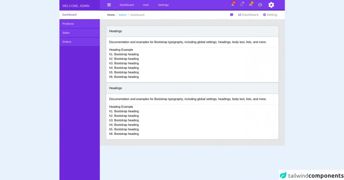
The preview of COREUI-Dashboard UI component
Free download of the COREUI-Dashboard's source code
The source code of COREUI-Dashboard UI component
<!DOCTYPE html>
<html lang="en">

<head>
    <meta charset="UTF-8">
    <meta http-equiv="X-UA-Compatible" content="IE=edge">
    <meta name="viewport" content="width=device-width, initial-scale=1.0">
    <title>Safal Admin Panel</title>
    <link href="https://unpkg.com/tailwindcss@^2/dist/tailwind.min.css" rel="stylesheet">
    <link rel="stylesheet" href="https://cdnjs.cloudflare.com/ajax/libs/font-awesome/5.15.3/css/all.min.css"
        integrity="sha512-iBBXm8fW90+nuLcSKlbmrPcLa0OT92xO1BIsZ+ywDWZCvqsWgccV3gFoRBv0z+8dLJgyAHIhR35VZc2oM/gI1w=="
        crossorigin="anonymous" />
    <script type="module" src="https://cdn.jsdelivr.net/gh/alpinejs/[email protected]/dist/alpine.min.js"></script>
    <script nomodule src="https://cdn.jsdelivr.net/gh/alpinejs/[email protected]/dist/alpine-ie11.min.js" defer></script>
</head>

<body>
    <div class="flex" style="font-family: Arial;" x-data="{ open: true }">
        <div class="sidebar h-screen" style="width: 260px;" x-show="open">
            <div>
                <div class="text-purple-200 bg-purple-700 h-14 mx-auto block px-4 py-5">
                    WELCOME, ADMIN
                </div>
                <div class="h-screen bg-purple-700">
                    <div class="" style="font-size: 14px;">
                        <a href=""
                            class="h-12 px-4 py-3 text-purple-800 tracking-wider block bg-white font-medium border-b-2 border-purple-800 hover:text-purple-800 hover:bg-white">Dashboard</a>
                        <a href=""
                            class="h-12 px-4 py-3 text-white tracking-wider block bg-purple-600 font-thin border-b-2 border-purple-800 hover:text-purple-800 hover:bg-white">Products</a>
                        <a href=""
                            class="h-12 px-4 py-3 text-white tracking-wider block bg-purple-600 font-thin border-b-2 border-purple-800 hover:text-purple-800 hover:bg-white">Sales</a>
                        <a href=""
                            class="h-12 px-4 py-3 text-white tracking-wider block bg-purple-600 font-thin border-b-2 border-purple-800 hover:text-purple-800 hover:bg-white">Orders</a>
                    </div>
                </div>
            </div>
        </div>
        <div class="w-full z-10">
            <div
                class="sticky top-0 bg-purple-600 header bg-white h-14 px-10 py-4 border-b-4 border-purple-900 flex items-center justify-between">
                <div class="flex items-center space-x-12 text-sm">
                    <i class="hover:text-purple text-xl fas fa-bars font-thin cursor-pointer text-white"
                        @click="open = !open"></i>
                    <a href=""
                        class="hover:text-purple-400 text-white  tracking-wider font-thin"><span>Dashboard</span></a>
                    <a href="" class="hover:text-purple-400 text-white  tracking-wider font-thin">User</a>
                    <a href="" class="hover:text-purple-400 text-white  tracking-wider font-thin">Settings</a>
                </div>
                <div class="flex items-center space-x-8 text-gray-400 text-base px-4 py-2">
                    <span class="relative inline-block cursor-pointer">
                        <i class="fas fa-bell font-thin"></i>
                        <span
                            class="absolute top-0 right-0 inline-flex items-center justify-center px-1  py-0.5 text-xs font-thin leading-none text-red-100 transform translate-x-1/2 -translate-y-1/2 bg-red-600 rounded-full">99</span>
                    </span>
                    <span class="relative inline-block cursor-pointer">
                        <i class="fas fa-list font-thin"></i>
                        <span
                            class="absolute top-0 right-0 inline-flex items-center justify-center px-1 py-0.5 text-xs font-thin leading-none text-red-100 transform translate-x-1/2 -translate-y-1/2 bg-purple-600 rounded-full">99</span>
                    </span>
                    <span class="relative inline-block cursor-pointer">
                        <i class="fas fa-envelope font-thin"></i>
                        <span
                            class="absolute top-0 right-0 inline-flex items-center justify-center px-1 py-0.5 text-xs font-thin leading-none text-red-100 transform translate-x-1/2 -translate-y-1/2 bg-yellow-600 rounded-full">9</span>
                    </span>
                    <i class="fas fa-user-circle fa-lg font-thin cursor-pointer"></i>
                    <i class="fas fa-cog fa-2x font-thin text-white cursor-pointer animate animate-spin hover:text-green-500"
                        style="animation-duration: 7000ms;"></i>
                </div>
            </div>
            <div
                class="sticky top-14 header bg-white h-12 px-10 py-4 border-b-2 border-gray-200 flex items-center justify-between">
                <div class="flex items-center space-x-2 text-gray-400 text-base">
                    <span class="text-black tracking-wider font-thin text-sm">Home</span>
                    <span>/</span>
                    <span class="tracking-wide text-sm">
                        <span class="hover:underline cursor-pointer"
                            style="color: #20a8d8; font-weight: 100;">Admin</span>
                    </span>
                    <span>/</span>
                    <span class="text-black tracking-wider font-thin text-sm text-opacity-50">Dashboard</span>
                </div>
                <div class="flex items-center space-x-6 text-gray-400 text-base text-black">
                    <i class="fas fa-comment-alt mr-1 text-purple-500"></i>
                    <a href="" class="mr-3 text-black">
                        <i class="fas fa-chart-line text-purple-500"></i>
                        <span
                            class="hover:text-purple-400 text-black text-opacity-50 tracking-wider font-thin">Dashboard</span>
                    </a>
                    <a href="" class="text-black">
                        <i class="fas fa-cog text-purple-500"></i>
                        <span
                            class="hover:text-purple-400 text-black text-opacity-50 tracking-wider font-thin">Setting</span>
                    </a>
                </div>
            </div>
            <div class="body">
                <div class="p-8" style="background-color: #E4E5E6;">
                    <div class="main bg-white border-2 border-gray-300 rounded">
                        <div class="rounded-t border-b-2 border-gray-300" style="background-color: #F0F3F5;">
                            <h1 class="p-4">Headings</h1>
                        </div>
                        <div class="p-4">
                            <p class="mb-4">Documentation and examples for Bootstrap typography, including global
                                settings, headings,
                                body text, lists, and more.</p>
                            <hr>
                            Heading Example
                            <h1></h1>

                            h1. Bootstrap heading
                            <h2></h2>

                            h2. Bootstrap heading
                            <h3></h3>

                            h3. Bootstrap heading
                            <h4></h4>

                            h4. Bootstrap heading
                            <h5></h5>

                            h5. Bootstrap heading
                            <h6></h6>

                            h6. Bootstrap heading
                        </div>
                    </div>
                </div>
            </div>
        </div>
    </div>
</body>

</html>
How to create a COREUI-Dashboard with Tailwind CSS?
Now that we've covered the basics, let's dive into the steps for creating a COREUI-Dashboard UI component with Tailwind CSS.
Step 1: Set up your project
The first step is to set up your project. You can do this by creating a new HTML file and linking to the Tailwind CSS stylesheet. You can also use a build tool like Webpack or Gulp to automate this process.
Step 2: Create the navigation menu
The next step is to create the navigation menu. You can do this by using the pre-defined classes provided by Tailwind CSS. For example, you can use the bg-gray-800 class to set the background color of the menu, and the text-white class to set the text color.
Step 3: Create the header section
The header section typically includes a logo and some navigation links. You can create this section by using the pre-defined classes provided by Tailwind CSS. For example, you can use the flex class to create a flexible container, and the items-center class to center the items vertically.
Step 4: Create the data visualization widgets
The data visualization widgets are the heart of the COREUI-Dashboard UI component. You can create these widgets using a combination of HTML, CSS, and JavaScript. Tailwind CSS provides a wide range of pre-defined classes that you can use to style your widgets.
Step 5: Add interactivity
Finally, you can add interactivity to your COREUI-Dashboard UI component using JavaScript. For example, you can use a library like Chart.js to create interactive charts and graphs.
Conclusion
In this article, we've covered the basics of using Tailwind CSS to create a COREUI-Dashboard UI component. With just a few easy steps, you can create a visually appealing and responsive dashboard that works well on all devices. Whether you're building a web application from scratch or just looking to improve your existing UI components, Tailwind CSS is an excellent choice. So why not give it a try today?