- Published on
6 Tips To Make A Custom Radio Buttons With Tailwind CSS
- What is Tailwind CSS?
- The description of Custom Radio Buttons ui component
- Why use Tailwind CSS to create a Custom Radio Buttons ui component?
- The preview of Custom Radio Buttons ui component
- The source code of Custom Radio Buttons ui component
- How to create a Custom Radio Buttons with Tailwind CSS?
- 1. Use the form-radio class
- 2. Use the form-radio and form-radio-checked classes together
- 3. Use the text-[color] class to change the color of the radio button label
- 4. Use the w-[size] and h-[size] classes to change the size of the radio button
- 5. Use the border-[size] class to change the border size of the radio button
- 6. Use the rounded-[size] class to change the border radius of the radio button
- Conclusion
Radio buttons are an essential UI component that allows users to select one option from multiple choices. However, the default radio buttons provided by browsers are often plain and unattractive. In this article, we will discuss how to create custom radio buttons with Tailwind CSS, a popular utility-first CSS framework.
What is Tailwind CSS?
Tailwind CSS is a utility-first CSS framework that allows you to rapidly build custom user interfaces. It provides a set of pre-defined CSS classes that you can use to style your HTML elements. With Tailwind CSS, you can create complex layouts and designs without writing any custom CSS code.
The description of Custom Radio Buttons ui component
Custom radio buttons are a UI component that allows users to select one option from multiple choices. They are similar to default radio buttons but have a custom design. Custom radio buttons can be styled to match the overall design of your website or application.
Why use Tailwind CSS to create a Custom Radio Buttons ui component?
Tailwind CSS provides a set of pre-defined CSS classes that you can use to style your custom radio buttons. This saves you time and effort in writing custom CSS code. Tailwind CSS also provides responsive design classes that allow you to create custom radio buttons that look great on all screen sizes.
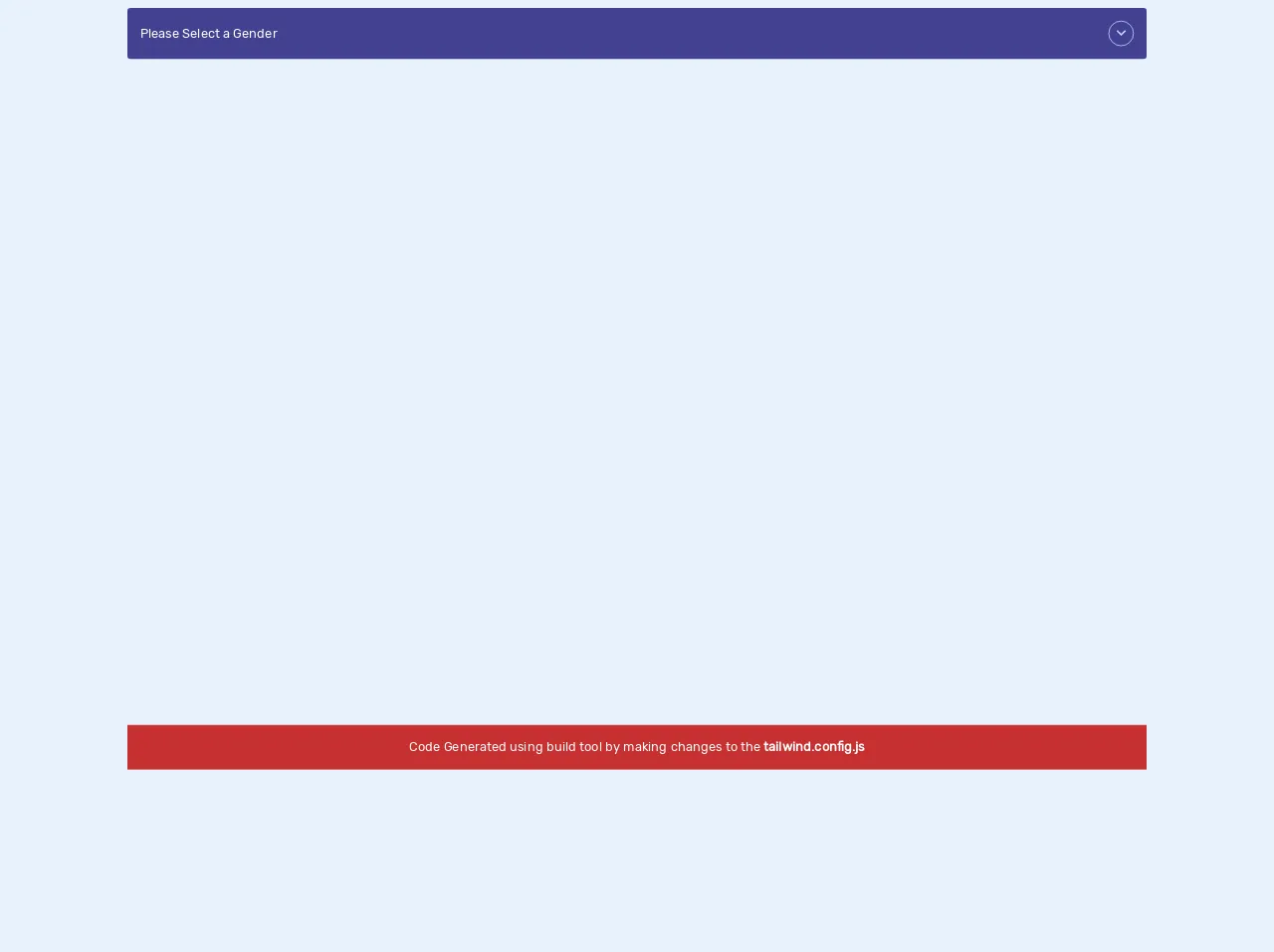
The preview of Custom Radio Buttons ui component
Custom radio buttons can be designed in many ways, depending on your website or application's overall design. Here is an example of what custom radio buttons can look like:
Free download of the Custom Radio Buttons's source code
The source code of Custom Radio Buttons ui component
To create custom radio buttons with Tailwind CSS, you need to add some custom CSS classes to your HTML code. Here is an example of the HTML and CSS code needed to create custom radio buttons:
<!DOCTYPE html>
<html lang="en">
  <head>
    <meta charset="UTF-8" />
    <meta name="viewport" content="width=device-width, initial-scale=1.0" />
    <title>Tailwind Radio Buttons</title>
    <link
      rel="stylesheet"
      href="https://cdnjs.cloudflare.com/ajax/libs/material-design-icons/3.0.1/iconfont/material-icons.min.css"
    />
  	<style>
    	/* ----- custom css ----------*/
      @import url("https://fonts.googleapis.com/css2?family=Rubik&display=swap");
body {
  font-family: "Rubik", sans-serif;
}

.select-dropdown input[type="radio"]:checked,
.select-dropdown input[type="radio"]:checked + label {
  display: inline-block;
}

      /* ------- code generated using built tool ------------*/

/*! normalize.css v8.0.1 | MIT License | github.com/necolas/normalize.css */
html {
  line-height: 1.15;
  -webkit-text-size-adjust: 100%;
}
body {
  margin: 0;
}
main {
  display: block;
}
h1 {
  font-size: 2em;
  margin: 0.67em 0;
}
hr {
  box-sizing: content-box;
  height: 0;
  overflow: visible;
}
pre {
  font-family: monospace, monospace;
  font-size: 1em;
}
a {
  background-color: transparent;
}
abbr[title] {
  border-bottom: none;
  text-decoration: underline;
  -webkit-text-decoration: underline dotted;
  text-decoration: underline dotted;
}
b,
strong {
  font-weight: bolder;
}
code,
kbd,
samp {
  font-family: monospace, monospace;
  font-size: 1em;
}
small {
  font-size: 80%;
}
sub,
sup {
  font-size: 75%;
  line-height: 0;
  position: relative;
  vertical-align: baseline;
}
sub {
  bottom: -0.25em;
}
sup {
  top: -0.5em;
}
img {
  border-style: none;
}
button,
input,
optgroup,
select,
textarea {
  font-family: inherit;
  font-size: 100%;
  line-height: 1.15;
  margin: 0;
}
button,
input {
  overflow: visible;
}
button,
select {
  text-transform: none;
}
[type="button"],
[type="reset"],
[type="submit"],
button {
  -webkit-appearance: button;
}
[type="button"]::-moz-focus-inner,
[type="reset"]::-moz-focus-inner,
[type="submit"]::-moz-focus-inner,
button::-moz-focus-inner {
  border-style: none;
  padding: 0;
}
[type="button"]:-moz-focusring,
[type="reset"]:-moz-focusring,
[type="submit"]:-moz-focusring,
button:-moz-focusring {
  outline: 1px dotted ButtonText;
}
fieldset {
  padding: 0.35em 0.75em 0.625em;
}
legend {
  box-sizing: border-box;
  color: inherit;
  display: table;
  max-width: 100%;
  padding: 0;
  white-space: normal;
}
progress {
  vertical-align: baseline;
}
textarea {
  overflow: auto;
}
[type="checkbox"],
[type="radio"] {
  box-sizing: border-box;
  padding: 0;
}
[type="number"]::-webkit-inner-spin-button,
[type="number"]::-webkit-outer-spin-button {
  height: auto;
}
[type="search"] {
  -webkit-appearance: textfield;
  outline-offset: -2px;
}
[type="search"]::-webkit-search-decoration {
  -webkit-appearance: none;
}
::-webkit-file-upload-button {
  -webkit-appearance: button;
  font: inherit;
}
details {
  display: block;
}
summary {
  display: list-item;
}
[hidden],
template {
  display: none;
}
blockquote,
dd,
dl,
figure,
h1,
h2,
h3,
h4,
h5,
h6,
hr,
p,
pre {
  margin: 0;
}
button {
  background-color: transparent;
  background-image: none;
}
button:focus {
  outline: 1px dotted;
  outline: 5px auto -webkit-focus-ring-color;
}
fieldset,
ol,
ul {
  margin: 0;
  padding: 0;
}
ol,
ul {
  list-style: none;
}
html {
  font-family: system-ui, -apple-system, BlinkMacSystemFont, Segoe UI, Roboto,
    Helvetica Neue, Arial, Noto Sans, sans-serif, Apple Color Emoji,
    Segoe UI Emoji, Segoe UI Symbol, Noto Color Emoji;
  line-height: 1.5;
}
*,
:after,
:before {
  box-sizing: border-box;
  border: 0 solid #e2e8f0;
}
hr {
  border-top-width: 1px;
}
img {
  border-style: solid;
}
textarea {
  resize: vertical;
}
input::-moz-placeholder,
textarea::-moz-placeholder {
  color: #a0aec0;
}
input:-ms-input-placeholder,
textarea:-ms-input-placeholder {
  color: #a0aec0;
}
input::-ms-input-placeholder,
textarea::-ms-input-placeholder {
  color: #a0aec0;
}
input::placeholder,
textarea::placeholder {
  color: #a0aec0;
}
[role="button"],
button {
  cursor: pointer;
}
table {
  border-collapse: collapse;
}
h1,
h2,
h3,
h4,
h5,
h6 {
  font-size: inherit;
  font-weight: inherit;
}
a {
  color: inherit;
  text-decoration: inherit;
}
button,
input,
optgroup,
select,
textarea {
  padding: 0;
  line-height: inherit;
  color: inherit;
}
code,
kbd,
pre,
samp {
  font-family: Menlo, Monaco, Consolas, Liberation Mono, Courier New, monospace;
}
audio,
canvas,
embed,
iframe,
img,
object,
svg,
video {
  display: block;
  vertical-align: middle;
}
img,
video {
  max-width: 100%;
  height: auto;
}
.container {
  width: 100%;
}
@media (min-width: 640px) {
  .container {
    max-width: 640px;
  }
}
@media (min-width: 768px) {
  .container {
    max-width: 768px;
  }
}
@media (min-width: 1024px) {
  .container {
    max-width: 1024px;
  }
}
@media (min-width: 1280px) {
  .container {
    max-width: 1280px;
  }
}
.appearance-none {
  -webkit-appearance: none;
  -moz-appearance: none;
  appearance: none;
}
.bg-red-700 {
  --bg-opacity: 1;
  background-color: #c53030;
  background-color: rgba(197, 48, 48, var(--bg-opacity));
}
.bg-indigo-800 {
  --bg-opacity: 1;
  background-color: #434190;
  background-color: rgba(67, 65, 144, var(--bg-opacity));
}
.hover\:bg-indigo-900:hover {
  --bg-opacity: 1;
  background-color: #3c366b;
  background-color: rgba(60, 54, 107, var(--bg-opacity));
}
.border-indigo-200 {
  --border-opacity: 1;
  border-color: #c3dafe;
  border-color: rgba(195, 218, 254, var(--border-opacity));
}
.rounded {
  border-radius: 0.25rem;
}
.rounded-full {
  border-radius: 9999px;
}
.border {
  border-width: 1px;
}
.cursor-pointer {
  cursor: pointer;
}
.flex {
  display: flex;
}
.inline-flex {
  display: inline-flex;
}
.hidden {
  display: none;
}
.group:focus .group-focus\:flex {
  display: flex;
}
.flex-col {
  flex-direction: column;
}
.items-center {
  align-items: center;
}
.justify-center {
  justify-content: center;
}
.flex-grow {
  flex-grow: 1;
}
.h-8 {
  height: 2rem;
}
.my-2 {
  margin-top: 0.5rem;
  margin-bottom: 0.5rem;
}
.mx-auto {
  margin-left: auto;
  margin-right: auto;
}
.mt-4 {
  margin-top: 1rem;
}
.mr-4 {
  margin-right: 1rem;
}
.opacity-0 {
  opacity: 0;
}
.outline-none {
  outline: 0;
}
.overflow-hidden {
  overflow: hidden;
}
.p-4 {
  padding: 1rem;
}
.py-1 {
  padding-top: 0.25rem;
  padding-bottom: 0.25rem;
}
.pr-12 {
  padding-right: 3rem;
}
.fixed {
  position: fixed;
}
.absolute {
  position: absolute;
}
.relative {
  position: relative;
}
.top-0 {
  top: 0;
}
.right-0 {
  right: 0;
}
.bottom-0 {
  bottom: 0;
}
.left-0 {
  left: 0;
}
.text-center {
  text-align: center;
}
.text-white {
  --text-opacity: 1;
  color: #fff;
  color: rgba(255, 255, 255, var(--text-opacity));
}
.text-indigo-200 {
  --text-opacity: 1;
  color: #c3dafe;
  color: rgba(195, 218, 254, var(--text-opacity));
}
.w-8 {
  width: 2rem;
}
.transform {
  --transform-translate-x: 0;
  --transform-translate-y: 0;
  --transform-rotate: 0;
  --transform-skew-x: 0;
  --transform-skew-y: 0;
  --transform-scale-x: 1;
  --transform-scale-y: 1;
  transform: translateX(var(--transform-translate-x))
    translateY(var(--transform-translate-y)) rotate(var(--transform-rotate))
    skewX(var(--transform-skew-x)) skewY(var(--transform-skew-y))
    scaleX(var(--transform-scale-x)) scaleY(var(--transform-scale-y));
}
.group:focus .group-focus\:rotate-180 {
  --transform-rotate: 180deg;
}
.ease-in-out {
  transition-timing-function: cubic-bezier(0.4, 0, 0.2, 1);
}
.duration-500 {
  transition-duration: 0.5s;
}
@media (min-width: 640px) {
  .sm\:container {
    width: 100%;
    max-width: 640px;
  }
  @media (min-width: 768px) {
    .sm\:container {
      max-width: 768px;
    }
  }
  @media (min-width: 1024px) {
    .sm\:container {
      max-width: 1024px;
    }
  }
  @media (min-width: 1280px) {
    .sm\:container {
      max-width: 1280px;
    }
  }
}
@media (min-width: 768px) {
  .md\:container {
    width: 100%;
  }
  @media (min-width: 640px) {
    .md\:container {
      max-width: 640px;
    }
  }
  @media (min-width: 768px) {
    .md\:container {
      max-width: 768px;
    }
  }
  @media (min-width: 1024px) {
    .md\:container {
      max-width: 1024px;
    }
  }
  @media (min-width: 1280px) {
    .md\:container {
      max-width: 1280px;
    }
  }
}
@media (min-width: 1024px) {
  .lg\:container {
    width: 100%;
  }
  @media (min-width: 640px) {
    .lg\:container {
      max-width: 640px;
    }
  }
  @media (min-width: 768px) {
    .lg\:container {
      max-width: 768px;
    }
  }
  @media (min-width: 1024px) {
    .lg\:container {
      max-width: 1024px;
    }
  }
  @media (min-width: 1280px) {
    .lg\:container {
      max-width: 1280px;
    }
  }
}
@media (min-width: 1280px) {
  .xl\:container {
    width: 100%;
  }
  @media (min-width: 640px) {
    .xl\:container {
      max-width: 640px;
    }
  }
  @media (min-width: 768px) {
    .xl\:container {
      max-width: 768px;
    }
  }
  @media (min-width: 1024px) {
    .xl\:container {
      max-width: 1024px;
    }
  }
  @media (min-width: 1280px) {
    .xl\:container {
      max-width: 1280px;
    }
  }
}


   	</style>
  </head>
  <body>
    <div class="container mx-auto">
      <div
        class="group relative flex flex-column overflow-hidden p-4 pr-12 bg-indigo-800 outline-none rounded my-2 cursor-pointer select-dropdown"
        tabindex="1"
      >
        <!-- select icon -->
        <div
          class="h-8 w-8 border border-indigo-200 inline-flex items-center justify-center text-indigo-200 absolute right-0 top-0 mt-4 mr-4 rounded-full transform ease-in-out duration-500 group-focus:rotate-180"
        >
          <span class="material-icons">
            keyboard_arrow_down
          </span>
        </div>
        <!-- select icon -->
        <div class="flex-col flex-grow">
          <!-- options -->
          <div class="flex items-center relative">
            <input
              class="opacity-0 absolute appearance-none"
              type="radio"
              id="default"
              name="gender"
              value="null"
              checked
              disabled
            />
            <label
              class="flex hidden py-1 flex-grow group-focus:flex text-white cursor-pointer"
              for="default"
              >Please Select a Gender</label
            >
          </div>

          <!--  -->
          <div class="flex items-center relative">
            <input
              class="opacity-0 absolute appearance-none"
              type="radio"
              id="option1"
              name="gender"
              value="male"
            />
            <label
              class="flex hidden py-1 flex-grow group-focus:flex text-white hover:bg-indigo-900 cursor-pointer"
              for="option1"
              >Male</label
            >
          </div>
          <!--  -->
          <div class="flex items-center relative">
            <input
              class="opacity-0 absolute appearance-none"
              type="radio"
              id="option2"
              name="gender"
              value="female"
            />
            <label
              class="flex hidden py-1 flex-grow group-focus:flex text-white hover:bg-indigo-900 cursor-pointer"
              for="option2"
              >Female</label
            >
          </div>
          <!--  -->
          <div class="flex items-center relative">
            <input
              class="opacity-0 absolute appearance-none"
              type="radio"
              id="option3"
              name="gender"
              value="other"
            />
            <label
              class="flex hidden py-1 flex-grow group-focus:flex text-white hover:bg-indigo-900 cursor-pointer"
              for="option3"
              >Other</label
            >
          </div>
          <!-- options -->
        </div>
      </div>
    </div>

    <div
      class="fixed bg-red-700 text-white p-4 text-center bottom-0 left-0 right-0"
    >
      Code Generated using build tool by making changes to the
      <strong>tailwind.config.js</strong>
    </div>
  </body>
</html>
How to create a Custom Radio Buttons with Tailwind CSS?
Here are six tips to create custom radio buttons with Tailwind CSS:
1. Use the form-radio class
The form-radio class is a pre-defined Tailwind CSS class that styles radio buttons. You can use this class to style your custom radio buttons.
2. Use the form-radio and form-radio-checked classes together
The form-radio and form-radio-checked classes work together to style the checked radio button. You can use these classes to style the checked radio button differently from the unchecked radio buttons.
3. Use the text-[color] class to change the color of the radio button label
The text-[color] class allows you to change the color of the radio button label. You can use this class to match the color of the label with your website or application's overall design.
4. Use the w-[size] and h-[size] classes to change the size of the radio button
The w-[size] and h-[size] classes allow you to change the width and height of the radio button. You can use these classes to create custom radio buttons that match the overall design of your website or application.
5. Use the border-[size] class to change the border size of the radio button
The border-[size] class allows you to change the border size of the radio button. You can use this class to create custom radio buttons with thicker or thinner borders.
6. Use the rounded-[size] class to change the border radius of the radio button
The rounded-[size] class allows you to change the border radius of the radio button. You can use this class to create custom radio buttons with more rounded or sharper corners.
Conclusion
Custom radio buttons are a great way to improve the design of your website or application. With Tailwind CSS, you can easily create custom radio buttons that match the overall design of your website or application. By following the tips in this article, you can create custom radio buttons that look great on all screen sizes.