- Published on
Learn How To Build A Custom Input Range With Tailwind CSS Like an Expert
- What is Tailwind CSS?
- The description of Custom input range ui component
- Why use Tailwind CSS to create a Custom input range ui component?
- The preview of Custom input range ui component
- The source code of Custom input range ui component
- How to create a Custom input range with Tailwind CSS?
- Step 1: Create the HTML code
- Step 2: Style the slider control
- Step 3: Add interactivity to the slider control
- Conclusion
What is Tailwind CSS?
Tailwind CSS is a utility-first CSS framework that allows developers to build custom user interfaces with ease. It provides a set of pre-defined CSS classes that can be used to style HTML elements. With Tailwind CSS, developers can create complex UI components quickly and efficiently.
The description of Custom input range ui component
A custom input range UI component is a slider control that allows users to select a value from a range of values. It is commonly used in web applications to set preferences, filter data, or adjust settings. A custom input range UI component can be styled to match the look and feel of the application.
Why use Tailwind CSS to create a Custom input range ui component?
Tailwind CSS provides a set of pre-defined CSS classes that can be used to style HTML elements. This makes it easy to create custom UI components without writing any CSS code. Tailwind CSS also provides a responsive design system that allows developers to create UI components that look great on any device.
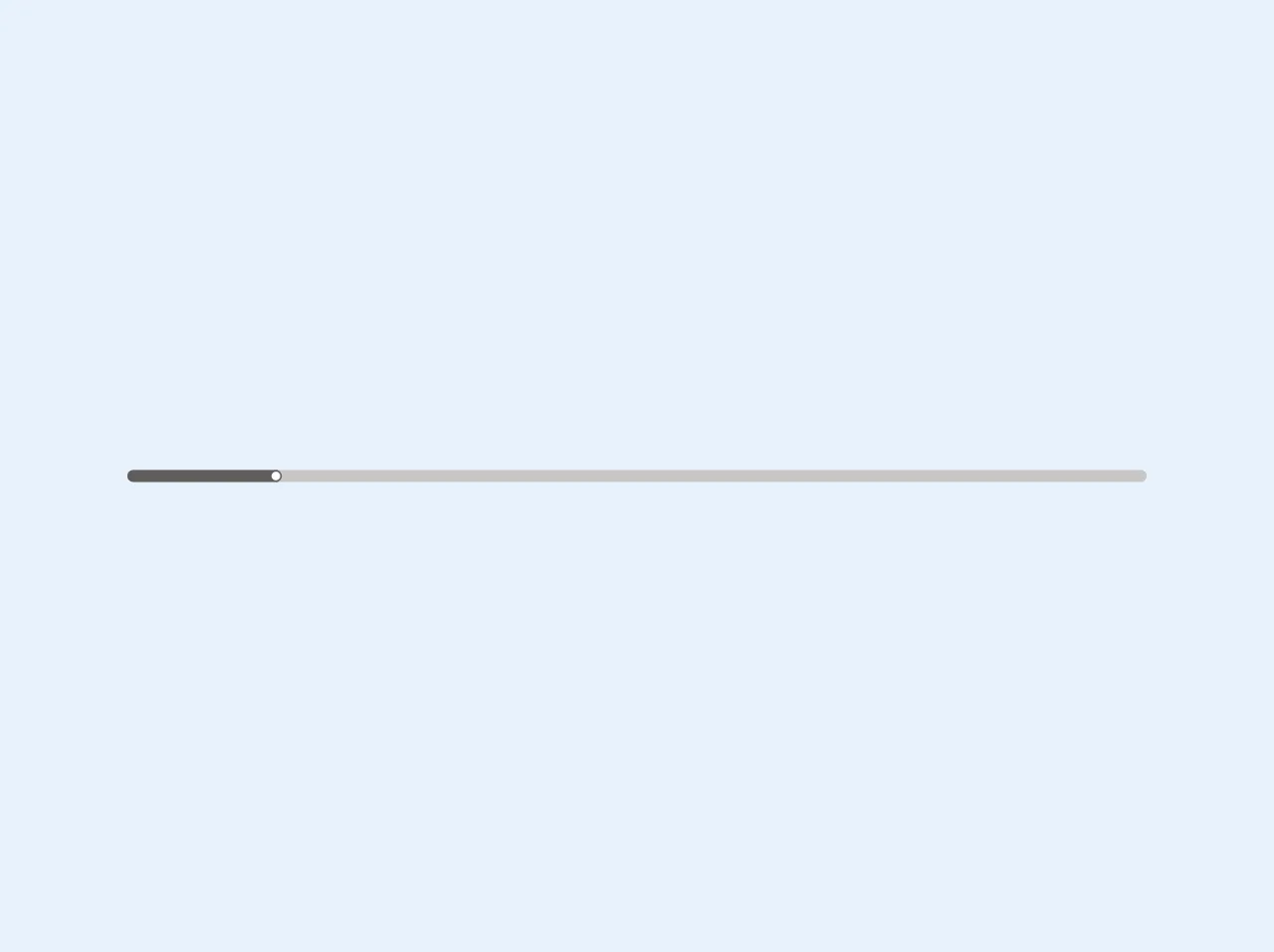
The preview of Custom input range ui component
To create a custom input range UI component with Tailwind CSS, we will use a combination of CSS classes to style the slider control. The result will be a slider control that looks great and is easy to use.
Free download of the Custom input range's source code
The source code of Custom input range ui component
To create a custom input range UI component with Tailwind CSS, we will use a combination of HTML and CSS code. The HTML code will define the structure of the slider control, while the CSS code will style the control.
<style>
    @media screen and (-webkit-min-device-pixel-ratio: 0) {

        input[type="range"]::-webkit-slider-thumb {
            width: 15px;
            -webkit-appearance: none;
  			appearance: none;
            height: 15px;
            cursor: ew-resize;
            background: #FFF;
            box-shadow: -405px 0 0 400px #605E5C;
            border-radius: 50%;

        }
    }
</style>
<input class="rounded-lg overflow-hidden appearance-none bg-gray-400 h-3 w-128" type="range" min="1" max="100" step="1" value="15" />
How to create a Custom input range with Tailwind CSS?
To create a custom input range UI component with Tailwind CSS, follow these steps:
Step 1: Create the HTML code
The first step is to create the HTML code for the slider control. The HTML code should include an input element with the type set to range.
<div class="w-full">
  <input type="range" class="slider" min="0" max="100" step="1" value="50">
</div>
Step 2: Style the slider control
The next step is to style the slider control using Tailwind CSS classes. We will use the bg-gray-400 class to set the background color of the slider track, and the appearance-none class to remove the default appearance of the slider control.
.slider {
  -webkit-appearance: none;
  width: 100%;
  height: 10px;
  border-radius: 5px;
  background: linear-gradient(to right, #4dc0b5 0%, #4dc0b5 {{__percentage__}}%, #e0e0e0 {{__percentage__}}%, #e0e0e0 100%);
  outline: none;
  opacity: 0.7;
  -webkit-transition: .2s;
  transition: opacity .2s;
}

.slider:hover {
  opacity: 1;
}

.slider::-webkit-slider-thumb {
  -webkit-appearance: none;
  appearance: none;
  width: 20px;
  height: 20px;
  border-radius: 50%;
  background: #4dc0b5;
  cursor: pointer;
}

.slider::-moz-range-thumb {
  width: 20px;
  height: 20px;
  border-radius: 50%;
  background: #4dc0b5;
  cursor: pointer;
}
Step 3: Add interactivity to the slider control
The final step is to add interactivity to the slider control using JavaScript. We will use the onchange event to update the value of the slider control whenever the user moves the slider.
const slider = document.querySelector('.slider');
const value = document.querySelector('.value');

slider.oninput = function() {
  const percentage = (slider.value - slider.min) / (slider.max - slider.min) * 100;
  value.innerHTML = slider.value;
  slider.style.background = `linear-gradient(to right, #4dc0b5 0%, #4dc0b5 ${percentage}%, #e0e0e0 ${percentage}%, #e0e0e0 100%)`;
}
Conclusion
Creating a custom input range UI component with Tailwind CSS is easy and fun. By following the steps outlined in this article, you can create a slider control that looks great and is easy to use. With Tailwind CSS, you can create custom UI components quickly and efficiently, allowing you to focus on building great web applications.