- Published on
How To Build A CTA Cards With Tailwind CSS In 5 Easy Steps
- What is Tailwind CSS?
- The description of CTA cards ui component
- Why use Tailwind CSS to create a CTA cards ui component?
- The preview of CTA cards ui component
- The source code of CTA cards ui component
- How to create a CTA cards with Tailwind CSS?
- Step 1: Set up your HTML
- Step 2: Add Tailwind CSS to your project
- Step 3: Style the card
- Step 4: Customize the card
- Step 5: Add animation
- Conclusion
What is Tailwind CSS?
Tailwind CSS is a utility-first CSS framework that allows developers to rapidly build custom user interfaces. It provides a set of pre-defined classes that can be used to style HTML elements without writing any custom CSS. With Tailwind CSS, developers can focus on building functionality rather than spending time on styling.
The description of CTA cards ui component
CTA (Call-to-Action) cards are a popular UI component used in websites and applications to encourage users to take a specific action. They are typically used to promote products, services, or events and can be designed in various ways to attract user attention.
Why use Tailwind CSS to create a CTA cards ui component?
Tailwind CSS provides a set of pre-defined classes that can be used to style CTA cards quickly and easily. With Tailwind CSS, developers can create custom CTA cards without writing any custom CSS. This saves time and effort and allows developers to focus on building functionality.
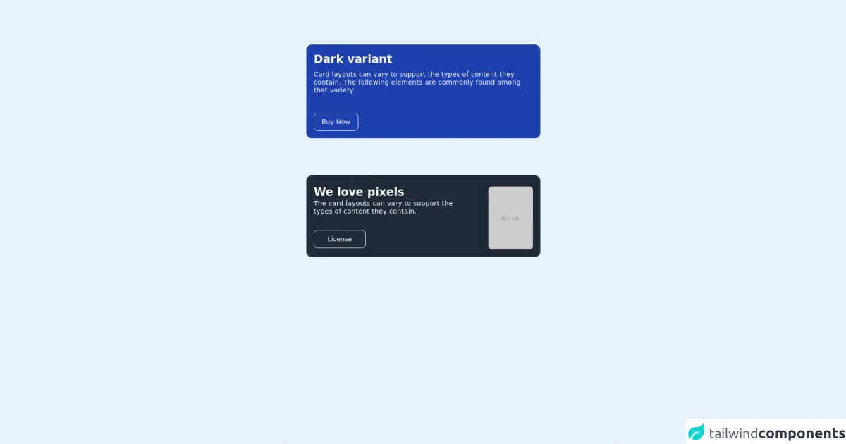
The preview of CTA cards ui component
CTA cards can be designed in various ways to attract user attention. They typically include a title, description, and a call-to-action button. Here is an example of a CTA card:
Free download of the CTA cards's source code
The source code of CTA cards ui component
To create a CTA card with Tailwind CSS, you can use the following HTML and CSS code:
<div class="h-screen max-w-2xl mx-auto mt-24 space-y-20">
  <div class="max-w-screen-md md:w-3/4 mx-auto">
    <div class="inline-flex flex-col space-y-2 items-center justify-end flex-1 h-full p-4 bg-blue-800 rounded-xl">
      <p class="w-full text-2xl font-semibold text-white">Dark variant</p>
      <p class="w-full pb-8 text-sm tracking-wide leading-tight text-white">Card layouts can vary to support the types of content they contain. The following elements are commonly found among that variety.</p>
      <div class="rounded mr-auto">
        <div class="opacity-95 border rounded-lg border-white px-4">
          <p class="m-auto inset-0 text-sm font-medium leading-normal text-center text-white py-2">Buy Now</p>
        </div>
      </div>
    </div>
  </div>

  <div class="max-w-screen md:w-3/4 mx-auto">
    <div class="flex flex-row space-y-2 items-center justify-center h-full py-4 bg-gray-800 rounded-xl space-x-10">
      <div class="w-2/3">
        <p class="w-full text-2xl font-semibold text-white">We love pixels</p>
        <p class="w-full pb-8 text-sm tracking-wide leading-tight text-white">The card layouts can vary to support the types of content they contain.</p>
        <div class="rounded w-1/3">
          <div class="opacity-95 border rounded-lg border-white px-4">
            <p class="m-auto inset-0 text-sm font-medium leading-normal text-center text-white py-2">License</p>
          </div>
        </div>
      </div>
      <div class="w-auto h-">
        <img class="flex-1 h-full rounded-lg" src="https://via.placeholder.com/96x136" />
      </div>
    </div>
  </div>
</div>
How to create a CTA cards with Tailwind CSS?
Here are the 5 easy steps to create a CTA card with Tailwind CSS:
Step 1: Set up your HTML
First, create a div element with a class of "card". Inside the card, create a div element with a class of "card-body". Inside the card-body, create a h2 element with a class of "card-title", a p element with a class of "card-text", and a button element with a class of "btn btn-primary".
<div class="card">
  <div class="card-body">
    <h2 class="card-title">Title</h2>
    <p class="card-text">Description</p>
    <button class="btn btn-primary">Call to Action</button>
  </div>
</div>
Step 2: Add Tailwind CSS to your project
Next, add Tailwind CSS to your project by including the CDN link in the head section of your HTML file.
<head>
  <link rel="stylesheet" href="https://cdn.jsdelivr.net/npm/tailwindcss@latest/dist/tailwind.min.css">
</head>
Step 3: Style the card
To style the card, add the "bg-white" and "shadow-md" classes to the card element. Add the "px-6 py-4" class to the card-body element to add padding. Add the "text-gray-900" class to the card-title element to change the text color to black. Add the "text-gray-600" class to the card-text element to change the text color to gray. Add the "mr-4" class to the button element to add margin to the right.
<div class="card bg-white shadow-md">
  <div class="card-body px-6 py-4">
    <h2 class="card-title text-gray-900">Title</h2>
    <p class="card-text text-gray-600">Description</p>
    <button class="btn btn-primary mr-4">Call to Action</button>
  </div>
</div>
Step 4: Customize the card
To customize the card, you can use Tailwind CSS classes to change the background color, text color, font size, and more. For example, to change the background color to blue, add the "bg-blue-500" class to the card element.
<div class="card bg-blue-500 shadow-md">
  <div class="card-body px-6 py-4">
    <h2 class="card-title text-white">Title</h2>
    <p class="card-text text-white">Description</p>
    <button class="btn btn-primary mr-4">Call to Action</button>
  </div>
</div>
Step 5: Add animation
To add animation to the card, you can use the Tailwind CSS "transition" classes. For example, to add a hover effect to the card, add the "transition duration-500 ease-in-out transform hover:-translate-y-1 hover:scale-110" class to the card element.
<div class="card bg-blue-500 shadow-md transition duration-500 ease-in-out transform hover:-translate-y-1 hover:scale-110">
  <div class="card-body px-6 py-4">
    <h2 class="card-title text-white">Title</h2>
    <p class="card-text text-white">Description</p>
    <button class="btn btn-primary mr-4">Call to Action</button>
  </div>
</div>
Conclusion
In this article, we have learned how to create a CTA card with Tailwind CSS in 5 easy steps. With Tailwind CSS, developers can create custom UI components quickly and easily without writing any custom CSS. This saves time and effort and allows developers to focus on building functionality.