- Published on
3 Things You Must Know To Make A CSS Only Slider With Tailwind CSS
- What is Tailwind CSS?
- The description of CSS only slider ui component
- Why use Tailwind CSS to create a CSS only slider ui component?
- The preview of CSS only slider ui component
- The source code of CSS only slider ui component
- How to create a CSS only slider with Tailwind CSS?
- Step 1: Create the HTML structure
- Step 2: Style the slider using Tailwind CSS
- Step 3: Customize the slider using Tailwind CSS
- Conclusion
In the world of web development, sliders are a popular UI component that can be used to showcase multiple images or content in a single space. While there are many slider plugins available, creating a CSS only slider with Tailwind CSS can be a great option for those who want to keep their code lightweight and easy to maintain. In this article, we will cover three things you must know to make a CSS only slider with Tailwind CSS.
What is Tailwind CSS?
Tailwind CSS is a utility-first CSS framework that provides a set of pre-defined classes to style HTML elements. It allows developers to create custom designs without writing any CSS code. With Tailwind CSS, you can quickly create a responsive and mobile-first design that works across all devices.
The description of CSS only slider ui component
A CSS only slider is a slider that does not require any JavaScript code to function. It is created using only HTML and CSS code. The CSS only slider is a lightweight and fast-loading option that can be easily customized to fit any design.
Why use Tailwind CSS to create a CSS only slider ui component?
Tailwind CSS provides a set of pre-defined classes that can be used to create a CSS only slider. It allows developers to create a responsive and mobile-first design without writing any CSS code. Tailwind CSS also provides a set of utility classes that can be used to customize the slider's appearance and behavior.
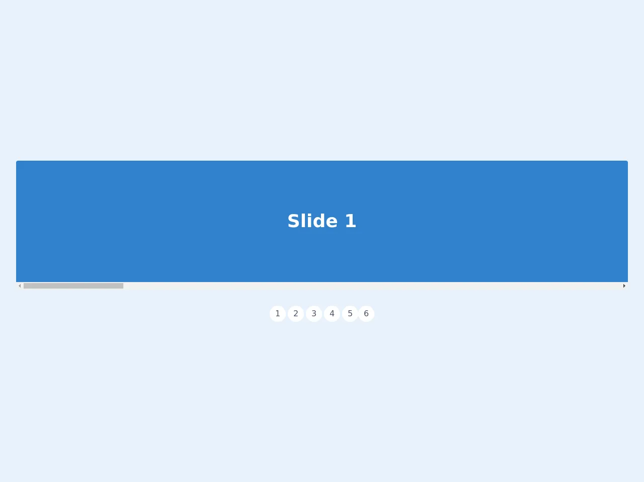
The preview of CSS only slider ui component
To create a CSS only slider with Tailwind CSS, we will use a combination of HTML and CSS code. The slider will consist of a container element that holds multiple slides. Each slide will contain an image and a caption. The slider will be controlled using radio buttons and CSS transitions.
Free download of the CSS only slider's source code
The source code of CSS only slider ui component
To create a CSS only slider with Tailwind CSS, we will use the following HTML and CSS code.
<style>
.snap-x {
    scroll-snap-type: x mandatory;

  scroll-behavior: smooth;
  -webkit-overflow-scrolling: touch;
}
.snap-start {
  scroll-snap-align: start;
}

</style>


<div class="flex flex-col items-center m-8">

  <div class="w-full bg-white rounded overflow-x-hidden flex snap-x" style="height: 40vh">
    <div class="snap-start w-full h-full flex items-center justify-center text-white text-4xl font-bold flex-shrink-0 bg-blue-600" id="slide-1">
      Slide 1
    </div>
    <div class="snap-start w-full h-full flex items-center justify-center text-white text-4xl font-bold flex-shrink-0 bg-green-600" id="slide-2">
      Slide 2
    </div>
    <div class="snap-start w-full h-full flex items-center justify-center text-white text-4xl font-bold flex-shrink-0 bg-red-600" id="slide-3">
      Slide 3
    </div>
    <div class="snap-start w-full h-full flex items-center justify-center text-white text-4xl font-bold flex-shrink-0 bg-orange-600" id="slide-4">
      Slide 4
    </div>
    <div class="snap-start w-full h-full flex items-center justify-center text-white text-4xl font-bold flex-shrink-0 bg-purple-600" id="slide-5">
      Slide 5
    </div>
    <div class="snap-start w-full h-full flex items-center justify-center text-white text-4xl font-bold flex-shrink-0 bg-black relative" id="slide-6">
      <img src="https://images.unsplash.com/photo-1556740738-b6a63e27c4df?ixlib=rb-1.2.1&ixid=eyJhcHBfaWQiOjEyMDd9&auto=format&fit=crop&w=448&q=80" class="h-full w-full object-cover absolute inset-0 z-10 opacity-25">
      <h1 class="z-20 text-center">Any kind of content here, images too!</h1>
    </div>
  </div>

  <div class="flex mt-8">
    <a class="w-8 mr-1 h-8 text-gray-700 rounded-full bg-white flex justify-center items-center" href="#slide-1">1</a>
    <a class="w-8 mr-1 h-8 text-gray-700 rounded-full bg-white flex justify-center items-center" href="#slide-2">2</a>
    <a class="w-8 mr-1 h-8 text-gray-700 rounded-full bg-white flex justify-center items-center" href="#slide-3">3</a>
    <a class="w-8 mr-1 h-8 text-gray-700 rounded-full bg-white flex justify-center items-center" href="#slide-4">4</a>
    <a class="w-8 h-8 text-gray-700 rounded-full bg-white flex justify-center items-center" href="#slide-5">5</a>
    <a class="w-8 h-8 text-gray-700 rounded-full bg-white flex justify-center items-center" href="#slide-6">6</a>
  </div>
</div>
How to create a CSS only slider with Tailwind CSS?
To create a CSS only slider with Tailwind CSS, follow these three steps:
Step 1: Create the HTML structure
The first step is to create the HTML structure for the slider. The slider will consist of a container element that holds multiple slides. Each slide will contain an image and a caption. Here is the HTML code for the slider:
<div class="slider">
  <input type="radio" name="slider" id="slide1" checked>
  <input type="radio" name="slider" id="slide2">
  <input type="radio" name="slider" id="slide3">
  <div class="slides">
    <div class="slide">
      <img src="https://via.placeholder.com/600x400.png?text=Slide+1" alt="Slide 1">
      <div class="caption">Slide 1</div>
    </div>
    <div class="slide">
      <img src="https://via.placeholder.com/600x400.png?text=Slide+2" alt="Slide 2">
      <div class="caption">Slide 2</div>
    </div>
    <div class="slide">
      <img src="https://via.placeholder.com/600x400.png?text=Slide+3" alt="Slide 3">
      <div class="caption">Slide 3</div>
    </div>
  </div>
  <div class="controls">
    <label for="slide1"></label>
    <label for="slide2"></label>
    <label for="slide3"></label>
  </div>
</div>
Step 2: Style the slider using Tailwind CSS
The second step is to style the slider using Tailwind CSS. We will use a combination of utility classes and custom CSS to create the slider's appearance and behavior. Here is the CSS code for the slider:
.slider {
  position: relative;
  height: 400px;
  overflow: hidden;
}

.slides {
  display: flex;
  position: absolute;
  top: 0;
  left: 0;
  height: 100%;
  width: 300%;
  transition: transform 0.6s ease;
}

.slide {
  flex: 1;
  height: 100%;
  display: flex;
  align-items: center;
  justify-content: center;
  position: relative;
}

.slide img {
  width: 100%;
  height: 100%;
  object-fit: cover;
}

.caption {
  position: absolute;
  bottom: 0;
  left: 0;
  width: 100%;
  padding: 1rem;
  background-color: rgba(0, 0, 0, 0.5);
  color: #fff;
  text-align: center;
}

input[type="radio"] {
  display: none;
}

input[type="radio"]:checked ~ .slides {
  transform: translateX(-100%);
}

.controls {
  position: absolute;
  bottom: 0;
  left: 50%;
  transform: translateX(-50%);
  display: flex;
}

label {
  display: block;
  width: 1rem;
  height: 1rem;
  border-radius: 50%;
  margin: 0 0.5rem;
  background-color: #999;
  cursor: pointer;
}

input[type="radio"]:checked + label {
  background-color: #333;
}
Step 3: Customize the slider using Tailwind CSS
The third step is to customize the slider using Tailwind CSS. We can use utility classes to change the slider's appearance and behavior. Here are some examples of how we can customize the slider using Tailwind CSS:
Change the slider height
<div class="slider h-64">
  ...
</div>
Change the slide caption background color
<div class="slide">
  <img src="..." alt="...">
  <div class="caption bg-blue-500">Slide 1</div>
</div>
Change the radio button color
<label for="slide1" class="bg-red-500"></label>
Conclusion
In conclusion, creating a CSS only slider with Tailwind CSS is a great option for those who want to keep their code lightweight and easy to maintain. By following the three steps outlined in this article, you can create a custom slider that works across all devices. With Tailwind CSS, you can quickly create a responsive and mobile-first design without writing any CSS code.