- Published on
Learn How To Build A Cookpad - Popular Searches With Tailwind CSS from the Pros
- What is Tailwind CSS?
- The description of Cookpad - Popular Searches UI component
- Why use Tailwind CSS to create a Cookpad - Popular Searches UI component?
- The preview of Cookpad - Popular Searches UI component
- The source code of Cookpad - Popular Searches UI component
- How to create a Cookpad - Popular Searches with Tailwind CSS?
- Step 1: Create the HTML structure
- Step 2: Style the UI component with Tailwind CSS
- Conclusion
If you are a FrontEnd developer, you must have heard of Tailwind CSS. It is a utility-first CSS framework that allows you to create custom designs quickly and efficiently. In this article, we will show you how to build a Cookpad - Popular Searches UI component using Tailwind CSS.
What is Tailwind CSS?
Tailwind CSS is a utility-first CSS framework that allows you to create custom designs quickly and efficiently. It provides a set of pre-defined classes that you can use to style your HTML elements. Unlike other CSS frameworks, Tailwind CSS does not provide pre-designed components. Instead, it provides a set of building blocks that you can use to create your own custom designs.
The description of Cookpad - Popular Searches UI component
Cookpad is a popular recipe-sharing platform that allows users to search for recipes based on different criteria. The Popular Searches UI component on Cookpad's homepage displays a list of popular recipe searches. The UI component consists of a title, a list of search terms, and a "View All" button.
Why use Tailwind CSS to create a Cookpad - Popular Searches UI component?
Tailwind CSS provides a set of pre-defined classes that you can use to style your HTML elements. This makes it easy to create custom designs quickly and efficiently. By using Tailwind CSS, you can save time and focus on creating a great user experience.
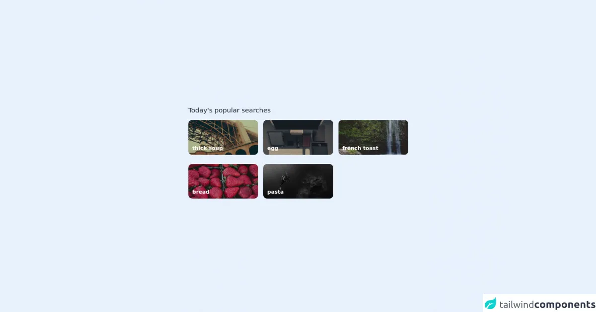
The preview of Cookpad - Popular Searches UI component
The Cookpad - Popular Searches UI component consists of a title, a list of search terms, and a "View All" button.
Free download of the Cookpad - Popular Searches's source code
The source code of Cookpad - Popular Searches UI component
To create the Cookpad - Popular Searches UI component, we will use HTML and Tailwind CSS.
<div class="h-screen flex items-center justify-center bg-amber-50">

  <div class="grid grid-cols-6 gap-x-4 gap-y-1 max-w-2xl">

    <!-- Title -->
    <div class="col-span-full mb-3">
      <p class="text-xl text-gray-800"> Today's popular searches </p>
    </div>

    <!-- Card 1 -->
    <div class="col-span-2">
      <a href="">
        <img src="https://picsum.photos/seed/1/2000/1000" class="rounded-xl brightness-75" />
      </a>
      <p class="text-xs -translate-y-6 text-white font-semibold sm:-translate-y-8 sm:text-base translate-x-3"> thick soup </p>
    </div>

    <!-- Card 2 -->
    <div class="col-span-2">
      <a href="">
        <img src="https://picsum.photos/seed/2/2000/1000" class="rounded-xl brightness-75" />
      </a>
      <p class="text-xs -translate-y-6 text-white font-semibold sm:-translate-y-8 sm:text-base translate-x-3"> egg </p>
    </div>

    <!-- Card 3 -->
    <div class="col-span-2">
      <a href="">
        <img src="https://picsum.photos/seed/3/2000/1000" class="rounded-xl brightness-75" />
      </a>
      <p class="text-xs -translate-y-6 text-white font-semibold sm:-translate-y-8 sm:text-base translate-x-3"> french toast </p>
    </div>

    <!-- Card 4 -->
    <div class="col-span-2">
      <a href="">
        <img src="https://picsum.photos/seed/4/2000/1000" class="rounded-xl brightness-75" />
      </a>
      <p class="text-xs -translate-y-6 text-white font-semibold sm:-translate-y-8 sm:text-base translate-x-3"> bread </p>
    </div>

    <!-- Card 5 -->
    <div class="col-span-2">
      <a href="">
        <img src="https://picsum.photos/seed/5/2000/1000" class="rounded-xl brightness-75" />
      </a>
      <p class="text-xs -translate-y-6 text-white font-semibold sm:-translate-y-8 sm:text-base translate-x-3"> pasta </p>
    </div>

  </div>

</div>
How to create a Cookpad - Popular Searches with Tailwind CSS?
To create the Cookpad - Popular Searches UI component, follow these steps:
Step 1: Create the HTML structure
The first step is to create the HTML structure for the UI component. Here's the code:
<div class="popular-searches">
  <h2 class="text-2xl font-bold mb-4">Popular Searches</h2>
  <ul class="list-disc pl-4">
    <li><a href="#" class="text-blue-500 hover:underline">Chicken Curry</a></li>
    <li><a href="#" class="text-blue-500 hover:underline">Pasta</a></li>
    <li><a href="#" class="text-blue-500 hover:underline">Pizza</a></li>
    <li><a href="#" class="text-blue-500 hover:underline">Burger</a></li>
    <li><a href="#" class="text-blue-500 hover:underline">Tacos</a></li>
  </ul>
  <a href="#" class="block text-center text-white bg-blue-500 hover:bg-blue-600 py-2 px-4 mt-4 rounded">View All</a>
</div>
In this code, we have created a div element with a class of popular-searches. Inside the div, we have a h2 element with a class of text-2xl font-bold mb-4 for the title. We also have a ul element with a class of list-disc pl-4 for the list of search terms. Each search term is an li element with an a element inside it. The a element has a class of text-blue-500 hover:underline for the link style. Finally, we have a a element with a class of block text-center text-white bg-blue-500 hover:bg-blue-600 py-2 px-4 mt-4 rounded for the "View All" button.
Step 2: Style the UI component with Tailwind CSS
The next step is to style the UI component with Tailwind CSS. Here's the code:
.popular-searches {
  background-color: #f7fafc;
  padding: 2rem;
}

.popular-searches h2 {
  color: #2d3748;
}

.popular-searches ul li {
  margin-bottom: 0.5rem;
}

.popular-searches a {
  transition: all 0.2s ease-in-out;
}

.popular-searches a:hover {
  text-decoration: underline;
}

.popular-searches .bg-blue-500 {
  background-color: #4299e1;
}

.popular-searches .bg-blue-500:hover {
  background-color: #3182ce;
}
In this code, we have styled the UI component using Tailwind CSS classes. We have set the background color of the div element to #f7fafc and added padding to it. We have also set the color of the title to #2d3748 and added margin to the list items. We have added a transition effect to the links and underlined them on hover. Finally, we have styled the "View All" button with a blue background color and a hover effect.
Conclusion
In this article, we have shown you how to build a Cookpad - Popular Searches UI component using Tailwind CSS. We have explained why Tailwind CSS is a great choice for creating custom designs quickly and efficiently. We have also provided you with the HTML and CSS code for the UI component. By following the steps outlined in this article, you can create your own custom UI components using Tailwind CSS.