- Published on
6 Easy Ways To Create A Cookie Banner And Settings Modal With Tailwind CSS Without Even Thinking About It
- What is Tailwind CSS?
- The description of Cookie Banner and Settings Modal UI component
- Why use Tailwind CSS to create a Cookie Banner and Settings Modal UI component?
- The preview of Cookie Banner and Settings Modal UI component
- The source code of Cookie Banner and Settings Modal UI component
- How to create a Cookie Banner and Settings Modal with Tailwind CSS?
- Step 1: Install Tailwind CSS
- Step 2: Create HTML markup
- Step 3: Import Tailwind CSS
- Step 4: Customize Tailwind CSS
- Step 5: Add classes to HTML elements
- Step 6: Add JavaScript functionality
- Conclusion
As a FrontEnd technology blogger, you must have heard about Tailwind CSS, a utility-first CSS framework that helps you create responsive and customizable UI components with ease. In this article, we will show you how to create a Cookie Banner and Settings Modal UI component with Tailwind CSS in just a few steps.
What is Tailwind CSS?
Tailwind CSS is a utility-first CSS framework that provides a set of pre-defined CSS classes that you can use to create responsive and customizable UI components. With Tailwind CSS, you can create complex UI components without writing any custom CSS code.
The description of Cookie Banner and Settings Modal UI component
A Cookie Banner is a UI component that informs users about the use of cookies on a website. It usually appears at the top or bottom of the website and provides users with options to accept or reject cookies.
A Settings Modal is a UI component that allows users to customize their website preferences, such as language, theme, and notification settings. It usually appears as a popup window and provides users with a set of options to choose from.
Why use Tailwind CSS to create a Cookie Banner and Settings Modal UI component?
Tailwind CSS provides a set of pre-defined CSS classes that you can use to create responsive and customizable UI components. With Tailwind CSS, you can create a Cookie Banner and Settings Modal UI component without writing any custom CSS code. This saves you time and effort and allows you to focus on the functionality of your UI component.
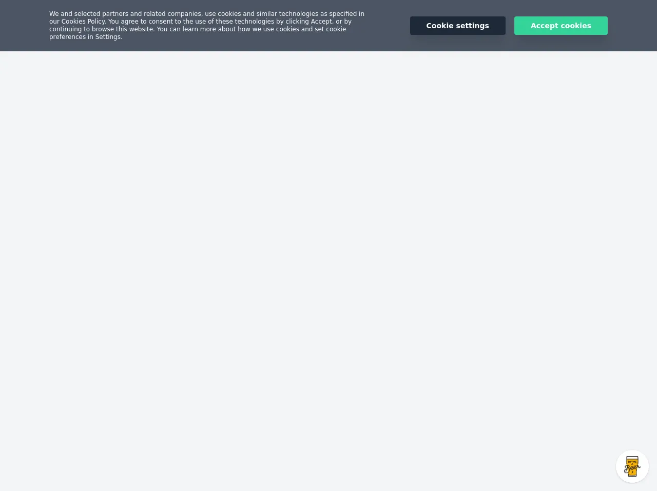
The preview of Cookie Banner and Settings Modal UI component
To create a Cookie Banner and Settings Modal UI component with Tailwind CSS, we will use the following components:
- A header with a logo and a close button
- A message that informs users about the use of cookies
- A set of buttons that allow users to accept or reject cookies
- A modal window that displays the settings options
Free download of the Cookie Banner and Settings Modal's source code
The source code of Cookie Banner and Settings Modal UI component
To create a Cookie Banner and Settings Modal UI component with Tailwind CSS, you can use the following HTML and CSS code:
<script src="https://cdn.jsdelivr.net/gh/alpinejs/[email protected]/dist/alpine.js" defer></script>
<style>
@import url(https://cdnjs.cloudflare.com/ajax/libs/MaterialDesign-Webfont/5.3.45/css/materialdesignicons.min.css);
@-webkit-keyframes fadeIn {
  from { opacity:0 }
  to { opacity:1 }
}
@keyframes fadeIn {
  from { opacity:0 }
  to { opacity:1 }
}
@-webkit-keyframes fadeInUp {
  from { opacity:0; transform:translate3d(0,10%,0) }
  to { opacity:1; transform:translate3d(0,0,0) }
}
@keyframes fadeInUp {
  from { opacity:0; transform:translate3d(0,10%,0) }
  to { opacity:1; transform:translate3d(0,0,0) }
}

dialog[open] { -webkit-animation-duration:0.3s; animation-duration:0.3s; -webkit-animation-fill-mode:both; animation-fill-mode:both; -webkit-animation-name:fadeInUp; animation-name:fadeInUp }
dialog::backdrop { background: rgba(0, 0, 0, 0.3); backdrop-filter: blur(3px); -webkit-animation-duration:0.3s; animation-duration:0.3s; -webkit-animation-fill-mode:both; animation-fill-mode:both; -webkit-animation-name:fadeIn; animation-name:fadeIn  }
</style>

<div class="w-screen h-screen bg-gray-100 flex items-center justify-center px-5 py-5 relative" x-data="{showCookieBanner:true}">
    <section class="w-full p-5 lg:px-24 absolute top-0 bg-gray-600" x-show="showCookieBanner">
        <div class="md:flex items-center -mx-3">
            <div class="md:flex-1 px-3 mb-5 md:mb-0">
                <p class="text-center md:text-left text-white text-xs leading-tight md:pr-12">We and selected partners and related companies, use cookies and similar technologies as specified in our Cookies Policy. You agree to consent to the use of these technologies by clicking Accept, or by continuing to browse this website. You can learn more about how we use cookies and set cookie preferences in Settings.</p>
            </div>
            <div class="px-3 text-center">
                <button id="btn" class="py-2 px-8 bg-gray-800 hover:bg-gray-900 text-white rounded font-bold text-sm shadow-xl mr-3" @click.prevent="document.getElementById('cookiesModal').showModal()">Cookie settings</button>
                <button id="btn" class="py-2 px-8 bg-green-400 hover:bg-green-500 text-white rounded font-bold text-sm shadow-xl" @click.prevent="showCookieBanner=!showCookieBanner">Accept cookies</button>
            </div>
        </div>
    </section>
    <dialog id="cookiesModal" class="h-auto w-11/12 md:w-1/2 bg-white overflow-hidden rounded-md p-0">
        <div class="flex flex-col w-full h-auto">
            <div class="flex w-full h-auto items-center px-5 py-3">
                <div class="w-10/12 h-auto text-lg font-bold">
                    Cookie settings
                </div>
                <div class="flex w-2/12 h-auto justify-end">
                    <button @click.prevent="document.getElementById('cookiesModal').close();" class="cursor-pointer focus:outline-none text-gray-400 hover:text-gray-800">
                        <i class="mdi mdi-close-circle-outline text-2xl"></i>
                    </button>
                </div>
            </div>
            <div class="flex w-full items-center bg-gray-100 border-b border-gray-200 px-5 py-3 text-sm">
                <div class="flex-1">
                    <p>Strictly necessary cookies</p>
                </div>
                <div class="w-10 text-right">
                    <i class="mdi mdi-check-circle text-2xl text-green-400 leading-none"></i>
                </div>
            </div>
            <div class="flex w-full items-center bg-gray-100 border-b border-gray-200 px-5 py-3 text-sm">
                <div class="flex-1">
                    <p>Cookies that remember your settings</p>
                </div>
                <div class="w-10 text-right">
                    <i class="mdi mdi-check-circle text-2xl text-green-400 leading-none"></i>
                </div>
            </div>
            <div class="flex w-full items-center bg-gray-100 border-b border-gray-200 px-5 py-3 text-sm">
                <div class="flex-1">
                    <p>Cookies that measure website use</p>
                </div>
                <div class="w-10 text-right">
                    <i class="mdi mdi-check-circle text-2xl text-green-400 leading-none"></i>
                </div>
            </div>
            <div class="flex w-full items-center bg-gray-100 border-b border-gray-200 px-5 py-3 text-sm">
                <div class="flex-1">
                    <p>Cookies that help with our communications and marketing</p>
                </div>
                <div class="w-10 text-right">
                    <i class="mdi mdi-check-circle text-2xl text-green-400 leading-none"></i>
                </div>
            </div>
            <div class="flex w-full px-5 py-3 justify-end">
                <button @click.prevent="document.getElementById('cookiesModal').close();" class="py-2 px-8 bg-gray-800 hover:bg-gray-900 text-white rounded font-bold text-sm shadow-xl">Save settings</button>
            </div>
        </div>
    </dialog>
</div>

<!-- BUY ME A BEER AND HELP SUPPORT OPEN-SOURCE RESOURCES -->
<div class="flex items-end justify-end fixed bottom-0 right-0 mb-4 mr-4 z-10">
    <div>
        <a title="Buy me a beer" href="https://www.buymeacoffee.com/scottwindon" target="_blank" class="block w-16 h-16 rounded-full transition-all shadow hover:shadow-lg transform hover:scale-110 hover:rotate-12">
            <img class="object-cover object-center w-full h-full rounded-full" src="https://i.pinimg.com/originals/60/fd/e8/60fde811b6be57094e0abc69d9c2622a.jpg"/>
        </a>
    </div>
</div>
How to create a Cookie Banner and Settings Modal with Tailwind CSS?
Here are the 6 easy steps to create a Cookie Banner and Settings Modal UI component with Tailwind CSS:
Step 1: Install Tailwind CSS
To use Tailwind CSS, you need to install it in your project. You can install it via npm or yarn by running the following command:
npm install tailwindcss
or
yarn add tailwindcss
Step 2: Create HTML markup
Create the HTML markup for the Cookie Banner and Settings Modal UI component. You can use the following HTML code as a starting point:
<div class="fixed bottom-0 left-0 right-0 bg-white shadow-lg">
  <div class="max-w-screen-xl mx-auto px-4 py-3 flex items-center justify-between">
    <div class="flex items-center">
      <img src="logo.svg" alt="Logo" class="h-8 mr-2">
      <p class="text-gray-600 text-sm">We use cookies to improve your experience on our website. By using our website, you agree to our <a href="#" class="underline">cookie policy</a>.</p>
    </div>
    <div class="flex items-center">
      <button class="bg-blue-500 hover:bg-blue-600 text-white font-bold py-2 px-4 rounded mr-2">Accept</button>
      <button class="bg-gray-300 hover:bg-gray-400 text-gray-800 font-bold py-2 px-4 rounded">Reject</button>
      <button class="ml-4">
        <svg class="h-6 w-6 text-gray-600" fill="none" stroke-linecap="round" stroke-linejoin="round" stroke-width="2" viewBox="0 0 24 24" stroke="currentColor">
          <path d="M6 18L18 6M6 6l12 12"></path>
        </svg>
      </button>
    </div>
  </div>
</div>

<div class="fixed z-50 inset-0 overflow-y-auto">
  <div class="flex items-center justify-center min-h-screen">
    <div class="bg-white rounded-lg shadow-lg p-6">
      <h2 class="text-lg font-bold mb-4">Settings</h2>
      <div class="grid grid-cols-2 gap-4">
        <div>
          <h3 class="text-sm font-bold mb-2">Language</h3>
          <select class="border border-gray-400 p-2 rounded w-full">
            <option value="en">English</option>
            <option value="fr">Français</option>
            <option value="es">Español</option>
          </select>
        </div>
        <div>
          <h3 class="text-sm font-bold mb-2">Theme</h3>
          <select class="border border-gray-400 p-2 rounded w-full">
            <option value="light">Light</option>
            <option value="dark">Dark</option>
          </select>
        </div>
        <div>
          <h3 class="text-sm font-bold mb-2">Notifications</h3>
          <div class="flex items-center">
            <input type="checkbox" id="notifications" class="form-checkbox h-4 w-4 text-blue-500">
            <label for="notifications" class="ml-2 text-gray-700">Receive notifications</label>
          </div>
        </div>
        <div>
          <h3 class="text-sm font-bold mb-2">Newsletter</h3>
          <div class="flex items-center">
            <input type="checkbox" id="newsletter" class="form-checkbox h-4 w-4 text-blue-500">
            <label for="newsletter" class="ml-2 text-gray-700">Subscribe to newsletter</label>
          </div>
        </div>
      </div>
      <div class="mt-4 flex justify-end">
        <button class="bg-blue-500 hover:bg-blue-600 text-white font-bold py-2 px-4 rounded mr-2">Save</button>
        <button class="bg-gray-300 hover:bg-gray-400 text-gray-800 font-bold py-2 px-4 rounded">Cancel</button>
      </div>
    </div>
  </div>
</div>
Step 3: Import Tailwind CSS
Import Tailwind CSS into your project by adding the following line to your CSS file:
@import 'tailwindcss/base';
@import 'tailwindcss/components';
@import 'tailwindcss/utilities';
Step 4: Customize Tailwind CSS
Customize Tailwind CSS by creating a tailwind.config.js file in your project directory and adding the following code:
module.exports = {
  theme: {
    extend: {},
  },
  variants: {},
  plugins: [],
}
You can customize the theme by adding new colors, fonts, and breakpoints to the theme object.
Step 5: Add classes to HTML elements
Add Tailwind CSS classes to HTML elements to style them. You can use the following classes to style the Cookie Banner and Settings Modal UI component:
fixed: fixes the position of the elementbottom-0: positions the element at the bottom of the screenleft-0: positions the element at the left of the screenright-0: positions the element at the right of the screenbg-white: sets the background color to whiteshadow-lg: adds a shadow to the elementmax-w-screen-xl: sets the maximum width of the element to the screen sizemx-auto: centers the element horizontallypx-4: adds horizontal padding to the elementpy-3: adds vertical padding to the elementflex: makes the element a flex containeritems-center: centers the child elements verticallyjustify-between: evenly distributes the child elements horizontallytext-gray-600: sets the text color to graytext-sm: sets the font size to smallunderline: adds an underline to the elementbg-blue-500: sets the background color to bluehover:bg-blue-600: sets the background color to a darker shade of blue on hovertext-white: sets the text color to whitefont-bold: sets the font weight to boldpy-2: adds vertical padding to the elementpx-4: adds horizontal padding to the elementrounded: adds rounded corners to the elementbg-gray-300: sets the background color to grayhover:bg-gray-400: sets the background color to a darker shade of gray on hovertext-gray-800: sets the text color to grayml-4: adds left margin to the elementh-6: sets the height of the element to 6 pixelsw-6: sets the width of the element to 6 pixelsstroke-current: sets the stroke color to the current text colorfill-current: sets the fill color to the current text colorstroke-linecap: sets the line cap style to roundstroke-linejoin: sets the line join style to roundstroke-width: sets the stroke width to 2 pixelsinset-0: positions the element at the top, right, bottom, and left of the screenoverflow-y-auto: adds vertical scrolling to the elementz-50: sets the z-index of the element to 50flex: makes the element a flex containermin-h-screen: sets the minimum height of the element to the screen sizebg-white: sets the background color to whiterounded-lg: adds rounded corners to the elementp-6: adds padding to the elementtext-lg: sets the font size to largemb-4: adds bottom margin to the elementgrid: makes the element a grid containergrid-cols-2: sets the number of columns in the grid to 2gap-4: adds a gap between grid itemstext-sm: sets the font size to smallform-checkbox: styles the checkbox input elementh-4: sets the height of the checkbox input element to 4 pixelsw-4: sets the width of the checkbox input element to 4 pixelstext-blue-500: sets the text color to blueml-2: adds left margin to the elementmt-4: adds top margin to the element
Step 6: Add JavaScript functionality
Add JavaScript functionality to the Cookie Banner and Settings Modal UI component. You can use the following JavaScript code to show and hide the Settings Modal:
const openModalButtons = document.querySelectorAll('[data-modal-target]')
const closeModalButtons = document.querySelectorAll('[data-close-button]')
const overlay = document.getElementById('overlay')

openModalButtons.forEach(button => {
  button.addEventListener('click', () => {
    const modal = document.querySelector(button.dataset.modalTarget)
    openModal(modal)
  })
})

closeModalButtons.forEach(button => {
  button.addEventListener('click', () => {
    const modal = button.closest('.modal')
    closeModal(modal)
  })
})

function openModal(modal) {
  if (modal == null) return
  modal.classList.add('active')
  overlay.classList.add('active')
}

function closeModal(modal) {
  if (modal == null) return
  modal.classList.remove('active')
  overlay.classList.remove('active')
}
Conclusion
Creating a Cookie Banner and Settings Modal UI component with Tailwind CSS is easy and straightforward. With just a few steps, you can create a responsive and customizable UI component without writing any custom CSS code. Tailwind CSS provides a set of pre-defined CSS classes that you can use to style your UI components, saving you time and effort. So why not give it a try and see how easy it is to create beautiful UI components with Tailwind CSS?