- Published on
Ultimate Guide: Create A Converter With Tailwind CSS
- What is Tailwind CSS?
- The description of Converter ui component
- Why use Tailwind CSS to create a Converter ui component?
- The preview of Converter ui component.
- The source code of Converter ui component.
- How to create a Converter with Tailwind CSS?
- Step 1: Set up your HTML
- Step 2: Add Tailwind CSS classes
- Step 3: Add custom styles
- Conclusion
Are you looking to create a converter UI component for your website or application? Look no further than Tailwind CSS! In this guide, we will walk you through the process of creating a converter UI component using Tailwind CSS.
What is Tailwind CSS?
Tailwind CSS is a utility-first CSS framework that allows you to quickly and easily create custom user interfaces. It provides a set of pre-defined classes that you can use to style your HTML elements. With Tailwind CSS, you can create beautiful, responsive designs without having to write a lot of custom CSS.
The description of Converter ui component
A converter UI component is a tool that allows users to convert one unit of measurement to another. For example, you might use a converter to convert inches to centimeters, or pounds to kilograms. A converter typically consists of two input fields, one for the original value and one for the converted value, as well as a dropdown menu for selecting the units of measurement.
Why use Tailwind CSS to create a Converter ui component?
Tailwind CSS is the perfect tool for creating a converter UI component because it allows you to easily style and customize your UI without having to write a lot of custom CSS. With Tailwind CSS, you can quickly create a responsive, mobile-friendly design that looks great on any device.
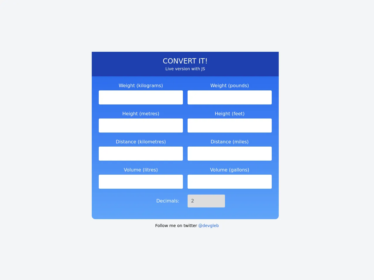
The preview of Converter ui component.
To give you an idea of what the converter UI component will look like, here is a preview:
Free download of the Converter's source code
The source code of Converter ui component.
Here is the source code for the converter UI component:
<div class="min-w-screen min-h-screen bg-gray-100 flex flex-col items-center justify-center">
        <div class="w-5/6 lg:w-3/6 rounded-xl bg-gradient-to-b from-blue-600 to-blue-400 mr-3">
            <div class="flex flex-col">
                <div id="header" class="flex flex-col items-center justify-center text-white py-4 bg-blue-800">
                    <div class="text-center uppercase text-2xl">Convert it!</div>
                    <div class="text-sm">
                        <a class="hover:underline" href="https://codepen.io/webgleb/full/GRNdeLv" target="_blank">Live version with JS</a>
                    </div>
                </div>

                <div id="converters-area" class="px-4 py-5">
                    <div class="flex flex-col text-white">

                        <div class="flex items-center justify-between mb-5">
                            <div class="flex flex-col text-center w-3/6 px-2">
                                <label class="mb-1" for="weight-kilograms">Weight (kilograms)</label>
                                <input type="number" id="weight-kilograms" class="py-3 px-5 rounded focus:outline-none text-gray-600 focus:text-gray-600" />
                            </div>
                            <div class="flex flex-col text-center w-3/6 px-2">
                                <label class="mb-1" for="weight-pounds">Weight (pounds)</label>
                                <input type="number" id="weight-pounds" class="py-3 px-5 rounded focus:outline-none text-gray-600 focus:text-gray-600" />
                            </div>
                        </div>

                        <div class="flex items-center justify-between mb-5">
                            <div class="flex flex-col text-center w-3/6 px-2">
                                <label class="mb-1" for="height-metres">Height (metres)</label>
                                <input type="number" id="height-metres" class="py-3 px-5 rounded focus:outline-none text-gray-600 focus:text-gray-600" />
                            </div>
                            <div class="flex flex-col text-center w-3/6 px-2">
                                <label class="mb-1" for="height-feet">Height (feet)</label>
                                <input type="number" id="height-feet" class="py-3 px-5 rounded focus:outline-none text-gray-600 focus:text-gray-600" />
                            </div>
                        </div>

                        <div class="flex items-center justify-between mb-5">
                            <div class="flex flex-col text-center w-3/6 px-2">
                                <label class="mb-1" for="height-metres">Distance (kilometres)</label>
                                <input type="number" id="distance-kilometres" class="py-3 px-5 rounded focus:outline-none text-gray-600 focus:text-gray-600" />
                            </div>
                            <div class="flex flex-col text-center w-3/6 px-2">
                                <label class="mb-1" for="height-feet">Distance (miles)</label>
                                <input type="number" id="distance-miles" class="py-3 px-5 rounded focus:outline-none text-gray-600 focus:text-gray-600" />
                            </div>
                        </div>

                        <div class="flex items-center justify-between mb-5">
                            <div class="flex flex-col text-center w-3/6 px-2">
                                <label class="mb-1" for="height-metres">Volume (litres)</label>
                                <input type="number" id="volume-litres" class="py-3 px-5 rounded focus:outline-none text-gray-600 focus:text-gray-600" />
                            </div>
                            <div class="flex flex-col text-center w-3/6 px-2">
                                <label class="mb-1" for="height-feet">Volume (gallons)</label>
                                <input type="number" id="volume-gallons" class="py-3 px-5 rounded focus:outline-none text-gray-600 focus:text-gray-600" />
                            </div>
                        </div>

                        <div class="flex items-center justify-between mb-5 text-right">
                            <div class="flex flex-col text-right w-3/6 px-2">
                                <label for="decimals" class="mr-3">Decimals:</label>
                            </div>
                            <div class="flex flex-col text-center w-3/6 px-2">
                                <select id="decimals" class="appearance-none border-none text-gray-600 py-3 pl-3 pr-8 rounded leading-tight w-32">
                                    <option value="0">0</option>
                                    <option value="1">1</option>
                                    <option value="2" selected>2</option>
                                    <option value="3">3</option>
                                    <option value="4">4</option>
                                </select>
                            </div>
                        </div>
                    </div>
                </div>
            </div>
        </div>
        <div class="text-sm mt-3">
            Follow me on twitter <a href="https://twitter.com/devgleb" class="text-blue-600 hover:underline" target="_blank">@devgleb</a>
        </div>
    </div>
How to create a Converter with Tailwind CSS?
Now that you know why Tailwind CSS is the perfect tool for creating a converter UI component, let's walk through the steps to create one.
Step 1: Set up your HTML
The first step is to set up your HTML. You will need two input fields, one for the original value and one for the converted value, as well as a dropdown menu for selecting the units of measurement. Here is an example:
<div class="converter">
  <input type="text" class="input" placeholder="Enter a value">
  <select class="select">
    <option value="inches">Inches</option>
    <option value="centimeters">Centimeters</option>
    <option value="feet">Feet</option>
    <option value="meters">Meters</option>
  </select>
  <span class="equals">=</span>
  <input type="text" class="input" placeholder="Converted value">
  <select class="select">
    <option value="inches">Inches</option>
    <option value="centimeters">Centimeters</option>
    <option value="feet">Feet</option>
    <option value="meters">Meters</option>
  </select>
</div>
Step 2: Add Tailwind CSS classes
Next, you will need to add Tailwind CSS classes to your HTML elements to style them. Here is an example:
<div class="converter flex items-center justify-center">
  <input type="text" class="input w-32 p-2 rounded-l-lg" placeholder="Enter a value">
  <select class="select w-32 p-2">
    <option value="inches">Inches</option>
    <option value="centimeters">Centimeters</option>
    <option value="feet">Feet</option>
    <option value="meters">Meters</option>
  </select>
  <span class="equals text-2xl mx-4">=</span>
  <input type="text" class="input w-32 p-2 rounded-r-lg" placeholder="Converted value">
  <select class="select w-32 p-2">
    <option value="inches">Inches</option>
    <option value="centimeters">Centimeters</option>
    <option value="feet">Feet</option>
    <option value="meters">Meters</option>
  </select>
</div>
In this example, we have added classes such as flex, items-center, justify-center, w-32, p-2, rounded-l-lg, and text-2xl to our HTML elements to style them.
Step 3: Add custom styles
Finally, you can add your own custom styles to further customize your converter UI component. Here is an example:
<style>
  .converter {
    background-color: #f7fafc;
    border: 1px solid #e2e8f0;
  }

  .input:focus,
  .select:focus {
    outline: none;
    box-shadow: 0 0 0 3px rgba(66, 153, 225, 0.5);
  }

  .equals {
    color: #718096;
  }
</style>
In this example, we have added custom styles to the .converter, .input:focus, .select:focus, and .equals classes to further customize our converter UI component.
Conclusion
In this guide, we have shown you how to create a converter UI component using Tailwind CSS. With Tailwind CSS, you can quickly and easily create beautiful, responsive designs without having to write a lot of custom CSS. We hope this guide has been helpful and that you are now ready to create your own converter UI component using Tailwind CSS.