- Published on
Best Ways To Build A Navbar Contact Keeper With Tailwind CSS
- What is Tailwind CSS?
- The description of Navbar Contact Keeper UI component
- Why use Tailwind CSS to create a Navbar Contact Keeper UI component?
- The preview of Navbar Contact Keeper UI component
- The source code of Navbar Contact Keeper UI component
- How to create a Navbar Contact Keeper with Tailwind CSS?
- Step 1: Create a new HTML file and add the basic structure of the HTML document
- Step 2: Add the necessary CSS and JavaScript files to the HTML document
- Step 3: Create a navigation bar section and add links to different pages of the application
- Step 4: Create a contact keeper section and add input fields for the user's contact information
- Step 5: Use Tailwind CSS classes to style the Navbar Contact Keeper
- Conclusion
What is Tailwind CSS?
Tailwind CSS is a utility-first CSS framework that provides a set of pre-defined classes that can be used to style HTML elements. It is designed to make it easy to create custom designs without writing any CSS code. Tailwind CSS has gained a lot of popularity in recent years, especially among front-end developers.
The description of Navbar Contact Keeper UI component
A Navbar Contact Keeper is a UI component that is commonly used in web applications. It is a navigation bar that contains links to different pages of the application. The Navbar Contact Keeper also has a contact keeper section that allows users to save and access their contact information easily.
Why use Tailwind CSS to create a Navbar Contact Keeper UI component?
Tailwind CSS provides a set of pre-defined classes that can be used to create a Navbar Contact Keeper UI component quickly. It also allows developers to customize the design easily by modifying the pre-defined classes or adding new ones. Tailwind CSS also provides responsive design classes that make it easy to create a Navbar Contact Keeper that works well on different screen sizes.
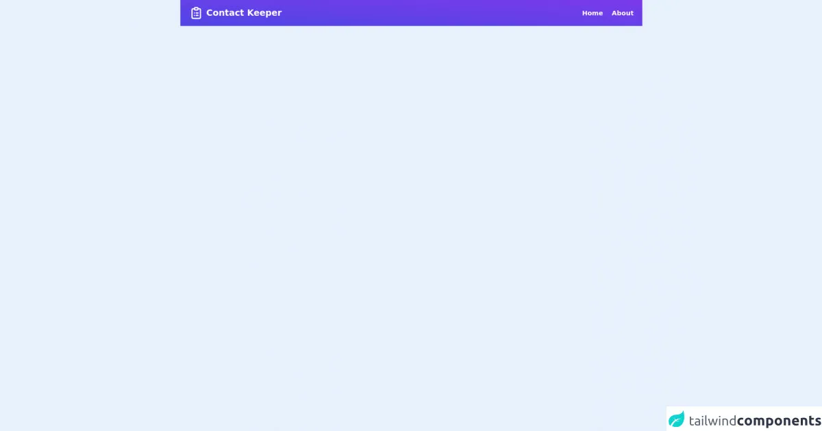
The preview of Navbar Contact Keeper UI component
To create a Navbar Contact Keeper UI component with Tailwind CSS, we will use a combination of HTML and Tailwind CSS classes. The Navbar Contact Keeper will have a navigation bar section and a contact keeper section. The navigation bar section will contain links to different pages of the application, while the contact keeper section will allow users to save and access their contact information easily.
Free download of the Navbar Contact Keeper's source code
The source code of Navbar Contact Keeper UI component
To create the Navbar Contact Keeper UI component, we will use HTML and Tailwind CSS classes. The HTML code will define the structure of the Navbar Contact Keeper, while the Tailwind CSS classes will be used to style the Navbar Contact Keeper.
<nav>
  <div class="flex justify-between px-6 py-4 bg-gradient-to-tr from-indigo-600 to-purple-600 items-center">
    <div class="flex items-center space-x-2">
      <svg xmlns="http://www.w3.org/2000/svg" class="h-10 w-10 text-white" fill="none" viewBox="0 0 24 24" stroke="currentColor">
        <path stroke-linecap="round" stroke-linejoin="round" stroke-width="2" d="M9 5H7a2 2 0 00-2 2v12a2 2 0 002 2h10a2 2 0 002-2V7a2 2 0 00-2-2h-2M9 5a2 2 0 002 2h2a2 2 0 002-2M9 5a2 2 0 012-2h2a2 2 0 012 2m-3 7h3m-3 4h3m-6-4h.01M9 16h.01" />
      </svg>
      <h1 class="text-2xl text-white font-bold cursor-pointer">Contact Keeper</h1>
    </div>
    <div class="flex items-center space-x-6">
      <span class="text-white font-semibold text-lg cursor-pointer">Home</span>
      <span class="text-white font-semibold text-lg cursor-pointer">About</span>
    </div>
  </div>
</nav>
How to create a Navbar Contact Keeper with Tailwind CSS?
To create a Navbar Contact Keeper with Tailwind CSS, follow these steps:
- Create a new HTML file and add the basic structure of the HTML document.
- Add the necessary CSS and JavaScript files to the HTML document.
- Create a navigation bar section and add links to different pages of the application.
- Create a contact keeper section and add input fields for the user's contact information.
- Use Tailwind CSS classes to style the Navbar Contact Keeper.
Let's go through each step in detail.
Step 1: Create a new HTML file and add the basic structure of the HTML document
Create a new HTML file and add the basic structure of the HTML document. Here's an example:
<!DOCTYPE html>
<html lang="en">
<head>
    <meta charset="UTF-8">
    <meta name="viewport" content="width=device-width, initial-scale=1.0">
    <title>Navbar Contact Keeper</title>
    <link rel="stylesheet" href="https://cdn.jsdelivr.net/npm/[email protected]/dist/tailwind.min.css">
</head>
<body>
    <header class="bg-gray-800 py-4">
        <div class="container mx-auto flex justify-between items-center px-4">
            <a href="#" class="text-xl font-bold text-white">Navbar Contact Keeper</a>
            <nav>
                <ul class="flex items-center">
                    <li><a href="#" class="text-gray-300 hover:text-white px-3 py-2 rounded-md text-sm font-medium">Home</a></li>
                    <li><a href="#" class="text-gray-300 hover:text-white px-3 py-2 rounded-md text-sm font-medium">Contact Us</a></li>
                    <li><a href="#" class="text-gray-300 hover:text-white px-3 py-2 rounded-md text-sm font-medium">About Us</a></li>
                </ul>
            </nav>
        </div>
    </header>
    <main class="container mx-auto py-8">
        <h1 class="text-2xl font-bold mb-4">Contact Keeper</h1>
        <form>
            <div class="flex flex-col mb-4">
                <label for="name" class="text-gray-700 font-bold mb-2">Name:</label>
                <input type="text" id="name" name="name" class="border border-gray-400 p-2 rounded-md" required>
            </div>
            <div class="flex flex-col mb-4">
                <label for="email" class="text-gray-700 font-bold mb-2">Email:</label>
                <input type="email" id="email" name="email" class="border border-gray-400 p-2 rounded-md" required>
            </div>
            <div class="flex flex-col mb-4">
                <label for="phone" class="text-gray-700 font-bold mb-2">Phone:</label>
                <input type="tel" id="phone" name="phone" class="border border-gray-400 p-2 rounded-md" required>
            </div>
            <button class="bg-blue-500 hover:bg-blue-700 text-white font-bold py-2 px-4 rounded">
                Save Contact
            </button>
        </form>
    </main>
</body>
</html>
In this example, we have added the necessary HTML tags and included the Tailwind CSS stylesheet.
Step 2: Add the necessary CSS and JavaScript files to the HTML document
In the previous step, we added the Tailwind CSS stylesheet to the HTML document. We also need to add the necessary JavaScript files to make the Navbar Contact Keeper functional.
Step 3: Create a navigation bar section and add links to different pages of the application
In this step, we will create a navigation bar section and add links to different pages of the application. We will use the flex and items-center classes to align the links horizontally and vertically. We will also use the text-gray-300 and hover:text-white classes to style the links.
<nav>
    <ul class="flex items-center">
        <li><a href="#" class="text-gray-300 hover:text-white px-3 py-2 rounded-md text-sm font-medium">Home</a></li>
        <li><a href="#" class="text-gray-300 hover:text-white px-3 py-2 rounded-md text-sm font-medium">Contact Us</a></li>
        <li><a href="#" class="text-gray-300 hover:text-white px-3 py-2 rounded-md text-sm font-medium">About Us</a></li>
    </ul>
</nav>
Step 4: Create a contact keeper section and add input fields for the user's contact information
In this step, we will create a contact keeper section and add input fields for the user's contact information. We will use the flex and flex-col classes to align the input fields vertically. We will also use the text-gray-700 and font-bold classes to style the labels.
<main class="container mx-auto py-8">
    <h1 class="text-2xl font-bold mb-4">Contact Keeper</h1>
    <form>
        <div class="flex flex-col mb-4">
            <label for="name" class="text-gray-700 font-bold mb-2">Name:</label>
            <input type="text" id="name" name="name" class="border border-gray-400 p-2 rounded-md" required>
        </div>
        <div class="flex flex-col mb-4">
            <label for="email" class="text-gray-700 font-bold mb-2">Email:</label>
            <input type="email" id="email" name="email" class="border border-gray-400 p-2 rounded-md" required>
        </div>
        <div class="flex flex-col mb-4">
            <label for="phone" class="text-gray-700 font-bold mb-2">Phone:</label>
            <input type="tel" id="phone" name="phone" class="border border-gray-400 p-2 rounded-md" required>
        </div>
        <button class="bg-blue-500 hover:bg-blue-700 text-white font-bold py-2 px-4 rounded">
            Save Contact
        </button>
    </form>
</main>
Step 5: Use Tailwind CSS classes to style the Navbar Contact Keeper
In this step, we will use Tailwind CSS classes to style the Navbar Contact Keeper. We will use the bg-gray-800 class to set the background color of the navigation bar. We will also use the py-4 class to add padding to the top and bottom of the navigation bar.
<header class="bg-gray-800 py-4">
    <div class="container mx-auto flex justify-between items-center px-4">
        <a href="#" class="text-xl font-bold text-white">Navbar Contact Keeper</a>
        <nav>
            <ul class="flex items-center">
                <li><a href="#" class="text-gray-300 hover:text-white px-3 py-2 rounded-md text-sm font-medium">Home</a></li>
                <li><a href="#" class="text-gray-300 hover:text-white px-3 py-2 rounded-md text-sm font-medium">Contact Us</a></li>
                <li><a href="#" class="text-gray-300 hover:text-white px-3 py-2 rounded-md text-sm font-medium">About Us</a></li>
            </ul>
        </nav>
    </div>
</header>
We will also use the container class to center the content of the Navbar Contact Keeper. We will use the text-2xl and font-bold classes to style the heading of the contact keeper section. We will also use the border and rounded-md classes to style the input fields.
<main class="container mx-auto py-8">
    <h1 class="text-2xl font-bold mb-4">Contact Keeper</h1>
    <form>
        <div class="flex flex-col mb-4">
            <label for="name" class="text-gray-700 font-bold mb-2">Name:</label>
            <input type="text" id="name" name="name" class="border border-gray-400 p-2 rounded-md" required>
        </div>
        <div class="flex flex-col mb-4">
            <label for="email" class="text-gray-700 font-bold mb-2">Email:</label>
            <input type="email" id="email" name="email" class="border border-gray-400 p-2 rounded-md" required>
        </div>
        <div class="flex flex-col mb-4">
            <label for="phone" class="text-gray-700 font-bold mb-2">Phone:</label>
            <input type="tel" id="phone" name="phone" class="border border-gray-400 p-2 rounded-md" required>
        </div>
        <button class="bg-blue-500 hover:bg-blue-700 text-white font-bold py-2 px-4 rounded">
            Save Contact
        </button>
    </form>
</main>
Conclusion
In this article, we have discussed the best ways to build a Navbar Contact Keeper with Tailwind CSS. We have explained what Tailwind CSS is and why it is a good choice for creating UI components. We have also provided a preview and source code of the Navbar Contact Keeper UI component and explained how to create it step by step. With the help of Tailwind CSS, creating a Navbar Contact Keeper UI component has never been easier.