- Published on
How to Build A Contact Form With Tailwind CSS?
- What is Tailwind CSS?
- The description of Contact form ui component
- Why use Tailwind CSS to create a Contact form ui component?
- The preview of Contact form ui component
- The source code of Contact form ui component
- How to create a Contact form with Tailwind CSS?
- Conclusion
What is Tailwind CSS?
Tailwind CSS is a utility-first CSS framework that gives you the building blocks you need to create your own custom designs. It provides a set of pre-defined classes that you can use to style your HTML elements. With Tailwind CSS, you can create responsive layouts, customize colors, typography, and more.
The description of Contact form ui component
A contact form is a common UI component that allows users to send messages to website owners. It typically includes fields for the user's name, email address, and message. The form can be used for various purposes, such as submitting feedback, asking questions, or requesting support.
Why use Tailwind CSS to create a Contact form ui component?
Tailwind CSS makes it easy to create a contact form UI component because it provides pre-defined classes for styling form elements. You don't have to write custom CSS code to achieve the desired look and feel. Instead, you can use the pre-defined classes to style your form elements and focus on the functionality of the form.
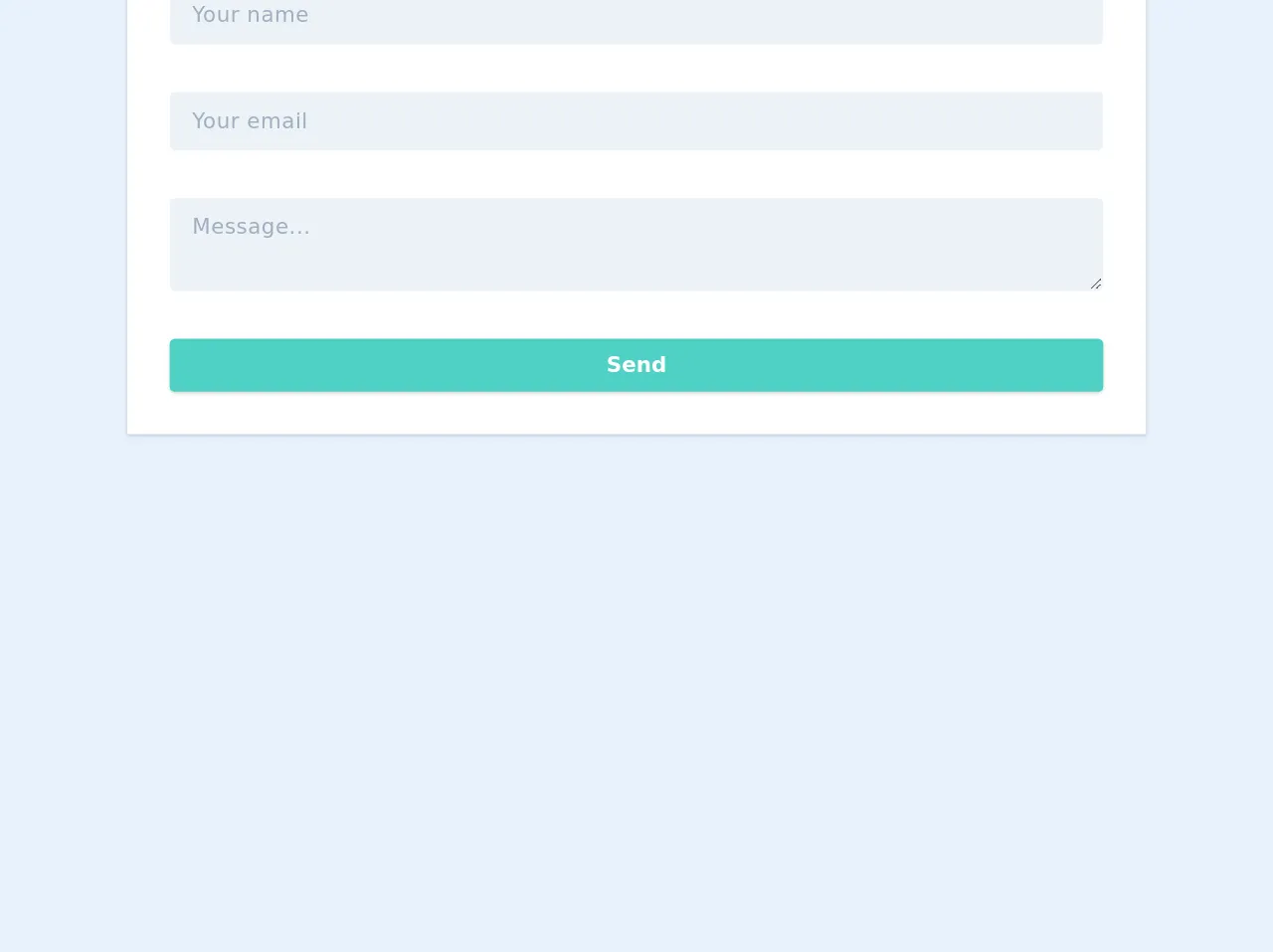
The preview of Contact form ui component
To create a contact form with Tailwind CSS, we will use the following HTML structure:
<form class="bg-white shadow-md rounded px-8 pt-6 pb-8 mb-4">
  <div class="mb-4">
    <label class="block text-gray-700 font-bold mb-2" for="name">
      Name
    </label>
    <input
      class="shadow appearance-none border rounded w-full py-2 px-3 text-gray-700 leading-tight focus:outline-none focus:shadow-outline"
      id="name"
      type="text"
      placeholder="Enter your name"
    />
  </div>
  <div class="mb-4">
    <label class="block text-gray-700 font-bold mb-2" for="email">
      Email
    </label>
    <input
      class="shadow appearance-none border rounded w-full py-2 px-3 text-gray-700 leading-tight focus:outline-none focus:shadow-outline"
      id="email"
      type="email"
      placeholder="Enter your email"
    />
  </div>
  <div class="mb-6">
    <label class="block text-gray-700 font-bold mb-2" for="message">
      Message
    </label>
    <textarea
      class="shadow appearance-none border rounded w-full py-2 px-3 text-gray-700 leading-tight focus:outline-none focus:shadow-outline"
      id="message"
      placeholder="Enter your message"
    ></textarea>
  </div>
  <div class="flex items-center justify-between">
    <button
      class="bg-blue-500 hover:bg-blue-700 text-white font-bold py-2 px-4 rounded focus:outline-none focus:shadow-outline"
      type="button"
    >
      Send
    </button>
  </div>
</form>
Free download of the Contact form's source code
The source code of Contact form ui component
To create the contact form UI component with Tailwind CSS, we used the following classes:
bg-white: sets the background color of the form to whiteshadow-md: adds a shadow effect to the formrounded: rounds the corners of the formpx-8: adds horizontal padding to the formpt-6: adds top padding to the formpb-8: adds bottom padding to the formmb-4: adds margin to the bottom of each form elementblock: sets the display property of the label element to blocktext-gray-700: sets the text color of the label element to grayfont-bold: sets the font weight of the label element to boldappearance-none: removes the default appearance of the input elementborder: adds a border to the input elementw-full: sets the width of the input element to 100%py-2: adds vertical padding to the input elementpx-3: adds horizontal padding to the input elementleading-tight: sets the line height of the input element to a tight valuefocus:outline-none: removes the outline when the input element is focusedfocus:shadow-outline: adds a shadow effect when the input element is focusedtextarea: sets the input element to a textarea elementflex: sets the display property of the button element to flexitems-center: centers the content of the button element verticallyjustify-between: aligns the content of the button element to the left and right edgesbg-blue-500: sets the background color of the button element to bluehover:bg-blue-700: changes the background color of the button element to a darker shade of blue when hovered overtext-white: sets the text color of the button element to whitefont-bold: sets the font weight of the button element to boldpy-2: adds vertical padding to the button elementpx-4: adds horizontal padding to the button elementrounded: rounds the corners of the button elementfocus:outline-none: removes the outline when the button element is focusedfocus:shadow-outline: adds a shadow effect when the button element is focused
<style>
  /* RED BORDER ON INVALID INPUT */
  .check input:invalid {
      border-color: red;
  }

  /* FLOATING LABEL */
  .label-floating input:not(:placeholder-shown),
  .label-floating textarea:not(:placeholder-shown) {
      padding-top: 1.4rem;
  }
  .label-floating input:not(:placeholder-shown) ~ label,
  .label-floating textarea:not(:placeholder-shown) ~ label {
      font-size: 0.8rem;
      transition: all 0.2s ease-in-out;
      color: #1f9d55;
      opacity: 1;
  }

</style>
<form id="contact-me" class="w-full mx-auto max-w-3xl bg-white shadow p-8 text-gray-700 ">


    <h2 class="w-full my-2 text-3xl font-bold leading-tight my-5">Contact form</h2>
    <!-- name field -->
    <div class="flex flex-wrap mb-6">
        <div class="relative w-full appearance-none label-floating">
            <input class="tracking-wide py-2 px-4 mb-3 leading-relaxed appearance-none block w-full bg-gray-200 border border-gray-200 rounded focus:outline-none focus:bg-white focus:border-gray-500"
            id="name" type="text" placeholder="Your name"required>
            <label for="name" class="absolute tracking-wide py-2 px-4 mb-4 opacity-0 leading-tight block top-0 left-0 cursor-text">
                Your name
            </label>
        </div>
    </div>
    <!-- email field -->
    <div class="flex flex-wrap mb-6">
        <div class="relative w-full appearance-none label-floating">
            <input class="tracking-wide py-2 px-4 mb-3 leading-relaxed appearance-none block w-full bg-gray-200 border border-gray-200 rounded focus:outline-none focus:bg-white focus:border-gray-500"
            id="name" type="text" placeholder="Your email"required>
            <label for="name" class="absolute tracking-wide py-2 px-4 mb-4 opacity-0 leading-tight block top-0 left-0 cursor-text">
                Your email
            </label>
        </div>
    </div>
    <!-- Message field -->
    <div class="flex flex-wrap mb-6">
        <div class="relative w-full appearance-none label-floating">
            <textarea class="autoexpand tracking-wide py-2 px-4 mb-3 leading-relaxed appearance-none block w-full bg-gray-200 border border-gray-200 rounded focus:outline-none focus:bg-white focus:border-gray-500"
                id="message" type="text" placeholder="Message..."></textarea>
                <label for="message" class="absolute tracking-wide py-2 px-4 mb-4 opacity-0 leading-tight block top-0 left-0 cursor-text">Message...
            </label>
        </div>
    </div>

    <div class="">
        <button class="w-full shadow bg-teal-400 hover:bg-teal-400 focus:shadow-outline focus:outline-none text-white font-bold py-2 px-4 rounded"
            type="submit">
            Send
        </button>

    </div>
</form>


<script>


//RED BORDER ON INVALID INPUT
document.getElementById('contact-me').addEventListener("invalid", function (event) {
	this.classList.add('check');
}, true);


	// TEXT AREA AUTO EXPAND
var textarea = document.querySelector('textarea.autoexpand');

textarea.addEventListener('keydown', autosize);

function autosize(){
  var el = this;
  setTimeout(function(){
    el.style.cssText = 'height:auto; padding: 1.4rem .2rem .5rem';

    el.style.cssText = 'height:' + el.scrollHeight + 'px';
  },0);
}


</script>
How to create a Contact form with Tailwind CSS?
To create a contact form with Tailwind CSS, follow these steps:
- Create a new HTML file and add the HTML structure for the contact form.
- Add the Tailwind CSS CDN link to the head section of your HTML file.
- Add the required classes to the form elements to style them using Tailwind CSS.
- Test the form by filling out the fields and clicking the send button.
Conclusion
In conclusion, Tailwind CSS is a powerful tool for creating custom UI components like contact forms. With its pre-defined classes, you can easily style your form elements and focus on the functionality of the form. By following the steps outlined in this article, you can create a contact form with Tailwind CSS in no time.