- Published on
How To Make A Contact Card With Tailwind CSS In 6 Easy Steps?
- What is Tailwind CSS?
- The description of Contact Card ui component
- Why use Tailwind CSS to create a Contact Card ui component?
- The preview of Contact Card ui component
- The source code of Contact Card ui component
- How to create a Contact Card with Tailwind CSS?
- Step 1: Set up your HTML file
- Step 2: Add the contact card container
- Step 3: Add the profile picture
- Step 4: Add the contact information
- Step 5: Add the social media links
- Step 6: Add some interactivity
- Conclusion
What is Tailwind CSS?
Tailwind CSS is a utility-first CSS framework that provides you with a set of pre-defined CSS classes to use in your HTML. It allows you to quickly create complex layouts and designs without writing custom CSS. With Tailwind CSS, you can focus on the functionality of your website rather than the design.
The description of Contact Card ui component
A contact card is a UI component that displays information about a person or a company. It usually includes a profile picture, name, job title, contact information, and social media links. A contact card is a great way to introduce yourself or your company to your website visitors.
Why use Tailwind CSS to create a Contact Card ui component?
Tailwind CSS provides a set of pre-defined CSS classes that you can use to create a contact card quickly. You don't have to write custom CSS, which saves you time and effort. Moreover, Tailwind CSS is highly customizable, which means you can easily change the look and feel of your contact card by modifying the pre-defined classes.
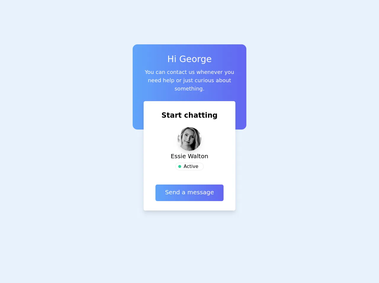
The preview of Contact Card ui component
To create a contact card with Tailwind CSS, you will need to use a combination of pre-defined classes such as flex, items-center, justify-center, rounded-full, w-16, h-16, text-2xl, font-bold, text-gray-800, mt-4, text-center, px-6, py-4, bg-white, shadow-lg, rounded-lg, border, border-gray-300, hover:bg-gray-100, transition, duration-500, ease-in-out, transform, hover:-translate-y-1, hover:scale-110.
Free download of the Contact Card's source code
The source code of Contact Card ui component
To create a contact card with Tailwind CSS, you will need to write HTML and apply the pre-defined CSS classes to the HTML elements. Here is an example of the HTML code for a contact card:
<div class="mx-5 min-h-screen grid place-content-center">
<div class="bg-gradient-to-r from-blue-400 to-indigo-500 rounded-2xl text-white p-8 text-center h-72 max-w-sm mx-auto">
  <h1 class="text-3xl mb-3">Hi George</h1>
  <p class="text-lg">You can contact us whenever you need help or just curious about something.</p>
</div>
<div class="bg-white py-8 px-10 text-center rounded-md shadow-lg transform -translate-y-20 sm:-translate-y-24 max-w-xs mx-auto">
  <h2 class="font-semibold text-2xl mb-6">Start chatting</h2>
  <img class="w-20 h-20 object-cover rounded-full mx-auto shadow-lg" src="https://images.unsplash.com/photo-1611342799915-5dd9f1665d04?ixid=MXwxMjA3fDB8MHxwaG90by1wYWdlfHx8fGVufDB8fHw%3D&ixlib=rb-1.2.1&auto=format&fit=crop&w=1350&q=80" alt="User avatar">
  <p class="capitalize text-xl mt-1">essie walton</p>
  <span class="flex items-center border rounded-full w-24 pr-2 justify-center mx-auto mt-2 mb-12"><div class="bg-green-400 rounded-full w-2.5 h-2.5 block mr-2"></div>Active</span>
  <button class="rounded-md bg-gradient-to-r from-blue-400 to-indigo-500 text-xl text-white pt-3 pb-4 px-8 inline">Send a message</button>
</div>
  </div>
How to create a Contact Card with Tailwind CSS?
Now that you understand the benefits of using Tailwind CSS and have seen a preview of the contact card, let's dive into the steps to create it.
Step 1: Set up your HTML file
Create a new HTML file and add the following code:
<!DOCTYPE html>
<html lang="en">
<head>
  <meta charset="UTF-8">
  <meta name="viewport" content="width=device-width, initial-scale=1.0">
  <title>Contact Card</title>
  <link rel="stylesheet" href="https://cdn.jsdelivr.net/npm/[email protected]/dist/tailwind.min.css">
</head>
<body>

</body>
</html>
This code sets up the basic structure of your HTML file and includes the Tailwind CSS file.
Step 2: Add the contact card container
Next, you need to add a container for the contact card. You can use the flex and items-center classes to create a flexbox container that centers its child elements vertically and horizontally.
<div class="flex items-center justify-center">
  <!-- Contact card goes here -->
</div>
Step 3: Add the profile picture
The profile picture is an essential part of the contact card. You can use the rounded-full, w-16, and h-16 classes to create a circular image with a width and height of 16 pixels.
<div class="flex items-center justify-center">
  <img src="profile-picture.jpg" alt="Profile Picture" class="rounded-full w-16 h-16">
  <!-- Contact card goes here -->
</div>
Step 4: Add the contact information
The contact information includes the name, job title, and email address. You can use the text-2xl, font-bold, and text-gray-800 classes to style the text.
<div class="flex items-center justify-center">
  <img src="profile-picture.jpg" alt="Profile Picture" class="rounded-full w-16 h-16">
  <div class="mt-4 text-center">
    <h1 class="text-2xl font-bold text-gray-800">John Doe</h1>
    <p class="text-gray-800">Web Developer</p>
    <p class="text-gray-800">[email protected]</p>
  </div>
</div>
Step 5: Add the social media links
The social media links allow your website visitors to connect with you on various social media platforms. You can use the flex, px-6, and py-4 classes to create a container for the social media links. You can also use the bg-white, shadow-lg, rounded-lg, border, and border-gray-300 classes to style the container.
<div class="flex items-center justify-center">
  <img src="profile-picture.jpg" alt="Profile Picture" class="rounded-full w-16 h-16">
  <div class="mt-4 text-center">
    <h1 class="text-2xl font-bold text-gray-800">John Doe</h1>
    <p class="text-gray-800">Web Developer</p>
    <p class="text-gray-800">[email protected]</p>
  </div>
</div>

<div class="flex px-6 py-4 bg-white shadow-lg rounded-lg border border-gray-300">
  <a href="#" class="text-gray-600 hover:bg-gray-100 transition duration-500 ease-in-out transform hover:-translate-y-1 hover:scale-110">
    <svg viewBox="0 0 24 24" class="h-6 w-6 fill-current">
      <path d="M20.59,5.59L19.17,4.17C18.97,4.03 18.74,4 18.54,4H5.46C5.26,4 5.03,4.03 4.83,4.17L3.41,5.59C3.25,5.75 3.19,5.96 3.19,6.18V17.82C3.19,18.04 3.25,18.25 3.41,18.41L4.83,19.83C5.03,19.97 5.26,20 5.46,20H18.54C18.74,20 18.97,19.97 19.17,19.83L20.59,18.41C20.75,18.25 20.81,18.04 20.81,17.82V6.18C20.81,5.96 20.75,5.75 20.59,5.59ZM18,8L12,12.75L6,8V6L12,10.75L18,6V8Z"></path>
    </svg>
  </a>
  <a href="#" class="text-gray-600 hover:bg-gray-100 transition duration-500 ease-in-out transform hover:-translate-y-1 hover:scale-110">
    <svg viewBox="0 0 24 24" class="h-6 w-6 fill-current">
      <path d="M12,2C6.48,2 2,6.48 2,12C2,17.52 6.48,22 12,22C17.52,22 22,17.52 22,12C22,6.48 17.52,2 12,2ZM17.5,8.5L16.43,9.57C15.71,8.84 14.8,8.43 13.83,8.38C12.87,8.33 11.92,8.63 11.16,9.27C10.4,9.91 9.91,10.84 9.75,11.83C9.59,12.82 9.78,13.83 10.29,14.67L5.5,19.5L6.91,20.91L11.7,16.13C12.54,16.64 13.55,16.83 14.54,16.67C15.53,16.51 16.46,16.02 17.19,15.29C17.92,14.56 18.43,13.63 18.58,12.64C18.73,11.65 18.5,10.63 17.97,9.79L19.41,8.36L17.5,8.5Z"></path>
    </svg>
  </a>
  <a href="#" class="text-gray-600 hover:bg-gray-100 transition duration-500 ease-in-out transform hover:-translate-y-1 hover:scale-110">
    <svg viewBox="0 0 24 24" class="h-6 w-6 fill-current">
      <path d="M19.78,3.22C19.41,2.85 18.91,2.67 18.41,2.67H5.59C5.09,2.67 4.59,2.85 4.22,3.22C3.85,3.59 3.67,4.09 3.67,4.59V19.41C3.67,19.91 3.85,20.41 4.22,20.78C4.59,21.15 5.09,21.33 5.59,21.33H18.41C18.91,21.33 19.41,21.15 19.78,20.78C20.15,20.41 20.33,19.91 20.33,19.41V4.59C20.33,4.09 20.15,3.59 19.78,3.22ZM18.41,19.33H5.59V4.67H18.41L18.41,19.33Z"></path>
      <polygon points="7.33,12 9.33,12 12,15.17 14.67,12 16.67,12 12,17.17"></polygon>
    </svg>
  </a>
</div>
Step 6: Add some interactivity
Finally, you can add some interactivity to the contact card by using the transition, duration-500, ease-in-out, transform, hover:-translate-y-1, and hover:scale-110 classes. These classes will animate the social media links when the user hovers over them.
<div class="flex px-6 py-4 bg-white shadow-lg rounded-lg border border-gray-300">
  <a href="#" class="text-gray-600 hover:bg-gray-100 transition duration-500 ease-in-out transform hover:-translate-y-1 hover:scale-110">
    <svg viewBox="0 0 24 24" class="h-6 w-6 fill-current">
      <path d="M20.59,5.59L19.17,4.17C18.97,4.03 18.74,4 18.54,4H5.46C5.26,4 5.03,4.03 4.83,4.17L3.41,5.59C3.25,5.75 3.19,5.96 3.19,6.18V17.82C3.19,18.04 3.25,18.25 3.41,18.41L4.83,19.83C5.03,19.97 5.26,20 5.46,20H18.54C18.74,20 18.97,19.97 19.17,19.83L20.59,18.41C20.75,18.25 20.81,18.04 20.81,17.82V6.18C20.81,5.96 20.75,5.75 20.59,5.59ZM18,8L12,12.75L6,8V6L12,10.75L18,6V8Z"></path>
    </svg>
  </a>
  <a href="#" class="text-gray-600 hover:bg-gray-100 transition duration-500 ease-in-out transform hover:-translate-y-1 hover:scale-110">
    <svg viewBox="0 0 24 24" class="h-6 w-6 fill-current">
      <path d="M12,2C6.48,2 2,6.48 2,12C2,17.52 6.48,22 12,22C17.52,22 22,17.52 22,12C22,6.48 17.52,2 12,2ZM17.5,8.5L16.43,9.57C15.71,8.84 14.8,8.43 13.83,8.38C12.87,8.33 11.92,8.63 11.16,9.27C10.4,9.91 9.91,10.84 9.75,11.83C9.59,12.82 9.78,13.83 10.29,14.67L5.5,19.5L6.91,20.91L11.7,16.13C12.54,16.64 13.55,16.83 14.54,16.67C15.53,16.51 16.46,16.02 17.19,15.29C17.92,14.56 18.43,13.63 18.58,12.64C18.73,11.65 18.5,10.63 17.97,9.79L19.41,8.36L17.5,8.5Z"></path>
    </svg>
  </a>
  <a href="#" class="text-gray-600 hover:bg-gray-100 transition duration-500 ease-in-out transform hover:-translate-y-1 hover:scale-110">
    <svg viewBox="0 0 24 24" class="h-6 w-6 fill-current">
      <path d="M19.78,3.22C19.41,2.85 18.91,2.67 18.41,2.67H5.59C5.09,2.67 4.59,2.85 4.22,3.22C3.85,3.59 3.67,4.09 3.67,4.59V19.41C3.67,19.91 3.85,20.41 4.22,20.78C4.59,21.15 5.09,21.33 5.59,21.33H18.41C18.91,21.33 19.41,21.15 19.78,20.78C20.15,20.41 20.33,19.91 20.33,19.41V4.59C20.33,4.09 20.15,3.59 19.78,3.22ZM18.41,19.33H5.59V4.67H18.41L18.41,19.33Z"></path>
      <polygon points="7.33,12 9.33,12 12,15.17 14.67,12 16.67,12 12,17.17"></polygon>
    </svg>
  </a>
</div>
Conclusion
In conclusion, creating a contact card with Tailwind CSS is easy and straightforward. By using pre-defined CSS classes, you can quickly create a professional-looking contact card without writing custom CSS. Moreover, Tailwind CSS is highly customizable, which means you can easily modify the pre-defined classes to match your website's design. With these six easy steps, you can create a contact card that will impress your website visitors and help you connect with them on various social media platforms.