- Published on
Beginners Guide: Create A Confirmation Boxes With Different Colors For Different Messages With Tailwind CSS
- What is Tailwind CSS?
- The description of Confirmation Boxes With Different Colors For Different Messages ui component
- Why use Tailwind CSS to create a Confirmation Boxes With Different Colors For Different Messages ui component?
- The preview of Confirmation Boxes With Different Colors For Different Messages ui component
- The source code of Confirmation Boxes With Different Colors For Different Messages ui component
- How to create a Confirmation Boxes With Different Colors For Different Messages with Tailwind CSS?
- Step 1: Create the HTML markup
- Step 2: Add Tailwind CSS
- Step 3: Customize the colors
- Step 4: Use the custom colors
- Step 5: Preview the confirmation boxes
- Conclusion
What is Tailwind CSS?
Tailwind CSS is a utility-first CSS framework that helps developers quickly build custom designs without writing any CSS. It provides a set of pre-defined classes that can be used to style HTML elements. Tailwind CSS is gaining popularity among developers due to its flexibility and ease of use.
The description of Confirmation Boxes With Different Colors For Different Messages ui component
Confirmation boxes are commonly used in web applications to confirm user actions such as deleting a record, submitting a form, or logging out. These boxes provide a way for users to confirm their actions before proceeding. In this tutorial, we will create confirmation boxes with different colors for different messages using Tailwind CSS.
Why use Tailwind CSS to create a Confirmation Boxes With Different Colors For Different Messages ui component?
Tailwind CSS provides a set of pre-defined classes that can be used to style HTML elements. This makes it easy to create custom designs without writing any CSS. In addition, Tailwind CSS is highly customizable, which means that developers can easily modify the default styles to match their design requirements.
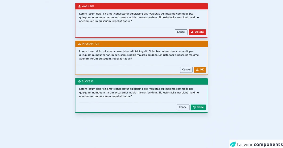
The preview of Confirmation Boxes With Different Colors For Different Messages ui component
In this tutorial, we will create confirmation boxes with different colors for different messages. These boxes will have a title, message, and two buttons: one for confirming the action and one for canceling the action.
Free download of the Confirmation Boxes With Different Colors For Different Messages's source code
The source code of Confirmation Boxes With Different Colors For Different Messages ui component
To create confirmation boxes with different colors for different messages, we will use Tailwind CSS. The source code for this component is provided below.
<div class="holder overflow-hidden w-4/6 mt-5 box-border border border-b-4 border-red-600 rounded-r-md shadow-xl  mx-auto">
  <div class="top bg-red-600 text-white p-2 px-4 uppercase">
  <svg class="h-5 w-5 inline" xmlns="http://www.w3.org/2000/svg" viewBox="0 0 20 20" fill="currentColor">
    <path fill-rule="evenodd" d="M8.257 3.099c.765-1.36 2.722-1.36 3.486 0l5.58 9.92c.75 1.334-.213 2.98-1.742 2.98H4.42c-1.53 0-2.493-1.646-1.743-2.98l5.58-9.92zM11 13a1 1 0 11-2 0 1 1 0 012 0zm-1-8a1 1 0 00-1 1v3a1 1 0 002 0V6a1 1 0 00-1-1z" clip-rule="evenodd" />
  </svg>
    warning
  </div>
  <div class="center flex box-border px-6 py-4">
    <div class="content">
      Lorem ipsum dolor sit amet consectetur adipisicing elit. Voluptas qui maxime commodi ipsa quisquam numquam harum accusamus nobis maiores quidem. Sit iusto facilis nesciunt maxime aperiam rerum quisquam, repellat itaque?
    </div>
  </div>

  <div class="bottom">
    <div class="hold flex space-x-2 border-t p-3 mt-3">
      <div class="border-gray-600 rounded text-gray-900 text-base cursor-pointer border p-1 px-3 ml-auto">Cancel</div>
      <div class="border-red-600 rounded text-white bg-red-600 text-base cursor-pointer border border-b-4 p-1 px-3 font-bold">
        <svg class="h-5 w-5 inline" xmlns="http://www.w3.org/2000/svg" viewBox="0 0 20 20" fill="currentColor">
          <path fill-rule="evenodd" d="M8.257 3.099c.765-1.36 2.722-1.36 3.486 0l5.58 9.92c.75 1.334-.213 2.98-1.742 2.98H4.42c-1.53 0-2.493-1.646-1.743-2.98l5.58-9.92zM11 13a1 1 0 11-2 0 1 1 0 012 0zm-1-8a1 1 0 00-1 1v3a1 1 0 002 0V6a1 1 0 00-1-1z" clip-rule="evenodd" />
        </svg>
        Delete
      </div>
    </div>
  </div>
</div>

<!-- warning -->

<div class="holder overflow-hidden w-4/6 mt-5 box-border border border-b-4 border-yellow-600 rounded-r-md shadow-xl  mx-auto">
  <div class="top bg-yellow-600 text-white p-2 px-4 uppercase">
  <svg class="h-5 w-5 inline" xmlns="http://www.w3.org/2000/svg" viewBox="0 0 20 20" fill="currentColor">
    <path fill-rule="evenodd" d="M8.257 3.099c.765-1.36 2.722-1.36 3.486 0l5.58 9.92c.75 1.334-.213 2.98-1.742 2.98H4.42c-1.53 0-2.493-1.646-1.743-2.98l5.58-9.92zM11 13a1 1 0 11-2 0 1 1 0 012 0zm-1-8a1 1 0 00-1 1v3a1 1 0 002 0V6a1 1 0 00-1-1z" clip-rule="evenodd" />
  </svg>
    information
  </div>
  <div class="center flex box-border px-6 py-4">
    <div class="content">
      Lorem ipsum dolor sit amet consectetur adipisicing elit. Voluptas qui maxime commodi ipsa quisquam numquam harum accusamus nobis maiores quidem. Sit iusto facilis nesciunt maxime aperiam rerum quisquam, repellat itaque?
    </div>
  </div>

  <div class="bottom">
    <div class="hold flex space-x-2 border-t p-3 mt-3">
      <div class="border-gray-600 rounded text-gray-900 text-base cursor-pointer border p-1 px-3 ml-auto">Cancel</div>
      <div class="border-yellow-600 rounded text-white bg-yellow-600 text-base cursor-pointer border border-b-4 p-1 px-3 font-bold">
        <svg class="h-5 w-5 inline" xmlns="http://www.w3.org/2000/svg" viewBox="0 0 20 20" fill="currentColor">
          <path fill-rule="evenodd" d="M8.257 3.099c.765-1.36 2.722-1.36 3.486 0l5.58 9.92c.75 1.334-.213 2.98-1.742 2.98H4.42c-1.53 0-2.493-1.646-1.743-2.98l5.58-9.92zM11 13a1 1 0 11-2 0 1 1 0 012 0zm-1-8a1 1 0 00-1 1v3a1 1 0 002 0V6a1 1 0 00-1-1z" clip-rule="evenodd" />
        </svg>
        OK
      </div>
    </div>
  </div>
</div>

<!-- information -->

<div class="holder overflow-hidden w-4/6 mt-5 box-border border border-b-4 border-green-600 rounded-r-md shadow-xl  mx-auto">
  <div class="top bg-green-600 text-white p-2 px-4 uppercase">
    <svg class="inline-block w-5 h-5" xmlns="http://www.w3.org/2000/svg" class="h-6 w-6" fill="none" viewBox="0 0 24 24" stroke="currentColor">
      <path stroke-linecap="round" stroke-linejoin="round" stroke-width="2" d="M9 12l2 2 4-4m5.618-4.016A11.955 11.955 0 0112 2.944a11.955 11.955 0 01-8.618 3.04A12.02 12.02 0 003 9c0 5.591 3.824 10.29 9 11.622 5.176-1.332 9-6.03 9-11.622 0-1.042-.133-2.052-.382-3.016z" />
    </svg>
    Success
  </div>
  <div class="center flex box-border px-6 py-4">
    <div class="content">
      Lorem ipsum dolor sit amet consectetur adipisicing elit. Voluptas qui maxime commodi ipsa quisquam numquam harum accusamus nobis maiores quidem. Sit iusto facilis nesciunt maxime aperiam rerum quisquam, repellat itaque?
    </div>
  </div>

  <div class="bottom">
    <div class="hold flex space-x-2 border-t p-3 mt-3">
      <div class="border-gray-600 rounded text-gray-900 text-base cursor-pointer border p-1 px-3 ml-auto">Cancel</div>
      <div class="border-green-600 rounded text-white bg-green-600 text-base cursor-pointer border border-b-4 p-1 px-3 font-bold">
        <svg class="inline-block w-5 h-5" xmlns="http://www.w3.org/2000/svg" class="h-6 w-6" fill="none" viewBox="0 0 24 24" stroke="currentColor">
          <path stroke-linecap="round" stroke-linejoin="round" stroke-width="2" d="M9 12l2 2 4-4m5.618-4.016A11.955 11.955 0 0112 2.944a11.955 11.955 0 01-8.618 3.04A12.02 12.02 0 003 9c0 5.591 3.824 10.29 9 11.622 5.176-1.332 9-6.03 9-11.622 0-1.042-.133-2.052-.382-3.016z" />
        </svg>
        Done
      </div>
    </div>
  </div>
</div>

<!-- Success -->

<div class="placeholder mb-28"></div>
How to create a Confirmation Boxes With Different Colors For Different Messages with Tailwind CSS?
To create confirmation boxes with different colors for different messages, follow the steps below:
Step 1: Create the HTML markup
Create an HTML file and add the following markup:
<div class="bg-white rounded-lg shadow-md p-6">
  <h2 class="text-lg font-medium mb-4">Confirmation Title</h2>
  <p class="text-gray-600 mb-4">Confirmation Message</p>
  <div class="flex justify-end">
    <button class="bg-red-500 hover:bg-red-700 text-white font-bold py-2 px-4 rounded mr-2">Confirm</button>
    <button class="bg-gray-500 hover:bg-gray-700 text-white font-bold py-2 px-4 rounded">Cancel</button>
  </div>
</div>
In the above markup, we have created a div element with the classes bg-white, rounded-lg, shadow-md, and p-6. These classes provide a white background, rounded corners, shadow, and padding to the div element.
We have also added a heading element with the classes text-lg, font-medium, and mb-4. These classes provide a large font size, medium font weight, and margin bottom to the heading element.
We have added a paragraph element with the classes text-gray-600 and mb-4. These classes provide a gray color text and margin bottom to the paragraph element.
Finally, we have added two button elements with the classes bg-red-500, hover:bg-red-700, text-white, font-bold, py-2, px-4, and rounded to create a red color confirm button. We have also added two button elements with the classes bg-gray-500, hover:bg-gray-700, text-white, font-bold, py-2, px-4, and rounded to create a gray color cancel button.
Step 2: Add Tailwind CSS
To use Tailwind CSS, we need to add the Tailwind CSS stylesheet to our HTML file. We can do this by adding the following link element to the head section of our HTML file:
<link rel="stylesheet" href="https://cdn.jsdelivr.net/npm/[email protected]/dist/tailwind.min.css">
Step 3: Customize the colors
To create confirmation boxes with different colors for different messages, we need to customize the colors of the buttons. We can do this by adding custom colors to the Tailwind CSS configuration file.
Create a file named tailwind.config.js in the root directory of your project and add the following code:
module.exports = {
  theme: {
    extend: {
      colors: {
        primary: '#ff0000',
        secondary: '#00ff00',
        tertiary: '#0000ff',
      },
    },
  },
  variants: {},
  plugins: [],
}
In the above code, we have added three custom colors: primary, secondary, and tertiary. You can modify these colors to match your design requirements.
Step 4: Use the custom colors
To use the custom colors, we need to modify the classes of the buttons. We can do this by replacing the classes bg-red-500 and bg-gray-500 with the classes bg-primary and bg-secondary, respectively.
<div class="bg-white rounded-lg shadow-md p-6">
  <h2 class="text-lg font-medium mb-4">Confirmation Title</h2>
  <p class="text-gray-600 mb-4">Confirmation Message</p>
  <div class="flex justify-end">
    <button class="bg-primary hover:bg-red-700 text-white font-bold py-2 px-4 rounded mr-2">Confirm</button>
    <button class="bg-secondary hover:bg-gray-700 text-white font-bold py-2 px-4 rounded">Cancel</button>
  </div>
</div>
Step 5: Preview the confirmation boxes
Open the HTML file in a web browser to preview the confirmation boxes with different colors for different messages.
Conclusion
In this tutorial, we have learned how to create confirmation boxes with different colors for different messages using Tailwind CSS. We have also learned how to customize the colors of the buttons using the Tailwind CSS configuration file. Tailwind CSS provides a quick and easy way to create custom designs without writing any CSS.