- Published on
6 Critical Skills To Build A Confirmation Boxe With Tailwind CSS Remarkably Well
- What is Tailwind CSS?
- The description of Confirmation Boxe ui component
- Why use Tailwind CSS to create a Confirmation Boxe ui component?
- The preview of Confirmation Boxe ui component
- The source code of Confirmation Boxe ui component
- How to create a Confirmation Boxe with Tailwind CSS?
- Step 1: Create the HTML structure
- Step 2: Style the HTML elements using Tailwind CSS classes
- Step 3: Add JavaScript functionality to the buttons
- Conclusion
What is Tailwind CSS?
Tailwind CSS is a utility-first CSS framework that provides a set of pre-defined classes to style your HTML elements. It is designed to be highly customizable, allowing you to create unique designs without writing custom CSS.
The description of Confirmation Boxe ui component
A Confirmation Boxe is a UI component that is used to confirm an action before it is executed. It typically consists of a message asking the user to confirm the action, along with buttons to confirm or cancel the action.
Why use Tailwind CSS to create a Confirmation Boxe ui component?
Tailwind CSS provides a set of pre-defined classes that can be used to style a Confirmation Boxe with ease. This saves time and effort, as you do not need to write custom CSS for every component.
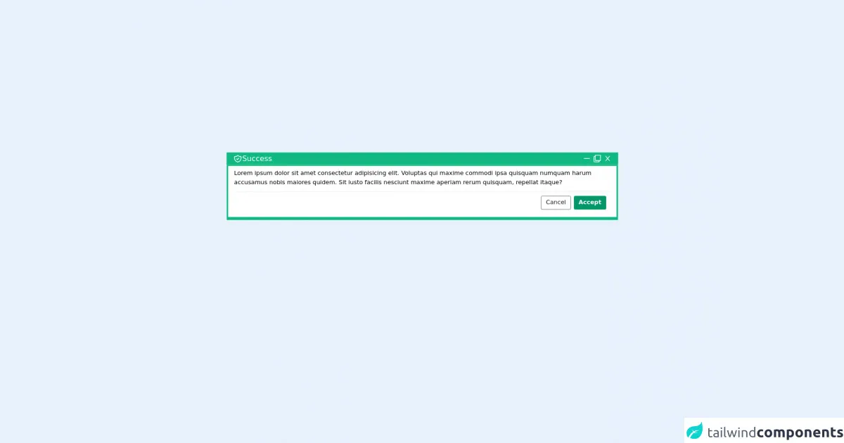
The preview of Confirmation Boxe ui component
A Confirmation Boxe typically consists of a message asking the user to confirm the action, along with buttons to confirm or cancel the action.
Free download of the Confirmation Boxe's source code
The source code of Confirmation Boxe ui component
To create a Confirmation Boxe with Tailwind CSS, you need to have a basic understanding of HTML and CSS. The following code shows how to create a simple Confirmation Boxe using Tailwind CSS.
<div class="container mt-12 text-white">
  <div class="ml-4 mr-4 md:ml-28 md:mr-28 px-4 text-xl bg-green-500 border-2 border-green-500">
    <div class="justify-between flex">
      <p>
        <svg class="inline-block w-6 h-6" xmlns="http://www.w3.org/2000/svg" class="h-6 w-6" fill="none" viewBox="0 0 24 24" stroke="currentColor">
          <path stroke-linecap="round" stroke-linejoin="round" stroke-width="2" d="M9 12l2 2 4-4m5.618-4.016A11.955 11.955 0 0112 2.944a11.955 11.955 0 01-8.618 3.04A12.02 12.02 0 003 9c0 5.591 3.824 10.29 9 11.622 5.176-1.332 9-6.03 9-11.622 0-1.042-.133-2.052-.382-3.016z" /></svg
        >Success
      </p>
      <div class="justify-end flex items-center">
        <svg class="mr-2 cursor-pointer hover:bg-opacity-30 hover:bg-green-300" stroke="currentColor" fill="currentColor" stroke-width="0" viewBox="0 0 1024 1024" height="1em" width="1em" xmlns="http://www.w3.org/2000/svg"><path d="M904 476H120c-4.4 0-8 3.6-8 8v56c0 4.4 3.6 8 8 8h784c4.4 0 8-3.6 8-8v-56c0-4.4-3.6-8-8-8z"></path></svg>
        <svg class="mr-2 cursor-pointer hover:bg-opacity-30 hover:bg-green-300" stroke="currentColor" fill="currentColor" stroke-width="0" viewBox="0 0 512 512" height="1em" width="1em" xmlns="http://www.w3.org/2000/svg"><path d="M464 0H144c-26.51 0-48 21.49-48 48v48H48c-26.51 0-48 21.49-48 48v320c0 26.51 21.49 48 48 48h320c26.51 0 48-21.49 48-48v-48h48c26.51 0 48-21.49 48-48V48c0-26.51-21.49-48-48-48zM362 464H54a6 6 0 0 1-6-6V150a6 6 0 0 1 6-6h42v224c0 26.51 21.49 48 48 48h224v42a6 6 0 0 1-6 6zm96-96H150a6 6 0 0 1-6-6V54a6 6 0 0 1 6-6h308a6 6 0 0 1 6 6v308a6 6 0 0 1-6 6z"></path></svg>
        <svg class="cursor-pointer hover:bg-opacity-30 hover:bg-green-300" stroke="currentColor" fill="currentColor" stroke-width="0" viewBox="0 0 1024 1024" height="1em" width="1em" xmlns="http://www.w3.org/2000/svg"><path d="M563.8 512l262.5-312.9c4.4-5.2.7-13.1-6.1-13.1h-79.8c-4.7 0-9.2 2.1-12.3 5.7L511.6 449.8 295.1 191.7c-3-3.6-7.5-5.7-12.3-5.7H203c-6.8 0-10.5 7.9-6.1 13.1L459.4 512 196.9 824.9A7.95 7.95 0 0 0 203 838h79.8c4.7 0 9.2-2.1 12.3-5.7l216.5-258.1 216.5 258.1c3 3.6 7.5 5.7 12.3 5.7h79.8c6.8 0 10.5-7.9 6.1-13.1L563.8 512z"></path></svg>
      </div>
    </div>
  </div>
  <div class="ml-4 mr-4 md:ml-28 md:mr-28 bg-white pt-2 pb-2 text-black border-4 border-b-8 border-green-500">
    <div class="ml-4 mr-4">
      Lorem ipsum dolor sit amet consectetur adipisicing elit. Voluptas qui maxime commodi ipsa quisquam numquam harum accusamus nobis maiores quidem. Sit iusto facilis nesciunt maxime aperiam rerum quisquam, repellat itaque?
      <div class="bottom">
        <div class="hold flex space-x-2 border-t p-3 mt-3">
          <div class="border-gray-600 rounded text-gray-900 text-base cursor-pointer border p-1 px-3 ml-auto hover:bg-gray-600 hover:text-white transform duration-300">Cancel</div>
          <div class="border-green-600 rounded text-white bg-green-600 text-base cursor-pointer border border-b-4 p-1 px-3 font-bold">Accept</div>
        </div>
      </div>
    </div>
  </div>
</div>
How to create a Confirmation Boxe with Tailwind CSS?
To create a Confirmation Boxe with Tailwind CSS, you need to follow these steps:
Step 1: Create the HTML structure
The first step is to create the HTML structure for the Confirmation Boxe. This typically consists of a container element, a message element, and two button elements.
<div class="bg-white rounded-lg shadow-lg p-4">
  <p class="text-gray-800">Are you sure you want to delete this item?</p>
  <div class="mt-4 flex justify-end">
    <button class="bg-red-500 hover:bg-red-700 text-white font-bold py-2 px-4 rounded mr-2">Delete</button>
    <button class="bg-gray-500 hover:bg-gray-700 text-white font-bold py-2 px-4 rounded">Cancel</button>
  </div>
</div>
Step 2: Style the HTML elements using Tailwind CSS classes
The next step is to style the HTML elements using Tailwind CSS classes. In the example above, we have used classes such as bg-white, rounded-lg, shadow-lg, text-gray-800, mt-4, flex, justify-end, bg-red-500, hover:bg-red-700, text-white, font-bold, py-2, px-4, and rounded to style the Confirmation Boxe.
Step 3: Add JavaScript functionality to the buttons
The final step is to add JavaScript functionality to the buttons. This typically involves adding event listeners to the buttons and executing the appropriate action based on the user's choice.
const deleteButton = document.querySelector('.delete-button');
const cancelButton = document.querySelector('.cancel-button');

deleteButton.addEventListener('click', () => {
  // Execute delete action
});

cancelButton.addEventListener('click', () => {
  // Do nothing
});
Conclusion
Creating a Confirmation Boxe with Tailwind CSS is a straightforward process that requires a basic understanding of HTML, CSS, and JavaScript. By following the steps outlined in this article, you can create a Confirmation Boxe that is both functional and visually appealing. Remember to use Tailwind CSS classes to style your components and add JavaScript functionality to the buttons to execute the appropriate action.