- Published on
How To Create A Component Hover Effect With Tailwind CSS In 5 Easy Steps
- What is Tailwind CSS?
- The description of Component Hover effect ui component
- Why use Tailwind CSS to create a Component Hover effect ui component?
- The preview of Component Hover effect ui component.
- The source code of Component Hover effect ui component.
- How to create a Component Hover effect with Tailwind CSS?
- Step 1: Set up your HTML
- Step 2: Add Tailwind CSS to your project
- Step 3: Add hover classes to your CSS
- Step 4: Add transition classes to your CSS
- Step 5: Preview your Component Hover effect
- Conclusion
Frontend developers are always on the lookout for new ways to create stunning user interfaces. One such way is by creating hover effects on components. Hover effects can add a layer of interactivity to your website and make it more engaging for users. In this article, we will show you how to create a component hover effect using Tailwind CSS in just 5 easy steps.
What is Tailwind CSS?
Tailwind CSS is a utility-first CSS framework that gives you complete control over your website's design. It provides a set of pre-defined classes that you can use to style your HTML elements. With Tailwind CSS, you can create complex layouts and designs without writing a single line of custom CSS.
The description of Component Hover effect ui component
A Component Hover effect is a UI component that adds an interactive effect to a component when the user hovers over it. This effect can be anything from changing the background color to displaying additional information.
Why use Tailwind CSS to create a Component Hover effect ui component?
Tailwind CSS makes it easy to create complex designs and layouts without writing custom CSS. It provides a set of pre-defined classes that you can use to style your HTML elements. This saves you time and effort, and makes your code more maintainable.
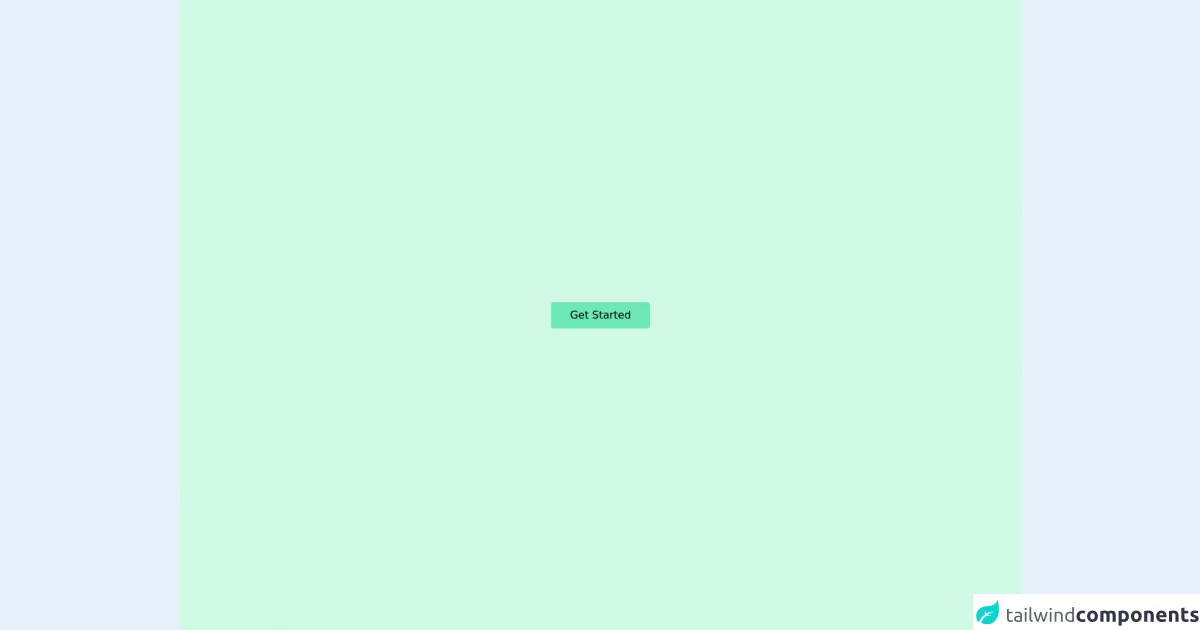
The preview of Component Hover effect ui component.
To give you an idea of what a Component Hover effect looks like, here is a preview:
Free download of the Component Hover effect's source code
The source code of Component Hover effect ui component.
Here is the source code for the Component Hover effect:
<div class="flex h-screen w-full items-center justify-center overflow-hidden bg-green-100">
  <div class="group relative border-dashed border-red-500 hover:border">
    <!-- replace the button with other elements as per your wish -->
    <button class="relative h-[40px] w-[150px] rounded bg-green-300 hover:border">Get Started</button>
    <span class="hidden md:group-hover:inline">
      <span class="absolute right-full bottom-full w-10 border-t border-dashed border-red-500"></span>
      <span class="absolute right-full top-full w-10 border-b border-dashed border-red-500"></span>
      <span class="absolute left-full bottom-full w-10 border-t border-dashed border-red-500"></span>
      <span class="absolute left-full top-full w-10 border-b border-dashed border-red-500"></span>

      <span class="absolute top-full left-full h-10 border-l border-dashed border-red-500"></span>
      <span class="absolute top-full right-full h-10 border-l border-dashed border-red-500"></span>
      <span class="absolute bottom-full right-full h-10 border-r border-dashed border-red-500"></span>
      <span class="absolute bottom-full left-full h-10 border-l border-dashed border-red-500"></span>

       <!-- here I set the background color to match the background color of the div -->
      <span class="absolute bottom-[calc(100%-2px)] right-[calc(100%-2px)] h-[5px] w-[5px] rounded-2xl border border-red-500 bg-green-100"></span>
      <span class="absolute top-[calc(100%-2px)] right-[calc(100%-2px)] h-[5px] w-[5px] rounded-2xl border border-red-500 bg-green-100"></span>
      <span class="absolute bottom-[calc(100%-2px)] left-[calc(100%-2px)] h-[5px] w-[5px] rounded-2xl border border-red-500 bg-green-100"></span>
      <span class="absolute top-[calc(100%-2px)] left-[calc(100%-2px)] h-[5px] w-[5px] rounded-2xl border border-red-500 bg-green-100"></span>
    </span>
  </div>
</div>
How to create a Component Hover effect with Tailwind CSS?
Now that we have a basic understanding of what a Component Hover effect is and why we should use Tailwind CSS to create it, let's dive into the steps:
Step 1: Set up your HTML
The first step is to set up your HTML. You need to create the component that you want to add a hover effect to. In this example, we will create a simple card component.
<div class="card">
  <img src="https://via.placeholder.com/150" alt="Placeholder Image">
  <h2>Card Title</h2>
  <p>Card Description</p>
</div>
Step 2: Add Tailwind CSS to your project
The next step is to add Tailwind CSS to your project. You can do this by including the Tailwind CSS CDN in your HTML file.
<link href="https://cdn.jsdelivr.net/npm/tailwindcss@latest/dist/tailwind.min.css" rel="stylesheet">
Step 3: Add hover classes to your CSS
The next step is to add the hover classes to your CSS. Tailwind CSS provides a set of hover classes that you can use to add hover effects to your components. In this example, we will use the hover:bg-gray-100 class to change the background color of the card when the user hovers over it.
.card:hover {
  box-shadow: 0 4px 6px rgba(0, 0, 0, 0.1);
  transform: translateY(-2px);
}
Step 4: Add transition classes to your CSS
To make the hover effect smoother, you can add transition classes to your CSS. Tailwind CSS provides a set of transition classes that you can use to add transition effects to your components. In this example, we will use the transition duration-300 ease-in-out class to add a 300ms transition effect to the card.
.card:hover {
  box-shadow: 0 4px 6px rgba(0, 0, 0, 0.1);
  transform: translateY(-2px);
  transition: all 0.3s ease-in-out;
}
Step 5: Preview your Component Hover effect
The final step is to preview your Component Hover effect. Open your HTML file in a web browser and hover over the card to see the effect in action.
Conclusion
Creating a Component Hover effect with Tailwind CSS is easy and can add a layer of interactivity to your website. By following the 5 easy steps outlined in this article, you can create stunning hover effects on your components in no time.