- Published on
3 Things You Must Know To Create A Commerce App Card With Tailwind CSS
- What is Tailwind CSS?
- The description of Commerce App Card UI component
- Why use Tailwind CSS to create a Commerce App Card UI component?
- The preview of Commerce App Card UI component
- The source code of Commerce App Card UI component
- How to create a Commerce App Card with Tailwind CSS?
- Step 1: Set up the HTML structure
- Step 2: Add Tailwind CSS classes
- Step 3: Customize the styles
- Conclusion
Tailwind CSS is a popular utility-first CSS framework that helps developers create responsive and customizable UI components quickly. In this article, we will discuss how to create a commerce app card UI component with Tailwind CSS.
What is Tailwind CSS?
Tailwind CSS is a CSS framework that provides a set of pre-defined CSS classes that can be used to style HTML elements. It is a utility-first framework, which means that it focuses on providing low-level utility classes that can be combined to create custom styles. Tailwind CSS is highly customizable and allows developers to create unique designs quickly.
The description of Commerce App Card UI component
A commerce app card is a UI component that is commonly used in e-commerce applications to display product information. It typically includes an image of the product, a title, a price, and a short description. The card is designed to be visually appealing and easy to read, with a clear call-to-action button that allows the user to add the product to their cart.
Why use Tailwind CSS to create a Commerce App Card UI component?
Tailwind CSS provides a set of utility classes that can be used to create a commerce app card quickly and easily. The framework includes classes for styling text, backgrounds, borders, and spacing, which are all essential for creating a visually appealing card. Additionally, Tailwind CSS is highly customizable, which means that developers can easily modify the styles to match their application's branding.
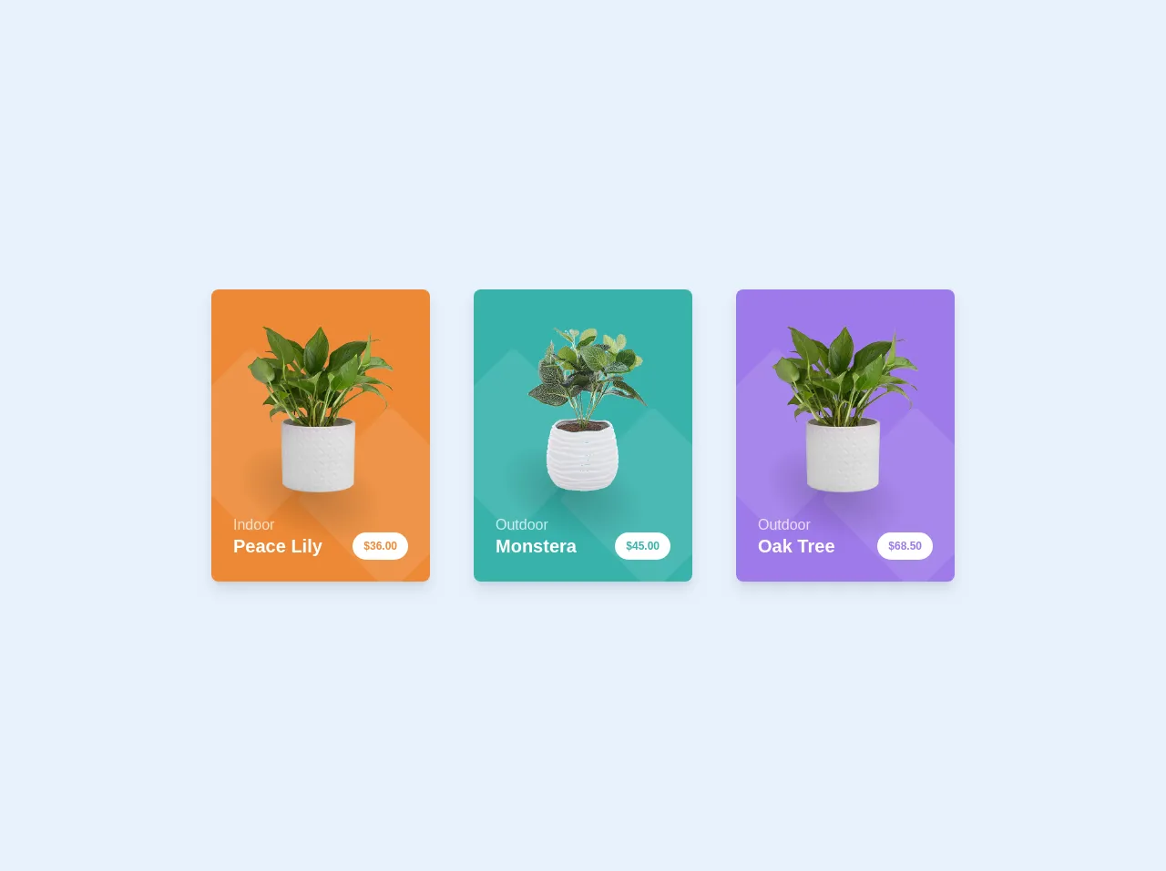
The preview of Commerce App Card UI component
Here is a preview of the commerce app card UI component that we will create:
Free download of the Commerce App Card's source code
The source code of Commerce App Card UI component
Here is the source code for the commerce app card UI component:
<div class="p-24 flex flex-wrap items-center justify-center">

    <div class="flex-shrink-0 m-6 relative overflow-hidden bg-orange-500 rounded-lg max-w-xs shadow-lg">
      <svg class="absolute bottom-0 left-0 mb-8" viewBox="0 0 375 283" fill="none" style="transform: scale(1.5); opacity: 0.1;">
        <rect x="159.52" y="175" width="152" height="152" rx="8" transform="rotate(-45 159.52 175)" fill="white"/>
        <rect y="107.48" width="152" height="152" rx="8" transform="rotate(-45 0 107.48)" fill="white"/>
      </svg>
      <div class="relative pt-10 px-10 flex items-center justify-center">
        <div class="block absolute w-48 h-48 bottom-0 left-0 -mb-24 ml-3" style="background: radial-gradient(black, transparent 60%); transform: rotate3d(0, 0, 1, 20deg) scale3d(1, 0.6, 1); opacity: 0.2;"></div>
        <img class="relative w-40" src="https://user-images.githubusercontent.com/2805249/64069899-8bdaa180-cc97-11e9-9b19-1a9e1a254c18.png" alt="">
      </div>
      <div class="relative text-white px-6 pb-6 mt-6">
        <span class="block opacity-75 -mb-1">Indoor</span>
        <div class="flex justify-between">
          <span class="block font-semibold text-xl">Peace Lily</span>
          <span class="block bg-white rounded-full text-orange-500 text-xs font-bold px-3 py-2 leading-none flex items-center">$36.00</span>
        </div>
      </div>
    </div>
    <div class="flex-shrink-0 m-6 relative overflow-hidden bg-teal-500 rounded-lg max-w-xs shadow-lg">
      <svg class="absolute bottom-0 left-0 mb-8" viewBox="0 0 375 283" fill="none" style="transform: scale(1.5); opacity: 0.1;">
        <rect x="159.52" y="175" width="152" height="152" rx="8" transform="rotate(-45 159.52 175)" fill="white"/>
        <rect y="107.48" width="152" height="152" rx="8" transform="rotate(-45 0 107.48)" fill="white"/>
      </svg>
      <div class="relative pt-10 px-10 flex items-center justify-center">
        <div class="block absolute w-48 h-48 bottom-0 left-0 -mb-24 ml-3" style="background: radial-gradient(black, transparent 60%); transform: rotate3d(0, 0, 1, 20deg) scale3d(1, 0.6, 1); opacity: 0.2;"></div>
        <img class="relative w-40" src="https://user-images.githubusercontent.com/2805249/64069998-305de300-cc9a-11e9-8ae7-5a0fe00299f2.png" alt="">
      </div>
      <div class="relative text-white px-6 pb-6 mt-6">
        <span class="block opacity-75 -mb-1">Outdoor</span>
        <div class="flex justify-between">
          <span class="block font-semibold text-xl">Monstera</span>
          <span class="block bg-white rounded-full text-teal-500 text-xs font-bold px-3 py-2 leading-none flex items-center">$45.00</span>
        </div>
      </div>
    </div>
    <div class="flex-shrink-0 m-6 relative overflow-hidden bg-purple-500 rounded-lg max-w-xs shadow-lg">
      <svg class="absolute bottom-0 left-0 mb-8" viewBox="0 0 375 283" fill="none" style="transform: scale(1.5); opacity: 0.1;">
        <rect x="159.52" y="175" width="152" height="152" rx="8" transform="rotate(-45 159.52 175)" fill="white"/>
        <rect y="107.48" width="152" height="152" rx="8" transform="rotate(-45 0 107.48)" fill="white"/>
      </svg>
      <div class="relative pt-10 px-10 flex items-center justify-center">
        <div class="block absolute w-48 h-48 bottom-0 left-0 -mb-24 ml-3" style="background: radial-gradient(black, transparent 60%); transform: rotate3d(0, 0, 1, 20deg) scale3d(1, 0.6, 1); opacity: 0.2;"></div>
        <img class="relative w-40" src="https://user-images.githubusercontent.com/2805249/64069899-8bdaa180-cc97-11e9-9b19-1a9e1a254c18.png" alt="">
      </div>
      <div class="relative text-white px-6 pb-6 mt-6">
        <span class="block opacity-75 -mb-1">Outdoor</span>
        <div class="flex justify-between">
          <span class="block font-semibold text-xl">Oak Tree</span>
          <span class="block bg-white rounded-full text-purple-500 text-xs font-bold px-3 py-2 leading-none flex items-center">$68.50</span>
        </div>
      </div>
    </div>

  </div>
How to create a Commerce App Card with Tailwind CSS?
To create a commerce app card with Tailwind CSS, follow these steps:
Step 1: Set up the HTML structure
The first step is to set up the HTML structure for the commerce app card. Here is an example:
<div class="max-w-md mx-auto bg-white rounded-xl shadow-md overflow-hidden md:max-w-2xl">
  <div class="md:flex">
    <div class="md:flex-shrink-0">
      <img class="h-48 w-full object-cover md:w-48" src="https://via.placeholder.com/150" alt="Product image">
    </div>
    <div class="p-8">
      <div class="uppercase tracking-wide text-sm text-indigo-500 font-semibold">Product Name</div>
      <a href="#" class="block mt-1 text-lg leading-tight font-medium text-black hover:underline">Product Description</a>
      <p class="mt-2 text-gray-500">Lorem ipsum dolor sit amet, consectetur adipiscing elit. Phasellus nec iaculis mauris.</p>
      <div class="mt-4">
        <span class="text-gray-600 text-sm">Price:</span>
        <span class="font-bold text-xl text-gray-800">$19.99</span>
      </div>
      <div class="mt-4">
        <button class="px-4 py-2 bg-indigo-500 text-white font-semibold rounded-lg shadow-md hover:bg-indigo-700 focus:outline-none focus:ring-2 focus:ring-indigo-400 focus:ring-opacity-75">Add to Cart</button>
      </div>
    </div>
  </div>
</div>
Step 2: Add Tailwind CSS classes
The next step is to add Tailwind CSS classes to the HTML elements to style the commerce app card. Here is an example:
<div class="max-w-md mx-auto bg-white rounded-xl shadow-md overflow-hidden md:max-w-2xl">
  <div class="md:flex">
    <div class="md:flex-shrink-0">
      <img class="h-48 w-full object-cover md:w-48" src="https://via.placeholder.com/150" alt="Product image">
    </div>
    <div class="p-8">
      <div class="uppercase tracking-wide text-sm text-indigo-500 font-semibold">Product Name</div>
      <a href="#" class="block mt-1 text-lg leading-tight font-medium text-black hover:underline">Product Description</a>
      <p class="mt-2 text-gray-500">Lorem ipsum dolor sit amet, consectetur adipiscing elit. Phasellus nec iaculis mauris.</p>
      <div class="mt-4">
        <span class="text-gray-600 text-sm">Price:</span>
        <span class="font-bold text-xl text-gray-800">$19.99</span>
      </div>
      <div class="mt-4">
        <button class="px-4 py-2 bg-indigo-500 text-white font-semibold rounded-lg shadow-md hover:bg-indigo-700 focus:outline-none focus:ring-2 focus:ring-indigo-400 focus:ring-opacity-75">Add to Cart</button>
      </div>
    </div>
  </div>
</div>
Step 3: Customize the styles
The final step is to customize the styles to match your application's branding. You can modify the colors, fonts, and spacing by editing the Tailwind CSS configuration file. Here is an example:
// tailwind.config.js

module.exports = {
  theme: {
    extend: {
      colors: {
        primary: '#FF4500',
      },
      fontFamily: {
        sans: ['Open Sans', 'sans-serif'],
      },
      spacing: {
        '72': '18rem',
      },
    },
  },
  variants: {},
  plugins: [],
}
Conclusion
Creating a commerce app card UI component with Tailwind CSS is a straightforward process that can be done quickly and easily. By using the pre-defined utility classes provided by the framework, developers can create visually appealing and customizable cards that match their application's branding. With Tailwind CSS, creating UI components has never been easier.