- Published on
6 Tips To Build A Comment With Tailwind CSS
- What is Tailwind CSS?
- The description of Comment UI component
- Why use Tailwind CSS to create a Comment UI component?
- The preview of Comment UI component
- The source code of Comment UI component
- How to create a Comment with Tailwind CSS?
- 1. Define the structure of the component using HTML
- 2. Use Tailwind CSS classes to style the comment form
- 3. Style the list of existing comments
- 4. Use responsive design to ensure the component looks good on all devices
- 5. Add animations and transitions to enhance the user experience
- 6. Test the component thoroughly to ensure it works as expected
- Conclusion
What is Tailwind CSS?
Tailwind CSS is a utility-first CSS framework that allows developers to quickly build responsive and customizable user interfaces. It provides a set of pre-defined classes that can be used to style HTML elements without having to write any custom CSS.
The description of Comment UI component
A comment UI component is a common feature on many websites and applications that allows users to leave feedback or engage in discussions. It typically includes a form for entering a comment, as well as a list of existing comments.
Why use Tailwind CSS to create a Comment UI component?
Tailwind CSS can make it much easier to create a comment UI component by providing pre-defined classes for common styles such as padding, margin, and text alignment. This can save developers time and effort compared to writing custom CSS from scratch.
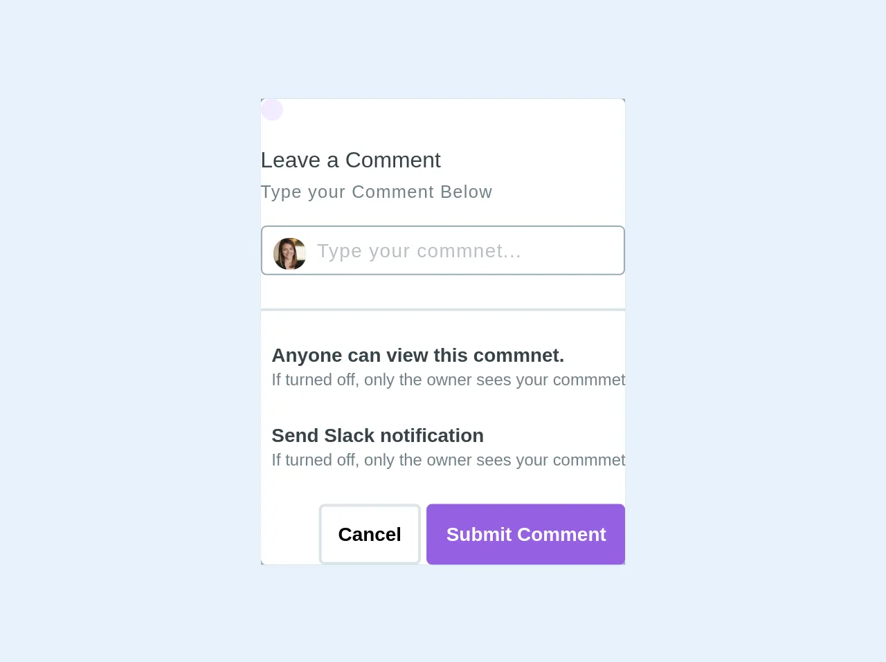
The preview of Comment UI component
To create a comment UI component with Tailwind CSS, we can start by defining the structure of the component using HTML. We can then use Tailwind CSS classes to style the various elements of the component, such as the comment form and the list of existing comments.
Free download of the Comment's source code
The source code of Comment UI component
The source code for a basic comment UI component using Tailwind CSS might look something like this:
<div class="bg-grey p-5">
<div class="max-w-xs mx-auto mt-10">
  <div class="bg-white p-5 modal__content rounded">
    <div class="modal__header mb-4">
      <div class="p-2 rounded-full bg-purple-lightest inline-block">
        <i class="fas fa-comments text-2xl text-purple-dark"></i>
      </div>
    </div>
    <div class="modal__body">
      <p class="text-grey-darkest font-medium mb-1 text-base"> Leave a Comment</p>
      <small class="text-grey-dark tracking-wide font-light"> Type your Comment Below</small>
      <div class="mt-4 border border-grey w-full border-1 rounded p-2 relative focus:border-red">
        <input type="text" class="pl-8 text-grey-dark font-light w-full text-sm font-medium tracking-wide" placeholder="Type your commnet...">
        <img src="https://content-static.upwork.com/uploads/2014/10/01073427/profilephoto1.jpg" alt="" class="w-6 rounded-full absolute pin-l pin-t ml-2 mt-2">
      </div>
      <div class="mt-6  border"></div>
      <div class="flex relative mt-6">
        <i class="fas fa-globe text-grey-dark"></i>
        <div class=" ml-2 ">
          <p class="font-medium text-sm text-grey-darkest font-semibold">Anyone can view this commnet.</p>
          <small class="text-grey-dark text-xs ">If turned off, only the owner sees your commmet</small>
        </div>
        <i class="fas fa-toggle-on fa-2x ml-auto text-blue"></i>
      </div>
      <div class="flex relative mt-6">
        <i class="fab fa-slack text-grey-dark"></i>
        <div class=" ml-2 ">
          <p class="font-medium text-sm text-grey-darkest font-semibold">Send Slack notification</p>
          <small class="text-grey-dark text-xs ">If turned off, only the owner sees your commmet</small>
        </div>
        <i class="fas fa-toggle-on fa-2x ml-auto text-blue"></i>
      </div>
    </div>
    <div class="modal__footer mt-6">
      <div class="text-right">
        <button class="bg-white border-2 p-3 rounded text-sm font-semibold hover:bg-grey-light">Cancel</button>
        <button class="bg-purple text-white border-2 border-purple p-3 rounded text-sm font-semibold hover:bg-purple-dark hover:border-purple-dark">Submit Comment</button>
      </div>
    </div>
  </div>

</div>
</div>
How to create a Comment with Tailwind CSS?
Here are six tips for building a comment UI component using Tailwind CSS:
1. Define the structure of the component using HTML
Start by creating the basic structure of the comment UI component using HTML. This might include a form for entering a new comment, as well as a list of existing comments.
2. Use Tailwind CSS classes to style the comment form
Tailwind CSS provides a range of pre-defined classes for styling form elements, such as inputs and buttons. Use these classes to style the comment form to match the design of your website or application.
3. Style the list of existing comments
Use Tailwind CSS classes to style the list of existing comments, including the individual comment items and any pagination or navigation elements.
4. Use responsive design to ensure the component looks good on all devices
Tailwind CSS makes it easy to create responsive designs that adapt to different screen sizes. Use responsive classes such as sm: and md: to ensure that your comment UI component looks good on all devices.
5. Add animations and transitions to enhance the user experience
Tailwind CSS includes pre-defined classes for adding animations and transitions to elements. Use these classes to add subtle animations to your comment UI component, such as fade-in effects when new comments are added.
6. Test the component thoroughly to ensure it works as expected
Before deploying your comment UI component, be sure to test it thoroughly to ensure that it works as expected. This might include testing different input scenarios, as well as testing the component on different devices and browsers.
Conclusion
Tailwind CSS is a powerful tool for building responsive and customizable user interfaces, including comment UI components. By following these tips, you can create a comment UI component that looks great and works well on all devices.