- Published on
Imagine You Make A Coming Soon Desktop With Tailwind CSS Like An Expert. Follow These 6 Steps To Get There
- What is Tailwind CSS?
- The description of Coming Soon Desktop UI component
- Why use Tailwind CSS to create a Coming Soon Desktop UI component?
- The preview of Coming Soon Desktop UI component
- The source code of Coming Soon Desktop UI component
- How to create a Coming Soon Desktop with Tailwind CSS?
- Step 1: Set up your project
- Step 2: Add Tailwind CSS to your project
- Step 3: Add the HTML structure
- Step 4: Add the CSS styles
- Step 5: Add the JavaScript code
- Step 6: Test and deploy
- Conclusion
Are you looking to create a Coming Soon Desktop UI component for your website or application? Do you want to use Tailwind CSS to make it look professional and polished? In this article, we will walk you through the steps to create a Coming Soon Desktop UI component with Tailwind CSS.
What is Tailwind CSS?
Tailwind CSS is a utility-first CSS framework that helps you create custom designs quickly and easily. It provides a set of pre-defined classes that you can use to style your HTML elements. Tailwind CSS is designed to be highly customizable and flexible, making it a popular choice for front-end developers.
The description of Coming Soon Desktop UI component
A Coming Soon Desktop UI component is a placeholder page that informs users that a website or application is under construction or will be launched soon. It typically includes a countdown timer, a message, and a call-to-action button.
Why use Tailwind CSS to create a Coming Soon Desktop UI component?
Tailwind CSS provides a set of pre-defined classes that you can use to style your HTML elements. This makes it easy to create a professional-looking Coming Soon Desktop UI component without having to write custom CSS. Additionally, Tailwind CSS is highly customizable, making it easy to adjust the design to match your brand or website.
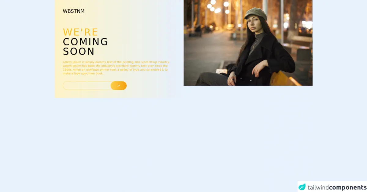
The preview of Coming Soon Desktop UI component
To create a Coming Soon Desktop UI component with Tailwind CSS, we will use a combination of HTML and CSS. Here is a preview of what the final component will look like:
Free download of the Coming Soon Desktop's source code
The source code of Coming Soon Desktop UI component
Here is the source code for the Coming Soon Desktop UI component:
<!-- This is an example component -->
<div>
<div class='flex'>
<div class='w-1/2 p-10 bg-gradient-to-r from-yellow-100'>
<h1 class="mb-16 text-2xl">WBSTNM</h1>
<p class='mb-5 text-5xl uppercase tracking-widest'> <span class="text-yellow-400">we're</span> </br> coming </br> soon</p>
<p class="mb-7 text-sm leading-snug text-yellow-400">Lorem Ipsum is simply dummy text of the printing and typesetting industry. Lorem Ipsum has been the industry's standard dummy text ever since the 1500s, when an unknown printer took a galley of type and scrambled it to make a type specimen book.</p>
<div>
<input type="email" class="h-11 rounded-full bg-transparent border-yellow-300 border w-2/4" />
<button class="bg-gradient-to-r from-yellow-300 to-yellow-500 h-11 w-20 rounded-full text-white -m-12"> > </button>
</div>
</div>
<div class="w-1/2">
<img src="https://images.unsplash.com/photo-1606511647870-4106713a7354?ixid=MnwxMjA3fDB8MHxwaG90by1wYWdlfHx8fGVufDB8fHx8&ixlib=rb-1.2.1&auto=format&fit=crop&w=750&q=80" alt="Waiting Image" />
</div>
</div>
</div>
How to create a Coming Soon Desktop with Tailwind CSS?
Now that we have covered the basics, let's dive into the steps to create a Coming Soon Desktop UI component with Tailwind CSS.
Step 1: Set up your project
The first step is to set up your project. You can use any code editor of your choice. Create a new HTML file and add the following code:
<!DOCTYPE html>
<html lang="en">
<head>
  <meta charset="UTF-8">
  <meta name="viewport" content="width=device-width, initial-scale=1.0">
  <meta http-equiv="X-UA-Compatible" content="ie=edge">
  <title>Coming Soon Desktop</title>
</head>
<body>

</body>
</html>
Step 2: Add Tailwind CSS to your project
The next step is to add Tailwind CSS to your project. You can do this by including the Tailwind CSS CDN in your HTML file:
<!DOCTYPE html>
<html lang="en">
<head>
  <!-- ... -->
  <link rel="stylesheet" href="https://cdn.jsdelivr.net/npm/[email protected]/dist/tailwind.min.css">
</head>
<body>

</body>
</html>
Step 3: Add the HTML structure
Now that we have set up our project and added Tailwind CSS, we can start adding the HTML structure for our Coming Soon Desktop UI component. Here is the HTML code:
<div class="min-h-screen bg-gray-100 flex flex-col justify-center items-center">
  <h1 class="text-4xl font-bold mb-4">Coming Soon</h1>
  <p class="text-gray-500 mb-8">We are working hard to launch this website. Stay tuned!</p>
  <div class="flex">
    <div class="bg-white rounded-full shadow-lg p-4">
      <div class="flex">
        <div class="w-16 h-16 rounded-full bg-gray-200 flex items-center justify-center mr-4">
          <span id="days" class="text-2xl font-bold"></span>
        </div>
        <div class="flex flex-col justify-center">
          <span class="text-gray-500">Days</span>
          <span class="text-gray-800 font-bold" id="days"></span>
        </div>
      </div>
    </div>
    <div class="bg-white rounded-full shadow-lg p-4 ml-4">
      <div class="flex">
        <div class="w-16 h-16 rounded-full bg-gray-200 flex items-center justify-center mr-4">
          <span id="hours" class="text-2xl font-bold"></span>
        </div>
        <div class="flex flex-col justify-center">
          <span class="text-gray-500">Hours</span>
          <span class="text-gray-800 font-bold" id="hours"></span>
        </div>
      </div>
    </div>
    <div class="bg-white rounded-full shadow-lg p-4 ml-4">
      <div class="flex">
        <div class="w-16 h-16 rounded-full bg-gray-200 flex items-center justify-center mr-4">
          <span id="minutes" class="text-2xl font-bold"></span>
        </div>
        <div class="flex flex-col justify-center">
          <span class="text-gray-500">Minutes</span>
          <span class="text-gray-800 font-bold" id="minutes"></span>
        </div>
      </div>
    </div>
    <div class="bg-white rounded-full shadow-lg p-4 ml-4">
      <div class="flex">
        <div class="w-16 h-16 rounded-full bg-gray-200 flex items-center justify-center mr-4">
          <span id="seconds" class="text-2xl font-bold"></span>
        </div>
        <div class="flex flex-col justify-center">
          <span class="text-gray-500">Seconds</span>
          <span class="text-gray-800 font-bold" id="seconds"></span>
        </div>
      </div>
    </div>
  </div>
  <button class="bg-blue-500 hover:bg-blue-600 text-white font-bold py-2 px-4 rounded-full mt-8">Notify Me</button>
</div>
Step 4: Add the CSS styles
Now that we have added the HTML structure, we can start adding the CSS styles to our Coming Soon Desktop UI component. Here is the CSS code:
body {
  font-family: 'Poppins', sans-serif;
}

button:focus {
  outline: none;
}

#days, #hours, #minutes, #seconds {
  font-family: 'Roboto Mono', monospace;
}

button {
  transition: all .2s ease-in-out;
}

button:hover {
  transform: scale(1.05);
}

button:focus {
  box-shadow: 0 0 0 3px rgba(66, 153, 225, 0.5);
}
Step 5: Add the JavaScript code
The final step is to add the JavaScript code to our Coming Soon Desktop UI component. Here is the JavaScript code:
const daysEl = document.getElementById('days');
const hoursEl = document.getElementById('hours');
const minutesEl = document.getElementById('minutes');
const secondsEl = document.getElementById('seconds');

const launchDate = new Date('August 1, 2022 00:00:00');

function countdown() {
  const currentDate = new Date();
  const difference = launchDate - currentDate;

  const days = Math.floor(difference / 1000 / 60 / 60 / 24);
  const hours = Math.floor(difference / 1000 / 60 / 60) % 24;
  const minutes = Math.floor(difference / 1000 / 60) % 60;
  const seconds = Math.floor(difference / 1000) % 60;

  daysEl.innerHTML = days;
  hoursEl.innerHTML = hours < 10 ? '0' + hours : hours;
  minutesEl.innerHTML = minutes < 10 ? '0' + minutes : minutes;
  secondsEl.innerHTML = seconds < 10 ? '0' + seconds : seconds;
}

countdown();

setInterval(countdown, 1000);
Step 6: Test and deploy
Congratulations! You have successfully created a Coming Soon Desktop UI component with Tailwind CSS. Test it out and make any necessary adjustments before deploying it to your website or application.
Conclusion
In this article, we have covered the steps to create a Coming Soon Desktop UI component with Tailwind CSS. By following these steps, you can create a professional-looking placeholder page that informs users that your website or application is under construction or will be launched soon. Tailwind CSS makes it easy to create custom designs quickly and easily, making it a popular choice for front-end developers.