- Published on
A Complete Guide To Build A Coming Soon With Tailwind CSS
- What is Tailwind CSS?
- The description of Coming Soon ui component
- Why use Tailwind CSS to create a Coming Soon ui component?
- The preview of Coming Soon ui component
- The source code of Coming Soon ui component
- How to create a Coming Soon with Tailwind CSS?
- Step 1: Set up your HTML structure
- Step 2: Style your HTML elements with Tailwind CSS
- Step 3: Add JavaScript for countdown timer
- Step 4: Launch your coming soon page
- Conclusion
Are you planning to launch a new website or product? A coming soon page is a great way to generate buzz and collect email addresses from interested users. In this article, we will guide you through the process of building a coming soon page using Tailwind CSS.
What is Tailwind CSS?
Tailwind CSS is a utility-first CSS framework that helps you quickly build custom designs without writing any CSS. It provides a set of pre-defined classes that you can use to style your HTML elements. With Tailwind CSS, you can easily create responsive and mobile-first designs.
The description of Coming Soon ui component
A coming soon page is a temporary page that informs visitors that a website or product is under construction or will be launched soon. It typically includes a countdown timer, a subscription form, and some information about the product or website.
Why use Tailwind CSS to create a Coming Soon ui component?
Tailwind CSS offers several benefits when it comes to building a coming soon page:
- Speed: Tailwind CSS allows you to build custom designs quickly without writing any CSS from scratch.
- Responsive design: Tailwind CSS provides a set of pre-defined classes that make it easy to create responsive designs that look great on all devices.
- Customization: Tailwind CSS provides a wide range of utility classes that allow you to customize your designs easily.
- Consistency: Tailwind CSS provides a consistent design system that ensures all elements on your page look and feel the same.
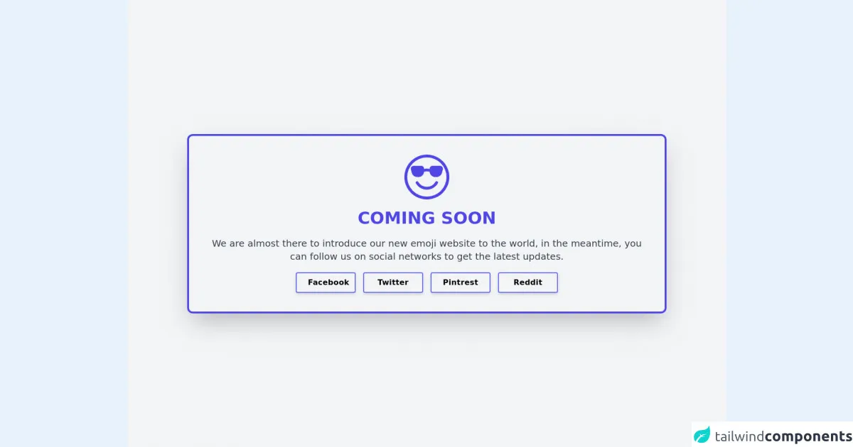
The preview of Coming Soon ui component
To give you an idea of what we will be building, here's a preview of the coming soon page we will create:
Free download of the Coming Soon's source code
The source code of Coming Soon ui component
Here's the HTML and CSS code we will use to create the coming soon page:
<div class="flex flex-col h-screen bg-center bg-cover bg-no-repeat bg-gray-100">
			<div class="grid place-items-center w-4/5 mx-auto p-10 my-20 sm:my-auto bg-white-600 border-4 border-indigo-600 bg-opacity-70 rounded-xl shadow-2xl space-y-5 text-center cursor-pointer">
        <svg xmlns="http://www.w3.org/2000/svg" width="16" height="16" fill="currentColor" class="h-24 w-24 text-indigo-600" viewBox="0 0 16 16">
  <path d="M4.968 9.75a.5.5 0 1 0-.866.5A4.498 4.498 0 0 0 8 12.5a4.5 4.5 0 0 0 3.898-2.25.5.5 0 1 0-.866-.5A3.498 3.498 0 0 1 8 11.5a3.498 3.498 0 0 1-3.032-1.75zM7 5.116V5a1 1 0 0 0-1-1H3.28a1 1 0 0 0-.97 1.243l.311 1.242A2 2 0 0 0 4.561 8H5a2 2 0 0 0 1.994-1.839A2.99 2.99 0 0 1 8 6c.393 0 .74.064 1.006.161A2 2 0 0 0 11 8h.438a2 2 0 0 0 1.94-1.515l.311-1.242A1 1 0 0 0 12.72 4H10a1 1 0 0 0-1 1v.116A4.22 4.22 0 0 0 8 5c-.35 0-.69.04-1 .116z"/>
  <path d="M16 8A8 8 0 1 1 0 8a8 8 0 0 1 16 0zm-1 0A7 7 0 1 0 1 8a7 7 0 0 0 14 0z"/>
</svg>

				<h1 class="text-4xl font-bold uppercase text-indigo-600 transition duration-500">Coming Soon</h1>
        <h2 class="text-xl text-gray-700 transition duration-500">We are almost there to introduce our new <a class="hover:underline" href="https://www.emojimania.org">emoji</a> website to the world, in the meantime, you can follow us on social networks to get the latest updates.</h2>
        <div class="grid grid-cols-2 md:grid-cols-4 gap-4">

            <a href="https://www.facebook.com/QuickToolz" title="Quicktoolz On Facebook"
              class="md:w-32 tracking-wide font-bold rounded border-2 border-indigo-500 hover:text-white hover:border-blue-600 hover:bg-blue-600 shadow-md py-2 px-6 inline-flex items-center transition duration-500">
              <span class="mx-auto">Facebook</span>
            </a>


            <a href="https://twitter.com/quicktoolz" title="Quicktoolz On Twitter"
              class="md:w-32 tracking-wide font-bold rounded border-2 border-indigo-500 hover:text-white hover:border-blue-500 hover:bg-blue-500 shadow-md py-2 px-6 inline-flex items-center transition duration-500">
              <span class="mx-auto">Twitter</span>
            </a>


            <a href="https://pinterest.com/quicktoolz/" title="Quicktoolz On Pinterest"
              class="md:w-32 tracking-wide font-bold rounded border-2 border-indigo-500 hover:text-white hover:border-red-600 hover:bg-red-600 shadow-md py-2 px-6 inline-flex items-center transition duration-500">
              <span class="mx-auto">Pintrest</span>
            </a>


            <a href="https://www.reddit.com/user/quicktoolz/" title="Quicktoolz On Facebook"
              class="md:w-32 tracking-wide font-bold rounded border-2 border-indigo-500 hover:text-white hover:border-yellow-600 hover:bg-yellow-600 shadow-md py-2 px-6 inline-flex items-center transition duration-500">
              <span class="mx-auto">Reddit</span>
            </a>

        </div>
			</div>
		</div>
How to create a Coming Soon with Tailwind CSS?
Now that you understand the benefits of using Tailwind CSS to build a coming soon page, let's dive into the steps to create one.
Step 1: Set up your HTML structure
The first step is to create the HTML structure for your coming soon page. Here's an example structure:
<div class="bg-gray-100 min-h-screen flex flex-col justify-center">
  <div class="container mx-auto">
    <h1 class="text-4xl font-bold text-center mb-8">Coming Soon</h1>
    <div class="flex justify-center mb-8">
      <div class="border rounded-full py-3 px-4 mr-2">
        <span class="text-xl font-bold" id="days"></span>
        <br>
        <span class="text-sm">Days</span>
      </div>
      <div class="border rounded-full py-3 px-4 mr-2">
        <span class="text-xl font-bold" id="hours"></span>
        <br>
        <span class="text-sm">Hours</span>
      </div>
      <div class="border rounded-full py-3 px-4 mr-2">
        <span class="text-xl font-bold" id="minutes"></span>
        <br>
        <span class="text-sm">Minutes</span>
      </div>
      <div class="border rounded-full py-3 px-4">
        <span class="text-xl font-bold" id="seconds"></span>
        <br>
        <span class="text-sm">Seconds</span>
      </div>
    </div>
    <form class="flex flex-col md:flex-row justify-center">
      <input type="email" placeholder="Enter your email" class="border rounded-l-lg py-3 px-4 mb-4 md:mb-0 md:mr-2 w-full md:w-auto">
      <button type="submit" class="bg-blue-500 hover:bg-blue-700 text-white font-bold rounded-r-lg py-3 px-4 w-full md:w-auto">Subscribe</button>
    </form>
  </div>
</div>
In this HTML structure, we have a container with a gray background that takes up the entire screen. Inside the container, we have a heading that says "Coming Soon" and a countdown timer that displays the number of days, hours, minutes, and seconds until the launch. We also have a subscription form that allows users to enter their email address and subscribe to updates.
Step 2: Style your HTML elements with Tailwind CSS
Once you have your HTML structure set up, you can start styling your elements using Tailwind CSS. Here's an example of how you can style the elements in your HTML:
<div class="bg-gray-100 min-h-screen flex flex-col justify-center">
  <div class="container mx-auto">
    <h1 class="text-4xl font-bold text-center mb-8">Coming Soon</h1>
    <div class="flex justify-center mb-8">
      <div class="border rounded-full py-3 px-4 mr-2">
        <span class="text-xl font-bold" id="days"></span>
        <br>
        <span class="text-sm">Days</span>
      </div>
      <div class="border rounded-full py-3 px-4 mr-2">
        <span class="text-xl font-bold" id="hours"></span>
        <br>
        <span class="text-sm">Hours</span>
      </div>
      <div class="border rounded-full py-3 px-4 mr-2">
        <span class="text-xl font-bold" id="minutes"></span>
        <br>
        <span class="text-sm">Minutes</span>
      </div>
      <div class="border rounded-full py-3 px-4">
        <span class="text-xl font-bold" id="seconds"></span>
        <br>
        <span class="text-sm">Seconds</span>
      </div>
    </div>
    <form class="flex flex-col md:flex-row justify-center">
      <input type="email" placeholder="Enter your email" class="border rounded-l-lg py-3 px-4 mb-4 md:mb-0 md:mr-2 w-full md:w-auto">
      <button type="submit" class="bg-blue-500 hover:bg-blue-700 text-white font-bold rounded-r-lg py-3 px-4 w-full md:w-auto">Subscribe</button>
    </form>
  </div>
</div>
In this example, we have used Tailwind CSS classes to style the background color, font size, font weight, margin, padding, border, and button color.
Step 3: Add JavaScript for countdown timer
To create the countdown timer, you need to add some JavaScript code to your HTML. Here's an example of how you can add a countdown timer using JavaScript:
<script>
  // Set the date we're counting down to
  var countDownDate = new Date("Jan 5, 2022 15:37:25").getTime();

  // Update the count down every 1 second
  var x = setInterval(function() {

    // Get today's date and time
    var now = new Date().getTime();

    // Find the distance between now and the count down date
    var distance = countDownDate - now;

    // Time calculations for days, hours, minutes and seconds
    var days = Math.floor(distance / (1000 * 60 * 60 * 24));
    var hours = Math.floor((distance % (1000 * 60 * 60 * 24)) / (1000 * 60 * 60));
    var minutes = Math.floor((distance % (1000 * 60 * 60)) / (1000 * 60));
    var seconds = Math.floor((distance % (1000 * 60)) / 1000);

    // Display the result in the element with id="demo"
    document.getElementById("days").innerHTML = days;
    document.getElementById("hours").innerHTML = hours;
    document.getElementById("minutes").innerHTML = minutes;
    document.getElementById("seconds").innerHTML = seconds;

    // If the count down is finished, write some text
    if (distance < 0) {
      clearInterval(x);
      document.getElementById("demo").innerHTML = "EXPIRED";
    }
  }, 1000);
</script>
In this example, we have used JavaScript to set the date we're counting down to and update the count down every second. We have also used JavaScript to calculate the number of days, hours, minutes, and seconds until the launch and display them on the page.
Step 4: Launch your coming soon page
Once you have completed the above steps, you can launch your coming soon page. You can use a web hosting service or deploy your page to a cloud platform like Netlify or Vercel.
Conclusion
In this article, we have shown you how to build a coming soon page using Tailwind CSS. We have explained the benefits of using Tailwind CSS and provided you with a step-by-step guide to create your own coming soon page. With Tailwind CSS, you can easily create custom designs that look great on all devices. So, what are you waiting for? Start building your coming soon page today!