- Published on
Most Effective Ways To Create A Color Picker With TailwindCSS And AlpineJS With Tailwind CSS
- What is Tailwind CSS?
- The description of Color Picker with TailwindCSS and AlpineJS ui component
- Why use Tailwind CSS to create a Color Picker with TailwindCSS and AlpineJS ui component?
- The preview of Color Picker with TailwindCSS and AlpineJS ui component
- The source code of Color Picker with TailwindCSS and AlpineJS ui component
- How to create a Color Picker with TailwindCSS and AlpineJS with Tailwind CSS?
- Step 1: Create the HTML markup
- Step 2: Add TailwindCSS classes
- Step 3: Add AlpineJS directives
- Conclusion
What is Tailwind CSS?
Tailwind CSS is a utility-first CSS framework that allows developers to quickly and easily create custom user interfaces. It provides a set of pre-defined classes that can be used to style HTML elements, making it easy to create responsive and mobile-first designs.
The description of Color Picker with TailwindCSS and AlpineJS ui component
A color picker is a user interface component that allows users to select a color from a range of options. With TailwindCSS and AlpineJS, it is easy to create a customizable color picker that can be used in any web application.
Why use Tailwind CSS to create a Color Picker with TailwindCSS and AlpineJS ui component?
Tailwind CSS provides a set of pre-defined classes that can be used to style HTML elements, making it easy to create responsive and mobile-first designs. AlpineJS is a lightweight JavaScript framework that allows developers to create dynamic and interactive user interfaces.
By using Tailwind CSS and AlpineJS together, developers can create a customizable color picker that is easy to use and can be integrated into any web application.
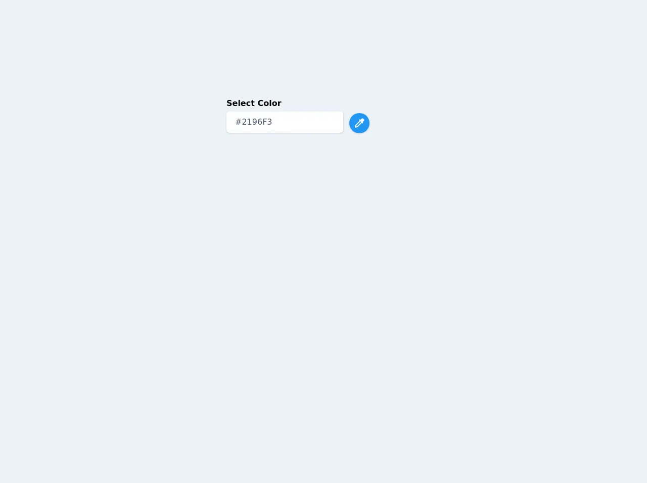
The preview of Color Picker with TailwindCSS and AlpineJS ui component
To create a color picker with TailwindCSS and AlpineJS, we will use a range input to allow users to select a color. We will also use TailwindCSS to style the color picker and AlpineJS to update the color value in real-time.
Free download of the Color Picker with TailwindCSS and AlpineJS's source code
The source code of Color Picker with TailwindCSS and AlpineJS ui component
To create a color picker with TailwindCSS and AlpineJS, we will use HTML, CSS, and JavaScript. We will use a range input to allow users to select a color, and we will use TailwindCSS to style the color picker. We will also use AlpineJS to update the color value in real-time.
<div class="antialiased sans-serif bg-gray-200 py-16 h-screen">
  <link href="https://unpkg.com/tailwindcss@^1.0/dist/tailwind.min.css" rel="stylesheet">
	<script src="https://cdn.jsdelivr.net/gh/alpinejs/[email protected]/dist/alpine.min.js" defer></script>
	<style>
		[x-cloak] {
			display: none;
		}
	</style>
	<div x-data="app()" x-cloak>
		<div class="max-w-sm mx-auto py-16 my-16">

			<div class="mb-5">
				<div class="flex items-center">
					<div>
						<label for="colorSelected" class="block font-bold mb-1">Select Color</label>
						<input id="colorSelected" type="text" placeholder="Pick a color"
							class="border border-transparent shadow px-4 py-2 leading-normal text-gray-700 bg-white rounded-md focus:outline-none focus:shadow-outline"
							readonly
							x-model="colorSelected">
					</div>
					<div class="relative ml-3 mt-8">
						<button type="button" @click="isOpen = !isOpen"
							class="w-10 h-10 rounded-full focus:outline-none focus:shadow-outline inline-flex p-2 shadow"
							:style="`background: ${colorSelected}; color: white`"
						>
							<svg class="w-6 h-6 fill-current" xmlns="http://www.w3.org/2000/svg" viewBox="0 0 24 24"><path fill="none" d="M15.584 10.001L13.998 8.417 5.903 16.512 5.374 18.626 7.488 18.097z"/><path d="M4.03,15.758l-1,4c-0.086,0.341,0.015,0.701,0.263,0.949C3.482,20.896,3.738,21,4,21c0.081,0,0.162-0.01,0.242-0.03l4-1 c0.176-0.044,0.337-0.135,0.465-0.263l8.292-8.292l1.294,1.292l1.414-1.414l-1.294-1.292L21,7.414 c0.378-0.378,0.586-0.88,0.586-1.414S21.378,4.964,21,4.586L19.414,3c-0.756-0.756-2.072-0.756-2.828,0l-2.589,2.589l-1.298-1.296 l-1.414,1.414l1.298,1.296l-8.29,8.29C4.165,15.421,4.074,15.582,4.03,15.758z M5.903,16.512l8.095-8.095l1.586,1.584 l-8.096,8.096l-2.114,0.529L5.903,16.512z"/></svg>
						</button>

						<div x-show="isOpen" @click.away="isOpen = false" x-transition:enter="transition ease-out duration-100 transform"
							x-transition:enter-start="opacity-0 scale-95" x-transition:enter-end="opacity-100 scale-100"
							x-transition:leave="transition ease-in duration-75 transform"
							x-transition:leave-start="opacity-100 scale-100" x-transition:leave-end="opacity-0 scale-95"
							class="origin-top-right absolute right-0 mt-2 w-40 rounded-md shadow-lg">
							<div class="rounded-md bg-white shadow-xs px-4 py-3">
								<div class="flex flex-wrap -mx-2">
								<template x-for="(color, index) in colors" :key="index">
									<div
										class="px-2"
									>
										<template x-if="colorSelected === color">
											<div
												class="w-8 h-8 inline-flex rounded-full cursor-pointer border-4 border-white"
												:style="`background: ${color}; box-shadow: 0 0 0 2px rgba(0, 0, 0, 0.2);`"
											></div>
										</template>

										<template x-if="colorSelected != color">
											<div
												@click="colorSelected = color"
												@keydown.enter="colorSelected = color"
												role="checkbox"
												  tabindex="0"
												  :aria-checked="colorSelected"
												class="w-8 h-8 inline-flex rounded-full cursor-pointer border-4 border-white focus:outline-none focus:shadow-outline"
												:style="`background: ${color};`"
											></div>
										</template>
									</div>
								</template>
							</div>
							</div>
						</div>
					</div>
				</div>
			</div>

		</div>
	</div>

	<script>
		function app() {
			return {
				isOpen: false,
				colors: ['#2196F3', '#009688', '#9C27B0', '#FFEB3B', '#afbbc9', '#4CAF50', '#2d3748', '#f56565', '#ed64a6'],
				colorSelected: '#2196F3'
			}
		}
	</script>
  </div>
How to create a Color Picker with TailwindCSS and AlpineJS with Tailwind CSS?
To create a color picker with TailwindCSS and AlpineJS, follow these steps:
Step 1: Create the HTML markup
The first step is to create the HTML markup for the color picker. We will use a range input to allow users to select a color.
<div x-data="{ color: '#000000' }">
  <input type="range" min="0" max="255" x-model="color" class="bg-gray-300 h-2 w-64 rounded-full">
  <div class="h-10 w-10 rounded-full" :style="'background-color: ' + color"></div>
</div>
Step 2: Add TailwindCSS classes
Next, we will add TailwindCSS classes to style the color picker.
<div x-data="{ color: '#000000' }">
  <input type="range" min="0" max="255" x-model="color" class="bg-gray-300 h-2 w-64 rounded-full">
  <div class="h-10 w-10 rounded-full" :style="'background-color: ' + color"></div>
</div>
Step 3: Add AlpineJS directives
Finally, we will add AlpineJS directives to update the color value in real-time.
<div x-data="{ color: '#000000' }">
  <input type="range" min="0" max="255" x-model="color" class="bg-gray-300 h-2 w-64 rounded-full">
  <div class="h-10 w-10 rounded-full" :style="'background-color: ' + color"></div>
</div>
Conclusion
Creating a color picker with TailwindCSS and AlpineJS is easy and can be customized to fit any web application. By using a range input, TailwindCSS classes, and AlpineJS directives, developers can create a dynamic and interactive color picker that is easy to use and visually appealing.