- Published on
6 Easy Ways To Create A Collapsible Card With Alpine.js With Tailwind CSS
- What is Tailwind CSS?
- The description of Collapsible Card with Alpine.js ui component
- Why use Tailwind CSS to create a Collapsible Card with Alpine.js ui component?
- The preview of Collapsible Card with Alpine.js ui component
- The source code of Collapsible Card with Alpine.js ui component
- Conclusion
What is Tailwind CSS?
Tailwind CSS is a utility-first CSS framework that helps you to create custom designs quickly. It provides a set of pre-defined classes that you can use to style your HTML elements. With Tailwind CSS, you can create responsive designs, customize colors, typography, and more.
The description of Collapsible Card with Alpine.js ui component
Collapsible Card is a UI component that allows you to hide and show content with a toggle button. It is useful when you have a lot of content on a page, and you want to make it more organized and user-friendly. Alpine.js is a lightweight JavaScript framework that helps you to create interactive web applications. It is a great fit for Collapsible Card because it allows you to add dynamic behavior to your HTML elements without writing a lot of JavaScript code.
Why use Tailwind CSS to create a Collapsible Card with Alpine.js ui component?
Tailwind CSS provides a set of pre-defined classes that you can use to style your HTML elements. It makes it easy to create a responsive design without writing a lot of custom CSS code. With Tailwind CSS, you can customize the appearance of your Collapsible Card by changing the color, font size, and other properties. It also works well with Alpine.js because you can use Tailwind CSS classes to toggle the visibility of your content.
The preview of Collapsible Card with Alpine.js ui component
To create a Collapsible Card with Alpine.js and Tailwind CSS, you can use a combination of HTML, CSS, and JavaScript. The result will be a card that contains a header, a toggle button, and a content section. When you click on the toggle button, the content section will expand or collapse.
Free download of the Collapsible Card with Alpine.js's source code
The source code of Collapsible Card with Alpine.js ui component
To create a Collapsible Card with Alpine.js and Tailwind CSS, you can follow these steps:
- Create an HTML structure for your card. It should contain a header, a toggle button, and a content section. You can use the
hiddenclass to hide the content section by default.
<div class="bg-white rounded-lg shadow-md">
  <div class="px-6 py-4">
    <h2 class="text-xl font-bold text-gray-800">Card Title</h2>
  </div>
  <div class="px-6 py-4">
    <button class="bg-gray-300 hover:bg-gray-400 text-gray-800 font-bold py-2 px-4 rounded inline-flex items-center">
      <span>Toggle Content</span>
    </button>
    <div class="mt-4 hidden">
      <p>Lorem ipsum dolor sit amet, consectetur adipiscing elit. Sed non risus. Suspendisse lectus tortor, dignissim sit amet, adipiscing nec, ultricies sed, dolor.</p>
    </div>
  </div>
</div>
- Add Alpine.js to your project by including the script tag in your HTML file.
<script src="https://cdn.jsdelivr.net/npm/[email protected]/dist/alpine.js"></script>
- Add a
x-dataattribute to your card element to initialize the Alpine.js component.
<div class="bg-white rounded-lg shadow-md" x-data="{ isOpen: false }">
- Add a
x-showattribute to your content section to toggle its visibility based on theisOpenvariable.
<div class="mt-4" x-show="isOpen">
  <p>Lorem ipsum dolor sit amet, consectetur adipiscing elit. Sed non risus. Suspendisse lectus tortor, dignissim sit amet, adipiscing nec, ultricies sed, dolor.</p>
</div>
- Add a
@clickattribute to your toggle button to toggle theisOpenvariable.
<button class="bg-gray-300 hover:bg-gray-400 text-gray-800 font-bold py-2 px-4 rounded inline-flex items-center" @click="isOpen = !isOpen">
- Add Tailwind CSS classes to your HTML elements to style them.
<div class="bg-white rounded-lg shadow-md">
  <div class="px-6 py-4">
    <h2 class="text-xl font-bold text-gray-800">Card Title</h2>
  </div>
  <div class="px-6 py-4">
    <button class="bg-gray-300 hover:bg-gray-400 text-gray-800 font-bold py-2 px-4 rounded inline-flex items-center">
      <span>Toggle Content</span>
    </button>
    <div class="mt-4 hidden">
      <p>Lorem ipsum dolor sit amet, consectetur adipiscing elit. Sed non risus. Suspendisse lectus tortor, dignissim sit amet, adipiscing nec, ultricies sed, dolor.</p>
    </div>
  </div>
</div>
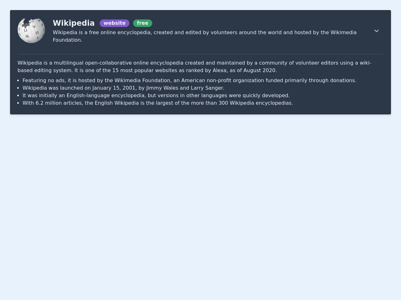
<!-- Collapsible card by Julian Rachele -->
<div class="shadow-md bg-gray-800 text-gray-200 m-8 p-6 rounded" x-data="{open: false}">
    <div class="flex items-center">
      <a href="https://wikipedia.org" class="w-auto h-20 mr-4"><img class="w-auto h-20 mr-4" src="https://upload.wikimedia.org/wikipedia/en/thumb/8/80/Wikipedia-logo-v2.svg/103px-Wikipedia-logo-v2.svg.png"></a>

      <div class="description">
        <div class="flex flex-row items-center">
          <a href="https://wikipedia.org"><h1 class="text-2xl font-semibold mr-4">Wikipedia</h1></a>
          <div class="rounded-full bg-purple-600 text-gray-100 mr-3"><span class="font-semibold p-3">website</span></div>
          <div class="rounded-full bg-green-600 text-gray-100"><span class="font-semibold p-3">free</span></div>
        </div>
        <p>Wikipedia is a free online encyclopedia, created and edited by volunteers around the world and hosted by the Wikimedia Foundation.</p>
      </div>
      <!-- Button for opening card -->
      <div class="ml-4">
        <div @click="open = !open;" class="flex items-center cursor-pointer px-3 py-2 text-gray-200 hover:text-gray-600" :class="{'transform rotate-180': open}">
          <svg class="h-5 w-5" xmlns="http://www.w3.org/2000/svg" fill="none" viewBox="0 0 24 24" stroke="currentColor">
            <path stroke-linecap="round" stroke-linejoin="round" stroke-width="2" d="M19 9l-7 7-7-7" />
          </svg>
        </div>
      </div>
    </div>
    <!-- Collapsed content -->
    <div class="w-full flex flex-col mt-8" :class="{'hidden': !open}">
      <hr class="mb-4 border-gray-700">
      <p>Wikipedia is a multilingual open-collaborative online encyclopedia created and maintained by a community of volunteer editors using a wiki-based editing system. It is one of the 15 most popular websites as ranked by Alexa, as of August 2020. </p>
      <ul class="list-disc ml-4 mt-2">
        <li>Featuring no ads, it is hosted by the Wikimedia Foundation, an American non-profit organization funded primarily through donations.</li>
        <li>Wikipedia was launched on January 15, 2001, by Jimmy Wales and Larry Sanger.</li>
        <li>It was initially an English-language encyclopedia, but versions in other languages were quickly developed.</li>
        <li>With 6.2 million articles, the English Wikipedia is the largest of the more than 300 Wikipedia encyclopedias.</li>
      </ul>
    </div>
 </div>
Conclusion
In this article, we have learned how to create a Collapsible Card with Alpine.js and Tailwind CSS. With these two tools, you can create dynamic and responsive web applications quickly and easily. By following the steps outlined in this article, you can create a Collapsible Card that will make your content more organized and user-friendly.