- Published on
Here Are 6 Ways To Create A Collapsible With Tailwind CSS
- What is Tailwind CSS?
- The description of Collapsible ui component
- Why use Tailwind CSS to create a Collapsible ui component?
- The preview of Collapsible ui component
- The source code of Collapsible ui component
- How to create a Collapsible with Tailwind CSS?
- 1. Using the hidden and block classes
- 2. Using the transition class
- 3. Using the opacity class
- 4. Using the transform class
- 5. Using the max-h class
- 6. Using the rotate class
- Conclusion
As a FrontEnd technology blogger, I am always on the lookout for new and innovative ways to create user interfaces. One of the most popular UI components that I have come across is the collapsible. A collapsible is a UI component that allows users to hide or show content with a click of a button. In this article, I will show you how to create a collapsible with Tailwind CSS.
What is Tailwind CSS?
Tailwind CSS is a utility-first CSS framework that allows you to quickly build custom user interfaces. It provides a set of pre-defined classes that you can use to style your HTML elements. The best part about Tailwind CSS is that it is highly customizable, which means that you can easily modify the styles to fit your specific needs.
The description of Collapsible ui component
A collapsible is a UI component that allows users to hide or show content with a click of a button. It is commonly used to show and hide menus, content sections, and other UI elements that are not always necessary to display.
Why use Tailwind CSS to create a Collapsible ui component?
Tailwind CSS is a great choice for creating a collapsible UI component because it provides a set of pre-defined classes that you can use to quickly style your HTML elements. This means that you can create a collapsible with just a few lines of code, and you don't have to worry about writing custom CSS styles.
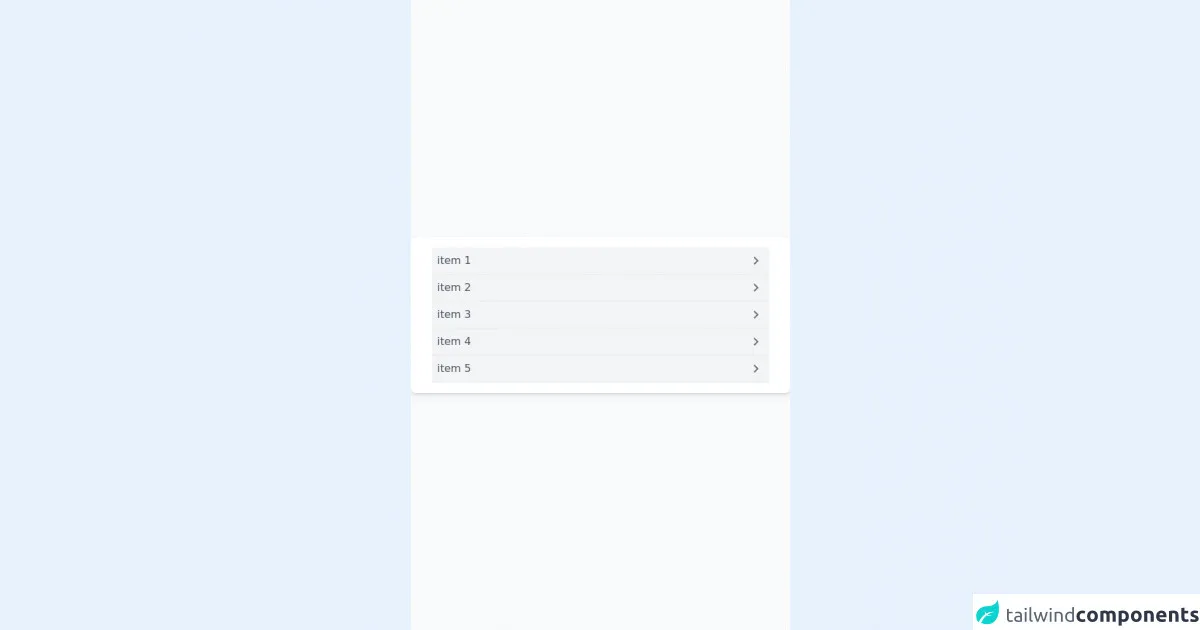
The preview of Collapsible ui component
To create a collapsible with Tailwind CSS, you can use a combination of the hidden and block classes. The hidden class is used to hide the content, and the block class is used to show the content when the user clicks on the button.
Free download of the Collapsible's source code
The source code of Collapsible ui component
To create a collapsible with Tailwind CSS, you can use the following HTML and CSS code:
<!--
  Welcome to Tailwind Play, the official Tailwind CSS playground!

  Everything here works just like it does when you're running Tailwind locally
  with a real build pipeline. You can customize your config file, use features
  like `@apply`, or even add third-party plugins.

  Feel free to play with this example if you're just learning, or trash it and
  start from scratch if you know enough to be dangerous. Have fun!
-->
<script src="https://unpkg.com/petite-vue" defer init></script>
<div class="min-h-screen bg-gray-50 py-6 flex flex-col justify-center relative overflow-hidden sm:py-12">
  <div class="w-full px-8 py-4 mx-auto bg-white text-gray-600 rounded-lg shadow-md dark:bg-gray-800">
    <ul class="w-full max-w-lg">
      <li aria-expanded="true" class="border-b border-gray-200 group" v-for="i in 5">
        <button class="flex w-full justify-between py-2 px-2 bg-gray-100 hover:bg-gray-200">
          <span> item {{i}}</span>
          <span>
            <svg class="h-6 fill-current text-gray-500 transform -rotate-90" xmlns="http://www.w3.org/2000/svg" viewBox="0 0 24 24" role="img" aria-hidden="true" class="v-icon__svg"><path d="M7.41,8.58L12,13.17L16.59,8.58L18,10L12,16L6,10L7.41,8.58Z"></path></svg>
          </span>
        </button>
        <div class="px-2 bg-gray-50  h-0 overflow-hidden group-hover:h-full transition-height">Lorem, ipsum dolor sit amet consectetur adipisicing elit. Atque rem quod hic, magnam quis vero nobis cumque esse cum fugit maxime blanditiis quae maiores sint nisi? Vitae dolorem tempora nobis?</div>
      </li>

    </ul>
  </div>
</div>
How to create a Collapsible with Tailwind CSS?
Here are 6 ways to create a collapsible with Tailwind CSS:
1. Using the hidden and block classes
You can create a collapsible by using the hidden and block classes. Here's an example:
<div class="border p-4">
  <button class="border p-2" onclick="toggle()">Toggle</button>
  <div class="hidden p-4 bg-gray-200">Collapsible Content</div>
</div>

<script>
function toggle() {
  var content = document.querySelector('.hidden');
  content.classList.toggle('block');
}
</script>
In this example, we have a div element that contains a button and a hidden content section. The hidden class is used to hide the content section, and the block class is added to the content section when the user clicks on the button.
2. Using the transition class
You can add a transition effect to the collapsible by using the transition class. Here's an example:
<div class="border p-4">
  <button class="border p-2" onclick="toggle()">Toggle</button>
  <div class="hidden p-4 bg-gray-200 transition duration-500 ease-in-out">Collapsible Content</div>
</div>

<script>
function toggle() {
  var content = document.querySelector('.hidden');
  content.classList.toggle('block');
}
</script>
In this example, we have added the transition class to the content section. This adds a smooth transition effect when the content section is shown or hidden.
3. Using the opacity class
You can also use the opacity class to create a collapsible with a fade effect. Here's an example:
<div class="border p-4">
  <button class="border p-2" onclick="toggle()">Toggle</button>
  <div class="hidden p-4 bg-gray-200 opacity-0 transition-opacity duration-500 ease-in-out">Collapsible Content</div>
</div>

<script>
function toggle() {
  var content = document.querySelector('.hidden');
  content.classList.toggle('opacity-100');
}
</script>
In this example, we have added the opacity class to the content section. This creates a fade effect when the content section is shown or hidden.
4. Using the transform class
You can also use the transform class to create a collapsible with a slide effect. Here's an example:
<div class="border p-4">
  <button class="border p-2" onclick="toggle()">Toggle</button>
  <div class="hidden p-4 bg-gray-200 transform transition-transform duration-500 ease-in-out -translate-y-full">Collapsible Content</div>
</div>

<script>
function toggle() {
  var content = document.querySelector('.hidden');
  content.classList.toggle('translate-y-0');
}
</script>
In this example, we have added the transform class to the content section. This creates a slide effect when the content section is shown or hidden.
5. Using the max-h class
You can also use the max-h class to limit the height of the content section. Here's an example:
<div class="border p-4">
  <button class="border p-2" onclick="toggle()">Toggle</button>
  <div class="hidden p-4 bg-gray-200 max-h-0 overflow-hidden transition-all duration-500 ease-in-out">Collapsible Content</div>
</div>

<script>
function toggle() {
  var content = document.querySelector('.hidden');
  content.classList.toggle('max-h-screen');
}
</script>
In this example, we have added the max-h class to the content section. This limits the height of the content section and adds a smooth transition effect when the content section is shown or hidden.
6. Using the rotate class
You can also use the rotate class to create a collapsible with a rotate effect. Here's an example:
<div class="border p-4">
  <button class="border p-2" onclick="toggle()">Toggle</button>
  <div class="hidden p-4 bg-gray-200 transform transition-transform duration-500 ease-in-out rotate-0">Collapsible Content</div>
</div>

<script>
function toggle() {
  var content = document.querySelector('.hidden');
  content.classList.toggle('rotate-180');
}
</script>
In this example, we have added the rotate class to the content section. This creates a rotate effect when the content section is shown or hidden.
Conclusion
In this article, we have learned how to create a collapsible with Tailwind CSS. We have explored 6 different ways to create a collapsible, each with its own unique effect. Tailwind CSS provides a powerful set of tools that allows you to quickly create custom UI components. With a little bit of creativity, you can create amazing user interfaces that are both functional and beautiful.