- Published on
Surprisingly Effective Ways To Make A Avatar Upload With Tailwind CSS
- What is Tailwind CSS?
- The description of Avatar Upload UI component
- Why use Tailwind CSS to create an Avatar Upload UI component?
- The preview of Avatar Upload UI component
- The source code of Avatar Upload UI component
- How to create an Avatar Upload with Tailwind CSS?
- Conclusion
As a FrontEnd technology blogger, it is important to stay up-to-date with the latest tools and techniques. One such tool that has gained immense popularity in recent years is Tailwind CSS. With its utility-first approach, Tailwind CSS makes it easy to create complex UI components with minimal effort. In this article, we will explore how to create an Avatar Upload UI component with Tailwind CSS.
What is Tailwind CSS?
Tailwind CSS is a utility-first CSS framework that provides a set of pre-defined classes to style HTML elements. It is designed to make it easy to create complex UI components without writing custom CSS. With Tailwind CSS, you can create responsive designs, customize colors, and typography, and much more.
The description of Avatar Upload UI component
An Avatar Upload UI component is a user interface element that allows users to upload an image or select an avatar from a list of predefined avatars. It is commonly used in social media applications, online forums, and chat applications. The Avatar Upload UI component typically consists of a preview of the selected avatar, a file input field, and a button to upload the selected image.
Why use Tailwind CSS to create an Avatar Upload UI component?
Tailwind CSS provides a set of pre-defined classes that can be used to create complex UI components with minimal effort. It also provides responsive design utilities that allow you to create UI components that work well on different screen sizes. With Tailwind CSS, you can customize the colors, typography, and layout of your UI components without writing custom CSS.
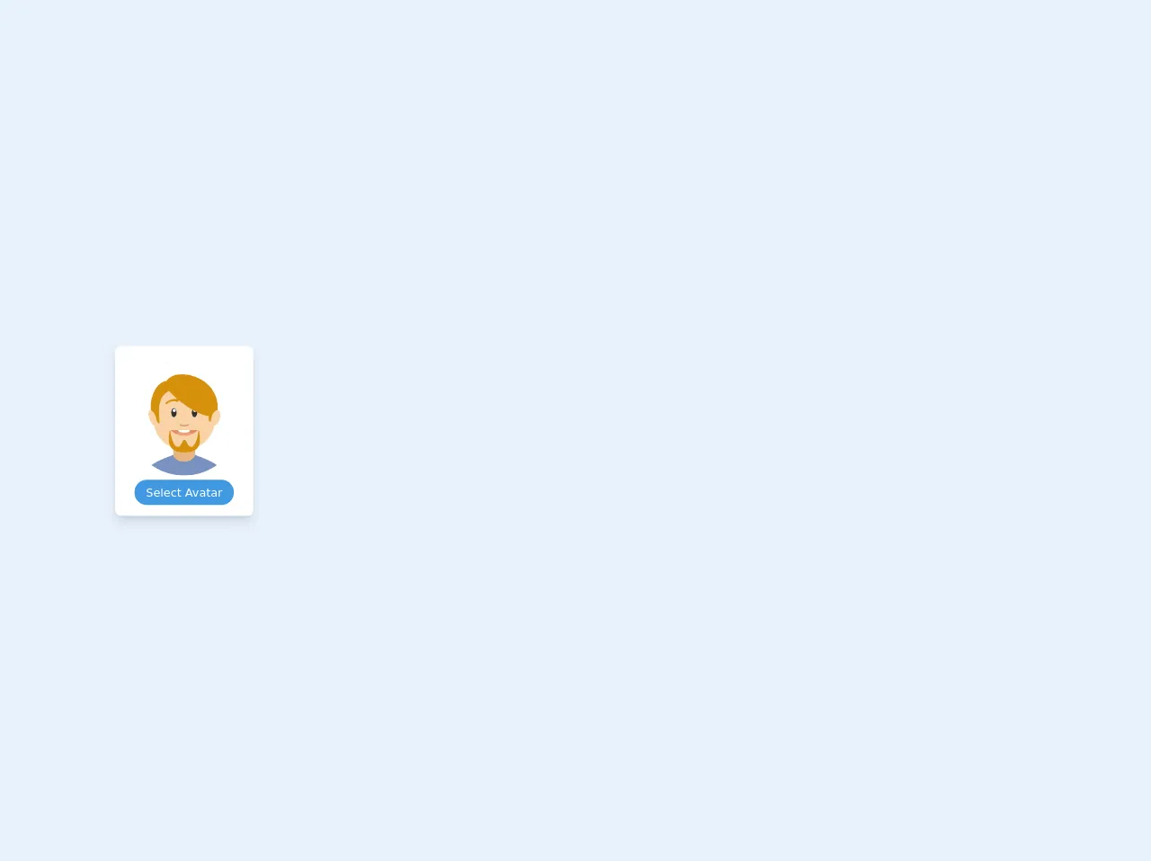
The preview of Avatar Upload UI component
To create an Avatar Upload UI component with Tailwind CSS, we will use a combination of HTML and CSS. Here is a preview of what the Avatar Upload UI component will look like:
Free download of the Avatar Upload's source code
The source code of Avatar Upload UI component
To create the Avatar Upload UI component, we will use a combination of HTML and Tailwind CSS classes. Here is the source code for the Avatar Upload UI component:
<div class="py-3 center mx-auto">
    <div class="bg-white px-4 py-5 rounded-lg shadow-lg text-center w-48">
      <div class="mb-4">
        <img class="w-auto mx-auto rounded-full object-cover object-center" src="https://i1.pngguru.com/preview/137/834/449/cartoon-cartoon-character-avatar-drawing-film-ecommerce-facial-expression-png-clipart.jpg" alt="Avatar Upload" />
      </div>
      <label class="cursor-pointer mt-6">
        <span class="mt-2 text-base leading-normal px-4 py-2 bg-blue-500 text-white text-sm rounded-full" >Select Avatar</span>
        <input type='file' class="hidden" :multiple="multiple" :accept="accept" />
      </label>
    </div>
  </div>
How to create an Avatar Upload with Tailwind CSS?
To create an Avatar Upload UI component with Tailwind CSS, follow these steps:
- Create a new HTML file and add the following code:
<div class="flex flex-col items-center justify-center">
  <div class="w-full max-w-xs">
    <div class="bg-white shadow-md rounded px-8 pt-6 pb-8 mb-4">
      <div class="mb-4">
        <img class="w-32 h-32 rounded-full mx-auto" src="https://via.placeholder.com/150" alt="avatar preview">
      </div>
      <div class="mb-4">
        <label class="block text-gray-700 text-sm font-bold mb-2" for="avatar">
          Avatar
        </label>
        <input class="shadow appearance-none border rounded w-full py-2 px-3 text-gray-700 leading-tight focus:outline-none focus:shadow-outline" id="avatar" type="file">
      </div>
      <div class="flex items-center justify-between">
        <button class="bg-blue-500 hover:bg-blue-700 text-white font-bold py-2 px-4 rounded focus:outline-none focus:shadow-outline" type="button">
          Upload
        </button>
        <button class="bg-red-500 hover:bg-red-700 text-white font-bold py-2 px-4 rounded focus:outline-none focus:shadow-outline" type="button">
          Cancel
        </button>
      </div>
    </div>
  </div>
</div>
Save the file and open it in a web browser. You should see the Avatar Upload UI component.
Customize the Avatar Upload UI component by modifying the Tailwind CSS classes. For example, you can change the background color of the component by modifying the
bg-whiteclass.Test the Avatar Upload UI component by uploading an image and clicking the Upload button.
Conclusion
In this article, we explored how to create an Avatar Upload UI component with Tailwind CSS. Tailwind CSS provides a set of pre-defined classes that can be used to create complex UI components with minimal effort. With Tailwind CSS, you can customize the colors, typography, and layout of your UI components without writing custom CSS. By following the steps outlined in this article, you can create an Avatar Upload UI component that is both functional and visually appealing.