- Published on
Best Ways To Create A Design Laboratory With Tailwind CSS
- What is Tailwind CSS?
- The description of Design Laboratory ui component
- Why use Tailwind CSS to create a Design Laboratory ui component?
- The preview of Design Laboratory ui component
- The source code of Design Laboratory ui component
- How to create a Design Laboratory with Tailwind CSS?
- Conclusion
Are you looking for a way to create a beautiful and functional design laboratory using Tailwind CSS? Look no further! In this article, we will explore the best ways to create a design laboratory with Tailwind CSS.
What is Tailwind CSS?
Tailwind CSS is a utility-first CSS framework that allows you to quickly and easily create beautiful and functional user interfaces. It provides a set of pre-defined classes that you can use to style your HTML elements without having to write any CSS code.
The description of Design Laboratory ui component
A design laboratory is a web application that allows designers to create and test different design elements, such as color schemes, typography, and layout. It is an essential tool for designers who want to create beautiful and functional user interfaces.
Why use Tailwind CSS to create a Design Laboratory ui component?
Tailwind CSS is an excellent choice for creating a design laboratory ui component for several reasons:
- It provides a set of pre-defined classes that you can use to style your HTML elements without having to write any CSS code.
- It is highly customizable, allowing you to create a unique design laboratory that fits your specific needs.
- It is easy to learn, even for beginners, thanks to its intuitive syntax and extensive documentation.
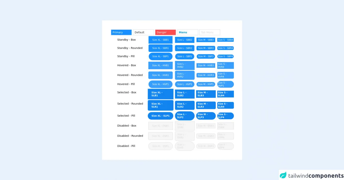
The preview of Design Laboratory ui component
To give you an idea of what a design laboratory ui component created with Tailwind CSS might look like, here is a preview:
Free download of the Design Laboratory's source code
The source code of Design Laboratory ui component
If you're interested in seeing the source code for a design laboratory ui component created with Tailwind CSS, here is an example:
<nav
        class="flex items-center justify-between flex-wrap bg-white py-4 lg:px-12 shadow border-solid border-t-2 border-blue-700">
        <div class="flex justify-between lg:w-auto w-full lg:border-b-0 pl-6 pr-2 border-solid border-b-2 border-gray-300 pb-5 lg:pb-0">
            <div class="flex items-center flex-shrink-0 text-gray-800 mr-16">
                <span class="font-semibold text-xl tracking-tight">My Navbar</span>
            </div>
            <div class="block lg:hidden ">
                <button
                    id="nav"
                    class="flex items-center px-3 py-2 border-2 rounded text-blue-700 border-blue-700 hover:text-blue-700 hover:border-blue-700">
                    <svg class="fill-current h-3 w-3" viewBox="0 0 20 20" xmlns="http://www.w3.org/2000/svg"><title>Menu</title>
                        <path d="M0 3h20v2H0V3zm0 6h20v2H0V9zm0 6h20v2H0v-2z"/>
                    </svg>
                </button>
            </div>
        </div>

        <div class="menu w-full lg:block flex-grow lg:flex lg:items-center lg:w-auto lg:px-3 px-8">
            <div class="text-md font-bold text-blue-700 lg:flex-grow">
                <a href="#responsive-header"
                   class="block mt-4 lg:inline-block lg:mt-0 hover:text-white px-4 py-2 rounded hover:bg-blue-700 mr-2">
                    Menu 1
                </a>
                <a href="#responsive-header"
                   class=" block mt-4 lg:inline-block lg:mt-0 hover:text-white px-4 py-2 rounded hover:bg-blue-700 mr-2">
                    Menu 2
                </a>
                <a href="#responsive-header"
                   class="block mt-4 lg:inline-block lg:mt-0 hover:text-white px-4 py-2 rounded hover:bg-blue-700 mr-2">
                    Menu 3
                </a>
            </div>
            <!-- This is an example component -->
            <div class="relative mx-auto text-gray-600 lg:block hidden">
                <input
                    class="border-2 border-gray-300 bg-white h-10 pl-2 pr-8 rounded-lg text-sm focus:outline-none"
                    type="search" name="search" placeholder="Search">
                <button type="submit" class="absolute right-0 top-0 mt-3 mr-2">
                    <svg class="text-gray-600 h-4 w-4 fill-current" xmlns="http://www.w3.org/2000/svg"
                         version="1.1" id="Capa_1" x="0px" y="0px"
                         viewBox="0 0 56.966 56.966" style="enable-background:new 0 0 56.966 56.966;"
                         xml:space="preserve"
                         width="512px" height="512px">
                <path
                    d="M55.146,51.887L41.588,37.786c3.486-4.144,5.396-9.358,5.396-14.786c0-12.682-10.318-23-23-23s-23,10.318-23,23  s10.318,23,23,23c4.761,0,9.298-1.436,13.177-4.162l13.661,14.208c0.571,0.593,1.339,0.92,2.162,0.92  c0.779,0,1.518-0.297,2.079-0.837C56.255,54.982,56.293,53.08,55.146,51.887z M23.984,6c9.374,0,17,7.626,17,17s-7.626,17-17,17  s-17-7.626-17-17S14.61,6,23.984,6z"/>
              </svg>
                </button>
            </div>
            <div class="flex ">
                <a href="#"
                   class="block text-md px-4 py-2 rounded text-blue-700 ml-2 font-bold hover:text-white mt-4 hover:bg-blue-700 lg:mt-0">Sign
                    in</a>

                <a href="#"
                   class=" block text-md px-4  ml-2 py-2 rounded text-blue-700 font-bold hover:text-white mt-4 hover:bg-blue-700 lg:mt-0">login</a>
            </div>
        </div>

    </nav>
How to create a Design Laboratory with Tailwind CSS?
Creating a design laboratory with Tailwind CSS is relatively straightforward. Here are the steps you can follow:
- Set up your development environment. You will need a text editor, a browser, and a local server to get started.
- Create a new HTML file and add the necessary HTML structure.
- Link to the Tailwind CSS stylesheet in the head section of your HTML file.
- Add the necessary HTML elements to create your design laboratory ui component.
- Use Tailwind CSS classes to style your HTML elements.
- Test your design laboratory in your browser and make any necessary adjustments.
Conclusion
Creating a design laboratory with Tailwind CSS is an excellent way to improve your design skills and create beautiful and functional user interfaces. With its intuitive syntax, extensive documentation, and pre-defined classes, Tailwind CSS makes it easy to create a unique design laboratory that fits your specific needs. So why not give it a try today?