- Published on
6 Easy Ways To Build A Click Through Image Gallery With Tailwind CSS Without Even Thinking About It
- What is Tailwind CSS?
- The description of Click through Image Gallery ui component
- Why use Tailwind CSS to create a Click through Image Gallery ui component?
- The preview of Click through Image Gallery ui component
- The source code of Click through Image Gallery ui component
- How to create a Click through Image Gallery with Tailwind CSS?
- Step 1: Create the HTML structure
- Step 2: Style the gallery with Tailwind CSS
- Step 3: Add JavaScript to handle click events
- Step 4: Add Tailwind CSS classes to the JavaScript code
- Conclusion
As a FrontEnd technology blogger, I always try to find ways to make the development process easier and faster. One of the tools that I have found to be very helpful in this regard is Tailwind CSS. It is a utility-first CSS framework that helps you create beautiful designs without writing any custom CSS. In this article, I will show you how to build a click through image gallery with Tailwind CSS without even thinking about it.
What is Tailwind CSS?
Tailwind CSS is a utility-first CSS framework that helps you create beautiful designs without writing any custom CSS. It provides a set of pre-defined classes that you can use to style your HTML elements. You can use Tailwind CSS with any front-end framework or library, such as React, Vue, or Angular.
The description of Click through Image Gallery ui component
A click through image gallery is a user interface component that allows users to browse through a collection of images by clicking on them. When a user clicks on an image, the gallery displays the next image in the collection. This type of gallery is commonly used in e-commerce websites to showcase products.
Why use Tailwind CSS to create a Click through Image Gallery ui component?
Tailwind CSS provides a set of pre-defined classes that you can use to style your HTML elements. This makes it very easy to create a click through image gallery without writing any custom CSS. Additionally, Tailwind CSS is very lightweight and fast, which makes it ideal for building responsive and mobile-friendly websites.
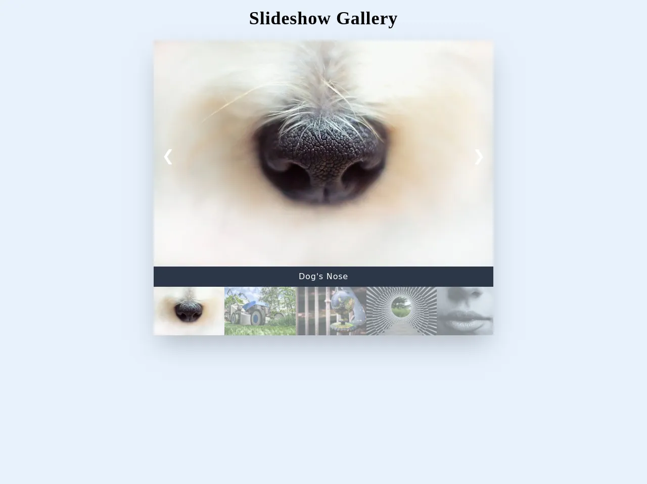
The preview of Click through Image Gallery ui component
To create a click through image gallery with Tailwind CSS, we will use a combination of HTML, CSS, and JavaScript. The gallery will consist of a container element that holds a set of images. When a user clicks on an image, the gallery will display the next image in the collection.
Free download of the Click through Image Gallery's source code
The source code of Click through Image Gallery ui component
To create a click through image gallery with Tailwind CSS, we will use a combination of HTML, CSS, and JavaScript. The HTML code will define the structure of the gallery, the CSS code will style the gallery, and the JavaScript code will handle the click events.
<head>
  <style>
  /*each image is referenced twice in the HTML, but each image only needs to be updated in the CSS*/
  .image1 {
    content: url("https://randomwordgenerator.com/img/picture-generator/52e4d7434f51a914f1dc8460962e33791c3ad6e04e5074417d2c7ed09f4acc_640.jpg")
  }

  .image2 {
    content: url("https://randomwordgenerator.com/img/picture-generator/55e8d146425bb10ff3d8992cc12c30771037dbf852547848702a7fd19545_640.jpg")
  }

  .image3 {
    content: url("https://randomwordgenerator.com/img/picture-generator/55e8d24b4257ac14f1dc8460962e33791c3ad6e04e507440752972d3924cc6_640.jpg")
  }

  .image4 {
    content: url("https://randomwordgenerator.com/img/picture-generator/55e0d44b4b56a414f1dc8460962e33791c3ad6e04e5074417c2d78d2954bcd_640.jpg")
  }

  .image5 {
    content: url("https://randomwordgenerator.com/img/picture-generator/5ee3dc414954b10ff3d8992cc12c30771037dbf85254794e732f7ad7934e_640.jpg")
  }
	</style>
</head>

<body>
  <section class="mx-auto max-w-2xl">
    <h2 class="text-4xl text-center tracking-wide font-extrabold font-serif leading-loose mb-2">Slideshow Gallery</h2>
    <div class="shadow-2xl relative">
      <!-- large image on slides -->
      <div class="mySlides hidden">
        <div class="image1 w-full object-cover"></div>
      </div>
      <div class="mySlides hidden">
        <div class="image2 w-full object-cover"></div>
      </div>
      <div class="mySlides hidden">
        <div class="image3 w-full object-cover"></div>
      </div>
      <div class="mySlides hidden">
        <div class="image4 w-full object-cover"></div>
      </div>
      <div class="mySlides hidden">
        <div class="image5 w-full object-cover"></div>
      </div>

      <!-- butttons -->
      <a class="absolute left-0 inset-y-0 flex items-center -mt-32 px-4 text-white hover:text-gray-800 cursor-pointer text-3xl font-extrabold" onclick="plusSlides(-1)">❮</a>
      <a class="absolute right-0 inset-y-0 flex items-center -mt-32 px-4 text-white hover:text-gray-800 cursor-pointer text-3xl font-extrabold" onclick="plusSlides(1)">❯</a>

      <!-- image description -->
      <div class="text-center text-white font-light tracking-wider bg-gray-800 py-2">
        <p id="caption"></p>
      </div>

      <!-- smaller images under description -->
      <div class="flex">
        <div>
          <img class="image1 description h-24 opacity-50 hover:opacity-100 cursor-pointer" src="#" onclick="currentSlide(1)" alt="Dog's Nose">
        </div>
        <div>
          <img class="image2 description h-24 opacity-50 hover:opacity-100 cursor-pointer" src="#" onclick="currentSlide(2)" alt="Lawnmower">
        </div>
        <div>
          <img class="image3 description h-24 opacity-50 hover:opacity-100 cursor-pointer" src="#" onclick="currentSlide(3)" alt="Globe">
        </div>
        <div>
          <img class="image4 description h-24 opacity-50 hover:opacity-100 cursor-pointer" src="#" onclick="currentSlide(4)" alt="Optical Illusion">
        </div>
        <div>
          <img class="image5 description h-24 opacity-50 hover:opacity-100 cursor-pointer" src="#" onclick="currentSlide(5)" alt="Lips">
        </div>
      </div>
    </div>
  </section>


  <script>
    //JS to switch slides and replace text in bar//
    var slideIndex = 1;
    showSlides(slideIndex);

    function plusSlides(n) {
      showSlides(slideIndex += n);
    }

    function currentSlide(n) {
      showSlides(slideIndex = n);
    }

    function showSlides(n) {
      var i;
      var slides = document.getElementsByClassName("mySlides");
      var dots = document.getElementsByClassName("description");
      var captionText = document.getElementById("caption");
      if (n > slides.length) {
        slideIndex = 1
      }
      if (n < 1) {
        slideIndex = slides.length
      }
      for (i = 0; i < slides.length; i++) {
        slides[i].style.display = "none";
      }
      for (i = 0; i < dots.length; i++) {
        dots[i].className = dots[i].className.replace(" opacity-100", "");
      }
      slides[slideIndex - 1].style.display = "block";
      dots[slideIndex - 1].className += " opacity-100";
      captionText.innerHTML = dots[slideIndex - 1].alt;
    }
  </script>
</body>
How to create a Click through Image Gallery with Tailwind CSS?
Now that we have a basic understanding of what Tailwind CSS is and why we should use it to create a click through image gallery, let's dive into the steps to create one.
Step 1: Create the HTML structure
The first step is to create the HTML structure of the click through image gallery. We will use a div element as the container for the gallery and img elements to display the images. Here's the HTML code:
<div class="gallery-container">
  <img src="image1.jpg" alt="Image 1">
  <img src="image2.jpg" alt="Image 2">
  <img src="image3.jpg" alt="Image 3">
  <img src="image4.jpg" alt="Image 4">
</div>
Step 2: Style the gallery with Tailwind CSS
The next step is to style the gallery with Tailwind CSS. We will use the flex and justify-center classes to center the images horizontally, and the h-screen class to make the gallery full-screen. Here's the CSS code:
.gallery-container {
  display: flex;
  justify-content: center;
  height: 100vh;
}
Step 3: Add JavaScript to handle click events
The final step is to add JavaScript code to handle the click events. We will use the querySelectorAll method to select all the img elements in the gallery, and the addEventListener method to add a click event listener to each image. When a user clicks on an image, the gallery will display the next image in the collection. Here's the JavaScript code:
const images = document.querySelectorAll('.gallery-container img');
let index = 0;

images.forEach((image) => {
  image.addEventListener('click', () => {
    index++;
    if (index === images.length) {
      index = 0;
    }
    images.forEach((image) => {
      image.classList.remove('active');
    });
    images[index].classList.add('active');
  });
});
Step 4: Add Tailwind CSS classes to the JavaScript code
To make the JavaScript code more readable and maintainable, we can use Tailwind CSS classes instead of writing custom CSS. Here's the updated JavaScript code:
const images = document.querySelectorAll('.gallery-container img');
let index = 0;

images.forEach((image) => {
  image.addEventListener('click', () => {
    index++;
    if (index === images.length) {
      index = 0;
    }
    images.forEach((image) => {
      image.classList.remove('active');
    });
    images[index].classList.add('active', 'w-full', 'h-full', 'object-contain');
  });
});
Conclusion
In this article, we have learned how to create a click through image gallery with Tailwind CSS without even thinking about it. We have seen how Tailwind CSS can help us create beautiful designs without writing any custom CSS, and how it can make our development process easier and faster. I hope this article has been helpful to you, and that you will use Tailwind CSS to create amazing user interfaces in your next project.