- Published on
What You Need To Make A Circular Progress Bar With Tailwind CSS
- What is Tailwind CSS?
- The description of Circular Progress Bar ui component
- Why use Tailwind CSS to create a Circular Progress Bar ui component?
- The preview of Circular Progress Bar ui component
- The source code of Circular Progress Bar ui component
- How to create a Circular Progress Bar with Tailwind CSS?
- Conclusion
What is Tailwind CSS?
Tailwind CSS is a utility-first CSS framework that provides a set of pre-defined CSS classes to create responsive and customizable user interfaces. It is designed to speed up the development process by providing a consistent set of styles that can be easily customized to fit the design requirements of any project.
The description of Circular Progress Bar ui component
A circular progress bar is a UI component that displays the progress of a task in a circular shape. It is commonly used in web and mobile applications to indicate the progress of a file upload, download, or installation process. The circular progress bar consists of a circular track and a circular indicator that moves along the track to indicate the progress of the task.
Why use Tailwind CSS to create a Circular Progress Bar ui component?
Tailwind CSS provides a set of pre-defined CSS classes that can be used to create a circular progress bar with minimal effort. It also allows for customization of the progress bar's color, size, and animation, making it a flexible solution for any project.
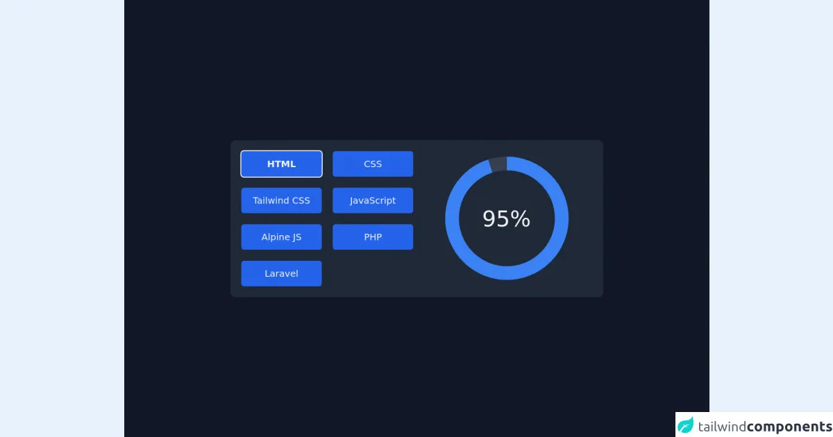
The preview of Circular Progress Bar ui component
To create a circular progress bar with Tailwind CSS, we will use the border and border- classes to create the circular track and the animate- classes to animate the progress indicator.
Free download of the Circular Progress Bar's source code
The source code of Circular Progress Bar ui component
To create a circular progress bar with Tailwind CSS, we will use the following HTML and CSS code:
<script defer src="https://unpkg.com/[email protected]/dist/cdn.min.js"></script>

<main class="grid w-full min-h-screen text-gray-100 bg-gray-900 place-content-center">

    <section x-data="skillDisplay"
        class="p-6 space-y-6 bg-gray-800 rounded-xl md:grid md:grid-cols-2 md:gap-4 sm:space-y-0">
        <div class="grid grid-cols-2 gap-6">
            <template x-for="skill in skills">
                <button x-text="skill.title"
                    class="px-4 py-2 text-xl text-gray-100 transition bg-blue-600 rounded-md h-14 w-44 hover:bg-blue-700"
                    :class="(currentSkill.title == skill.title) && 'font-bold ring-2 ring-gray-100'"
                    @click="currentSkill = skill"></button>
            </template>
        </div>

        <div class="flex items-center justify-center" x-data="{ circumference: 2 * 22 / 7 * 120 }">
            <svg class="transform -rotate-90 w-72 h-72">
                <circle cx="145" cy="145" r="120" stroke="currentColor" stroke-width="30" fill="transparent"
                    class="text-gray-700" />

                <circle cx="145" cy="145" r="120" stroke="currentColor" stroke-width="30" fill="transparent"
                    :stroke-dasharray="circumference"
                    :stroke-dashoffset="circumference - currentSkill.percent / 100 * circumference"
                    class="text-blue-500 " />
            </svg>
            <span class="absolute text-5xl" x-text="`${currentSkill.percent}%`"></span>
    </section>
</main>

<script>
    document.addEventListener('alpine:init', () => {
        Alpine.data('skillDisplay', () => ({
            skills: [{
                    'title': 'HTML',
                    'percent': '95',
                },
                {
                    'title': 'CSS',
                    'percent': '70',
                },
                {
                    'title': 'Tailwind CSS',
                    'percent': '90',
                },
                {
                    'title': 'JavaScript',
                    'percent': '70',
                },
                {
                    'title': 'Alpine JS',
                    'percent': '80',
                }, {
                    'title': 'PHP',
                    'percent': '65',
                }, {
                    'title': 'Laravel',
                    'percent': '75',
                }
            ],
            currentSkill: {
                'title': 'HTML',
                'percent': '95',
            }
        }));
    });
</script>
How to create a Circular Progress Bar with Tailwind CSS?
To create a circular progress bar with Tailwind CSS, follow these steps:
- Create a container element for the progress bar.
<div class="relative w-24 h-24">
  <!-- Progress bar elements will go here -->
</div>
- Create the circular track using the
borderclass.
<div class="relative w-24 h-24">
  <div class="absolute inset-0 rounded-full bg-gray-200"></div>
  <!-- Progress bar elements will go here -->
</div>
- Create the progress indicator using the
borderclass and theanimate-classes.
<div class="relative w-24 h-24">
  <div class="absolute inset-0 rounded-full bg-gray-200"></div>
  <div class="absolute inset-0 rounded-full bg-blue-500 border-t-4 border-blue-600 transform -rotate-90 origin-center"></div>
</div>
- Add the
animate-spinclass to animate the progress indicator.
<div class="relative w-24 h-24">
  <div class="absolute inset-0 rounded-full bg-gray-200"></div>
  <div class="absolute inset-0 rounded-full bg-blue-500 border-t-4 border-blue-600 transform -rotate-90 origin-center animate-spin"></div>
</div>
- Customize the progress bar's color, size, and animation as needed using Tailwind CSS classes.
<div class="relative w-24 h-24">
  <div class="absolute inset-0 rounded-full bg-gray-200"></div>
  <div class="absolute inset-0 rounded-full bg-green-500 border-t-4 border-green-600 transform -rotate-90 origin-center animate-pulse"></div>
</div>
Conclusion
Creating a circular progress bar with Tailwind CSS is a simple and effective way to display the progress of a task in a visually appealing way. With Tailwind CSS's pre-defined CSS classes and customization options, it is easy to create a progress bar that fits the design requirements of any project.