- Published on
Ultimate Guide: Build A Circular Progress Bar With Tailwind CSS
- What is Tailwind CSS?
- The description of Circular progress bar UI component
- Why use Tailwind CSS to create a Circular progress bar UI component?
- The preview of Circular progress bar UI component
- The source code of Circular progress bar UI component
- How to create a Circular progress bar with Tailwind CSS?
- Step 1: Create the HTML structure
- Step 2: Style the progress bar with CSS and Tailwind CSS
- Step 3: Customize the progress bar with Tailwind CSS
- Conclusion
In this article, we will be discussing how to create a circular progress bar UI component with Tailwind CSS. We will provide a brief introduction to Tailwind CSS, explain what a circular progress bar is, and why Tailwind CSS is the best tool to use for creating this component. We will also provide a preview of the component, the source code, and a step-by-step guide on how to create it.
What is Tailwind CSS?
Tailwind CSS is a utility-first CSS framework that provides a set of pre-defined CSS classes that can be used to style HTML elements. It is designed to help developers build responsive and customizable user interfaces quickly and easily. With Tailwind CSS, you can create complex layouts and designs without writing any custom CSS.
The description of Circular progress bar UI component
A circular progress bar is a UI component that displays the progress of a task in a circular shape. It is commonly used in web and mobile applications to show the progress of file uploads, form submissions, or any other task that requires user feedback.
Why use Tailwind CSS to create a Circular progress bar UI component?
Tailwind CSS provides a set of pre-defined classes that can be used to style HTML elements. This makes it easy to create a circular progress bar UI component without writing any custom CSS. Tailwind CSS also provides responsive design classes that can be used to make the progress bar look good on different screen sizes.
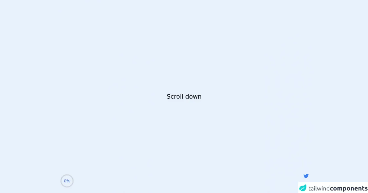
The preview of Circular progress bar UI component
To create a circular progress bar UI component, we will be using Tailwind CSS. The progress bar will be displayed in a circular shape, and the progress will be indicated by a colored arc that fills up the circle.
Free download of the Circular progress bar's source code
The source code of Circular progress bar UI component
To create the circular progress bar UI component, we will be using HTML, CSS, and Tailwind CSS. The HTML will be used to create the circular shape, and the CSS will be used to style the progress bar. We will also be using Tailwind CSS classes to make the progress bar responsive and customizable.
<script src="https://cdnjs.cloudflare.com/ajax/libs/alpinejs/3.2.2/cdn.js" defer></script>

<style>
    .container {
        height: 400vh;
    }
</style>

<div class="container">
    <!-- Top bar -->
    <div x-data="scrollProgress" class="fixed inset-x-0 top-0 z-50">
        <div class="h-1 bg-blue-500" :style="`width: ${percent}%`"></div>
    </div>

    <main class="w-scrren min-h-screen flex items-center justify-center">
      <h1 class="text-3xl font-medium">Scroll down</h1>
    </main>

    <!-- Circle -->
    <div
      x-data="scrollProgress"
      class="fixed inline-flex items-center justify-center overflow-hidden rounded-full bottom-5 left-5"
    >
      <!-- Building a Progress Ring: https://css-tricks.com/building-progress-ring-quickly/ -->
      <svg class="w-20 h-20">
        <circle
          class="text-gray-300"
          stroke-width="5"
          stroke="currentColor"
          fill="transparent"
          r="30"
          cx="40"
          cy="40"
        />
        <circle
          class="text-blue-600"
          stroke-width="5"
          :stroke-dasharray="circumference"
          :stroke-dashoffset="circumference - percent / 100 * circumference"
          stroke-linecap="round"
          stroke="currentColor"
          fill="transparent"
          r="30"
          cx="40"
          cy="40"
        />
      </svg>
      <span class="absolute text-xl text-blue-700" x-text="`${percent}%`"></span>
    </div>

    <!-- Social links -->
    <div class="fixed flex flex-col items-center space-y-4 bottom-5 right-5">
      <a href="https://twitter.com/ak_kamona" target="_blank" class="transition-transform transform hover:scale-125">
        <span class="sr-only">Twitter</span>
        <svg
          aria-hidden="true"
          class="w-8 h-8 text-blue-500"
          fill="currentColor"
          xmlns="http://www.w3.org/2000/svg"
          viewBox="0 0 24 24"
        >
          <path
            d="M19.633,7.997c0.013,0.175,0.013,0.349,0.013,0.523c0,5.325-4.053,11.461-11.46,11.461c-2.282,0-4.402-0.661-6.186-1.809 c0.324,0.037,0.636,0.05,0.973,0.05c1.883,0,3.616-0.636,5.001-1.721c-1.771-0.037-3.255-1.197-3.767-2.793 c0.249,0.037,0.499,0.062,0.761,0.062c0.361,0,0.724-0.05,1.061-0.137c-1.847-0.374-3.23-1.995-3.23-3.953v-0.05 c0.537,0.299,1.16,0.486,1.82,0.511C3.534,9.419,2.823,8.184,2.823,6.787c0-0.748,0.199-1.434,0.548-2.032 c1.983,2.443,4.964,4.04,8.306,4.215c-0.062-0.3-0.1-0.611-0.1-0.923c0-2.22,1.796-4.028,4.028-4.028 c1.16,0,2.207,0.486,2.943,1.272c0.91-0.175,1.782-0.512,2.556-0.973c-0.299,0.935-0.936,1.721-1.771,2.22 c0.811-0.088,1.597-0.312,2.319-0.624C21.104,6.712,20.419,7.423,19.633,7.997z"
          ></path>
        </svg>
      </a>
      <a href="https://github.com/Kamona-WD" target="_blank" class="transition-transform transform hover:scale-125">
        <span class="sr-only">Github</span>
        <svg
          aria-hidden="true"
          class="w-8 h-8 text-black"
          fill="currentColor"
          xmlns="http://www.w3.org/2000/svg"
          viewBox="0 0 24 24"
        >
          <path
            fill-rule="evenodd"
            clip-rule="evenodd"
            d="M12.026,2c-5.509,0-9.974,4.465-9.974,9.974c0,4.406,2.857,8.145,6.821,9.465 c0.499,0.09,0.679-0.217,0.679-0.481c0-0.237-0.008-0.865-0.011-1.696c-2.775,0.602-3.361-1.338-3.361-1.338 c-0.452-1.152-1.107-1.459-1.107-1.459c-0.905-0.619,0.069-0.605,0.069-0.605c1.002,0.07,1.527,1.028,1.527,1.028 c0.89,1.524,2.336,1.084,2.902,0.829c0.091-0.645,0.351-1.085,0.635-1.334c-2.214-0.251-4.542-1.107-4.542-4.93 c0-1.087,0.389-1.979,1.024-2.675c-0.101-0.253-0.446-1.268,0.099-2.64c0,0,0.837-0.269,2.742,1.021 c0.798-0.221,1.649-0.332,2.496-0.336c0.849,0.004,1.701,0.115,2.496,0.336c1.906-1.291,2.742-1.021,2.742-1.021 c0.545,1.372,0.203,2.387,0.099,2.64c0.64,0.696,1.024,1.587,1.024,2.675c0,3.833-2.33,4.675-4.552,4.922 c0.355,0.308,0.675,0.916,0.675,1.846c0,1.334-0.012,2.41-0.012,2.737c0,0.267,0.178,0.577,0.687,0.479 C19.146,20.115,22,16.379,22,11.974C22,6.465,17.535,2,12.026,2z"
          ></path>
        </svg>
      </a>
    </div>
</div>

<script>
    const scrollProgress = () => {
        return {
            init() {
                window.addEventListener('scroll', () => {
                    let winScroll = document.body.scrollTop || document.documentElement.scrollTop
                    let height = document.documentElement.scrollHeight - document.documentElement.clientHeight
                    this.percent = Math.round((winScroll / height) * 100)
                })
            },
            circumference: 30 * 2 * Math.PI,
            percent: 0,
        }
    }
</script>
How to create a Circular progress bar with Tailwind CSS?
Now that we know what a circular progress bar is, why we should use Tailwind CSS to create it, and what the preview and source code look like, let's dive into the step-by-step guide on how to create it.
Step 1: Create the HTML structure
The first step is to create the HTML structure for the circular progress bar. We will be using an SVG element to create the circle. Here's the code:
<svg class="progress" viewBox="0 0 100 100">
  <circle class="progress-background" cx="50" cy="50" r="45"></circle>
  <circle class="progress-bar" cx="50" cy="50" r="45"></circle>
</svg>
In this code, we have created an SVG element with a class of "progress". Inside the SVG element, we have created two circle elements. The first circle element has a class of "progress-background" and is used to create the background of the progress bar. The second circle element has a class of "progress-bar" and is used to create the colored arc that indicates the progress.
Step 2: Style the progress bar with CSS and Tailwind CSS
The next step is to style the progress bar with CSS and Tailwind CSS. Here's the code:
.progress {
  width: 100px;
  height: 100px;
}

.progress-background {
  fill: none;
  stroke: #ddd;
  stroke-width: 5;
}

.progress-bar {
  fill: none;
  stroke: #007aff;
  stroke-width: 5;
  stroke-dasharray: 0 283;
  stroke-linecap: round;
  transform-origin: center;
  transform: rotate(-90deg);
  animation: progress 2s ease-out forwards;
}

@keyframes progress {
  to {
    stroke-dasharray: 283 283;
  }
}
In this code, we have styled the progress bar using CSS and Tailwind CSS classes. We have set the width and height of the SVG element to 100px. We have also set the fill and stroke properties of the circle elements to create the background and progress arc.
We have used the "stroke-dasharray" property to create the animation that fills up the progress bar. The "stroke-linecap" property is used to create a rounded end for the progress arc. We have also used the "transform-origin" and "transform" properties to rotate the progress bar by -90 degrees, so that it starts from the top.
Step 3: Customize the progress bar with Tailwind CSS
The final step is to customize the progress bar with Tailwind CSS classes. Here's an example:
<svg class="progress w-16 h-16">
  <circle class="progress-background" cx="50" cy="50" r="45"></circle>
  <circle class="progress-bar text-green-500" cx="50" cy="50" r="45"></circle>
</svg>
In this code, we have added the "w-16" and "h-16" classes to the SVG element to make it smaller. We have also added the "text-green-500" class to the progress bar to change the color to green.
Conclusion
In this article, we have discussed how to create a circular progress bar UI component with Tailwind CSS. We have provided a brief introduction to Tailwind CSS, explained what a circular progress bar is, and why Tailwind CSS is the best tool to use for creating this component. We have also provided a preview of the component, the source code, and a step-by-step guide on how to create it. With this guide, you should now be able to create your own circular progress bar UI component with Tailwind CSS.