- Published on
Practical Guide: Create A Checkout Page With Tailwind CSS
- What is Tailwind CSS?
- The description of Checkout Page ui component
- Why use Tailwind CSS to create a Checkout Page ui component?
- The preview of Checkout Page ui component
- The source code of Checkout Page ui component
- How to create a Checkout Page with Tailwind CSS?
- Step 1: Set up your project
- Step 2: Create the HTML structure
- Step 3: Style the HTML elements
- Step 4: Add responsive design
- Step 5: Add interactivity
- Conclusion
As a FrontEnd technology blogger, you must have heard of Tailwind CSS. It is a utility-first CSS framework that allows you to quickly create custom designs without writing any CSS. In this article, we will guide you on how to create a Checkout Page with Tailwind CSS.
What is Tailwind CSS?
Tailwind CSS is a utility-first CSS framework that provides a set of pre-defined classes to style HTML elements. It is designed to be highly customizable and easy to use. With Tailwind CSS, you can create custom designs without writing any CSS.
The description of Checkout Page ui component
A Checkout Page is an essential part of any e-commerce website. It is the page where customers can review their orders and provide their shipping and payment information. A well-designed Checkout Page can improve the user experience and increase the conversion rate.
A typical Checkout Page consists of several sections, including order summary, shipping information, payment information, and order confirmation.
Why use Tailwind CSS to create a Checkout Page ui component?
Tailwind CSS provides a set of pre-defined classes that can be used to style HTML elements. It allows you to create custom designs without writing any CSS. This makes it an ideal choice for creating a Checkout Page ui component.
Tailwind CSS also provides responsive design classes that allow you to create designs that adapt to different screen sizes. This is important for creating a Checkout Page that looks good on both desktop and mobile devices.
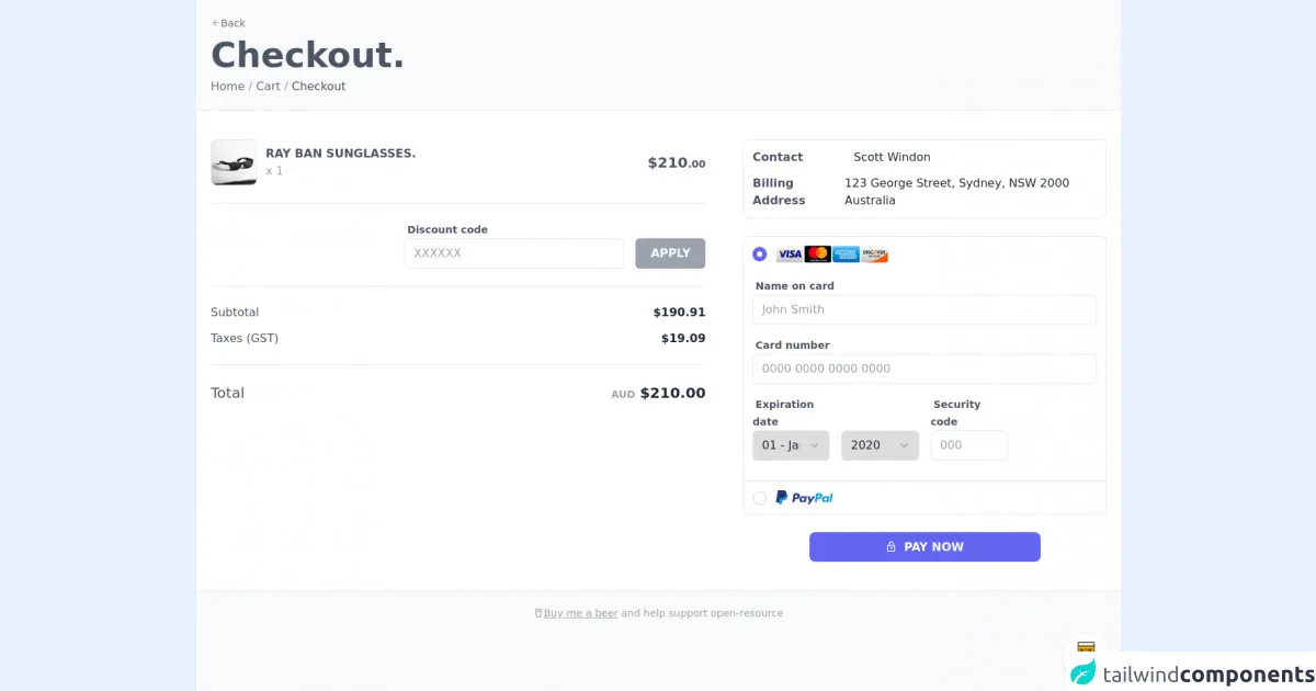
The preview of Checkout Page ui component
To create a Checkout Page with Tailwind CSS, we will use a sample design. The design consists of several sections, including order summary, shipping information, payment information, and order confirmation.
Free download of the Checkout Page's source code
The source code of Checkout Page ui component
The source code for the Checkout Page ui component is available on GitHub. You can download the code and use it as a starting point for your own project.
<style>@import url('https://cdnjs.cloudflare.com/ajax/libs/MaterialDesign-Webfont/5.3.45/css/materialdesignicons.min.css')</style>
<style>
/*
module.exports = {
plugins: [require('@tailwindcss/forms'),]
};
*/
.form-radio {
-webkit-appearance: none;
-moz-appearance: none;
appearance: none;
-webkit-print-color-adjust: exact;
color-adjust: exact;
display: inline-block;
vertical-align: middle;
background-origin: border-box;
-webkit-user-select: none;
-moz-user-select: none;
-ms-user-select: none;
user-select: none;
flex-shrink: 0;
border-radius: 100%;
border-width: 2px;
}
.form-radio:checked {
background-image: url("data:image/svg+xml,%3csvg viewBox='0 0 16 16' fill='white' xmlns='http://www.w3.org/2000/svg'%3e%3ccircle cx='8' cy='8' r='3'/%3e%3c/svg%3e");
border-color: transparent;
background-color: currentColor;
background-size: 100% 100%;
background-position: center;
background-repeat: no-repeat;
}
@media not print {
.form-radio::-ms-check {
border-width: 1px;
color: transparent;
background: inherit;
border-color: inherit;
border-radius: inherit;
}
}
.form-radio:focus {
outline: none;
}
.form-select {
background-image: url("data:image/svg+xml,%3csvg xmlns='http://www.w3.org/2000/svg' viewBox='0 0 24 24' fill='%23a0aec0'%3e%3cpath d='M15.3 9.3a1 1 0 0 1 1.4 1.4l-4 4a1 1 0 0 1-1.4 0l-4-4a1 1 0 0 1 1.4-1.4l3.3 3.29 3.3-3.3z'/%3e%3c/svg%3e");
-webkit-appearance: none;
-moz-appearance: none;
appearance: none;
-webkit-print-color-adjust: exact;
color-adjust: exact;
background-repeat: no-repeat;
padding-top: 0.5rem;
padding-right: 2.5rem;
padding-bottom: 0.5rem;
padding-left: 0.75rem;
font-size: 1rem;
line-height: 1.5;
background-position: right 0.5rem center;
background-size: 1.5em 1.5em;
}
.form-select::-ms-expand {
color: #a0aec0;
border: none;
}
@media not print {
.form-select::-ms-expand {
display: none;
}
}
@media print and (-ms-high-contrast: active), print and (-ms-high-contrast: none) {
.form-select {
padding-right: 0.75rem;
}
}
</style>
<div class="min-w-screen min-h-screen bg-gray-50 py-5">
<div class="px-5">
<div class="mb-2">
<a href="#" class="focus:outline-none hover:underline text-gray-500 text-sm"><i class="mdi mdi-arrow-left text-gray-400"></i>Back</a>
</div>
<div class="mb-2">
<h1 class="text-3xl md:text-5xl font-bold text-gray-600">Checkout.</h1>
</div>
<div class="mb-5 text-gray-400">
<a href="#" class="focus:outline-none hover:underline text-gray-500">Home</a> / <a href="#" class="focus:outline-none hover:underline text-gray-500">Cart</a> / <span class="text-gray-600">Checkout</span>
</div>
</div>
<div class="w-full bg-white border-t border-b border-gray-200 px-5 py-10 text-gray-800">
<div class="w-full">
<div class="-mx-3 md:flex items-start">
<div class="px-3 md:w-7/12 lg:pr-10">
<div class="w-full mx-auto text-gray-800 font-light mb-6 border-b border-gray-200 pb-6">
<div class="w-full flex items-center">
<div class="overflow-hidden rounded-lg w-16 h-16 bg-gray-50 border border-gray-200">
<img src="https://images.unsplash.com/photo-1572635196237-14b3f281503f?ixlib=rb-1.2.1&ixid=MnwxMjA3fDB8MHxwaG90by1wYWdlfHx8fGVufDB8fHx8&auto=format&fit=crop&w=1160&q=80" alt="">
</div>
<div class="flex-grow pl-3">
<h6 class="font-semibold uppercase text-gray-600">Ray Ban Sunglasses.</h6>
<p class="text-gray-400">x 1</p>
</div>
<div>
<span class="font-semibold text-gray-600 text-xl">$210</span><span class="font-semibold text-gray-600 text-sm">.00</span>
</div>
</div>
</div>
<div class="mb-6 pb-6 border-b border-gray-200">
<div class="-mx-2 flex items-end justify-end">
<div class="flex-grow px-2 lg:max-w-xs">
<label class="text-gray-600 font-semibold text-sm mb-2 ml-1">Discount code</label>
<div>
<input class="w-full px-3 py-2 border border-gray-200 rounded-md focus:outline-none focus:border-indigo-500 transition-colors" placeholder="XXXXXX" type="text"/>
</div>
</div>
<div class="px-2">
<button class="block w-full max-w-xs mx-auto border border-transparent bg-gray-400 hover:bg-gray-500 focus:bg-gray-500 text-white rounded-md px-5 py-2 font-semibold">APPLY</button>
</div>
</div>
</div>
<div class="mb-6 pb-6 border-b border-gray-200 text-gray-800">
<div class="w-full flex mb-3 items-center">
<div class="flex-grow">
<span class="text-gray-600">Subtotal</span>
</div>
<div class="pl-3">
<span class="font-semibold">$190.91</span>
</div>
</div>
<div class="w-full flex items-center">
<div class="flex-grow">
<span class="text-gray-600">Taxes (GST)</span>
</div>
<div class="pl-3">
<span class="font-semibold">$19.09</span>
</div>
</div>
</div>
<div class="mb-6 pb-6 border-b border-gray-200 md:border-none text-gray-800 text-xl">
<div class="w-full flex items-center">
<div class="flex-grow">
<span class="text-gray-600">Total</span>
</div>
<div class="pl-3">
<span class="font-semibold text-gray-400 text-sm">AUD</span> <span class="font-semibold">$210.00</span>
</div>
</div>
</div>
</div>
<div class="px-3 md:w-5/12">
<div class="w-full mx-auto rounded-lg bg-white border border-gray-200 p-3 text-gray-800 font-light mb-6">
<div class="w-full flex mb-3 items-center">
<div class="w-32">
<span class="text-gray-600 font-semibold">Contact</span>
</div>
<div class="flex-grow pl-3">
<span>Scott Windon</span>
</div>
</div>
<div class="w-full flex items-center">
<div class="w-32">
<span class="text-gray-600 font-semibold">Billing Address</span>
</div>
<div class="flex-grow pl-3">
<span>123 George Street, Sydney, NSW 2000 Australia</span>
</div>
</div>
</div>
<div class="w-full mx-auto rounded-lg bg-white border border-gray-200 text-gray-800 font-light mb-6">
<div class="w-full p-3 border-b border-gray-200">
<div class="mb-5">
<label for="type1" class="flex items-center cursor-pointer">
<input type="radio" class="form-radio h-5 w-5 text-indigo-500" name="type" id="type1" checked>
<img src="https://leadershipmemphis.org/wp-content/uploads/2020/08/780370.png" class="h-6 ml-3">
</label>
</div>
<div>
<div class="mb-3">
<label class="text-gray-600 font-semibold text-sm mb-2 ml-1">Name on card</label>
<div>
<input class="w-full px-3 py-2 mb-1 border border-gray-200 rounded-md focus:outline-none focus:border-indigo-500 transition-colors" placeholder="John Smith" type="text"/>
</div>
</div>
<div class="mb-3">
<label class="text-gray-600 font-semibold text-sm mb-2 ml-1">Card number</label>
<div>
<input class="w-full px-3 py-2 mb-1 border border-gray-200 rounded-md focus:outline-none focus:border-indigo-500 transition-colors" placeholder="0000 0000 0000 0000" type="text"/>
</div>
</div>
<div class="mb-3 -mx-2 flex items-end">
<div class="px-2 w-1/4">
<label class="text-gray-600 font-semibold text-sm mb-2 ml-1">Expiration date</label>
<div>
<select class="form-select w-full px-3 py-2 mb-1 border border-gray-200 rounded-md focus:outline-none focus:border-indigo-500 transition-colors cursor-pointer">
<option value="01">01 - January</option>
<option value="02">02 - February</option>
<option value="03">03 - March</option>
<option value="04">04 - April</option>
<option value="05">05 - May</option>
<option value="06">06 - June</option>
<option value="07">07 - July</option>
<option value="08">08 - August</option>
<option value="09">09 - September</option>
<option value="10">10 - October</option>
<option value="11">11 - November</option>
<option value="12">12 - December</option>
</select>
</div>
</div>
<div class="px-2 w-1/4">
<select class="form-select w-full px-3 py-2 mb-1 border border-gray-200 rounded-md focus:outline-none focus:border-indigo-500 transition-colors cursor-pointer">
<option value="2020">2020</option>
<option value="2021">2021</option>
<option value="2022">2022</option>
<option value="2023">2023</option>
<option value="2024">2024</option>
<option value="2025">2025</option>
<option value="2026">2026</option>
<option value="2027">2027</option>
<option value="2028">2028</option>
<option value="2029">2029</option>
</select>
</div>
<div class="px-2 w-1/4">
<label class="text-gray-600 font-semibold text-sm mb-2 ml-1">Security code</label>
<div>
<input class="w-full px-3 py-2 mb-1 border border-gray-200 rounded-md focus:outline-none focus:border-indigo-500 transition-colors" placeholder="000" type="text"/>
</div>
</div>
</div>
</div>
</div>
<div class="w-full p-3">
<label for="type2" class="flex items-center cursor-pointer">
<input type="radio" class="form-radio h-5 w-5 text-indigo-500" name="type" id="type2">
<img src="https://upload.wikimedia.org/wikipedia/commons/b/b5/PayPal.svg" width="80" class="ml-3"/>
</label>
</div>
</div>
<div>
<button class="block w-full max-w-xs mx-auto bg-indigo-500 hover:bg-indigo-700 focus:bg-indigo-700 text-white rounded-lg px-3 py-2 font-semibold"><i class="mdi mdi-lock-outline mr-1"></i> PAY NOW</button>
</div>
</div>
</div>
</div>
</div>
<div class="p-5">
<div class="text-center text-gray-400 text-sm">
<a href="https://www.buymeacoffee.com/scottwindon" target="_blank" class="focus:outline-none underline text-gray-400"><i class="mdi mdi-beer-outline"></i>Buy me a beer</a> and help support open-resource
</div>
</div>
</div>
<!-- BUY ME A BEER AND HELP SUPPORT OPEN-SOURCE RESOURCES -->
<div class="flex items-end justify-end fixed bottom-0 right-0 mb-4 mr-4 z-10">
<div>
<a title="Buy me a beer" href="https://www.buymeacoffee.com/scottwindon" target="_blank" class="block w-16 h-16 rounded-full transition-all shadow hover:shadow-lg transform hover:scale-110 hover:rotate-12">
<img class="object-cover object-center w-full h-full rounded-full" src="https://i.pinimg.com/originals/60/fd/e8/60fde811b6be57094e0abc69d9c2622a.jpg"/>
</a>
</div>
</div>
How to create a Checkout Page with Tailwind CSS?
To create a Checkout Page with Tailwind CSS, follow these steps:
Step 1: Set up your project
To use Tailwind CSS, you need to install it in your project. You can install it using npm or yarn. Once installed, you need to create a configuration file for Tailwind CSS. You can use the default configuration file or customize it to suit your needs.
Step 2: Create the HTML structure
The first step in creating a Checkout Page is to create the HTML structure. You can use semantic HTML tags to create the structure. The structure should include sections for order summary, shipping information, payment information, and order confirmation.
Step 3: Style the HTML elements
Once you have created the HTML structure, you can start styling the HTML elements using Tailwind CSS classes. You can use the pre-defined classes to style the elements or create custom classes to suit your needs.
Step 4: Add responsive design
To ensure that your Checkout Page looks good on both desktop and mobile devices, you need to add responsive design. You can use Tailwind CSS responsive design classes to create designs that adapt to different screen sizes.
Step 5: Add interactivity
To improve the user experience, you can add interactivity to your Checkout Page. You can use JavaScript or jQuery to add interactivity, such as form validation or dynamic updates.
Conclusion
Creating a Checkout Page with Tailwind CSS is easy and straightforward. With its pre-defined classes and responsive design, you can create custom designs without writing any CSS. By following the steps outlined in this article, you can create a Checkout Page that looks good on both desktop and mobile devices.