- Published on
Imagine You Make A Checkout Form With Tailwind CSS Like An Expert. Follow These 6 Steps To Get There
- What is Tailwind CSS?
- The description of Checkout Form UI component
- Why use Tailwind CSS to create a Checkout Form UI component?
- The preview of Checkout Form UI component
- The source code of Checkout Form UI component
- How to create a Checkout Form with Tailwind CSS?
- Step 1: Set up your HTML
- Step 2: Add Tailwind CSS to your project
- Step 3: Style the form using Tailwind CSS classes
- Step 4: Add custom styles using Tailwind CSS utilities
- Step 5: Add responsive styles using Tailwind CSS utilities
- Step 6: Add accessibility features to the form
- Conclusion
As a FrontEnd technology blogger, you are always looking for ways to improve your skills and create beautiful user interfaces. One of the most popular CSS frameworks for creating beautiful UIs is Tailwind CSS. In this article, we will explore how to create a Checkout Form UI component using Tailwind CSS.
What is Tailwind CSS?
Tailwind CSS is a utility-first CSS framework that allows you to quickly create custom designs without writing any CSS. It provides a set of pre-defined classes that you can use to style your HTML elements. Tailwind CSS is highly customizable and can be used with any JavaScript framework or library.
The description of Checkout Form UI component
A Checkout Form UI component is a form that allows users to enter their billing and shipping information when they are making a purchase. The form typically includes fields for name, address, email, phone number, and payment information. The Checkout Form UI component is a critical part of any e-commerce website.
Why use Tailwind CSS to create a Checkout Form UI component?
Tailwind CSS is an excellent choice for creating a Checkout Form UI component because it provides a set of pre-defined classes that make it easy to style the form quickly. With Tailwind CSS, you can focus on the design and layout of the form without worrying about the CSS.
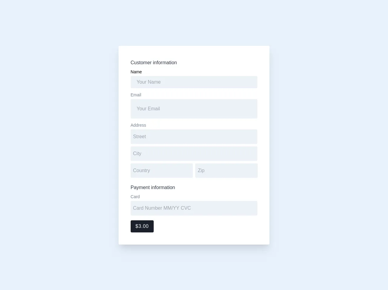
The preview of Checkout Form UI component
To give you an idea of what the Checkout Form UI component looks like, here is a preview:
Free download of the Checkout Form's source code
The source code of Checkout Form UI component
Here is the source code for the Checkout Form UI component:
<div class="leading-loose">
  <form class="max-w-xl m-4 p-10 bg-white rounded shadow-xl">
    <p class="text-gray-800 font-medium">Customer information</p>
    <div class="">
      <label class="block text-sm text-gray-00" for="cus_name">Name</label>
      <input class="w-full px-5 py-1 text-gray-700 bg-gray-200 rounded" id="cus_name" name="cus_name" type="text" required="" placeholder="Your Name" aria-label="Name">
    </div>
    <div class="mt-2">
      <label class="block text-sm text-gray-600" for="cus_email">Email</label>
      <input class="w-full px-5  py-4 text-gray-700 bg-gray-200 rounded" id="cus_email" name="cus_email" type="text" required="" placeholder="Your Email" aria-label="Email">
    </div>
    <div class="mt-2">
      <label class=" block text-sm text-gray-600" for="cus_email">Address</label>
      <input class="w-full px-2 py-2 text-gray-700 bg-gray-200 rounded" id="cus_email" name="cus_email" type="text" required="" placeholder="Street" aria-label="Email">
    </div>
    <div class="mt-2">
      <label class="hidden text-sm block text-gray-600" for="cus_email">City</label>
      <input class="w-full px-2 py-2 text-gray-700 bg-gray-200 rounded" id="cus_email" name="cus_email" type="text" required="" placeholder="City" aria-label="Email">
    </div>
    <div class="inline-block mt-2 w-1/2 pr-1">
      <label class="hidden block text-sm text-gray-600" for="cus_email">Country</label>
      <input class="w-full px-2 py-2 text-gray-700 bg-gray-200 rounded" id="cus_email" name="cus_email" type="text" required="" placeholder="Country" aria-label="Email">
    </div>
    <div class="inline-block mt-2 -mx-1 pl-1 w-1/2">
      <label class="hidden block text-sm text-gray-600" for="cus_email">Zip</label>
      <input class="w-full px-2 py-2 text-gray-700 bg-gray-200 rounded" id="cus_email"  name="cus_email" type="text" required="" placeholder="Zip" aria-label="Email">
    </div>
    <p class="mt-4 text-gray-800 font-medium">Payment information</p>
    <div class="">
      <label class="block text-sm text-gray-600" for="cus_name">Card</label>
      <input class="w-full px-2 py-2 text-gray-700 bg-gray-200 rounded" id="cus_name" name="cus_name" type="text" required="" placeholder="Card Number MM/YY CVC" aria-label="Name">
    </div>
    <div class="mt-4">
      <button class="px-4 py-1 text-white font-light tracking-wider bg-gray-900 rounded" type="submit">$3.00</button>
    </div>
  </form>
</div>
How to create a Checkout Form with Tailwind CSS?
Now that we have an idea of what the Checkout Form UI component looks like let's go through the steps to create it using Tailwind CSS.
Step 1: Set up your HTML
The first step is to set up your HTML. You can use any HTML structure you like, but for this example, we will use the following:
<form>
  <div>
    <label for="name">Name</label>
    <input type="text" id="name" name="name" />
  </div>
  <div>
    <label for="email">Email</label>
    <input type="email" id="email" name="email" />
  </div>
  <div>
    <label for="address">Address</label>
    <input type="text" id="address" name="address" />
  </div>
  <div>
    <label for="city">City</label>
    <input type="text" id="city" name="city" />
  </div>
  <div>
    <label for="state">State</label>
    <input type="text" id="state" name="state" />
  </div>
  <div>
    <label for="zip">Zip</label>
    <input type="text" id="zip" name="zip" />
  </div>
  <div>
    <label for="phone">Phone</label>
    <input type="tel" id="phone" name="phone" />
  </div>
  <div>
    <label for="card-number">Card Number</label>
    <input type="text" id="card-number" name="card-number" />
  </div>
  <div>
    <label for="exp-date">Expiration Date</label>
    <input type="text" id="exp-date" name="exp-date" />
  </div>
  <div>
    <label for="cvv">CVV</label>
    <input type="text" id="cvv" name="cvv" />
  </div>
  <button type="submit">Submit</button>
</form>
Step 2: Add Tailwind CSS to your project
The next step is to add Tailwind CSS to your project. You can do this by including the Tailwind CSS CDN in your HTML file:
<link
  href="https://cdn.jsdelivr.net/npm/[email protected]/dist/tailwind.min.css"
  rel="stylesheet"
/>
Alternatively, you can install Tailwind CSS using npm and include it in your project using a build tool like Webpack.
Step 3: Style the form using Tailwind CSS classes
Now that we have our HTML and Tailwind CSS set up, we can start styling the form using Tailwind CSS classes. Here is an example of how we can style the name input field:
<div class="mb-4">
  <label class="block text-gray-700 text-sm font-bold mb-2" for="name">
    Name
  </label>
  <input
    class="shadow appearance-none border rounded w-full py-2 px-3 text-gray-700 leading-tight focus:outline-none focus:shadow-outline"
    id="name"
    type="text"
    placeholder="John Doe"
  />
</div>
In this example, we are using the mb-4 class to add margin-bottom to the div that contains the input field. We are also using several other classes to style the label and input field, including block, text-gray-700, text-sm, font-bold, shadow, appearance-none, border, rounded, w-full, py-2, px-3, leading-tight, focus:outline-none, and focus:shadow-outline.
You can use similar classes to style the rest of the form fields.
Step 4: Add custom styles using Tailwind CSS utilities
Tailwind CSS provides a set of utilities that allow you to add custom styles to your elements. For example, you can use the bg-red-500 class to add a red background color to an element. Here is an example of how we can use custom styles to add a blue border to the name input field when it is focused:
<input
  class="shadow appearance-none border rounded w-full py-2 px-3 text-gray-700 leading-tight focus:outline-none focus:shadow-outline border-blue-500"
  id="name"
  type="text"
  placeholder="John Doe"
/>
In this example, we are using the border-blue-500 class to add a blue border to the input field when it is focused.
Step 5: Add responsive styles using Tailwind CSS utilities
Tailwind CSS also provides a set of utilities that allow you to add responsive styles to your elements. For example, you can use the md:text-lg class to increase the font size of an element on medium-sized screens. Here is an example of how we can use responsive styles to increase the font size of the label on medium-sized screens:
<label
  class="block text-gray-700 text-sm font-bold mb-2 md:text-lg"
  for="name"
>
  Name
</label>
In this example, we are using the md:text-lg class to increase the font size of the label on medium-sized screens.
Step 6: Add accessibility features to the form
Finally, it is essential to add accessibility features to your form to ensure that it is usable by everyone, including people with disabilities. You can do this by adding labels to your form fields, using ARIA attributes, and ensuring that your form can be navigated using the keyboard.
Conclusion
In this article, we have explored how to create a Checkout Form UI component using Tailwind CSS. We have discussed the benefits of using Tailwind CSS, provided a preview of the Checkout Form UI component, and walked through the steps to create it. By following these steps, you can create beautiful and accessible forms quickly and easily using Tailwind CSS.