- Published on
Here Are 6 Ways To Create A Checkout Card With Tailwind CSS
- What is Tailwind CSS?
- The description of Checkout card ui component
- Why use Tailwind CSS to create a Checkout card ui component?
- The preview of Checkout card ui component
- The source code of Checkout card ui component
- How to create a Checkout card with Tailwind CSS?
- 1. Set up your HTML structure
- 2. Style the container element
- 3. Style the individual elements
- 4. Add interactivity
- Conclusion
As a FrontEnd technology blogger, you are always looking for the latest and greatest tools to help you create beautiful and functional user interfaces. One such tool that has gained a lot of popularity in recent years is Tailwind CSS. In this article, we will explore how to use Tailwind CSS to create a checkout card ui component.
What is Tailwind CSS?
Tailwind CSS is a utility-first CSS framework that provides a set of pre-defined classes that can be used to style HTML elements. It is designed to be highly customizable and easy to use, making it a popular choice for developers who want to create responsive and scalable user interfaces.
The description of Checkout card ui component
A checkout card ui component is a user interface element that is commonly used in e-commerce websites. It typically contains information about the products that a user has added to their cart, as well as the total cost of the order and any applicable taxes or shipping fees.
Why use Tailwind CSS to create a Checkout card ui component?
Tailwind CSS provides a number of benefits that make it an ideal choice for creating a checkout card ui component. Firstly, it is highly customizable, which means that you can easily modify the styles of the component to match the design of your website. Secondly, it is easy to use, which means that you can quickly create a checkout card ui component without having to write a lot of custom CSS code. Finally, it is responsive, which means that the checkout card ui component will look great on all devices, including desktops, tablets, and smartphones.
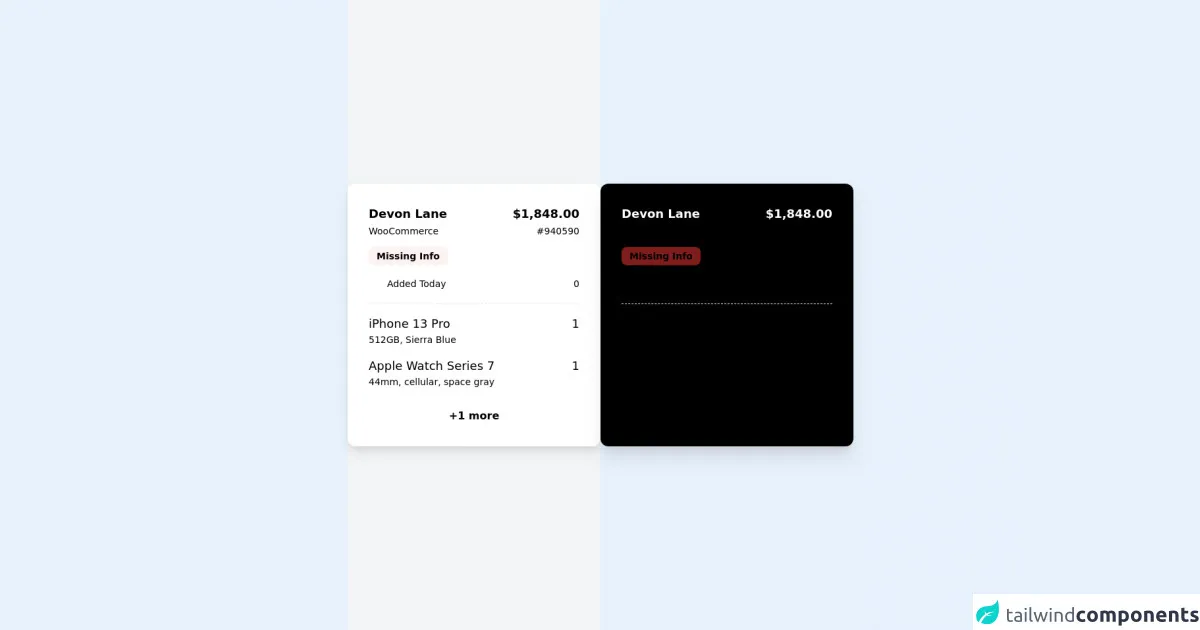
The preview of Checkout card ui component
Creating a checkout card ui component with Tailwind CSS is easy and straightforward. Here is a preview of what the component will look like:
Free download of the Checkout card's source code
The source code of Checkout card ui component
To create a checkout card ui component with Tailwind CSS, you will need to write some HTML and CSS code. Here is an example of what the code might look like:
<div class="flex flex-col md:lg:xl:flex-row">
        <!-- light -->
        <div class="h-screen w-screen md:lg:xl:w-1/2 bg-gray-100 flex flex-wrap justify-center content-center ">

                <!-- card a -->

                <div class="bg-white p-8 rounded-xl shadow-lg shadow-neutral-200 w-96">
                    <!-- header -->
                    <div class="flex justify-between mb-4">
                        <div>
                            <p class="text-lg font-semibold text-neutral-700">Devon Lane</p>
                            <p class="mt-0.5  text-neutral-400 text-sm">WooCommerce</p>
                        </div>
                        <div class="text-right">
                            <p class="text-lg font-semibold text-neutral-700">$1,848.00</p>
                            <p class="mt-0.5  text-neutral-400 text-sm">#940590</p>
                        </div>
                    </div>
                    <!-- bedge -->
                    <span class="text-orange-500   px-3 text-sm py-1.5 bg-red-50 rounded-lg font-semibold">Missing Info</span>


                    <div class="flex items-center justify-between mt-5">
                        <div class="flex items-center">
                            <svg   class="h-5 w-5 stroke-gray-400 mr-2" fill="none"   viewBox="0 0 24 24" stroke="gray-400" stroke-width="2">
                                <path stroke-linecap="round" stroke-linejoin="round" d="M8 7V3m8 4V3m-9 8h10M5 21h14a2 2 0 002-2V7a2 2 0 00-2-2H5a2 2 0 00-2 2v12a2 2 0 002 2z" />
                              </svg>
                              <span class="text-neutral-400 text-sm">Added Today</span>
                        </div>
                        <div class="flex items-center">
                            <span class="text-neutral-400 text-sm">0</span>
                        </div>

                    </div>

                    <!-- body -->
                    <div class="mt-5 border-t border-dashed space-y-4 py-4">
                        <!-- item 1 -->
                        <div class="flex justify-between group duration-150 cursor-pointer">
                            <div>
                                <p class="text-lg text-neutral-600 group-hover:text-red-600 duration-150">iPhone 13 Pro</p>
                                <p class="text-sm text-neutral-400" >512GB, Sierra Blue</p>
                            </div>
                            <span class="text-lg text-neutral-600">1</span>
                        </div>

                         <!-- item 2 -->
                         <div class="flex justify-between group duration-150 cursor-pointer">
                            <div>
                                <p class="text-lg text-neutral-600 group-hover:text-red-600 duration-150">Apple Watch Series 7</p>
                                <p class="text-sm text-neutral-400" >44mm, cellular, space gray</p>
                            </div>
                            <span class="text-lg text-neutral-600">1</span>
                        </div>


                    </div>
                    <div class="text-center cursor-pointer duration-150 hover:bg-neutral-200 py-0.5 bg-neutral-100 text-neutral-400 font-semibold rounded-lg mt-3">+1 more</div>
                </div>


        </div>


        <!-- dark -->
        <div class="h-screen  md:lg:xl:w-1/2 bg-neutral-800 flex flex-wrap justify-center content-center ">

                <!-- card a -->

                <div class="bg-black p-8 rounded-xl shadow-xl shadow-neutral-900  w-96">
                    <!-- header -->
                    <div class="flex justify-between mb-4">
                        <div>
                            <p class="text-lg font-semibold text-white">Devon Lane</p>
                            <p class="mt-0.5  text-neutral-500 text-sm">WooCommerce</p>
                        </div>
                        <div class="text-right">
                            <p class="text-lg font-semibold text-white">$1,848.00</p>
                            <p class="mt-0.5  text-neutral-500 text-sm">#940590</p>
                        </div>
                    </div>
                    <!-- bedge -->
                    <span class="text-orange-300   px-3 text-sm py-1.5 bg-red-900 rounded-lg font-semibold">Missing Info</span>


                    <div class="flex items-center justify-between mt-5">
                        <div class="flex items-center">
                            <svg   class="h-5 w-5 stroke-gray-500 mr-2" fill="none"   viewBox="0 0 24 24" stroke="gray-400" stroke-width="2">
                                <path stroke-linecap="round" stroke-linejoin="round" d="M8 7V3m8 4V3m-9 8h10M5 21h14a2 2 0 002-2V7a2 2 0 00-2-2H5a2 2 0 00-2 2v12a2 2 0 002 2z" />
                              </svg>
                            <span class="text-neutral-500 text-sm">Added Today</span>
                        </div>
                        <div class="flex items-center">
                            <span class="text-neutral-500 text-sm">0</span>
                        </div>

                    </div>

                    <!-- body -->
                    <div class="mt-5 border-t border-dashed border-neutral-700 space-y-4 py-4">
                        <!-- item 1 -->
                        <div class="flex justify-between  group cursor-pointer">
                            <div>
                                <p class="text-lg text-neutral-400 group-hover:text-red-500 duration-150 ">iPhone 13 Pro</p>
                                <p class="text-sm text-neutral-600" >512GB, Sierra Blue</p>
                            </div>
                            <span class="text-lg text-neutral-400">1</span>
                        </div>

                         <!-- item 2 -->
                         <div class="flex justify-between group  cursor-pointer">
                            <div>
                                <p class="text-lg text-neutral-400 group-hover:text-red-500 duration-150">Apple Watch Series 7</p>
                                <p class="text-sm text-neutral-600" >44mm, cellular, space gray</p>
                            </div>
                            <span class="text-lg text-neutral-400">1</span>
                        </div>


                    </div>
                    <div class="cursor-pointer hover:bg-neutral-900 duration-150 text-center py-0.5 bg-neutral-800 text-neutral-500 font-semibold rounded-lg mt-3">+1 more</div>
                </div>


        </div>

    </div>
How to create a Checkout card with Tailwind CSS?
Now that we have covered the basics of what a checkout card ui component is and why you should use Tailwind CSS to create one, let's dive into the details of how to actually create the component.
1. Set up your HTML structure
The first step in creating a checkout card ui component is to set up the HTML structure. This will typically involve creating a container element that will hold all of the other elements in the component, as well as individual elements for each piece of information that you want to display.
2. Style the container element
Once you have set up your HTML structure, you can start styling the container element. This will typically involve setting the background color, border radius, and padding of the container element to create a visually appealing and functional component.
3. Style the individual elements
After you have styled the container element, you can move on to styling the individual elements that make up the checkout card ui component. This will typically involve setting the font size, color, and margin of each element to ensure that the component is easy to read and visually appealing.
4. Add interactivity
Finally, you can add interactivity to the checkout card ui component by using JavaScript or CSS transitions to animate the component when the user interacts with it. This can help to create a more engaging and intuitive user experience, which can ultimately lead to higher conversion rates and increased sales.
Conclusion
In conclusion, creating a checkout card ui component with Tailwind CSS is a great way to create a visually appealing and functional user interface for your e-commerce website. By following the steps outlined in this article, you can quickly and easily create a checkout card ui component that will help to increase conversions and drive sales. So why not give it a try today?