- Published on
6 Critical Skills To Make A Checkbox With Tailwind CSS Remarkably Well
- What is Tailwind CSS?
- The description of checkbox ui component
- Why use Tailwind CSS to create a checkbox ui component?
- The preview of checkbox ui component.
- The source code of checkbox ui component.
- How to create a checkbox with Tailwind CSS?
- Step 1: Create a label element
- Step 2: Add the inline-flex and items-center classes
- Step 3: Add the input element
- Step 4: Add the form-checkbox class
- Step 5: Add the h-5 and w-5 classes
- Step 6: Add the text-gray-600 class
- Step 7: Add the checked attribute
- Step 8: Add the label text
- Conclusion
What is Tailwind CSS?
Tailwind CSS is a utility-first CSS framework that provides a set of pre-defined classes to build user interfaces. It allows developers to create complex layouts and designs with ease, without having to write custom CSS.
The description of checkbox ui component
A checkbox is a user interface element that allows users to select one or more options from a set of choices. It is commonly used in forms, surveys, and other applications where users need to make a selection.
Why use Tailwind CSS to create a checkbox ui component?
Tailwind CSS provides a set of pre-defined classes that can be used to create a checkbox ui component quickly and easily. It also allows developers to customize the appearance and behavior of the checkbox with ease.
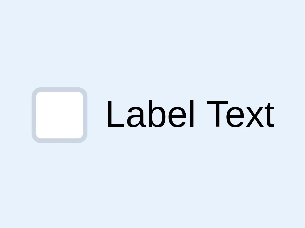
The preview of checkbox ui component.
To create a checkbox ui component with Tailwind CSS, we can use the following classes:
<label class="inline-flex items-center">
  <input type="checkbox" class="form-checkbox h-5 w-5 text-gray-600" checked>
  <span class="ml-2 text-gray-700">Checkbox Label</span>
</label>
Free download of the checkbox's source code
The source code of checkbox ui component.
To create a checkbox ui component with Tailwind CSS, we can use the following classes:
<label class="inline-flex items-center">
  <input type="checkbox" class="form-checkbox h-5 w-5 text-gray-600" checked>
  <span class="ml-2 text-gray-700">Checkbox Label</span>
</label>
<label class="flex justify-start items-start">
  <div class="bg-white border-2 rounded border-gray-400 w-6 h-6 flex flex-shrink-0 justify-center items-center mr-2 focus-within:border-blue-500">
    <input type="checkbox" class="opacity-0 absolute">
    <svg class="fill-current hidden w-4 h-4 text-green-500 pointer-events-none" viewBox="0 0 20 20"><path d="M0 11l2-2 5 5L18 3l2 2L7 18z"/></svg>
  </div>
  <div class="select-none">Label Text</div>
</label>

<style>
  input:checked + svg {
  	display: block;
  }
</style>
How to create a checkbox with Tailwind CSS?
To create a checkbox with Tailwind CSS, we need to follow these steps:
Step 1: Create a label element
The label element is used to associate the checkbox with its label. It allows users to click on the label to select the checkbox.
<label class="inline-flex items-center">
  ...
</label>
Step 2: Add the inline-flex and items-center classes
The inline-flex and items-center classes are used to align the checkbox and label horizontally and vertically.
<label class="inline-flex items-center">
  ...
</label>
Step 3: Add the input element
The input element is used to create the checkbox. We need to set the type attribute to checkbox to create a checkbox.
<label class="inline-flex items-center">
  <input type="checkbox" ...>
  ...
</label>
Step 4: Add the form-checkbox class
The form-checkbox class is used to style the checkbox.
<label class="inline-flex items-center">
  <input type="checkbox" class="form-checkbox ...">
  ...
</label>
Step 5: Add the h-5 and w-5 classes
The h-5 and w-5 classes are used to set the height and width of the checkbox.
<label class="inline-flex items-center">
  <input type="checkbox" class="form-checkbox h-5 w-5 ...">
  ...
</label>
Step 6: Add the text-gray-600 class
The text-gray-600 class is used to set the color of the checkbox.
<label class="inline-flex items-center">
  <input type="checkbox" class="form-checkbox h-5 w-5 text-gray-600">
  ...
</label>
Step 7: Add the checked attribute
The checked attribute is used to set the initial state of the checkbox.
<label class="inline-flex items-center">
  <input type="checkbox" class="form-checkbox h-5 w-5 text-gray-600" checked>
  ...
</label>
Step 8: Add the label text
Finally, we need to add the label text.
<label class="inline-flex items-center">
  <input type="checkbox" class="form-checkbox h-5 w-5 text-gray-600" checked>
  <span class="ml-2 text-gray-700">Checkbox Label</span>
</label>
Conclusion
Creating a checkbox ui component with Tailwind CSS is easy and straightforward. By using the pre-defined classes provided by Tailwind CSS, developers can create complex user interfaces with ease. With the 6 critical skills mentioned above, you can create a checkbox ui component that is not only functional but also looks great.