- Published on
6 Steps To Make A Checkbox With Tailwind CSS Like A Pro In Under An Hour
- What is Tailwind CSS?
- The description of Checkbox ui component
- Why use Tailwind CSS to create a Checkbox ui component?
- The preview of Checkbox ui component.
- The source code of Checkbox ui component.
- How to create a Checkbox with Tailwind CSS?
- Step 1: Create a HTML file
- Step 2: Add Tailwind CSS classes
- Step 3: Style the checkbox UI component
- Step 4: Preview the checkbox UI component
- Step 5: Customize the checkbox UI component
- Step 6: Add more checkbox UI components
- Conclusion
What is Tailwind CSS?
Tailwind CSS is a utility-first CSS framework that allows developers to create responsive and customizable user interfaces quickly. It provides a set of pre-defined classes that can be used to style HTML elements. With Tailwind CSS, developers can focus on the functionality of their application rather than spending time on designing and styling.
The description of Checkbox ui component
A checkbox is a user interface element that allows users to select one or more options from a list of choices. It is a common UI element used in forms, surveys, and other applications. A checkbox consists of a small square box that can be checked or unchecked.
Why use Tailwind CSS to create a Checkbox ui component?
Tailwind CSS provides a set of pre-defined classes that can be used to create a checkbox UI component quickly. It also allows developers to customize the checkbox component easily using its utility classes. With Tailwind CSS, developers can create a checkbox UI component that is responsive and accessible.
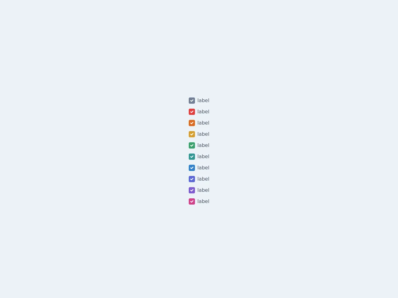
The preview of Checkbox ui component.
To create a checkbox UI component with Tailwind CSS, we will use the following classes:
form-checkbox: This class is used to style the checkbox input element.form-checkbox-label: This class is used to style the label element for the checkbox.form-checkbox-checked: This class is used to style the checkbox when it is checked.
Free download of the Checkbox's source code
The source code of Checkbox ui component.
To create a checkbox UI component with Tailwind CSS, we will use the following HTML code:
<div class="flex items-center">
  <input type="checkbox" id="checkbox" class="form-checkbox h-5 w-5 text-blue-600">
  <label for="checkbox" class="ml-2 block text-gray-700 font-medium">Checkbox</label>
</div>
To style the checkbox UI component, we will use the following Tailwind CSS classes:
/* Style for the checkbox input element */
.form-checkbox {
  -webkit-appearance: none;
  -moz-appearance: none;
  appearance: none;
  border-radius: 0;
  border-width: 2px;
  border-color: currentColor;
  height: 1.25em;
  width: 1.25em;
  vertical-align: top;
  position: relative;
  display: inline-block;
  color-adjust: exact;
  transition: background-color 0.15s ease-in-out, border-color 0.15s ease-in-out, box-shadow 0.15s ease-in-out;
}

/* Style for the checkbox label element */
.form-checkbox-label {
  display: inline-block;
  margin-left: 0.5rem;
  line-height: 1.25rem;
}

/* Style for the checked checkbox */
.form-checkbox:checked {
  background-color: currentColor;
  border-color: currentColor;
}
<div class="bg-gray-200">
    <div class="flex flex-col items-center justify-center h-screen">
        <div class="flex flex-col">
            <label class="inline-flex items-center mt-3">
                <input type="checkbox" class="form-checkbox h-5 w-5 text-gray-600" checked><span class="ml-2 text-gray-700">label</span>
            </label>

            <label class="inline-flex items-center mt-3">
                <input type="checkbox" class="form-checkbox h-5 w-5 text-red-600" checked><span class="ml-2 text-gray-700">label</span>
            </label>

            <label class="inline-flex items-center mt-3">
                <input type="checkbox" class="form-checkbox h-5 w-5 text-orange-600" checked><span class="ml-2 text-gray-700">label</span>
            </label>

            <label class="inline-flex items-center mt-3">
                <input type="checkbox" class="form-checkbox h-5 w-5 text-yellow-600" checked><span class="ml-2 text-gray-700">label</span>
            </label>

            <label class="inline-flex items-center mt-3">
                <input type="checkbox" class="form-checkbox h-5 w-5 text-green-600" checked><span class="ml-2 text-gray-700">label</span>
            </label>

            <label class="inline-flex items-center mt-3">
                <input type="checkbox" class="form-checkbox h-5 w-5 text-teal-600" checked><span class="ml-2 text-gray-700">label</span>
            </label>

            <label class="inline-flex items-center mt-3">
                <input type="checkbox" class="form-checkbox h-5 w-5 text-blue-600" checked><span class="ml-2 text-gray-700">label</span>
            </label>

            <label class="inline-flex items-center mt-3">
                <input type="checkbox" class="form-checkbox h-5 w-5 text-indigo-600" checked><span class="ml-2 text-gray-700">label</span>
            </label>

            <label class="inline-flex items-center mt-3">
                <input type="checkbox" class="form-checkbox h-5 w-5 text-purple-600" checked><span class="ml-2 text-gray-700">label</span>
            </label>

            <label class="inline-flex items-center mt-3">
                <input type="checkbox" class="form-checkbox h-5 w-5 text-pink-600" checked><span class="ml-2 text-gray-700">label</span>
            </label>
        </div>
    </div>
</div>
How to create a Checkbox with Tailwind CSS?
To create a checkbox UI component with Tailwind CSS, follow the steps below:
Step 1: Create a HTML file
Create a new HTML file and add the following code:
<!DOCTYPE html>
<html lang="en">
<head>
  <meta charset="UTF-8">
  <title>Checkbox UI Component</title>
  <!-- Add Tailwind CSS stylesheet -->
  <link rel="stylesheet" href="https://cdn.jsdelivr.net/npm/[email protected]/dist/tailwind.min.css">
</head>
<body>
  <div class="flex items-center">
    <input type="checkbox" id="checkbox" class="form-checkbox h-5 w-5 text-blue-600">
    <label for="checkbox" class="ml-2 block text-gray-700 font-medium">Checkbox</label>
  </div>
</body>
</html>
Step 2: Add Tailwind CSS classes
Add the following Tailwind CSS classes to the checkbox input and label elements:
<input type="checkbox" id="checkbox" class="form-checkbox h-5 w-5 text-blue-600">
<label for="checkbox" class="ml-2 block text-gray-700 font-medium">Checkbox</label>
Step 3: Style the checkbox UI component
Add the following CSS code to style the checkbox UI component:
/* Style for the checkbox input element */
.form-checkbox {
  -webkit-appearance: none;
  -moz-appearance: none;
  appearance: none;
  border-radius: 0;
  border-width: 2px;
  border-color: currentColor;
  height: 1.25em;
  width: 1.25em;
  vertical-align: top;
  position: relative;
  display: inline-block;
  color-adjust: exact;
  transition: background-color 0.15s ease-in-out, border-color 0.15s ease-in-out, box-shadow 0.15s ease-in-out;
}

/* Style for the checkbox label element */
.form-checkbox-label {
  display: inline-block;
  margin-left: 0.5rem;
  line-height: 1.25rem;
}

/* Style for the checked checkbox */
.form-checkbox:checked {
  background-color: currentColor;
  border-color: currentColor;
}
Step 4: Preview the checkbox UI component
Open the HTML file in a web browser to preview the checkbox UI component.
Step 5: Customize the checkbox UI component
Tailwind CSS provides a set of utility classes that can be used to customize the checkbox UI component. For example, you can change the color of the checkbox by using the text-red-500 class:
<input type="checkbox" id="checkbox" class="form-checkbox h-5 w-5 text-red-500">
Step 6: Add more checkbox UI components
You can add more checkbox UI components by duplicating the HTML code and customizing the classes.
Conclusion
In this article, we have learned how to create a checkbox UI component with Tailwind CSS. We have also learned why Tailwind CSS is a great choice for creating UI components quickly and easily. By following the steps outlined in this article, you can create a checkbox UI component like a pro in under an hour.