- Published on
Learn How To Build A Chatroom With Tailwind CSS from the Pros
- What is Tailwind CSS?
- The description of Chatroom UI component
- Why use Tailwind CSS to create a Chatroom UI component?
- The preview of Chatroom UI component
- The source code of Chatroom UI component
- How to create a Chatroom with Tailwind CSS?
- Step 1: Set up your HTML structure
- Step 2: Add Tailwind CSS classes
- Step 3: Add JavaScript
- Conclusion
Are you looking for a way to create a chatroom for your website or application? Look no further than Tailwind CSS! In this article, we will explore how to use Tailwind CSS to build a chatroom UI component, step-by-step.
What is Tailwind CSS?
Tailwind CSS is a utility-first CSS framework that provides a set of pre-defined classes to help you style your website or application quickly and easily. With Tailwind CSS, you can create complex layouts and designs without writing custom CSS code.
The description of Chatroom UI component
A chatroom is a UI component that allows users to communicate with each other in real-time. It typically includes a list of messages, an input field to type new messages, and some buttons to perform actions like sending messages or adding new users.
Why use Tailwind CSS to create a Chatroom UI component?
Tailwind CSS is an excellent choice for building a chatroom UI component because it provides a wide range of pre-defined classes that can be used to style the various elements of the chatroom. This means that you can create a custom chatroom design quickly and easily without writing much custom CSS code.
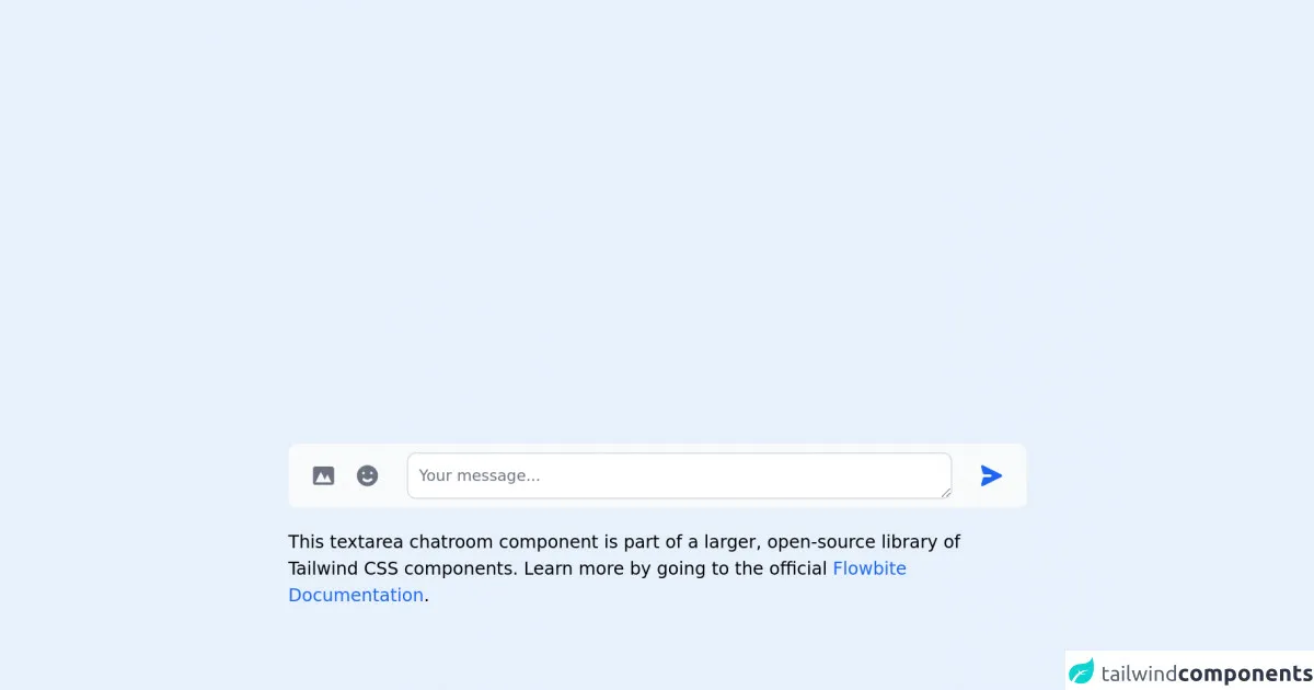
The preview of Chatroom UI component
To give you an idea of what a chatroom UI component built with Tailwind CSS might look like, here's a preview:
Free download of the Chatroom's source code
The source code of Chatroom UI component
Here's a sample HTML and CSS code for a chatroom UI component built with Tailwind CSS:
<link rel="stylesheet" href="https://unpkg.com/[email protected]/dist/flowbite.min.css" />

<!-- This is an example component -->
<div class="max-w-2xl mx-auto">

	<form>
    <label for="chat" class="sr-only">Your message</label>
    <div class="flex items-center py-2 px-3 bg-gray-50 rounded-lg dark:bg-gray-700">
        <button type="button" class="inline-flex justify-center p-2 text-gray-500 rounded-lg cursor-pointer hover:text-gray-900 hover:bg-gray-100 dark:text-gray-400 dark:hover:text-white dark:hover:bg-gray-600">
            <svg class="w-6 h-6" fill="currentColor" viewBox="0 0 20 20" xmlns="http://www.w3.org/2000/svg"><path fill-rule="evenodd" d="M4 3a2 2 0 00-2 2v10a2 2 0 002 2h12a2 2 0 002-2V5a2 2 0 00-2-2H4zm12 12H4l4-8 3 6 2-4 3 6z" clip-rule="evenodd"></path></svg>
        </button>
        <button type="button" class="p-2 text-gray-500 rounded-lg cursor-pointer hover:text-gray-900 hover:bg-gray-100 dark:text-gray-400 dark:hover:text-white dark:hover:bg-gray-600">
            <svg class="w-6 h-6" fill="currentColor" viewBox="0 0 20 20" xmlns="http://www.w3.org/2000/svg"><path fill-rule="evenodd" d="M10 18a8 8 0 100-16 8 8 0 000 16zM7 9a1 1 0 100-2 1 1 0 000 2zm7-1a1 1 0 11-2 0 1 1 0 012 0zm-.464 5.535a1 1 0 10-1.415-1.414 3 3 0 01-4.242 0 1 1 0 00-1.415 1.414 5 5 0 007.072 0z" clip-rule="evenodd"></path></svg>
        </button>
        <textarea id="chat" rows="1" class="block mx-4 p-2.5 w-full text-sm text-gray-900 bg-white rounded-lg border border-gray-300 focus:ring-blue-500 focus:border-blue-500 dark:bg-gray-800 dark:border-gray-600 dark:placeholder-gray-400 dark:text-white dark:focus:ring-blue-500 dark:focus:border-blue-500" placeholder="Your message..."></textarea>
            <button type="submit" class="inline-flex justify-center p-2 text-blue-600 rounded-full cursor-pointer hover:bg-blue-100 dark:text-blue-500 dark:hover:bg-gray-600">
            <svg class="w-6 h-6 rotate-90" fill="currentColor" viewBox="0 0 20 20" xmlns="http://www.w3.org/2000/svg"><path d="M10.894 2.553a1 1 0 00-1.788 0l-7 14a1 1 0 001.169 1.409l5-1.429A1 1 0 009 15.571V11a1 1 0 112 0v4.571a1 1 0 00.725.962l5 1.428a1 1 0 001.17-1.408l-7-14z"></path></svg>
        </button>
    </div>
</form>

	<p class="mt-5">This textarea chatroom component is part of a larger, open-source library of Tailwind CSS components. Learn
		more
		by going to the official <a class="text-blue-600 hover:underline"
			href="https://flowbite.com/docs/getting-started/introduction/" target="_blank">Flowbite Documentation</a>.
	</p>
    <script src="https://unpkg.com/[email protected]/dist/flowbite.js"></script>
</div>
How to create a Chatroom with Tailwind CSS?
Now that we've covered the basics of Tailwind CSS and why it's a great choice for building a chatroom UI component, let's dive into the steps to create a chatroom with Tailwind CSS.
Step 1: Set up your HTML structure
The first step is to set up your HTML structure. Here's a basic structure for a chatroom UI component:
<div class="chatroom">
  <div class="chatroom__messages">
    <!-- Messages will be added here -->
  </div>
  <div class="chatroom__input">
    <input type="text" placeholder="Type your message here" class="chatroom__input-field">
    <button class="chatroom__send-button">Send</button>
  </div>
</div>
In this structure, we have a div element with a class of chatroom that contains two child elements: div with a class of chatroom__messages and div with a class of chatroom__input. The chatroom__messages element will contain the list of messages, and the chatroom__input element will contain the input field and send button.
Step 2: Add Tailwind CSS classes
Next, we'll add Tailwind CSS classes to our HTML structure to style the chatroom UI component. Here are the classes we'll use:
<div class="chatroom bg-gray-100 rounded-lg p-4">
  <div class="chatroom__messages h-64 overflow-y-scroll">
    <!-- Messages will be added here -->
  </div>
  <div class="chatroom__input mt-4">
    <input type="text" placeholder="Type your message here" class="chatroom__input-field border rounded-l-lg px-2 py-1">
    <button class="chatroom__send-button bg-blue-500 text-white rounded-r-lg px-4 py-1">Send</button>
  </div>
</div>
In this code, we've added several Tailwind CSS classes to our HTML structure. We've used the bg-gray-100 class to set the background color of the chatroom to light gray. We've also used the rounded-lg class to round the corners of the chatroom, and the p-4 class to add some padding.
For the chatroom__messages element, we've used the h-64 class to set the height of the element to 64 pixels and the overflow-y-scroll class to add a vertical scrollbar when the content overflows.
For the chatroom__input element, we've used the mt-4 class to add some margin to the top of the element. We've also used the border class to add a border around the input field, and the rounded-l-lg class to round the left corners of the input field. We've used the px-2 and py-1 classes to add some padding to the input field.
Finally, we've used the bg-blue-500 class to set the background color of the send button to blue, and the text-white class to set the text color to white. We've also used the rounded-r-lg class to round the right corners of the button, and the px-4 and py-1 classes to add some padding.
Step 3: Add JavaScript
The final step is to add some JavaScript to handle sending messages. Here's an example of how you might do this:
const inputField = document.querySelector('.chatroom__input-field');
const sendButton = document.querySelector('.chatroom__send-button');
const messagesContainer = document.querySelector('.chatroom__messages');

sendButton.addEventListener('click', () => {
  const message = inputField.value;
  const messageElement = document.createElement('div');
  messageElement.innerText = message;
  messagesContainer.appendChild(messageElement);
  inputField.value = '';
});
In this code, we've used the querySelector method to select the input field, send button, and messages container. We've added an event listener to the send button that creates a new div element with the message text and appends it to the messages container. Finally, we've cleared the input field.
Conclusion
In this article, we've explored how to use Tailwind CSS to build a chatroom UI component. We've covered the basics of Tailwind CSS, why it's a great choice for building a chatroom UI component, and the steps to create a chatroom with Tailwind CSS. With this knowledge, you'll be able to create custom chatroom designs quickly and easily.