- Published on
Make A Chat Support With Tailwind CSS Like A Pro With The Help Of These 6 Tips
- What is Tailwind CSS?
- The description of Chat Support UI component
- Why use Tailwind CSS to create a Chat Support UI component?
- The preview of Chat Support UI component
- The source code of Chat Support UI component
- How to create a Chat Support with Tailwind CSS?
- Step 1: Create the HTML structure
- Step 2: Style the Chat Support UI component with Tailwind CSS
- Step 3: Customize the Chat Support UI component
- Conclusion
As a FrontEnd technology blogger, you might have heard of Tailwind CSS. It is a utility-first CSS framework that helps you create responsive and customizable UI components with ease. In this article, we will explore how to create a Chat Support UI component with Tailwind CSS like a pro.
What is Tailwind CSS?
Tailwind CSS is a utility-first CSS framework that provides you with a set of pre-defined CSS classes. These classes help you create responsive and customizable UI components without writing any CSS code. You can use Tailwind CSS with any FrontEnd technology like React, Vue, Angular, or vanilla JavaScript.
The description of Chat Support UI component
A Chat Support UI component is a user interface that allows users to communicate with customer support representatives in real-time. It usually consists of a chat window, message input field, and send button. The Chat Support UI component is a common feature in many websites and applications, especially in e-commerce and customer service industries.
Why use Tailwind CSS to create a Chat Support UI component?
Tailwind CSS provides you with a set of pre-defined CSS classes that help you create responsive and customizable UI components without writing any CSS code. You can easily customize the appearance of the Chat Support UI component by modifying the pre-defined CSS classes. Moreover, Tailwind CSS is compatible with any FrontEnd technology, which makes it easy to integrate into your project.
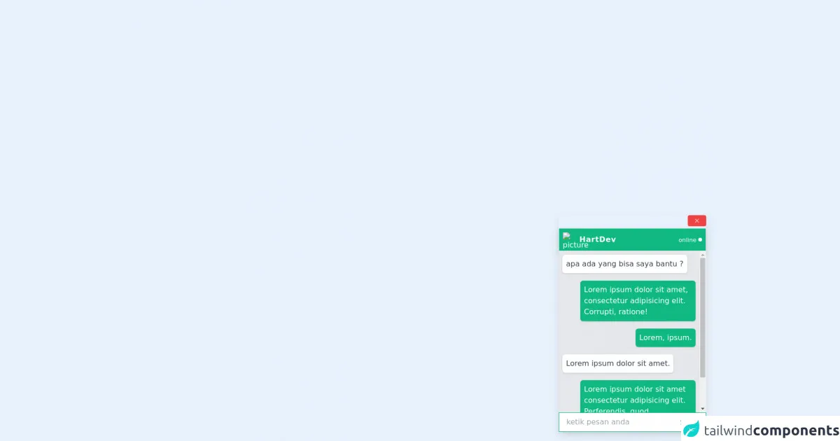
The preview of Chat Support UI component
To create a Chat Support UI component with Tailwind CSS, we will use HTML and CSS code. Here is a preview of the Chat Support UI component that we will create:
Free download of the Chat Support's source code
The source code of Chat Support UI component
To create the Chat Support UI component, we will use HTML and CSS code. Here is the source code of the Chat Support UI component:
<style>
    .chat-services{
      transition: .5s;
      max-height: 0;
    }
    .chat-services.expand{
      max-height: 350px;
    }
    .message {
      max-width: 250px;
    }

    .chat-modal{
      transition: .5s;
      opacity: 0;
      transform: translateX(500px);
    }

    .chat-modal.show{
      opacity: 1;
      transform: translateX(0);
    }

    @keyframes animateModal {
      from{
        transform: translateX(200px) opacity(0);
      }
      to{
        transform: translateX(0) opacity(1);
      }
    }
  </style>

<div class="fixed bottom-0 right-0 flex flex-col items-end ml-6 w-full">
    <div class="chat-modal show  mr-5 flex flex-col mb-5 shadow-lg sm:w-1/2 md:w-1/3 lg:w-1/4">
      <!-- close button -->
      <div class="close-chat bg-red-500 hover:bg-red-600 text-white mb-1 w-10 flex justify-center items-center px-2 py-1 rounded self-end cursor-pointer">
        <svg width="1em" height="1em" viewBox="0 0 16 16" class="bi bi-x" fill="currentColor" xmlns="http://www.w3.org/2000/svg">
          <path fill-rule="evenodd" d="M11.854 4.146a.5.5 0 0 1 0 .708l-7 7a.5.5 0 0 1-.708-.708l7-7a.5.5 0 0 1 .708 0z"/>
          <path fill-rule="evenodd" d="M4.146 4.146a.5.5 0 0 0 0 .708l7 7a.5.5 0 0 0 .708-.708l-7-7a.5.5 0 0 0-.708 0z"/>
        </svg>
      </div>
      <!-- admin profile -->
      <div class="flex justify-between items-center text-white p-2 bg-green-500 border shadow-lg mr-5 w-full">
        <div class="flex items-center">
          <img src="https://f0.pngfuel.com/png/136/22/profile-icon-illustration-user-profile-computer-icons-girl-customer-avatar-png-clip-art-thumbnail.png" alt="picture" class="rounded-full w-8 h-8 mr-1">
          <h2 class="font-semibold tracking-wider">HartDev</h2>
        </div>
        <div class="flex items-center justify-center">
          <small class="mr-1">online</small>
          <div class="rounded-full w-2 h-2 bg-white"></div>
        </div>
      </div>
      <!-- chats -->
      <div class="flex flex-col bg-gray-200 px-2 chat-services expand overflow-auto">
        <div class="chat bg-white text-gray-700 p-2 self-start my-2 rounded-md shadow mr-3">
          apa ada yang bisa saya bantu ?
        </div>
        <div class="message bg-green-500 text-white p-2 self-end my-2 rounded-md shadow ml-3">
          Lorem ipsum dolor sit amet, consectetur adipisicing elit. Corrupti, ratione!
        </div>
        <div class="message bg-green-500 text-white p-2 self-end my-2 rounded-md shadow ml-3">
          Lorem, ipsum.
        </div>
        <div class="message bg-white text-gray-700 p-2 self-start my-2 rounded-md shadow mr-3">
          Lorem ipsum dolor sit amet.
        </div>
        <div class="message bg-green-500 text-white p-2 self-end my-2 rounded-md shadow ml-3">
          Lorem ipsum dolor sit amet consectetur adipisicing elit. Perferendis, quod.
        </div>
        <div class="message bg-white text-gray-700 p-2 self-start my-2 rounded-md shadow mr-3">
          Lorem, ipsum dolor.
        </div>

      </div>
      <!-- send message -->
      <div class="relative bg-white">
        <input type="text" name="message" placeholder="ketik pesan anda"
              class="pl-4 pr-16 py-2 border border-green-500 focus:outline-none w-full">
          <button class="absolute right-0 bottom-0 text-green-600 bg-white  hover:text-green-500 m-1 px-3 py-1 w-auto transistion-color duration-100 focus:outline-none">Send</button>
      </div>
    </div>
    <div class="show-chat hidden mx-10 mb-6 mt-4 text-green-500 hover:text-green-600 flex justify-center items-center cursor-pointer ">
      <svg width="4em" height="4em" viewBox="0 0 16 16" class="bi bi-chat-text-fill" fill="currentColor" xmlns="http://www.w3.org/2000/svg">
        <path fill-rule="evenodd" d="M16 8c0 3.866-3.582 7-8 7a9.06 9.06 0 0 1-2.347-.306c-.584.296-1.925.864-4.181 1.234-.2.032-.352-.176-.273-.362.354-.836.674-1.95.77-2.966C.744 11.37 0 9.76 0 8c0-3.866 3.582-7 8-7s8 3.134 8 7zM4.5 5a.5.5 0 0 0 0 1h7a.5.5 0 0 0 0-1h-7zm0 2.5a.5.5 0 0 0 0 1h7a.5.5 0 0 0 0-1h-7zm0 2.5a.5.5 0 0 0 0 1h4a.5.5 0 0 0 0-1h-4z"/>
      </svg>
    </div>
  </div>

  <script>
    const chatModal = document.querySelector('.chat-modal');
    const chatServices = document.querySelector('.chat-services');

    const showChat = document.querySelector('.show-chat');
    const closeChat = document.querySelector('.close-chat');

    showChat.addEventListener('click', function (){
      chatModal.classList.add('show')
      showChat.classList.add('hidden')
      setTimeout(() => {
        chatServices.classList.add('expand')
      }, 500);
    });
    closeChat.addEventListener('click',function () {
      setTimeout(() => {
        showChat.classList.remove('hidden')
      }, 820);
      chatServices.classList.remove('expand')
      setTimeout(() => {
      chatModal.classList.remove('show')
      }, 500);
    });
  </script>
How to create a Chat Support with Tailwind CSS?
Now, let's dive into the steps to create a Chat Support UI component with Tailwind CSS:
Step 1: Create the HTML structure
The first step is to create the HTML structure of the Chat Support UI component. We will use a simple HTML structure that consists of a chat window, message input field, and send button. Here is the HTML code:
<div class="chat-support">
  <div class="chat-window">
    <div class="chat-message">
      <div class="chat-message-text">
        <p>Hello, how can I help you today?</p>
      </div>
      <div class="chat-message-time">
        <small>10:00 AM</small>
      </div>
    </div>
  </div>
  <div class="chat-input">
    <input type="text" placeholder="Type your message here" class="w-full px-4 py-2 rounded-lg border border-gray-300 focus:outline-none focus:border-blue-500">
    <button class="ml-2 px-4 py-2 rounded-lg bg-blue-500 text-white hover:bg-blue-600 focus:outline-none focus:bg-blue-600">Send</button>
  </div>
</div>
Step 2: Style the Chat Support UI component with Tailwind CSS
The next step is to style the Chat Support UI component with Tailwind CSS. We will use the pre-defined CSS classes provided by Tailwind CSS to style the Chat Support UI component. Here is the CSS code:
.chat-support {
  display: flex;
  flex-direction: column;
  height: 400px;
  border: 1px solid #ccc;
}

.chat-window {
  flex: 1;
  overflow-y: scroll;
  padding: 10px;
}

.chat-message {
  display: flex;
  margin-bottom: 10px;
}

.chat-message-text {
  background-color: #f1f0f0;
  padding: 10px;
  border-radius: 10px;
  max-width: 70%;
}

.chat-message-time {
  margin-left: 10px;
  align-self: center;
}

.chat-input {
  display: flex;
  align-items: center;
  padding: 10px;
  border-top: 1px solid #ccc;
}

.chat-input input[type="text"] {
  flex: 1;
}

.chat-input button {
  min-width: 80px;
}
Step 3: Customize the Chat Support UI component
The final step is to customize the Chat Support UI component to match your project's design. You can modify the pre-defined CSS classes or add your own CSS classes to customize the appearance of the Chat Support UI component. Here are some tips to customize the Chat Support UI component with Tailwind CSS:
- Use the
bg-*classes to change the background color of the Chat Support UI component. - Use the
text-*classes to change the text color of the Chat Support UI component. - Use the
border-*classes to change the border color of the Chat Support UI component. - Use the
rounded-*classes to change the border radius of the Chat Support UI component. - Use the
hover:*classes to add hover effects to the Chat Support UI component. - Use the
focus:*classes to add focus effects to the Chat Support UI component.
Conclusion
In this article, we have explored how to create a Chat Support UI component with Tailwind CSS like a pro. We have discussed the benefits of using Tailwind CSS to create UI components and provided a step-by-step guide to create a Chat Support UI component with Tailwind CSS. With these tips, you can easily create customizable and responsive UI components with Tailwind CSS.