- Published on
Beginners Guide: Make A Chat Messages With Tailwind CSS
- What is Tailwind CSS?
- The description of Chat Messages UI component
- Why use Tailwind CSS to create a Chat Messages UI component?
- The preview of Chat Messages UI component
- The source code of Chat Messages UI component
- How to create a Chat Messages with Tailwind CSS?
- Step 1: Set up the HTML structure
- Step 2: Add Tailwind CSS classes
- Step 3: Customize the design
- Conclusion
What is Tailwind CSS?
Tailwind CSS is a utility-first CSS framework that provides a set of pre-defined classes to create custom designs quickly. It is a low-level CSS framework that allows you to build responsive and user-friendly web interfaces with ease. The framework is designed to be highly customizable, and it provides a lot of flexibility to developers to create their own designs.
The description of Chat Messages UI component
A chat message UI component is a user interface element that displays chat messages in a conversational format. It is a common feature in many web applications, including social media platforms, messaging apps, and customer support systems. The chat message UI component typically displays a list of messages in chronological order, with the most recent message at the bottom of the list.
Why use Tailwind CSS to create a Chat Messages UI component?
Tailwind CSS is an excellent choice for creating a chat message UI component because it provides a lot of pre-defined classes that can be used to create custom designs quickly. The utility-first approach of Tailwind CSS makes it easy to create responsive and user-friendly designs without writing a lot of custom CSS code. Additionally, Tailwind CSS provides a lot of flexibility to developers to customize their designs and create unique user interfaces.
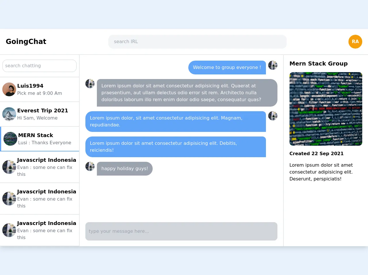
The preview of Chat Messages UI component
To create a chat message UI component with Tailwind CSS, we will use a combination of flexbox and grid layout. The chat message UI component will display a list of messages in a conversational format, with the most recent message at the bottom of the list.
Free download of the Chat Messages's source code
The source code of Chat Messages UI component
To create a chat message UI component with Tailwind CSS, we will use HTML and CSS code. The HTML code will define the structure of the chat message UI component, while the CSS code will provide the styling and layout.
<!-- This is an example component -->
<div class="container mx-auto shadow-lg rounded-lg">
        <!-- headaer -->
    <div class="px-5 py-5 flex justify-between items-center bg-white border-b-2">
      <div class="font-semibold text-2xl">GoingChat</div>
      <div class="w-1/2">
        <input
          type="text"
          name=""
          id=""
          placeholder="search IRL"
          class="rounded-2xl bg-gray-100 py-3 px-5 w-full"
        />
      </div>
      <div
        class="h-12 w-12 p-2 bg-yellow-500 rounded-full text-white font-semibold flex items-center justify-center"
      >
        RA
      </div>
    </div>
    <!-- end header -->
    <!-- Chatting -->
    <div class="flex flex-row justify-between bg-white">
      <!-- chat list -->
      <div class="flex flex-col w-2/5 border-r-2 overflow-y-auto">
        <!-- search compt -->
        <div class="border-b-2 py-4 px-2">
          <input
            type="text"
            placeholder="search chatting"
            class="py-2 px-2 border-2 border-gray-200 rounded-2xl w-full"
          />
        </div>
        <!-- end search compt -->
        <!-- user list -->
        <div
          class="flex flex-row py-4 px-2 justify-center items-center border-b-2"
        >
          <div class="w-1/4">
            <img
              src="https://source.unsplash.com/_7LbC5J-jw4/600x600"
              class="object-cover h-12 w-12 rounded-full"
              alt=""
            />
          </div>
          <div class="w-full">
            <div class="text-lg font-semibold">Luis1994</div>
            <span class="text-gray-500">Pick me at 9:00 Am</span>
          </div>
        </div>
        <div class="flex flex-row py-4 px-2 items-center border-b-2">
          <div class="w-1/4">
            <img
              src="https://source.unsplash.com/otT2199XwI8/600x600"
              class="object-cover h-12 w-12 rounded-full"
              alt=""
            />
          </div>
          <div class="w-full">
            <div class="text-lg font-semibold">Everest Trip 2021</div>
            <span class="text-gray-500">Hi Sam, Welcome</span>
          </div>
        </div>
        <div
          class="flex flex-row py-4 px-2 items-center border-b-2 border-l-4 border-blue-400"
        >
          <div class="w-1/4">
            <img
              src="https://source.unsplash.com/L2cxSuKWbpo/600x600"
              class="object-cover h-12 w-12 rounded-full"
              alt=""
            />
          </div>
          <div class="w-full">
            <div class="text-lg font-semibold">MERN Stack</div>
            <span class="text-gray-500">Lusi : Thanks Everyone</span>
          </div>
        </div>
        <div class="flex flex-row py-4 px-2 items-center border-b-2">
          <div class="w-1/4">
            <img
              src="https://source.unsplash.com/vpOeXr5wmR4/600x600"
              class="object-cover h-12 w-12 rounded-full"
              alt=""
            />
          </div>
          <div class="w-full">
            <div class="text-lg font-semibold">Javascript Indonesia</div>
            <span class="text-gray-500">Evan : some one can fix this</span>
          </div>
        </div>
        <!-- end user list -->
      </div>
      <!-- end chat list -->
      <!-- message -->
      <div class="w-full px-5 flex flex-col justify-between">
        <div class="flex flex-col mt-5">
          <div class="flex justify-end mb-4">
            <div
              class="mr-2 py-3 px-4 bg-blue-400 rounded-bl-3xl rounded-tl-3xl rounded-tr-xl text-white"
            >
              Welcome to group everyone !
            </div>
            <img
              src="https://source.unsplash.com/vpOeXr5wmR4/600x600"
              class="object-cover h-8 w-8 rounded-full"
              alt=""
            />
          </div>
          <div class="flex justify-start mb-4">
            <img
              src="https://source.unsplash.com/vpOeXr5wmR4/600x600"
              class="object-cover h-8 w-8 rounded-full"
              alt=""
            />
            <div
              class="ml-2 py-3 px-4 bg-gray-400 rounded-br-3xl rounded-tr-3xl rounded-tl-xl text-white"
            >
              Lorem ipsum dolor sit amet consectetur adipisicing elit. Quaerat
              at praesentium, aut ullam delectus odio error sit rem. Architecto
              nulla doloribus laborum illo rem enim dolor odio saepe,
              consequatur quas?
            </div>
          </div>
          <div class="flex justify-end mb-4">
            <div>
              <div
                class="mr-2 py-3 px-4 bg-blue-400 rounded-bl-3xl rounded-tl-3xl rounded-tr-xl text-white"
              >
                Lorem ipsum dolor, sit amet consectetur adipisicing elit.
                Magnam, repudiandae.
              </div>

              <div
                class="mt-4 mr-2 py-3 px-4 bg-blue-400 rounded-bl-3xl rounded-tl-3xl rounded-tr-xl text-white"
              >
                Lorem ipsum dolor sit amet consectetur adipisicing elit.
                Debitis, reiciendis!
              </div>
            </div>
            <img
              src="https://source.unsplash.com/vpOeXr5wmR4/600x600"
              class="object-cover h-8 w-8 rounded-full"
              alt=""
            />
          </div>
          <div class="flex justify-start mb-4">
            <img
              src="https://source.unsplash.com/vpOeXr5wmR4/600x600"
              class="object-cover h-8 w-8 rounded-full"
              alt=""
            />
            <div
              class="ml-2 py-3 px-4 bg-gray-400 rounded-br-3xl rounded-tr-3xl rounded-tl-xl text-white"
            >
              happy holiday guys!
            </div>
          </div>
        </div>
        <div class="py-5">
          <input
            class="w-full bg-gray-300 py-5 px-3 rounded-xl"
            type="text"
            placeholder="type your message here..."
          />
        </div>
      </div>
      <!-- end message -->
      <div class="w-2/5 border-l-2 px-5">
        <div class="flex flex-col">
          <div class="font-semibold text-xl py-4">Mern Stack Group</div>
          <img
            src="https://source.unsplash.com/L2cxSuKWbpo/600x600"
            class="object-cover rounded-xl h-64"
            alt=""
          />
          <div class="font-semibold py-4">Created 22 Sep 2021</div>
          <div class="font-light">
            Lorem ipsum dolor sit amet consectetur adipisicing elit. Deserunt,
            perspiciatis!
          </div>
          </div>
        </div>
      </div>
    </div>
</div>
How to create a Chat Messages with Tailwind CSS?
To create a chat message UI component with Tailwind CSS, follow these steps:
Step 1: Set up the HTML structure
The first step is to set up the HTML structure of the chat message UI component. We will use a combination of flexbox and grid layout to create the chat message UI component.
<div class="chat-messages-container">
  <div class="chat-message">
    <div class="chat-message-content">
      <p>Message content</p>
    </div>
    <div class="chat-message-meta">
      <span class="chat-message-time">Message time</span>
      <span class="chat-message-status">Message status</span>
    </div>
  </div>
</div>
Step 2: Add Tailwind CSS classes
The next step is to add Tailwind CSS classes to the HTML code to style and layout the chat message UI component.
<div class="chat-messages-container">
  <div class="chat-message flex flex-col">
    <div class="chat-message-content bg-gray-200 p-2 rounded-lg">
      <p>Message content</p>
    </div>
    <div class="chat-message-meta flex justify-between text-gray-500 text-sm mt-1">
      <span class="chat-message-time">Message time</span>
      <span class="chat-message-status">Message status</span>
    </div>
  </div>
</div>
Step 3: Customize the design
The final step is to customize the design of the chat message UI component by adding custom CSS code or modifying the existing Tailwind CSS classes.
<div class="chat-messages-container">
  <div class="chat-message flex flex-col">
    <div class="chat-message-content bg-gray-200 p-2 rounded-lg">
      <p class="text-sm">Message content</p>
    </div>
    <div class="chat-message-meta flex justify-between text-gray-500 text-xs mt-1">
      <span class="chat-message-time">Message time</span>
      <span class="chat-message-status text-green-500">Sent</span>
    </div>
  </div>
  <div class="chat-message flex flex-col">
    <div class="chat-message-content bg-blue-500 text-white p-2 rounded-lg">
      <p class="text-sm">Message content</p>
    </div>
    <div class="chat-message-meta flex justify-between text-gray-500 text-xs mt-1">
      <span class="chat-message-time">Message time</span>
      <span class="chat-message-status text-white">Delivered</span>
    </div>
  </div>
  <div class="chat-message flex flex-col">
    <div class="chat-message-content bg-gray-200 p-2 rounded-lg">
      <p class="text-sm">Message content</p>
    </div>
    <div class="chat-message-meta flex justify-between text-gray-500 text-xs mt-1">
      <span class="chat-message-time">Message time</span>
      <span class="chat-message-status text-red-500">Failed</span>
    </div>
  </div>
</div>
Conclusion
In conclusion, Tailwind CSS is an excellent choice for creating a chat message UI component because it provides a lot of pre-defined classes that can be used to create custom designs quickly. With Tailwind CSS, you can create responsive and user-friendly designs without writing a lot of custom CSS code. Additionally, Tailwind CSS provides a lot of flexibility to developers to customize their designs and create unique user interfaces.