- Published on
Learn How To Create A Changelog With Tailwind CSS Like an Expert
- What is Tailwind CSS?
- The description of Changelog ui component
- Why use Tailwind CSS to create a Changelog ui component?
- The preview of Changelog ui component
- The source code of Changelog ui component
- How to create a Changelog with Tailwind CSS?
- Conclusion
If you are a web developer, you know how important it is to keep track of changes made to your project. A changelog is a great way to do that. It is a log or record of all the changes made to a project. In this article, we will learn how to create a changelog with Tailwind CSS.
What is Tailwind CSS?
Tailwind CSS is a utility-first CSS framework that allows you to create custom designs without writing any CSS. It provides a set of pre-defined classes that you can use to style your HTML elements. Tailwind CSS is gaining popularity among developers because of its simplicity and flexibility.
The description of Changelog ui component
A changelog is a UI component that displays a list of changes made to a project. It usually consists of a list of items, with each item representing a change. The items are usually displayed in reverse chronological order, with the most recent change displayed at the top.
Why use Tailwind CSS to create a Changelog ui component?
Tailwind CSS provides a set of pre-defined classes that you can use to style your HTML elements. This makes it easy to create a changelog UI component without writing any CSS. Tailwind CSS also provides a responsive design, which means that your changelog will look good on all screen sizes.
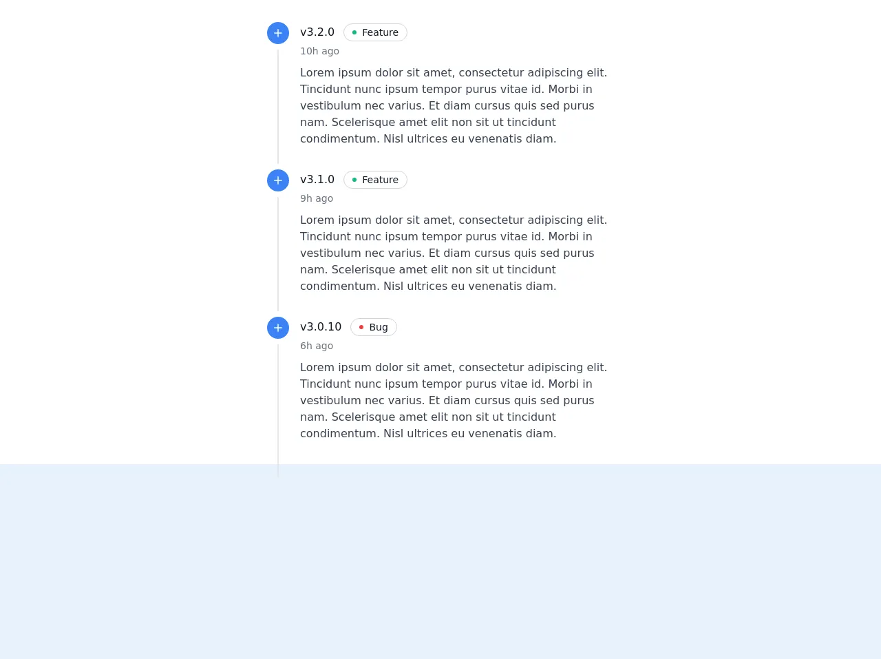
The preview of Changelog ui component
To create a changelog UI component with Tailwind CSS, we will use a list of items to represent the changes. Each item will have a title, a date, and a description. We will use the flex and gap classes to create a responsive layout. We will also use the text-gray-500 class to style the date.
Free download of the Changelog's source code
The source code of Changelog ui component
To create a changelog UI component with Tailwind CSS, we will use the ul and li elements to represent the list of items. We will use the flex and gap classes to create a responsive layout. We will also use the text-gray-500 class to style the date.
<div class="bg-white">
<div class="max-w-xl mx-auto p-8">
  <div class="flow-root">
    <ul class="-mb-8">

      <li>
        <div class="relative pb-8">
          <span class="absolute top-5 left-5 -ml-px h-full w-0.5 bg-gray-200" aria-hidden="true"></span>
          <div class="relative flex items-start space-x-3">
            <div>
              <div class="relative px-1">
                <div class="h-8 w-8 bg-blue-500 rounded-full ring-8 ring-white flex items-center justify-center">
                  <svg class="text-white h-5 w-5" xmlns="http://www.w3.org/2000/svg" fill="none" viewBox="0 0 24 24" stroke="currentColor">
                    <path stroke-linecap="round" stroke-linejoin="round" stroke-width="2" d="M12 6v6m0 0v6m0-6h6m-6 0H6" />
                  </svg>
                </div>
              </div>
            </div>
            <div class="min-w-0 flex-1 py-0">
              <div class="text-md text-gray-500">
                <div>
                  <a href="#" class="font-medium text-gray-900 mr-2">v3.2.0</a>

                  <a href="#" class="my-0.5 relative inline-flex items-center bg-white rounded-full border border-gray-300 px-3 py-0.5 text-sm">
                    <div class="absolute flex-shrink-0 flex items-center justify-center">
                      <span class="h-1.5 w-1.5 rounded-full bg-green-500" aria-hidden="true"></span>
                    </div>
                    <div class="ml-3.5 font-medium text-gray-900">Feature</div>
                  </a>
                </div>
                <span class="whitespace-nowrap text-sm">10h ago</span>
              </div>
              <div class="mt-2 text-gray-700">
                <p>Lorem ipsum dolor sit amet, consectetur adipiscing elit. Tincidunt nunc ipsum tempor purus vitae id. Morbi in vestibulum nec varius. Et diam cursus quis sed purus nam. Scelerisque amet elit non sit ut tincidunt condimentum. Nisl ultrices eu venenatis diam.</p>
              </div>
            </div>
          </div>
        </div>
      </li><li>
        <div class="relative pb-8">
          <span class="absolute top-5 left-5 -ml-px h-full w-0.5 bg-gray-200" aria-hidden="true"></span>
          <div class="relative flex items-start space-x-3">
            <div>
              <div class="relative px-1">
                <div class="h-8 w-8 bg-blue-500 rounded-full ring-8 ring-white flex items-center justify-center">
                  <svg class="text-white h-5 w-5" xmlns="http://www.w3.org/2000/svg" fill="none" viewBox="0 0 24 24" stroke="currentColor">
                    <path stroke-linecap="round" stroke-linejoin="round" stroke-width="2" d="M12 6v6m0 0v6m0-6h6m-6 0H6" />
                  </svg>
                </div>
              </div>
            </div>
            <div class="min-w-0 flex-1 py-0">
              <div class="text-md text-gray-500">
                <div>
                  <a href="#" class="font-medium text-gray-900 mr-2">v3.1.0</a>

                  <a href="#" class="my-0.5 relative inline-flex items-center bg-white rounded-full border border-gray-300 px-3 py-0.5 text-sm">
                    <div class="absolute flex-shrink-0 flex items-center justify-center">
                      <span class="h-1.5 w-1.5 rounded-full bg-green-500" aria-hidden="true"></span>
                    </div>
                    <div class="ml-3.5 font-medium text-gray-900">Feature</div>
                  </a>
                </div>
                <span class="whitespace-nowrap text-sm">9h ago</span>
              </div>
              <div class="mt-2 text-gray-700">
                <p>Lorem ipsum dolor sit amet, consectetur adipiscing elit. Tincidunt nunc ipsum tempor purus vitae id. Morbi in vestibulum nec varius. Et diam cursus quis sed purus nam. Scelerisque amet elit non sit ut tincidunt condimentum. Nisl ultrices eu venenatis diam.</p>
              </div>
            </div>
          </div>
        </div>
      </li>

      <li>
        <div class="relative pb-8">
          <span class="absolute top-5 left-5 -ml-px h-full w-0.5 bg-gray-200" aria-hidden="true"></span>
          <div class="relative flex items-start space-x-3">
            <div>
              <div class="relative px-1">
                <div class="h-8 w-8 bg-blue-500 rounded-full ring-8 ring-white flex items-center justify-center">
                  <svg class="text-white h-5 w-5" xmlns="http://www.w3.org/2000/svg" fill="none" viewBox="0 0 24 24" stroke="currentColor">
                    <path stroke-linecap="round" stroke-linejoin="round" stroke-width="2" d="M12 6v6m0 0v6m0-6h6m-6 0H6" />
                  </svg>
                </div>
              </div>
            </div>
            <div class="min-w-0 flex-1 py-0">
              <div class="text-md text-gray-500">
                <div>
                  <a href="#" class="font-medium text-gray-900 mr-2">v3.0.10</a>

                  <a href="#" class="my-0.5 relative inline-flex items-center bg-white rounded-full border border-gray-300 px-3 py-0.5 text-sm">
                    <div class="absolute flex-shrink-0 flex items-center justify-center">
                      <span class="h-1.5 w-1.5 rounded-full bg-red-500" aria-hidden="true"></span>
                    </div>
                    <div class="ml-3.5 font-medium text-gray-900">Bug</div>
                  </a>
                </div>
                <span class="whitespace-nowrap text-sm">6h ago</span>
              </div>
              <div class="mt-2 text-gray-700">
                <p>Lorem ipsum dolor sit amet, consectetur adipiscing elit. Tincidunt nunc ipsum tempor purus vitae id. Morbi in vestibulum nec varius. Et diam cursus quis sed purus nam. Scelerisque amet elit non sit ut tincidunt condimentum. Nisl ultrices eu venenatis diam.</p>
              </div>
            </div>
          </div>
        </div>
      </li>


    </ul>
  </div>
</div>

</div>
How to create a Changelog with Tailwind CSS?
To create a changelog with Tailwind CSS, follow these steps:
- Create an HTML file and add the following code:
<div class="bg-gray-100 py-8">
  <div class="container mx-auto">
    <h1 class="text-3xl font-bold mb-4">Changelog</h1>
    <ul class="divide-y divide-gray-300">
      <li class="py-4 flex">
        <div class="flex-1">
          <div class="font-bold">Version 1.0.0</div>
          <div class="text-gray-500">May 1, 2021</div>
          <div class="mt-2">Initial release</div>
        </div>
      </li>
      <li class="py-4 flex">
        <div class="flex-1">
          <div class="font-bold">Version 1.1.0</div>
          <div class="text-gray-500">May 15, 2021</div>
          <div class="mt-2">Added new feature</div>
        </div>
      </li>
      <li class="py-4 flex">
        <div class="flex-1">
          <div class="font-bold">Version 1.2.0</div>
          <div class="text-gray-500">June 1, 2021</div>
          <div class="mt-2">Fixed bug</div>
        </div>
      </li>
    </ul>
  </div>
</div>
- Add the Tailwind CSS CDN to your HTML file:
<link href="https://cdn.jsdelivr.net/npm/[email protected]/dist/tailwind.min.css" rel="stylesheet">
- Open the HTML file in your browser, and you should see the changelog.
Conclusion
In this article, we learned how to create a changelog with Tailwind CSS. We used the ul and li elements to represent the list of items, and we used the flex and gap classes to create a responsive layout. We also used the text-gray-500 class to style the date. With Tailwind CSS, creating a changelog UI component is easy and straightforward.