- Published on
3 Things You Must Know To Make A Cart With Tailwind CSS
- What is Tailwind CSS?
- The description of Cart ui component
- Why use Tailwind CSS to create a Cart ui component?
- The preview of Cart ui component
- The source code of Cart ui component
- How to create a Cart with Tailwind CSS?
- Step 1: Set up the HTML structure
- Step 2: Style the cart with Tailwind CSS
- Step 3: Add functionality to the cart
- Conclusion
What is Tailwind CSS?
Tailwind CSS is a utility-first CSS framework that helps you quickly build custom designs without writing any CSS. It provides a set of pre-defined classes that can be used to create a wide range of UI components. Tailwind CSS is designed to be highly customizable, which means you can easily modify the default styles to match your brand or design requirements.
The description of Cart ui component
A cart is an essential component of any e-commerce website. It allows users to add products to their cart and proceed to checkout. A well-designed cart can help improve the user experience and increase conversions. A typical cart UI component consists of a list of products, a summary of the total cost, and options to update or remove items from the cart.
Why use Tailwind CSS to create a Cart ui component?
Tailwind CSS provides a set of pre-defined classes that can be used to create a cart UI component quickly. It also allows you to customize the styles to match your design requirements. Using Tailwind CSS can save you a lot of time and effort in writing custom CSS for your cart component.
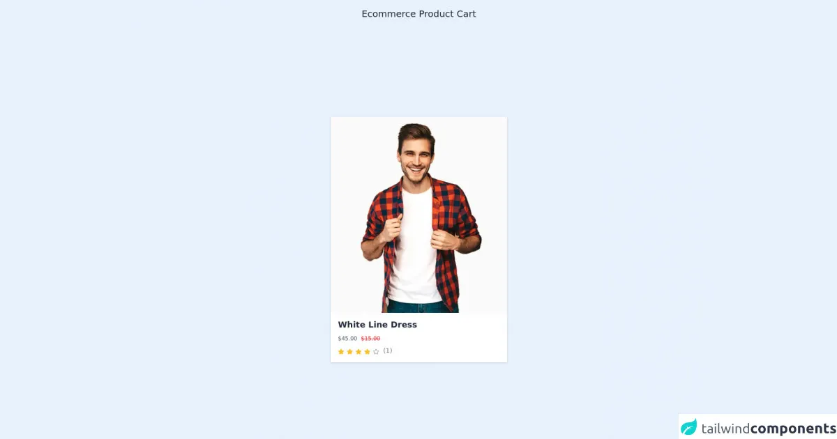
The preview of Cart ui component
To create a cart UI component with Tailwind CSS, we will use a combination of flexbox and grid layout. The cart will consist of a list of products with their details, a summary of the total cost, and options to update or remove items from the cart.
Free download of the Cart's source code
The source code of Cart ui component
To create the cart UI component, we will use HTML and Tailwind CSS classes. The HTML structure will consist of a container element with a grid layout to display the cart items and a flexbox layout to display the summary and options.
<!-- font-awesome cdn -->
<link rel="stylesheet" href="https://cdnjs.cloudflare.com/ajax/libs/font-awesome/5.15.3/css/all.min.css" referrerpolicy="no-referrer" />


<div class="text-gray-800 text-xl text-center pt-4">Ecommerce Product Cart</div>
<div class="w-full h-screen flex justify-center items-center">
   <div>
        <div class="w-96">
            <div class="shadow hover:shadow-lg transition duration-300 ease-in-out xl:mb-0 lg:mb-0 md:mb-0 mb-6 cursor-pointer group">
                <div class="overflow-hidden relative">
                <img class="w-full transition duration-700 ease-in-out group-hover:opacity-60" src="https://klbtheme.com/shopwise/fashion/wp-content/uploads/2020/04/product_img10-1.jpg" alt="image" />
                <div class="flex justify-center">
                    <div class="absolute bottom-4 transition duration-500 ease-in-out opacity-0 group-hover:opacity-100">
                        <a href="cart.html" class="bg-gray-700 px-3 py-3 hover:bg-red-500 transition duration-300 ease-in-out">
                            <i class="fas fa-shopping-cart transition duration-300 ease-in-out flex justify-center items-center text-gray-100"></i>
                        </a>
                        <a href="random.html" class="bg-gray-700 px-3 py-3 hover:bg-red-500 transition duration-300 ease-in-out">
                            <i class="fas fa-random transition duration-300 ease-in-out flex justify-center items-center text-gray-100"></i>
                        </a>
                        <a href="single_prod.html" class="bg-gray-700 px-3 py-3 hover:bg-red-500 transition duration-300 ease-in-out">
                            <i class="fas fa-search transition duration-300 ease-in-out flex justify-center items-center text-gray-100"></i>
                        </a>
                        <a href="cart.html" class="bg-gray-700 px-3 py-3 hover:bg-red-500 transition duration-300 ease-in-out">
                            <i class="fas fa-heart transition duration-300 ease-in-out flex justify-center items-center text-gray-100"></i>
                        </a>
                    </div>
                </div>
            </div>
            <div class="px-4 py-3 bg-white">
                <a href="#" class=""><h1 class="text-gray-800 font-semibold text-lg hover:text-red-500 transition duration-300 ease-in-out">White Line Dress</h1></a>
                <div class="flex py-2">
                    <p class="mr-2 text-xs text-gray-600">$45.00</p>
                        <p class="mr-2 text-xs text-red-600 line-through">$15.00</p>
                </div>
                <div class="flex">
                    <div class="">
                        <i class="fas fa-star text-yellow-400 text-xs"></i>
                        <i class="fas fa-star text-yellow-400 text-xs"></i>
                        <i class="fas fa-star text-yellow-400 text-xs"></i>
                        <i class="fas fa-star text-yellow-400 text-xs"></i>
                        <i class="far fa-star text-gray-400 text-xs"></i>
                    </div>
                    <div class="ml-2">
                        <p class="text-gray-500 font-medium text-sm">(1)</p>
                    </div>
                </div>
            </div>
            </div>
       </div>
   </div>
</div>
How to create a Cart with Tailwind CSS?
To create a cart with Tailwind CSS, follow these three steps:
Step 1: Set up the HTML structure
Create a container element with a grid layout to display the cart items. The grid layout will have three columns: one for the product image, one for the product details, and one for the product price and options. Use a flexbox layout to display the summary and options.
<div class="cart-container grid grid-cols-3 gap-4">
  <!-- Product Image -->
  <div class="cart-item-image"></div>

  <!-- Product Details -->
  <div class="cart-item-details"></div>

  <!-- Product Price and Options -->
  <div class="cart-item-price"></div>

  <!-- Summary and Options -->
  <div class="cart-summary flex flex-col"></div>
</div>
Step 2: Style the cart with Tailwind CSS
Use Tailwind CSS classes to style the cart components. Here are some examples:
/* Cart Container */
.cart-container {
  border: 1px solid #ccc;
  padding: 1rem;
}

/* Cart Item Image */
.cart-item-image {
  background-image: url('product-image.jpg');
  background-size: cover;
  height: 100px;
}

/* Cart Item Details */
.cart-item-details {
  display: flex;
  flex-direction: column;
  justify-content: center;
  padding: 0.5rem;
}

/* Cart Item Price */
.cart-item-price {
  display: flex;
  flex-direction: column;
  justify-content: center;
  align-items: flex-end;
  padding: 0.5rem;
}

/* Cart Summary */
.cart-summary {
  margin-top: auto;
  padding: 1rem;
  background-color: #f5f5f5;
}
Step 3: Add functionality to the cart
Add JavaScript code to handle the cart functionality, such as adding or removing items, updating the total cost, and displaying the cart summary.
Conclusion
Creating a cart UI component with Tailwind CSS is a quick and easy process. By using pre-defined classes and customizing the styles, you can create a cart that matches your design requirements. With the help of JavaScript, you can add functionality to the cart and improve the user experience.