- Published on
Here Are 6 Ways To Build A Cards With Tailwind CSS
- What is Tailwind CSS?
- The description of cards UI component
- Why use Tailwind CSS to create a cards UI component?
- The preview of cards UI component
- The source code of cards UI component
- How to create a cards with Tailwind CSS?
- Step 1: Create the HTML structure
- Step 2: Style the header
- Step 3: Style the body
- Step 4: Style the footer
- Step 5: Customize the design
- Conclusion
As a FrontEnd technology blogger, I am always on the lookout for new and innovative ways to create stunning UI components. One such component that has become increasingly popular in recent years is the cards UI component. In this article, I will show you how to create a cards UI component using Tailwind CSS.
What is Tailwind CSS?
Tailwind CSS is a utility-first CSS framework that allows you to rapidly build custom user interfaces. It provides a set of pre-defined classes that can be used to style HTML elements. With Tailwind CSS, you can create complex layouts and designs without having to write custom CSS.
The description of cards UI component
The cards UI component is a popular design pattern that is used to display information in a visually appealing way. Cards are typically rectangular in shape and contain a header, body, and footer. They can be used to display a wide range of content, including text, images, and videos.
Why use Tailwind CSS to create a cards UI component?
Tailwind CSS is an excellent choice for creating a cards UI component for several reasons. First, it provides a set of pre-defined classes that can be used to style the various elements of the card. This makes it easy to create a consistent design across all of your cards.
Second, Tailwind CSS is highly customizable. You can easily modify the default styles to create a unique look and feel for your cards. This allows you to create a design that matches your brand or website.
Finally, Tailwind CSS is easy to use. You don't need to have extensive knowledge of CSS to create beautiful cards. With just a few classes, you can create a stunning design that will impress your users.
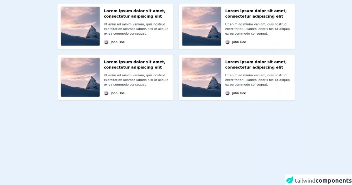
The preview of cards UI component
Cards UI components are a great way to display information in a visually appealing way. They can be used to display a wide range of content, including text, images, and videos. With Tailwind CSS, you can easily create beautiful cards that will impress your users.
Free download of the cards's source code
The source code of cards UI component
Creating a cards UI component with Tailwind CSS is easy. You can use a combination of pre-defined classes and custom styles to create a unique design. Here is an example of how to create a simple card using Tailwind CSS.
<section class="container px-6 py-4 mx-auto">
  <div class="grid gap-6 mb-8 md:grid-cols-1 lg:grid-cols-2">
    <!-- Card 1 -->
    <div class="flex items-center p-4 bg-white border-2 border-gray-200 rounded-lg shadow-sm dark:bg-gray-800">
        <img alt="mountain" class="w-45 rounded-md border-2 border-gray-300" src="https://picsum.photos/seed/picsum/200" />
         <div id="body" class="flex flex-col ml-5">
            <h4 id="name" class="text-xl font-semibold mb-2">Lorem ipsum dolor sit amet, consectetur adipiscing elit</h4>
            <p id="job" class="text-gray-800 mt-2">Ut enim ad minim veniam, quis nostrud exercitation ullamco laboris nisi ut aliquip ex ea commodo consequat.</p>
            <div class="flex mt-5">
               <img alt="avatar" class="w-6 rounded-full border-2 border-gray-300" src="https://picsum.photos/seed/picsum/200" />
               <p class="ml-3">John Doe</p>
            </div>
         </div>
    </div>
    <!-- Card 2 -->
    <div class="flex items-center p-4 bg-white border-2 border-gray-200 rounded-lg shadow-sm dark:bg-gray-800">
           <img alt="mountain" class="w-45 rounded-md border-2 border-gray-300" src="https://picsum.photos/seed/picsum/200" />
         <div id="body" class="flex flex-col ml-5">
            <h4 id="name" class="text-xl font-semibold mb-2">Lorem ipsum dolor sit amet, consectetur adipiscing elit</h4>
            <p id="job" class="text-gray-800 mt-2">Ut enim ad minim veniam, quis nostrud exercitation ullamco laboris nisi ut aliquip ex ea commodo consequat.</p>
            <div class="flex mt-5">
               <img alt="avatar" class="w-6 rounded-full border-2 border-gray-300" src="https://picsum.photos/seed/picsum/200" />
               <p class="ml-3">John Doe</p>
            </div>
         </div>
    </div>
    <!-- Card 3 -->
    <div class="flex items-center p-4 bg-white border-2 border-gray-200 rounded-lg shadow-sm dark:bg-gray-800">
            <img alt="mountain" class="w-45 rounded-md border-2 border-gray-300" src="https://picsum.photos/seed/picsum/200" />
         <div id="body" class="flex flex-col ml-5">
            <h4 id="name" class="text-xl font-semibold mb-2">Lorem ipsum dolor sit amet, consectetur adipiscing elit</h4>
            <p id="job" class="text-gray-800 mt-2">Ut enim ad minim veniam, quis nostrud exercitation ullamco laboris nisi ut aliquip ex ea commodo consequat.</p>
            <div class="flex mt-5">
               <img alt="avatar" class="w-6 rounded-full border-2 border-gray-300" src="https://picsum.photos/seed/picsum/200" />
               <p class="ml-3">John Doe</p>
            </div>
         </div>
    </div>
    <!-- Card 4 -->
    <div class="flex items-center p-4 bg-white border-2 border-gray-200 rounded-lg shadow-sm dark:bg-gray-800">
       <img alt="mountain" class="w-45 rounded-md border-2 border-gray-300" src="https://picsum.photos/seed/picsum/200" />
         <div id="body" class="flex flex-col ml-5">
            <h4 id="name" class="text-xl font-semibold mb-2">Lorem ipsum dolor sit amet, consectetur adipiscing elit</h4>
            <p id="job" class="text-gray-800 mt-2">Ut enim ad minim veniam, quis nostrud exercitation ullamco laboris nisi ut aliquip ex ea commodo consequat.</p>
            <div class="flex mt-5">
               <img alt="avatar" class="w-6 rounded-full border-2 border-gray-300" src="https://picsum.photos/seed/picsum/200" />
               <p class="ml-3">John Doe</p>
            </div>
         </div>
    </div>
  </div>
</section>
How to create a cards with Tailwind CSS?
Now that you understand the benefits of using Tailwind CSS to create a cards UI component, let's take a look at how to create a card.
Step 1: Create the HTML structure
The first step in creating a card is to create the HTML structure. The card consists of a container div that contains a header, body, and footer. Here is an example of the HTML structure for a card:
<div class="card">
  <div class="card-header">
    <!-- Header content goes here -->
  </div>
  <div class="card-body">
    <!-- Body content goes here -->
  </div>
  <div class="card-footer">
    <!-- Footer content goes here -->
  </div>
</div>
Step 2: Style the header
The header of the card typically contains a title and some additional information. To style the header, you can use the following classes:
<div class="card-header bg-gray-200 py-2 px-4">
  <h2 class="font-bold text-lg">Card Title</h2>
  <p class="text-gray-600">Additional information goes here</p>
</div>
Step 3: Style the body
The body of the card contains the main content. To style the body, you can use the following classes:
<div class="card-body py-4 px-4">
  <!-- Body content goes here -->
</div>
Step 4: Style the footer
The footer of the card typically contains additional information or actions. To style the footer, you can use the following classes:
<div class="card-footer bg-gray-200 py-2 px-4">
  <p class="text-gray-600">Additional information or actions go here</p>
</div>
Step 5: Customize the design
Once you have created the basic structure of the card, you can customize the design by modifying the default styles or adding your own custom styles. Here are some examples of how you can customize the design:
<div class="card bg-white rounded-lg shadow-lg">
  <div class="card-header bg-blue-500 text-white py-2 px-4 rounded-t-lg">
    <h2 class="font-bold text-lg">Card Title</h2>
  </div>
  <div class="card-body py-4 px-4">
    <!-- Body content goes here -->
  </div>
  <div class="card-footer bg-gray-200 py-2 px-4 rounded-b-lg">
    <p class="text-gray-600">Additional information or actions go here</p>
  </div>
</div>
Conclusion
In conclusion, creating a cards UI component with Tailwind CSS is easy and highly customizable. With just a few classes, you can create a stunning design that will impress your users. By following the steps outlined in this article, you can create beautiful cards that will enhance the user experience of your website or application.