- Published on
Surprisingly Effective Ways To Create A Card With Title With Tailwind CSS
- What is Tailwind CSS?
- The description of Card With Title UI component
- Why use Tailwind CSS to create a Card With Title UI component?
- The preview of Card With Title UI component
- The source code of Card With Title UI component
- How to create a Card With Title with Tailwind CSS?
- Step 1: Set up your HTML structure
- Step 2: Apply Tailwind CSS classes
- Step 3: Customize the styles
- Conclusion
Are you tired of spending hours creating a card with title UI component? Look no further because Tailwind CSS is here to save the day! In this article, we will explore how to create a card with title UI component with Tailwind CSS, and why it is the best tool for the job.
What is Tailwind CSS?
Tailwind CSS is a utility-first CSS framework that provides a set of pre-defined classes that can be used to style HTML elements. It allows developers to create complex UI components quickly and easily, without the need to write custom CSS code. Tailwind CSS is highly customizable, and developers can easily modify the default styles to match their design requirements.
The description of Card With Title UI component
A card with title UI component is a common design pattern used in web development. It is used to display information in a structured and organized manner. The card typically consists of a title, an image, and a description. The card with title UI component is used in a variety of contexts, such as product listings, blog posts, and news articles.
Why use Tailwind CSS to create a Card With Title UI component?
Tailwind CSS is the perfect tool for creating a card with title UI component. It provides a set of pre-defined classes that can be used to style the various elements of the card, such as the title, image, and description. This saves developers a lot of time, as they do not need to write custom CSS code. Additionally, Tailwind CSS is highly customizable, so developers can easily modify the default styles to match their design requirements.
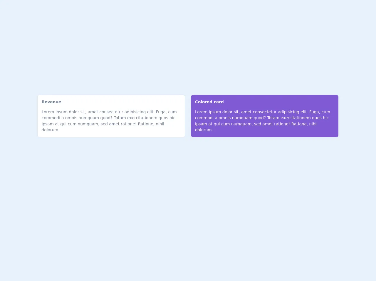
The preview of Card With Title UI component
Creating a card with title UI component with Tailwind CSS is surprisingly easy. Here is a preview of what the final product will look like:
Free download of the Card With Title's source code
The source code of Card With Title UI component
To create a card with title UI component with Tailwind CSS, you will need to write some HTML and apply Tailwind CSS classes to the various elements. Here is the source code for the card with title UI component:
<!-- This is an example component -->
<div class="mx-10 pt-15">
   <div class="grid gap-6 mb-8 md:grid-cols-2">
              <div class="min-w-0 p-4 bg-white rounded-lg shadow-xs dark:bg-gray-800">
                <h4 class="mb-4 font-semibold text-gray-600 dark:text-gray-300">
                  Revenue
                </h4>
                <p class="text-gray-600 dark:text-gray-400">
                  Lorem ipsum dolor sit, amet consectetur adipisicing elit.
                  Fuga, cum commodi a omnis numquam quod? Totam exercitationem
                  quos hic ipsam at qui cum numquam, sed amet ratione! Ratione,
                  nihil dolorum.
                </p>
              </div>
              <div class="min-w-0 p-4 text-white bg-purple-600 rounded-lg shadow-xs">
                <h4 class="mb-4 font-semibold">
                  Colored card
                </h4>
                <p>
                  Lorem ipsum dolor sit, amet consectetur adipisicing elit.
                  Fuga, cum commodi a omnis numquam quod? Totam exercitationem
                  quos hic ipsam at qui cum numquam, sed amet ratione! Ratione,
                  nihil dolorum.
                </p>
              </div>
            </div>
</div>
How to create a Card With Title with Tailwind CSS?
Now that we have covered the basics, let's dive into how to create a card with title UI component with Tailwind CSS.
Step 1: Set up your HTML structure
The first step is to set up your HTML structure. Here is an example:
<div class="max-w-md mx-auto bg-white rounded-xl shadow-md overflow-hidden md:max-w-2xl">
  <div class="md:flex">
    <div class="md:flex-shrink-0">
      <img class="h-48 w-full object-cover md:w-48" src="https://via.placeholder.com/150" alt="Placeholder image">
    </div>
    <div class="p-8">
      <div class="uppercase tracking-wide text-sm text-indigo-500 font-semibold">Case study</div>
      <a href="#" class="block mt-1 text-lg leading-tight font-medium text-black hover:underline">Finding customers for your new business</a>
      <p class="mt-2 text-gray-500">Getting a new business off the ground is a lot of hard work. Here are five ideas you can use to find your first customers.</p>
    </div>
  </div>
</div>
Step 2: Apply Tailwind CSS classes
The next step is to apply Tailwind CSS classes to the various elements. Here is an example:
<div class="max-w-md mx-auto bg-white rounded-xl shadow-md overflow-hidden md:max-w-2xl">
  <div class="md:flex">
    <div class="md:flex-shrink-0">
      <img class="h-48 w-full object-cover md:w-48" src="https://via.placeholder.com/150" alt="Placeholder image">
    </div>
    <div class="p-8">
      <div class="uppercase tracking-wide text-sm text-indigo-500 font-semibold">Case study</div>
      <a href="#" class="block mt-1 text-lg leading-tight font-medium text-black hover:underline">Finding customers for your new business</a>
      <p class="mt-2 text-gray-500">Getting a new business off the ground is a lot of hard work. Here are five ideas you can use to find your first customers.</p>
    </div>
  </div>
</div>
Step 3: Customize the styles
The final step is to customize the styles to match your design requirements. Here is an example:
<div class="max-w-md mx-auto bg-white rounded-xl shadow-md overflow-hidden md:max-w-2xl">
  <div class="md:flex">
    <div class="md:flex-shrink-0">
      <img class="h-48 w-full object-cover md:w-48" src="https://via.placeholder.com/150" alt="Placeholder image">
    </div>
    <div class="p-8">
      <div class="uppercase tracking-wide text-sm text-indigo-500 font-semibold">Case study</div>
      <a href="#" class="block mt-1 text-lg leading-tight font-medium text-black hover:underline">Finding customers for your new business</a>
      <p class="mt-2 text-gray-500">Getting a new business off the ground is a lot of hard work. Here are five ideas you can use to find your first customers.</p>
      <div class="mt-4">
        <a href="#" class="text-indigo-500 hover:text-indigo-600 font-bold">Read more</a>
      </div>
    </div>
  </div>
</div>
Conclusion
Creating a card with title UI component with Tailwind CSS is surprisingly easy and effective. With its pre-defined classes and customization options, Tailwind CSS makes it easy to create complex UI components quickly and easily. If you haven't tried Tailwind CSS yet, give it a try and see how it can simplify your web development workflow.