- Published on
Best Ways To Make A Card User With Tailwind CSS
- What is Tailwind CSS?
- The description of Card User UI component
- Why use Tailwind CSS to create a Card User UI component?
- The preview of Card User UI component
- The source code of Card User UI component
- How to create a Card User with Tailwind CSS?
- Conclusion
What is Tailwind CSS?
Tailwind CSS is a popular utility-first CSS framework that provides a set of pre-defined classes to quickly build custom user interfaces. It is a low-level framework that focuses on providing a wide range of utility classes that can be combined to create complex layouts and designs. Tailwind CSS is easy to learn and use, making it a favorite among developers.
The description of Card User UI component
A Card User UI component is a common design pattern used in many web applications. It is a container that displays information about a user, such as their name, profile picture, and contact information. The Card User UI component is often used in social media applications, e-commerce websites, and online directories.
Why use Tailwind CSS to create a Card User UI component?
Tailwind CSS is an excellent choice for creating a Card User UI component because it provides a wide range of utility classes that can be used to customize the component's appearance and behavior. With Tailwind CSS, you can quickly create a responsive and visually appealing Card User UI component without writing a lot of custom CSS code.
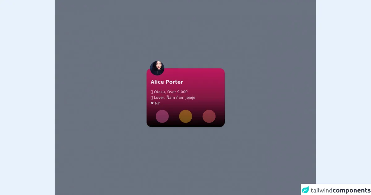
The preview of Card User UI component
Free download of the Card User's source code
The source code of Card User UI component
To create the Card User UI component, you can use the following HTML and Tailwind CSS classes:
<div class="min-h-screen bg-gray-500 py-6 flex flex-col justify-center sm:py-12">
  <div class="flex space-x-4 px-4 justify-around">
    <!-- CARD -->
    <div class="bg-gradient-to-t from-black via-pink-900 to-pink-700  h-72 w-28 md:w-96 md:rounded-3xl rounded-full shadow-md relative flex flex-col items-center justify-between md:items-start py-5 md:p-5 transition-all duration-150">
      <!-- IMG PROFILE -->
      <img class="rounded-full w-16 h-16 shadow-sm absolute -top-8 transform md:scale-110 duration-700" src="https://randomuser.me/api/portraits/women/17.jpg" alt="" />

      <!-- TEXTS -->
      <div class="transform -rotate-90 md:rotate-0 align-middle text-2xl font-semibold text-gray-200 text-center m-auto md:m-0 md:mt-8">Alice Porter</div>
      <ul class="text-lg text-gray-300 font-light hidden md:block">
        <li>🍙 Otaku, Over 9.000</li>
        <li>🍕 Lover, Ñam ñam jejeje</li>
        <li>❤ NY</li>
      </ul>

      <!-- BUTTONS -->
      <div class="flex w-full justify-around">
        <button class=" rounded-full w-16 h-16 shadow-sm bg-pink-400 bg-opacity-40 backdrop-blur-lg" src="https://randomuser.me/api/portraits/women/17.jpg" alt="">
          <img class="p-4 w-16 h-16" src="https://www.flaticon.com/svg/vstatic/svg/2362/2362719.svg?token=exp=1618564954~hmac=10f97ba27ae869c1901e136068278327" alt="" />
        </button>
        <button class="hidden md:block | rounded-full w-16 h-16 shadow-sm bg-yellow-400 bg-opacity-40 backdrop-blur-lg" src="https://randomuser.me/api/portraits/women/17.jpg" alt="">
          <img class="p-4 w-16 h-16" src="https://www.flaticon.com/svg/vstatic/svg/1256/1256468.svg?token=exp=1618558810~hmac=ba07805284d7548e9f5a51136fd2239d" alt="" />
        </button>
        <button class="hidden md:block | rounded-full w-16 h-16 shadow-sm bg-red-400 bg-opacity-40 backdrop-blur-lg" src="https://randomuser.me/api/portraits/women/17.jpg" alt="">
          <img class="p-4 w-16 h-16" src="https://www.flaticon.com/svg/vstatic/svg/1256/1256450.svg?token=exp=1618558812~hmac=898fb277bfa2d329029c133292caacab" alt="" />
        </button>
      </div>
    </div>
  </div>
</div>
How to create a Card User with Tailwind CSS?
To create a Card User UI component with Tailwind CSS, follow these steps:
- Create a new HTML file and add the basic structure of an HTML document.
- Add the Card User UI component's HTML code to the file.
- Add the Tailwind CSS classes to the HTML elements to style the component.
- Save the file and open it in a web browser to preview the Card User UI component.
Here is an example of how to create a Card User UI component with Tailwind CSS:
<!DOCTYPE html>
<html>
<head>
  <title>Card User UI Component</title>
  <link rel="stylesheet" href="https://cdn.jsdelivr.net/npm/[email protected]/dist/tailwind.min.css">
</head>
<body>
  <div class="bg-white rounded-lg shadow-lg p-4">
    <div class="flex items-center">
      <img class="w-16 h-16 rounded-full mr-4" src="user-profile-picture.jpg" alt="User profile picture">
      <div>
        <h2 class="text-lg font-semibold">John Doe</h2>
        <p class="text-gray-600">[email protected]</p>
      </div>
    </div>
    <div class="mt-4">
      <p class="text-gray-700">Lorem ipsum dolor sit amet, consectetur adipiscing elit. Sed vitae nisi nec augue aliquam dapibus.</p>
    </div>
  </div>
</body>
</html>
Conclusion
Creating a Card User UI component with Tailwind CSS is a straightforward process that can be accomplished with just a few lines of code. By using Tailwind CSS's utility classes, you can quickly customize the component's appearance and behavior to match your application's design requirements. With Tailwind CSS, you can save time and effort while creating beautiful and responsive user interfaces.