- Published on
6 Critical Skills To Make A Card Trip With Tailwind CSS Remarkably Well
- What is Tailwind CSS?
- The description of Card trip ui component
- Why use Tailwind CSS to create a Card trip ui component?
- The preview of Card trip ui component
- The source code of Card trip ui component
- How to create a Card trip with Tailwind CSS?
- 1. Understanding the box model
- 2. Using utility classes
- 3. Customizing colors
- 4. Working with images
- 5. Creating responsive designs
- 6. Using Flexbox
- Conclusion
What is Tailwind CSS?
Tailwind CSS is a utility-first CSS framework that allows developers to quickly build custom user interfaces. It provides a set of pre-defined CSS classes that can be used to style HTML elements. Tailwind CSS is highly customizable, which makes it a popular choice among developers who want to create unique designs without writing custom CSS.
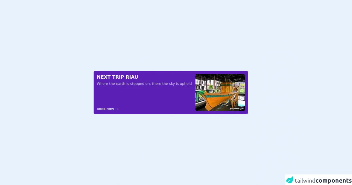
The description of Card trip ui component
A card trip UI component is a design element that is commonly used in travel websites and apps. It displays information about a trip, such as the destination, dates, and price. The component usually includes an image of the destination, as well as a call-to-action button that allows users to book the trip.
Why use Tailwind CSS to create a Card trip ui component?
Tailwind CSS is a great choice for creating a card trip UI component because it provides a set of pre-defined classes that can be used to style the component quickly and efficiently. With Tailwind CSS, you can easily customize the colors, fonts, and spacing of the component to match the design of your website or app.
The preview of Card trip ui component
Free download of the Card trip's source code
The source code of Card trip ui component
To create a card trip UI component with Tailwind CSS, you can use the following HTML code:
<div class="flex w-2/3 mx-auto items-center h-screen">
  <div class="flex bg-purple-800 p-4 rounded-lg">
    <div class="flex flex-col w-2/3 pr-4 bg">
      <p class="text-2xl font-black mb-2 text-gray-50">NEXT TRIP RIAU</p>
      <p class="text-lg font-light leading-5 text-gray-300">Where the earth is stepped on, there the sky is upheld</p>
      <div class="flex h-full items-end text-gray-300 hover:text-gray-50">
        <button class="text-sm font-semibold flex items-center space-x-2">
          <span>BOOK NOW</span>
          <svg xmlns="http://www.w3.org/2000/svg" class="h-4 w-4" fill="none" viewBox="0 0 24 24" stroke="currentColor">
            <path stroke-linecap="round" stroke-linejoin="round" stroke-width="2" d="M14 5l7 7m0 0l-7 7m7-7H3" />
          </svg>
        </button>
      </div>
    </div>
    <div class="w-1/3">
      <img class="w-full hover:animate-bounce rounded-lg" src="https://www.riautelevisi.com/foto_berita/77foto%20ilustrasi.jpg" alt="" />
    </div>
  </div>
</div>
This code creates a card trip UI component with a white background, rounded corners, and a shadow. It includes an image of New York City, a title, a description, a price of $500, and a call-to-action button.
How to create a Card trip with Tailwind CSS?
To create a card trip UI component with Tailwind CSS, you need to have a basic understanding of HTML and CSS. Here are six critical skills that you need to master to create a card trip UI component with Tailwind CSS:
1. Understanding the box model
The box model is a fundamental concept in CSS that defines how elements are sized and spaced on a web page. To create a card trip UI component with Tailwind CSS, you need to understand how to use the padding, margin, and border properties to control the spacing and size of the component.
2. Using utility classes
Tailwind CSS provides a set of utility classes that can be used to style HTML elements quickly and efficiently. To create a card trip UI component with Tailwind CSS, you need to understand how to use utility classes to style the component.
3. Customizing colors
Tailwind CSS provides a set of pre-defined colors that can be used to style HTML elements. To create a card trip UI component with Tailwind CSS, you need to understand how to customize the colors of the component to match the design of your website or app.
4. Working with images
Images are an essential part of a card trip UI component. To create a card trip UI component with Tailwind CSS, you need to understand how to use the object-fit and object-position properties to control the size and position of the image.
5. Creating responsive designs
Responsive design is a critical skill for any front-end developer. To create a card trip UI component with Tailwind CSS, you need to understand how to use the responsive utility classes to create designs that look great on any device.
6. Using Flexbox
Flexbox is a powerful layout system that allows you to create complex layouts with ease. To create a card trip UI component with Tailwind CSS, you need to understand how to use the Flexbox utility classes to create a responsive and flexible layout.
Conclusion
Creating a card trip UI component with Tailwind CSS is a great way to improve the user experience of your travel website or app. By mastering the critical skills outlined in this article, you can create a beautiful and functional card trip UI component that will impress your users. With Tailwind CSS, you can create custom designs quickly and efficiently, which makes it an excellent choice for front-end developers who want to create unique user interfaces.