- Published on
The Ninja Guide To How To Build A Card Template With Tailwind CSS Better
- What is Tailwind CSS?
- The description of Card Template UI component
- Why use Tailwind CSS to create a Card Template UI component?
- The preview of Card Template UI component
- The source code of Card Template UI component
- How to create a Card Template with Tailwind CSS?
- Step 1: Set up your HTML
- Step 2: Add Tailwind CSS
- Step 3: Style your Card Template
- Step 4: Customize your Card Template
- Conclusion
Are you looking to create a stunning Card Template UI component for your website? Look no further than Tailwind CSS, the utility-first CSS framework that makes designing beautiful web pages a breeze. In this article, we'll explore how to create a Card Template UI component with Tailwind CSS, and why it's the perfect tool for the job.
What is Tailwind CSS?
Tailwind CSS is a utility-first CSS framework that makes designing web pages faster and easier than ever before. With Tailwind CSS, you can create complex layouts and beautiful designs without writing a single line of custom CSS. Instead, you use pre-defined utility classes that allow you to quickly and easily style your HTML elements.
The description of Card Template UI component
A Card Template is a UI component that is used to display information in a visually appealing way. It is a container that holds information and can be used to display images, text, and other content. Card Templates are often used to display products, blog posts, or other types of content on a website.
Why use Tailwind CSS to create a Card Template UI component?
Tailwind CSS is the perfect tool for creating a Card Template UI component because it allows you to quickly and easily style your HTML elements using pre-defined utility classes. This means you don't have to spend hours writing custom CSS to achieve the look you want. With Tailwind CSS, you can create beautiful Card Templates in minutes.
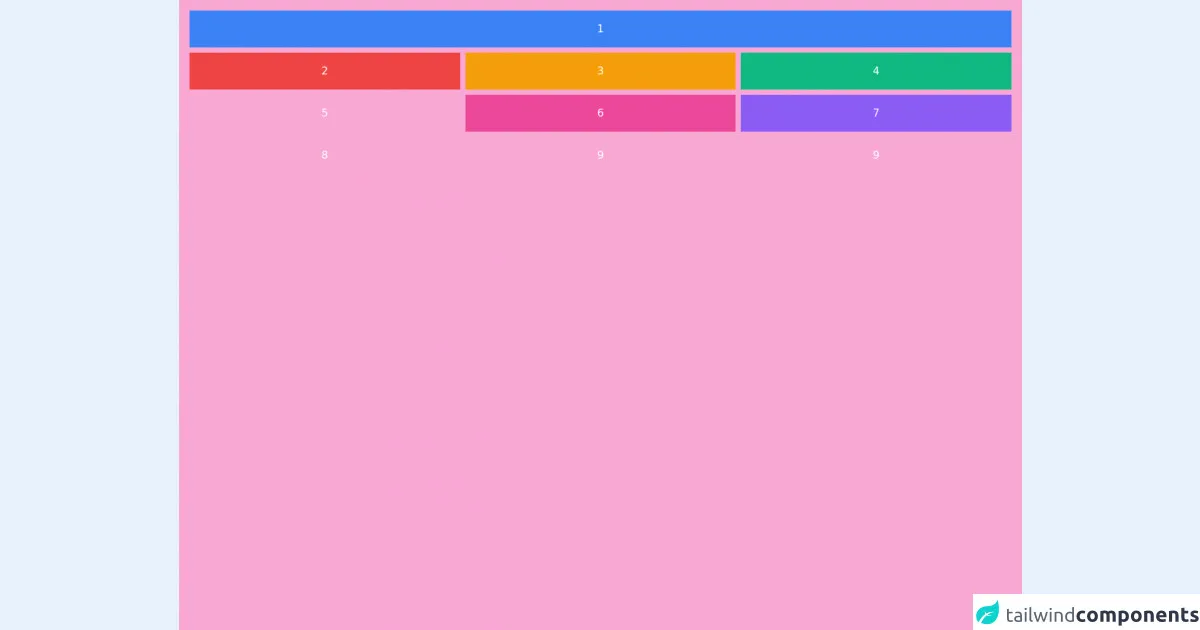
The preview of Card Template UI component
Creating a Card Template UI component with Tailwind CSS is easy. Here's a preview of what your Card Template could look like:
Free download of the Card Template's source code
The source code of Card Template UI component
To create a Card Template UI component with Tailwind CSS, you'll need to use HTML and CSS. Here's an example of what your HTML and CSS code could look like:
<div class="h-screen bg-pink-300">
  <div class="text-center text-white">
    <div class="grid gap-2 p-4 md:grid-cols-3">
      <div class="bg-blue-500 p-4 md:col-span-3">1</div>
      <div class="bg-red-500 p-4">2</div>
      <div class="bg-yellow-500 p-4">3</div>
      <div class="bg-green-500 p-4">4</div>
      <div class="bg-orange-500 p-4">5</div>
      <div class="bg-pink-500 p-4">6</div>
      <div class="bg-purple-500 p-4">7</div>
      <div class="bg-zinc-500 p-4">8</div>
      <div class="bg-sky-400 p-4">9</div>
      <div class="bg-lime-400 p-4">9</div>
    </div>
  </div>
</div>
How to create a Card Template with Tailwind CSS?
Now that you've seen what a Card Template UI component can look like and what the source code might look like, let's dive into how to create one with Tailwind CSS.
Step 1: Set up your HTML
To create a Card Template UI component, you'll need to start with some HTML. Here's an example of what your HTML could look like:
<div class="card">
  <img src="https://via.placeholder.com/150" alt="Placeholder Image">
  <div class="card-body">
    <h2 class="card-title">Card Title</h2>
    <p class="card-text">Lorem ipsum dolor sit amet, consectetur adipiscing elit. Sed non risus. Suspendisse lectus tortor, dignissim sit amet, adipiscing nec, ultricies sed, dolor.</p>
    <a href="#" class="btn btn-primary">Read More</a>
  </div>
</div>
Step 2: Add Tailwind CSS
Next, you'll need to add Tailwind CSS to your project. You can do this by including the Tailwind CSS CDN in your HTML file:
<link href="https://cdn.jsdelivr.net/npm/tailwindcss@latest/dist/tailwind.min.css" rel="stylesheet">
Step 3: Style your Card Template
Now that you have your HTML and Tailwind CSS set up, it's time to style your Card Template. Here's an example of what your CSS could look like:
.card {
  border: 1px solid #ccc;
  border-radius: 5px;
  overflow: hidden;
}

.card img {
  width: 100%;
  height: auto;
}

.card-body {
  padding: 1rem;
}

.card-title {
  font-size: 1.25rem;
  font-weight: bold;
  margin-bottom: 0.5rem;
}

.card-text {
  font-size: 1rem;
  line-height: 1.5;
  margin-bottom: 1rem;
}

.btn {
  display: inline-block;
  font-weight: 400;
  color: #fff;
  text-align: center;
  vertical-align: middle;
  user-select: none;
  background-color: #007bff;
  border: 1px solid #007bff;
  padding: 0.375rem 0.75rem;
  font-size: 1rem;
  line-height: 1.5;
  border-radius: 0.25rem;
  transition: color 0.15s ease-in-out, background-color 0.15s ease-in-out, border-color 0.15s ease-in-out, box-shadow 0.15s ease-in-out;
}

.btn:hover {
  background-color: #0069d9;
  border-color: #0062cc;
}
Step 4: Customize your Card Template
Once you have your basic Card Template styled, you can customize it to fit your needs. You can change the colors, fonts, and other styles to match your website's branding. Here's an example of what a customized Card Template could look like:
<div class="card bg-white rounded-lg shadow-md">
  <img src="https://via.placeholder.com/150" alt="Placeholder Image" class="w-full h-auto">
  <div class="card-body">
    <h2 class="card-title text-gray-900 font-semibold mb-2">Card Title</h2>
    <p class="card-text text-gray-700 leading-relaxed mb-2">Lorem ipsum dolor sit amet, consectetur adipiscing elit. Sed non risus. Suspendisse lectus tortor, dignissim sit amet, adipiscing nec, ultricies sed, dolor.</p>
    <a href="#" class="btn btn-primary hover:bg-blue-700">Read More</a>
  </div>
</div>
Conclusion
Creating a Card Template UI component with Tailwind CSS is easy and fun. With Tailwind CSS, you can create beautiful Card Templates in minutes, without writing a single line of custom CSS. Whether you're a beginner or an experienced web developer, Tailwind CSS is the perfect tool for the job. So why wait? Start creating stunning Card Templates with Tailwind CSS today!