- Published on
How To Create A Card Simple With Tailwind CSS From Scratch
- What is Tailwind CSS?
- The description of Card Simple ui component
- Why use Tailwind CSS to create a Card Simple ui component?
- The preview of Card Simple ui component
- The source code of Card Simple ui component
- How to create a Card Simple with Tailwind CSS?
- Conclusion
What is Tailwind CSS?
Tailwind CSS is a utility-first CSS framework that allows you to rapidly build custom user interfaces. It provides a set of pre-defined CSS classes that you can use to style your HTML elements. With Tailwind CSS, you can quickly create responsive and mobile-first designs without writing any custom CSS.
The description of Card Simple ui component
A Card Simple is a UI component that displays content in a card-like format. It typically includes an image, a title, a description, and a button. The Card Simple is a popular design pattern that is used in many web applications.
Why use Tailwind CSS to create a Card Simple ui component?
Tailwind CSS provides a set of pre-defined CSS classes that make it easy to create a Card Simple UI component. With Tailwind CSS, you can quickly add styles to your HTML elements without writing any custom CSS. This saves you time and makes your code more maintainable.
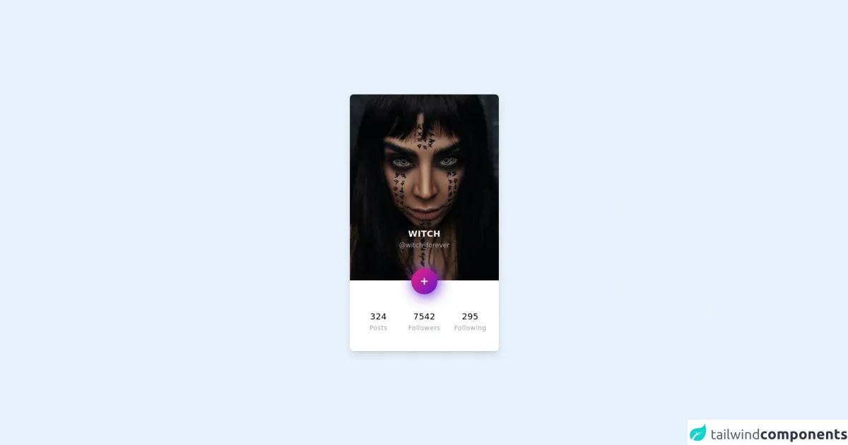
The preview of Card Simple ui component
To create a Card Simple with Tailwind CSS, we will use the following HTML structure:
Free download of the Card Simple's source code
This HTML structure includes an image, a title, a description, and a button. We will use Tailwind CSS classes to style these elements.
The source code of Card Simple ui component
To create a Card Simple with Tailwind CSS, we will use the following CSS classes:
<!-- component -->
<div class="w-screen h-screen flex justify-center items-center">
      <style>
      button {
      background-color: #6617cb;
      background-image: linear-gradient(315deg, #6617cb 0%, #cb218e 74%);
      box-shadow: 0 0 0 0 #ec008c, 0.2rem 0.2rem 30px #6617cb;
      }
      button:hover {
      box-shadow: 0 0 0 0 #ec008c, 0.2rem 0.2rem 60px #6617cb;
      }
   </style>
   <div class="container mx-auto max-w-xs rounded-lg overflow-hidden shadow-lg my-2 bg-white">
      <div class="relative mb-6">
         <img class="w-full" src="https://unsplash.com/photos/PElJMFWV3kk/download?force=true&w=640"
            alt="Profile picture" />
         <div class="text-center absolute w-full" style="bottom: -30px">
            <div class="mb-10">
               <p class="text-white tracking-wide uppercase text-lg font-bold">Witch</p>
               <p class="text-gray-400 text-sm">@witch_forever</p>
            </div>
            <button class="p-4 rounded-full transition ease-in duration-200 focus:outline-none">
               <svg viewBox="0 0 20 20" enable-background="new 0 0 20 20" class="w-6 h-6">
                  <path fill="#FFFFFF" d="M16,10c0,0.553-0.048,1-0.601,1H11v4.399C11,15.951,10.553,16,10,16c-0.553,0-1-0.049-1-0.601V11H4.601
                     C4.049,11,4,10.553,4,10c0-0.553,0.049-1,0.601-1H9V4.601C9,4.048,9.447,4,10,4c0.553,0,1,0.048,1,0.601V9h4.399
                     C15.952,9,16,9.447,16,10z" />
               </svg>
            </button>
         </div>
      </div>
      <div class="py-10 px-6 text-center tracking-wide grid grid-cols-3 gap-6">
         <div class="posts">
            <p class="text-lg">324</p>
            <p class="text-gray-400 text-sm">Posts</p>
         </div>
         <div class="followers">
            <p class="text-lg">7542</p>
            <p class="text-gray-400 text-sm">Followers</p>
         </div>
         <div class="following">
            <p class="text-lg">295</p>
            <p class="text-gray-400 text-sm">Following</p>
         </div>
      </div>
   </div>
</div>
These CSS classes define the styles for the Card Simple UI component. We will use these classes to style our HTML elements.
How to create a Card Simple with Tailwind CSS?
To create a Card Simple with Tailwind CSS, follow these steps:
- Create a new HTML file and add the following HTML structure:
<div class="bg-white rounded-lg overflow-hidden shadow-lg">
  <img class="w-full" src="placeholder1" alt="Sunset in the mountains">
  <div class="px-6 py-4">
    <div class="font-bold text-xl mb-2">placeholder2</div>
    <p class="text-gray-700 text-base">placeholder3</p>
  </div>
  <div class="px-6 pt-4 pb-2">
    <button class="bg-blue-500 hover:bg-blue-700 text-white font-bold py-2 px-4 rounded">
      placeholder4
    </button>
  </div>
</div>
- Replace the
placeholder1placeholder with the URL of your image. - Replace the
placeholder2placeholder with the title of your card. - Replace the
placeholder3placeholder with the description of your card. - Replace the
placeholder4placeholder with the text of your button. - Save the file and open it in your web browser.
You should see a Card Simple UI component with your image, title, description, and button.
Conclusion
In this article, we learned how to create a Card Simple UI component with Tailwind CSS. We used pre-defined CSS classes to style our HTML elements and created a responsive and mobile-first design. With Tailwind CSS, you can quickly create custom user interfaces without writing any custom CSS.