- Published on
Surprisingly Effective Ways To Create A Card Sidebar Navigation With Tailwind CSS
- What is Tailwind CSS?
- The description of Card Sidebar Navigation ui component
- Why use Tailwind CSS to create a Card Sidebar Navigation ui component?
- The preview of Card Sidebar Navigation ui component
- The source code of Card Sidebar Navigation ui component
- How to create a Card Sidebar Navigation with Tailwind CSS?
- Conclusion
As a FrontEnd technology blogger, you must have heard of Tailwind CSS, a utility-first CSS framework that allows you to quickly design and customize your website's user interface. In this article, we will explore how to create a Card Sidebar Navigation ui component with Tailwind CSS, and why it is an effective way to enhance your website's user experience.
What is Tailwind CSS?
Tailwind CSS is a utility-first CSS framework that provides a set of pre-defined CSS classes that you can use to style your HTML elements. Unlike traditional CSS frameworks, such as Bootstrap or Foundation, Tailwind CSS focuses on providing low-level utility classes that allow you to quickly and easily customize your website's user interface. With Tailwind CSS, you can avoid writing custom CSS code and reduce your development time.
The description of Card Sidebar Navigation ui component
A Card Sidebar Navigation ui component is a user interface element that consists of a sidebar navigation menu and a main content area. The sidebar navigation menu typically contains links to different sections of the website, while the main content area displays the content associated with the selected link. The Card Sidebar Navigation ui component is an effective way to organize your website's content and improve its user experience.
Why use Tailwind CSS to create a Card Sidebar Navigation ui component?
Tailwind CSS provides a set of pre-defined utility classes that you can use to create a Card Sidebar Navigation ui component quickly and easily. With Tailwind CSS, you can customize the appearance of your Card Sidebar Navigation ui component by applying different utility classes to its HTML elements. This allows you to create a unique and visually appealing Card Sidebar Navigation ui component without writing custom CSS code.
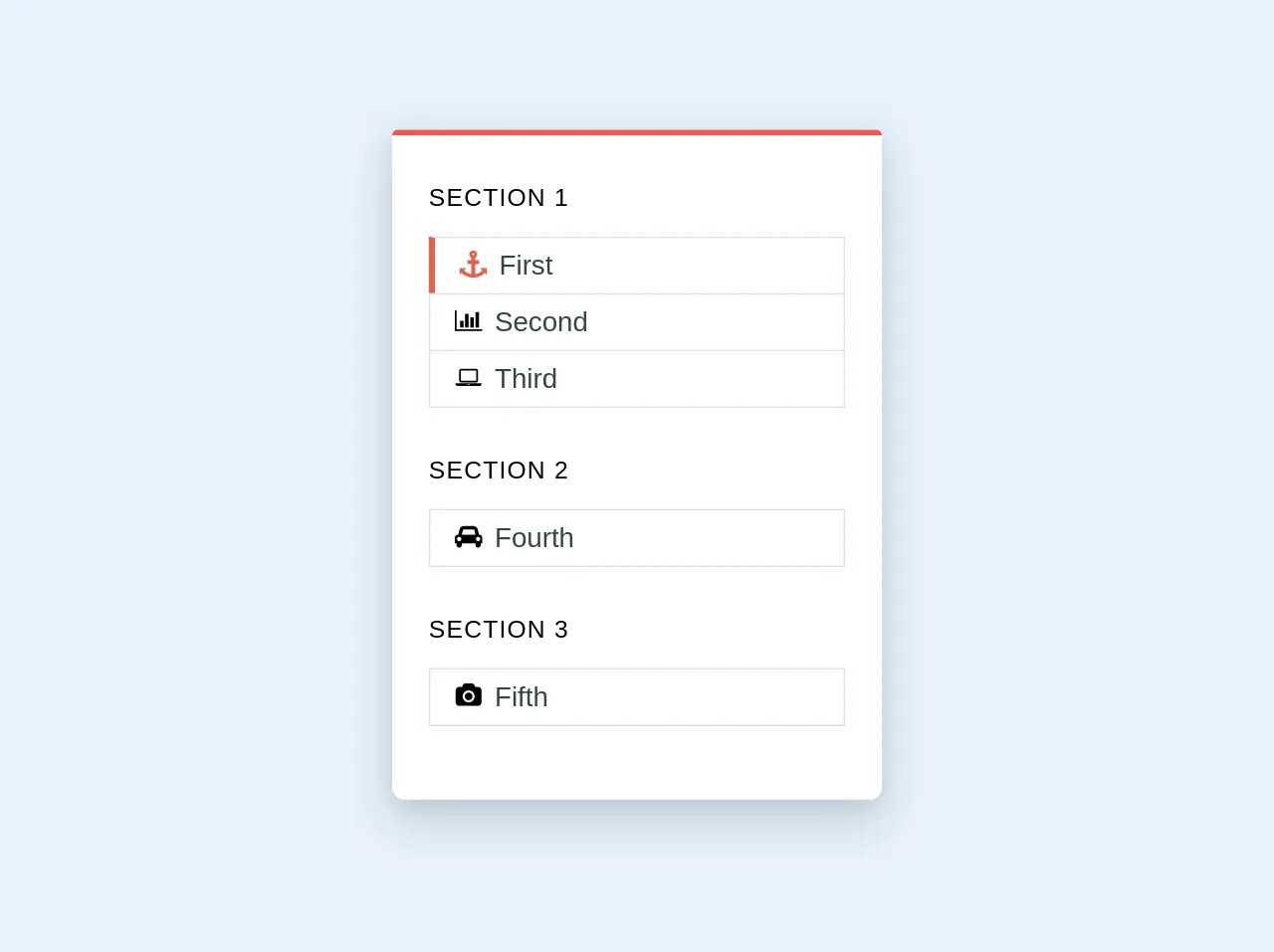
The preview of Card Sidebar Navigation ui component
To create a Card Sidebar Navigation ui component with Tailwind CSS, we will use a combination of HTML and CSS code. The HTML code defines the structure of the Card Sidebar Navigation ui component, while the CSS code applies the necessary styles to its HTML elements.
Free download of the Card Sidebar Navigation's source code
The source code of Card Sidebar Navigation ui component
To create a Card Sidebar Navigation ui component with Tailwind CSS, we will use a combination of HTML and CSS code. The HTML code defines the structure of the Card Sidebar Navigation ui component, while the CSS code applies the necessary styles to its HTML elements.
<div class="overflow-hidden shadow-lg border-t-4 bg-white mb-4 rounded-b-lg rounded-t border-red-light w-full md:w-1/4">
    <div class="px-6 py-4 mb-2 mt-4 mb-8">
        <div class="uppercase tracking-wide text-c2 mb-4">Section 1</div>
        <div class="flex cursor-pointer border px-4 py-2 text-lg text-grey-darkest border-b-0" style="border-left: 4px solid #e2624b !important;">
            <svg width="18" height="18" viewBox="0 0 1792 1792" xmlns="http://www.w3.org/2000/svg" style="fill: #e2624b;">
                <path d="M960 256q0-26-19-45t-45-19-45 19-19 45 19 45 45 19 45-19 19-45zm832 928v352q0 22-20 30-8 2-12 2-12 0-23-9l-93-93q-119 143-318.5 226.5t-429.5 83.5-429.5-83.5-318.5-226.5l-93 93q-9 9-23 9-4 0-12-2-20-8-20-30v-352q0-14 9-23t23-9h352q22 0 30 20 8 19-7 35l-100 100q67 91 189.5 153.5t271.5 82.5v-647h-192q-26 0-45-19t-19-45v-128q0-26 19-45t45-19h192v-163q-58-34-93-92.5t-35-128.5q0-106 75-181t181-75 181 75 75 181q0 70-35 128.5t-93 92.5v163h192q26 0 45 19t19 45v128q0 26-19 45t-45 19h-192v647q149-20 271.5-82.5t189.5-153.5l-100-100q-15-16-7-35 8-20 30-20h352q14 0 23 9t9 23z"
                />
            </svg>
            <div class="pl-2">First</div>
        </div>
        <div class="flex cursor-pointer border px-4 py-2 text-lg text-grey-darkest border-b-0">
            <svg width="18" height="18" viewBox="0 0 2048 1792" xmlns="http://www.w3.org/2000/svg">
                <path d="M640 896v512h-256v-512h256zm384-512v1024h-256v-1024h256zm1024 1152v128h-2048v-1536h128v1408h1920zm-640-896v768h-256v-768h256zm384-384v1152h-256v-1152h256z"
                />
            </svg>
            <div class="pl-2">Second</div>
        </div>
        <div class="flex cursor-pointer border px-4 py-2 text-lg text-grey-darkest">
            <svg width="18" height="18" viewBox="0 0 2048 1792" xmlns="http://www.w3.org/2000/svg">
                <path d="M480 1280q-66 0-113-47t-47-113v-704q0-66 47-113t113-47h1088q66 0 113 47t47 113v704q0 66-47 113t-113 47h-1088zm-32-864v704q0 13 9.5 22.5t22.5 9.5h1088q13 0 22.5-9.5t9.5-22.5v-704q0-13-9.5-22.5t-22.5-9.5h-1088q-13 0-22.5 9.5t-9.5 22.5zm1376 928h160v96q0 40-47 68t-113 28h-1600q-66 0-113-28t-47-68v-96h1760zm-720 96q16 0 16-16t-16-16h-160q-16 0-16 16t16 16h160z"
                />
            </svg>
            <div class="pl-2">Third</div>
        </div>
        <div class="uppercase tracking-wide text-c2 mb-4 mt-8">Section 2</div>
        <div class="flex cursor-pointer border px-4 py-2 text-lg text-grey-darkest">
            <svg width="18" height="18" viewBox="0 0 2048 1792" xmlns="http://www.w3.org/2000/svg">
                <path d="M480 1088q0-66-47-113t-113-47-113 47-47 113 47 113 113 47 113-47 47-113zm36-320h1016l-89-357q-2-8-14-17.5t-21-9.5h-768q-9 0-21 9.5t-14 17.5zm1372 320q0-66-47-113t-113-47-113 47-47 113 47 113 113 47 113-47 47-113zm160-96v384q0 14-9 23t-23 9h-96v128q0 80-56 136t-136 56-136-56-56-136v-128h-1024v128q0 80-56 136t-136 56-136-56-56-136v-128h-96q-14 0-23-9t-9-23v-384q0-93 65.5-158.5t158.5-65.5h28l105-419q23-94 104-157.5t179-63.5h768q98 0 179 63.5t104 157.5l105 419h28q93 0 158.5 65.5t65.5 158.5z"
                />
            </svg>
            <div class="pl-2">Fourth</div>
        </div>
        <div>
            <div class="uppercase tracking-wide text-c2 mb-4 mt-8">Section 3</div>
            <div class="flex cursor-pointer border px-4 py-2 text-lg text-grey-darkest">
                <svg width="18" height="18" viewBox="0 0 2048 1792" xmlns="http://www.w3.org/2000/svg">
                    <path d="M1024 672q119 0 203.5 84.5t84.5 203.5-84.5 203.5-203.5 84.5-203.5-84.5-84.5-203.5 84.5-203.5 203.5-84.5zm704-416q106 0 181 75t75 181v896q0 106-75 181t-181 75h-1408q-106 0-181-75t-75-181v-896q0-106 75-181t181-75h224l51-136q19-49 69.5-84.5t103.5-35.5h512q53 0 103.5 35.5t69.5 84.5l51 136h224zm-704 1152q185 0 316.5-131.5t131.5-316.5-131.5-316.5-316.5-131.5-316.5 131.5-131.5 316.5 131.5 316.5 316.5 131.5z"
                    />
                </svg>
                <div class="pl-2">Fifth</div>
            </div>
        </div>
    </div>
</div>
How to create a Card Sidebar Navigation with Tailwind CSS?
To create a Card Sidebar Navigation ui component with Tailwind CSS, follow these steps:
Create a new HTML file and add the necessary HTML code to define the structure of the Card Sidebar Navigation ui component. The HTML code should include a sidebar navigation menu and a main content area. The sidebar navigation menu should contain links to different sections of the website, while the main content area should display the content associated with the selected link.
Add the necessary Tailwind CSS utility classes to the HTML elements of the Card Sidebar Navigation ui component. You can use the pre-defined Tailwind CSS utility classes to customize the appearance of the Card Sidebar Navigation ui component. For example, you can use the "bg-gray-100" class to set the background color of the sidebar navigation menu.
Customize the appearance of the Card Sidebar Navigation ui component by applying additional Tailwind CSS utility classes to its HTML elements. You can use the pre-defined Tailwind CSS utility classes to adjust the font size, font weight, padding, margin, and other visual properties of the Card Sidebar Navigation ui component.
Test the Card Sidebar Navigation ui component to ensure that it works as expected and looks visually appealing.
Conclusion
In this article, we explored how to create a Card Sidebar Navigation ui component with Tailwind CSS, a utility-first CSS framework that allows you to quickly design and customize your website's user interface. By using Tailwind CSS, you can create a visually appealing and effective Card Sidebar Navigation ui component without writing custom CSS code. With the tips and techniques outlined in this article, you can enhance your website's user experience and improve its overall design.