- Published on
Build A Card Design Using Tailwind With Tailwind CSS Like A Pro With The Help Of These 6 Tips
- What is Tailwind CSS?
- The description of Card design using tailwind ui component
- Why use Tailwind CSS to create a Card design using tailwind ui component?
- The preview of Card design using tailwind ui component.
- The source code of Card design using tailwind ui component.
- How to create a Card design using tailwind with Tailwind CSS?
- 1. Define the HTML structure
- 2. Add Tailwind CSS to your project
- 3. Configure Tailwind CSS
- 4. Use Tailwind CSS classes to style the card
- 5. Customize the card design
- 6. Make the card design responsive
- Conclusion
What is Tailwind CSS?
Tailwind CSS is a utility-first CSS framework that allows you to design and style your web applications with ease. It provides a set of pre-defined classes that can be used to create responsive and customizable UI components. Tailwind CSS has become very popular among developers due to its simplicity and flexibility.
The description of Card design using tailwind ui component
A card is a UI component that is used to display information in a structured and organized manner. It is commonly used to showcase products, articles, or any other type of content. A card typically consists of an image, a title, a description, and some buttons or links.
Tailwind CSS provides a set of pre-defined classes that can be used to create a card design. These classes can be used to style the different elements of the card, such as the image, title, and description.
Why use Tailwind CSS to create a Card design using tailwind ui component?
Tailwind CSS provides a set of pre-defined classes that can be used to create a card design quickly and easily. These classes are designed to be responsive and customizable, which means that you can create a card design that looks great on any device.
Using Tailwind CSS also allows you to maintain a consistent design across your web application. Since Tailwind CSS provides a set of pre-defined classes, you can use the same classes to style different UI components, which helps to maintain a consistent design.
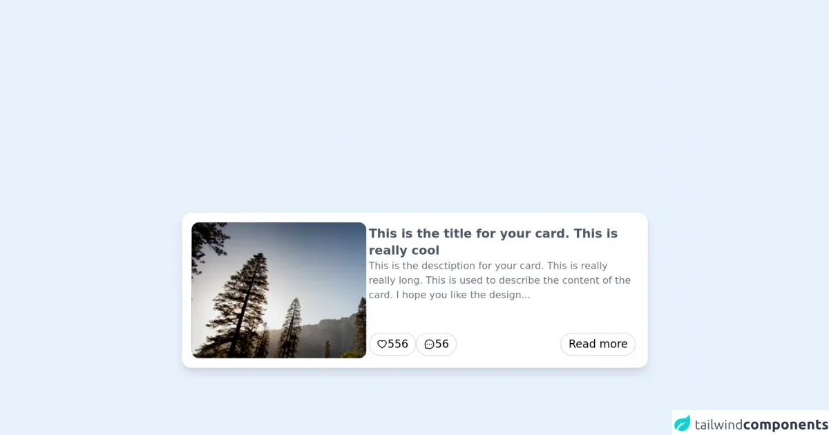
The preview of Card design using tailwind ui component.
To create a card design using Tailwind CSS, we will use a set of pre-defined classes to style the different elements of the card. Here is a preview of what the card design will look like:
Free download of the Card design using tailwind's source code
The source code of Card design using tailwind ui component.
To create a card design using Tailwind CSS, we will use a set of pre-defined classes to style the different elements of the card. Here is the source code for the card design:
<div class="bg-white p-2 w-80 max-w-3xl sm:w-full sm:p-4 h-auto sm:h-64 rounded-2xl shadow-lg flex flex-col sm:flex-row gap-5 select-none">
    <div
        style='background: url("https://images.unsplash.com/photo-1426604966848-d7adac402bff?ixid=MnwxMjA3fDB8MHxzZWFyY2h8OXx8bmF0dXJlfGVufDB8fDB8fA%3D%3D&ixlib=rb-1.2.1&auto=format&fit=crop&w=500&q=60")'
        class="h-52 sm:h-full sm:w-72 rounded-xl bg-gray-100 bg-center bg-cover"
    ></div>
    <div class="flex sm:flex-1 flex-col gap-2 p-1">
        <h1 class="text-lg sm:text-xl font-semibold  text-gray-600">
            This is the title for your card. This is really cool
        </h1>
        <p class="text-gray-500 text-sm sm:text-base line-clamp-3">
            This is the desctiption for your card. This is really really long. This is used to describe the content of the card. I hope you like the design...
        </p>
        <div class="flex gap-4 mt-auto">
        <button
            class='flex items-center gap-1 sm:text-lg border border-gray-300 px-3 py-1 rounded-full hover:bg-gray-50 transition-colors focus:bg-gray-100 focus:outline-none focus-visible:border-gray-500'
        >
            <svg stroke="currentColor" fill="currentColor" stroke-width="0" viewBox="0 0 1024 1024" height="1em" width="1em" xmlns="http://www.w3.org/2000/svg"><path d="M923 283.6a260.04 260.04 0 0 0-56.9-82.8 264.4 264.4 0 0 0-84-55.5A265.34 265.34 0 0 0 679.7 125c-49.3 0-97.4 13.5-139.2 39-10 6.1-19.5 12.8-28.5 20.1-9-7.3-18.5-14-28.5-20.1-41.8-25.5-89.9-39-139.2-39-35.5 0-69.9 6.8-102.4 20.3-31.4 13-59.7 31.7-84 55.5a258.44 258.44 0 0 0-56.9 82.8c-13.9 32.3-21 66.6-21 101.9 0 33.3 6.8 68 20.3 103.3 11.3 29.5 27.5 60.1 48.2 91 32.8 48.9 77.9 99.9 133.9 151.6 92.8 85.7 184.7 144.9 188.6 147.3l23.7 15.2c10.5 6.7 24 6.7 34.5 0l23.7-15.2c3.9-2.5 95.7-61.6 188.6-147.3 56-51.7 101.1-102.7 133.9-151.6 20.7-30.9 37-61.5 48.2-91 13.5-35.3 20.3-70 20.3-103.3.1-35.3-7-69.6-20.9-101.9zM512 814.8S156 586.7 156 385.5C156 283.6 240.3 201 344.3 201c73.1 0 136.5 40.8 167.7 100.4C543.2 241.8 606.6 201 679.7 201c104 0 188.3 82.6 188.3 184.5 0 201.2-356 429.3-356 429.3z"></path></svg>
            <span>556</span>
        </button>
         <button
            class='flex items-center gap-1 sm:text-lg border border-gray-300 px-3 py-1 rounded-full hover:bg-gray-50 transition-colors focus:bg-gray-100 focus:outline-none focus-visible:border-gray-500'
        >
            <svg stroke="currentColor" fill="currentColor" stroke-width="0" viewBox="0 0 1024 1024" height="1em" width="1em" xmlns="http://www.w3.org/2000/svg"><path d="M464 512a48 48 0 1 0 96 0 48 48 0 1 0-96 0zm200 0a48 48 0 1 0 96 0 48 48 0 1 0-96 0zm-400 0a48 48 0 1 0 96 0 48 48 0 1 0-96 0zm661.2-173.6c-22.6-53.7-55-101.9-96.3-143.3a444.35 444.35 0 0 0-143.3-96.3C630.6 75.7 572.2 64 512 64h-2c-60.6.3-119.3 12.3-174.5 35.9a445.35 445.35 0 0 0-142 96.5c-40.9 41.3-73 89.3-95.2 142.8-23 55.4-34.6 114.3-34.3 174.9A449.4 449.4 0 0 0 112 714v152a46 46 0 0 0 46 46h152.1A449.4 449.4 0 0 0 510 960h2.1c59.9 0 118-11.6 172.7-34.3a444.48 444.48 0 0 0 142.8-95.2c41.3-40.9 73.8-88.7 96.5-142 23.6-55.2 35.6-113.9 35.9-174.5.3-60.9-11.5-120-34.8-175.6zm-151.1 438C704 845.8 611 884 512 884h-1.7c-60.3-.3-120.2-15.3-173.1-43.5l-8.4-4.5H188V695.2l-4.5-8.4C155.3 633.9 140.3 574 140 513.7c-.4-99.7 37.7-193.3 107.6-263.8 69.8-70.5 163.1-109.5 262.8-109.9h1.7c50 0 98.5 9.7 144.2 28.9 44.6 18.7 84.6 45.6 119 80 34.3 34.3 61.3 74.4 80 119 19.4 46.2 29.1 95.2 28.9 145.8-.6 99.6-39.7 192.9-110.1 262.7z"></path></svg>
            <span>56</span>
        </button>
         <button
            class='ml-auto flex items-center gap-1 sm:text-lg border border-gray-300 px-3 py-1 rounded-full hover:bg-gray-50 transition-colors focus:bg-gray-100 focus:outline-none focus-visible:border-gray-500'
        >
            <span>Read more</span>
        </button>
        </div>
    </div>
</div>
How to create a Card design using tailwind with Tailwind CSS?
Here are the 6 tips to create a card design using Tailwind CSS:
1. Define the HTML structure
The first step in creating a card design using Tailwind CSS is to define the HTML structure. The card typically consists of an image, a title, a description, and some buttons or links. Here is an example HTML structure for the card:
<div class="max-w-sm rounded overflow-hidden shadow-lg">
  <img class="w-full" src="img/card-image.jpg" alt="Sunset in the mountains">
  <div class="px-6 py-4">
    <div class="font-bold text-xl mb-2">The Coldest Sunset</div>
    <p class="text-gray-700 text-base">
      Lorem ipsum dolor sit amet, consectetur adipisicing elit. Voluptatibus quia, nulla! Maiores et perferendis eaque, exercitationem praesentium nihil.
    </p>
  </div>
  <div class="px-6 pt-4 pb-2">
    <button class="bg-blue-500 hover:bg-blue-700 text-white font-bold py-2 px-4 rounded">
      Read More
    </button>
  </div>
</div>
2. Add Tailwind CSS to your project
The next step is to add Tailwind CSS to your project. You can either download the CSS file and include it in your HTML file or install it using a package manager like npm. Here is an example of how to install Tailwind CSS using npm:
npm install tailwindcss
3. Configure Tailwind CSS
After adding Tailwind CSS to your project, you need to configure it. Tailwind CSS provides a configuration file that allows you to customize the framework to your needs. You can either create a configuration file from scratch or use a pre-defined configuration file. Here is an example of a pre-defined configuration file:
// tailwind.config.js
module.exports = {
  theme: {
    extend: {},
  },
  variants: {},
  plugins: [],
}
4. Use Tailwind CSS classes to style the card
Once you have configured Tailwind CSS, you can start using the pre-defined classes to style the card. Here is an example of how to use Tailwind CSS classes to style the card:
<div class="max-w-sm rounded overflow-hidden shadow-lg">
  <img class="w-full" src="img/card-image.jpg" alt="Sunset in the mountains">
  <div class="px-6 py-4">
    <div class="font-bold text-xl mb-2">The Coldest Sunset</div>
    <p class="text-gray-700 text-base">
      Lorem ipsum dolor sit amet, consectetur adipisicing elit. Voluptatibus quia, nulla! Maiores et perferendis eaque, exercitationem praesentium nihil.
    </p>
  </div>
  <div class="px-6 pt-4 pb-2">
    <button class="bg-blue-500 hover:bg-blue-700 text-white font-bold py-2 px-4 rounded">
      Read More
    </button>
  </div>
</div>
5. Customize the card design
Tailwind CSS allows you to customize the card design by modifying the pre-defined classes or adding your own classes. Here is an example of how to customize the card design:
<div class="max-w-sm rounded overflow-hidden shadow-lg">
  <img class="w-full" src="img/card-image.jpg" alt="Sunset in the mountains">
  <div class="px-6 py-4">
    <div class="font-bold text-xl mb-2 text-green-500">The Coldest Sunset</div>
    <p class="text-gray-700 text-base">
      Lorem ipsum dolor sit amet, consectetur adipisicing elit. Voluptatibus quia, nulla! Maiores et perferendis eaque, exercitationem praesentium nihil.
    </p>
  </div>
  <div class="px-6 pt-4 pb-2">
    <button class="bg-blue-500 hover:bg-blue-700 text-white font-bold py-2 px-4 rounded-full">
      Read More
    </button>
  </div>
</div>
6. Make the card design responsive
Tailwind CSS provides a set of pre-defined classes that can be used to make the card design responsive. These classes allow you to adjust the size and position of the different elements of the card based on the screen size. Here is an example of how to make the card design responsive:
<div class="md:max-w-sm md:mx-auto md:flex md:shadow-lg md:rounded-lg md:overflow-hidden">
  <div class="md:w-1/3">
    <img class="h-full w-full object-cover md:h-full md:w-full" src="img/card-image.jpg" alt="Sunset in the mountains">
  </div>
  <div class="p-8 md:w-2/3">
    <div class="uppercase tracking-wide text-sm text-indigo-500 font-semibold">Case study</div>
    <a href="#" class="block mt-1 text-lg leading-tight font-medium text-black hover:underline">Finding customers for your new business</a>
    <p class="mt-2 text-gray-500">Getting a new business off the ground is a lot of hard work. Here are five ideas you can use to find your first customers.</p>
  </div>
</div>
Conclusion
In conclusion, Tailwind CSS is a powerful and flexible CSS framework that can be used to create a card design quickly and easily. By following these 6 tips, you can create a card design using Tailwind CSS like a pro. With Tailwind CSS, you can maintain a consistent design across your web application and create responsive UI components that look great on any device.