- Published on
How to Build A Card Dashboard With Tailwind CSS?
- What is Tailwind CSS?
- The description of Card Dashboard ui component
- Why use Tailwind CSS to create a Card Dashboard ui component?
- The preview of Card Dashboard ui component
- The source code of Card Dashboard ui component
- How to create a Card Dashboard with Tailwind CSS?
- Conclusion
What is Tailwind CSS?
Tailwind CSS is a utility-first CSS framework that provides a set of pre-defined CSS classes to help you quickly build custom user interfaces. With Tailwind CSS, you can easily create responsive designs, customize your styles, and maintain consistency across your project.
The description of Card Dashboard ui component
A Card Dashboard is a user interface component that displays information in a card-like format. It is commonly used in web applications to display data in a visually appealing and organized manner. A Card Dashboard typically consists of multiple cards that display different types of information, such as statistics, charts, or lists.
Why use Tailwind CSS to create a Card Dashboard ui component?
Tailwind CSS provides a set of pre-defined CSS classes that can be used to quickly build a Card Dashboard. These classes are designed to be easy to use and highly customizable, making it easy to create a unique and visually appealing design. Additionally, Tailwind CSS is highly responsive, which means that your Card Dashboard will look great on any device.
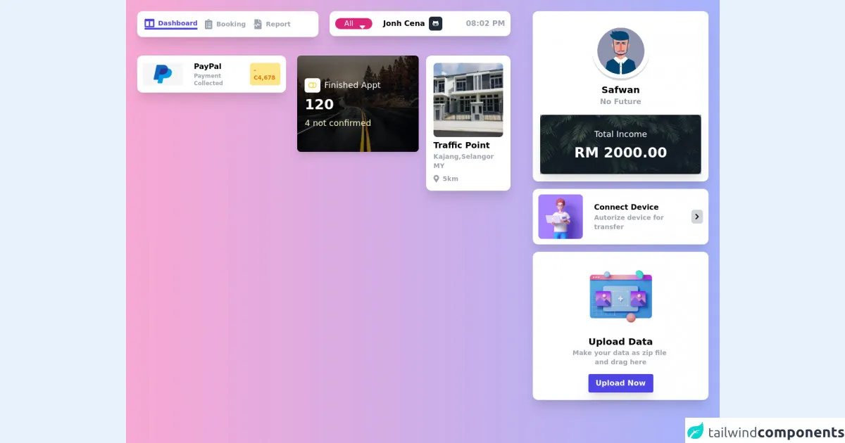
The preview of Card Dashboard ui component
To create a Card Dashboard with Tailwind CSS, we will use a combination of CSS classes to style our cards. The result will be a visually appealing and organized dashboard that displays information in a clear and concise manner.
Free download of the Card Dashboard's source code
The source code of Card Dashboard ui component
To create a Card Dashboard with Tailwind CSS, we will use a combination of HTML and CSS. The HTML will define the structure of our dashboard, while the CSS will style our cards. Here is an example of the source code for a simple Card Dashboard:
<head>
    <meta charset="UTF-8" />
    <meta name="viewport" content="width=device-width, initial-scale=1.0" />
    <title>Dashboard</title>
    <link href="https://fonts.googleapis.com/css2?family=Inter:wght@400;500;600;700;800&display=swap"
        rel="stylesheet" />
    <link href="https://cdnjs.cloudflare.com/ajax/libs/font-awesome/5.15.4/css/all.min.css"
        rel="stylesheet" />
    <link href="https://cdnjs.cloudflare.com/ajax/libs/animate.css/4.1.1/animate.min.css"
        rel="stylesheet" />
    <script src="https://cdn.jsdelivr.net/gh/alpinejs/[email protected]/dist/alpine.min.js" defer></script>
</head>
<body>
    <div class="h-full  bg-gradient-to-r from-pink-300 to-indigo-300">
        <div class="grid grid-cols-12 gap-0">
            <div class="col-span-12 sm:col-span-12 md:col-span-12 lg:col-span-8 xxl:col-span-8 px-6 py-6">
                <div class="grid grid-cols-12 gap-6">
                    <div class="col-span-12 sm:col-span-12 md:col-span-6 lg:col-span-6 xxl:col-span-6">
                        <!-- Start Nav Bar -->
                        <nav x-data="{ active: 1 }" class="bg-white p-4 rounded-xl shadow-xl flex items-center">
                            <a href="#" class="flex space-x-2 items-center mr-4 text-gray-400"
                            x-bind:class="{'text-indigo-600 border-b-4 border-indigo-600': active === 1 }"
                            x-on:click.prevent="active = 1">
                                <i class="fas fa-columns fa-lg"></i>
                                <p class="font-semibold text-sm">Dashboard</p>
                            </a>
                            <a href="#" class="flex space-x-2 items-center mr-4 text-gray-400"
                            x-bind:class="{'text-indigo-600 border-b-4 border-indigo-600': active === 2 }"
                            x-on:click.prevent="active = 2">
                                <i class="fas fa-clipboard-list fa-lg"></i>
                                <p class="font-semibold text-sm">Booking</p>
                            </a>
                            <a href="#" class="flex space-x-2 items-center mr-4 text-gray-400"
                            x-bind:class="{'text-indigo-600 border-b-4 border-indigo-600': active === 3 }"
                            x-on:click.prevent="active = 3">
                                <i class="fas fa-file-medical-alt fa-lg"></i>
                                <p class="font-semibold text-sm">Report</p>
                            </a>
                        </nav>
                        <!-- End Nav Bar -->
                    </div>
                    <div class="col-span-12 sm:col-span-12 md:col-span-6 lg:col-span-6 xxl:col-span-6">
                        <!-- Start Card List -->
                        <div class="bg-white p-3 rounded-xl shadow-xl flex items-center justify-between">
                            <div class="flex space-x-6 items-center">
                                <div class="relative inline-flex">
                                    <i class="fa-lg fas fa-sort-down w-2 h-2 absolute top-0 right-0 mx-5 my-2 pointer-events-none text-white"></i>
                                    <select class="border-white rounded-xl text-white  pl-5 pr-10 bg-pink-600 hover:bg-pink-700 focus:outline-none appearance-none">
                                        <option>All</option>
                                    </select>
                                </div>
                                <div class="flex space-x-2 items-center">
                                    <p class="font-semibold">Jonh Cena</p>
                                    <div class="bg-gray-800 rounded-md p-2 flex items-center">
                                        <i class="fab fa-github-alt fa-sm text-white"></i>
                                    </div>
                                </div>
                            </div>
                             <p class="font-semibold text-gray-400">08:02 PM</p>
                        </div>
                        <!-- End Card List -->
                    </div>
                    <div class="col-span-12 sm:col-span-12 md:col-span-5 lg:col-span-5 xxl:col-span-5">
                        <!-- Start Card List -->
                        <div class="bg-white p-3 rounded-xl shadow-xl flex items-center justify-between mt-4">
                            <div class="flex space-x-6 items-center">
                               <img src="https://www.nicepng.com/png/detail/395-3955418_paypal-icon-png.png" class="w-auto h-12"/>
                                <div>
                                    <p class="font-semibold text-base">PayPal</p>
                                    <p class="font-semibold text-xs text-gray-400">Payment Collected</p>
                                </div>
                            </div>

                            <div class="flex space-x-2 items-center">
                                <div class="bg-yellow-200 rounded-md p-2 flex items-center">
                                    <p class="text-yellow-600 font-semibold text-xs">-C4,678</p>
                                </div>
                            </div>
                        </div>
                        <!-- End Card List -->
                    </div>
                    <div class="col-span-12 sm:col-span-12 md:col-span-7 lg:col-span-7 xxl:col-span-7">
                        <div class="grid grid-cols-12 gap-4">
                            <div class="col-span-12 sm:col-span-12 md:col-span-7 lg:col-span-7 xxl:col-span-7">
                            <!-- Start Card List -->
                            <div class="relative w-full h-52 bg-cover bg-center group rounded-lg overflow-hidden mt-4 shadow-lg transition duration-300 ease-in-out"
                                style="background-image: url('https://www.tokkoro.com/picsup/5081898-forest-nature-road.jpg');">
                                <div class="absolute inset-0 bg-black bg-opacity-50 transition duration-300 ease-in-out"></div>
                                    <div class="relative w-full h-full px-4 sm:px-6 lg:px-4 flex items-center">
                                    <div>
                                    <div class="text-white text-lg flex space-x-2 items-center">
                                        <div class="bg-white rounded-md p-2 flex items-center">
                                        <i class="fas fa-toggle-off fa-sm text-yellow-300"></i>
                                        </div>
                                        <p>Finished Appt</p>
                                    </div>
                                    <h3 class="text-white text-3xl mt-2 font-bold">
                                        120
                                    </h3>
                                    <h3 class="text-white text-lg mt-2 text-yellow-100 ">
                                        4 not confirmed
                                    </h3>
                                    </div>
                                </div>
                            </div>
                            <!-- End Card List -->
                            </div>
                            <div class="col-span-12 sm:col-span-12 md:col-span-5 lg:col-span-5 xxl:col-span-5">
                                <!-- Start Card List -->
                                <div class="bg-white rounded-xl p-4 shadow-xl mt-4">
                                    <div class="flex flex-col justify-center items-center">
                                        <img src="https://media.karousell.com/media/photos/products/2021/4/16/kajang_3xxk3xxk3xxk22x70_4r3b__1618542693_a779ef2b_progressive.jpg" class="w-full h-40 rounded-lg"/>
                                    </div>
                                    <p class="font-semibold text-lg mt-1 text-left">Traffic Point</p>
                                    <p class="font-semibold text-sm text-gray-400">Kajang,Selangor MY</p>
                                    <div class="flex space-x-2 text-gray-400 items-center mt-2">
                                         <i class="fas fa-map-marker-alt"></i>
                                        <p class="font-semibold text-sm text-gray-400">5km</p>
                                    </div>
                                </div>
                                <!-- End Card List -->
                            </div>
                        </div>
                    </div>
                </div>

            </div>
            <div class="col-span-12 sm:col-span-12 md:col-span-12 lg:col-span-4 xxl:col-span-4 px-6 py-6">
                <!-- Start profile Card -->
                <div class="bg-white rounded-xl p-4 shadow-xl">
                    <div class="flex flex-col justify-center items-center">
                        <div class="w-32 h-32 rounded-full bg-gray-300 border-2 border-white mt-2">
                            <img
                            src="https://encrypted-tbn0.gstatic.com/images?q=tbn:ANd9GcQVxhAxJ4D7MOeTTj6kR9PBeZonW5HM7giKjTbEmR-HMBwf3G1VqGnlwpO1kWrdyIZu8_U&usqp=CAU"
                            class="rounded-full w-auto"
                            />
                        </div>
                        <p class="font-semibold text-xl mt-1">Safwan</p>
                        <p class="font-semibold text-base text-gray-400">No Future</p>

                        <div class="relative  p-4 rounded-lg shadow-xl w-full bg-cover bg-center h-32 mt-4"
                            style="background-image: url('https://images.pexels.com/photos/1072179/pexels-photo-1072179.jpeg?auto=compress&cs=tinysrgb&dpr=1&w=500');"
                        >
                        <div class="absolute inset-0 bg-gray-800 bg-opacity-50"></div>
                            <div class="relative w-full h-full px-4 sm:px-6 lg:px-4 flex items-center justify-center">
                                <div>
                                    <h3 class="text-center text-white text-lg">
                                        Total Income
                                    </h3>
                                    <h3 class="text-center text-white text-3xl mt-2 font-bold">
                                        RM 2000.00
                                    </h3>
                                </div>
                            </div>
                        </div>
                    </div>
                </div>
                <!-- End profile Card -->
                <!-- Start Card List -->
                <div class="bg-white p-3 rounded-xl shadow-xl flex items-center justify-between mt-4">
                    <div class="flex space-x-6 items-center">
                        <img src="https://i.pinimg.com/originals/25/0c/a0/250ca0295215879bd0d53e3a58fa1289.png" class="w-auto h-24 rounded-lg"/>
                        <div>
                            <p class="font-semibold text-base">Connect Device</p>
                            <p class="font-semibold text-sm text-gray-400">Autorize device for transfer</p>
                        </div>
                    </div>

                    <div class="flex space-x-2 items-center">
                        <div class="bg-gray-300 rounded-md p-2 flex items-center">
                            <i class="fas fa-chevron-right fa-sm text-black"></i>
                        </div>
                    </div>
                </div>
                <!-- End Card List -->
                <!-- Start Card List -->
                <div class="bg-white rounded-xl p-4 shadow-xl mt-4">
                    <div class="flex flex-col justify-center items-center">
                       <img src="https://cdn3d.iconscout.com/3d/premium/thumb/upload-social-media-post-4291893-3569926.png" class="w-auto h-40 rounded-lg"/>
                        <p class="font-semibold text-xl mt-1">Upload Data</p>
                        <p class="font-semibold text-sm text-gray-400 text-center">Make your data as zip file <br> and drag here</p>
                        <button class=" mt-4 bg-indigo-600 hover:bg-indigo-700 shadow-xl text-white font-bold py-2 px-4 rounded">
                            Upload Now
                        </button>

                    </div>
                </div>
                <!-- End Card List -->
            </div>
        </div>
    </div>
</body>
How to create a Card Dashboard with Tailwind CSS?
To create a Card Dashboard with Tailwind CSS, follow these steps:
Define the structure of your dashboard using HTML. This will typically involve creating a container element that will hold all of your cards, and then creating individual card elements inside that container.
Apply Tailwind CSS classes to your HTML to style your cards. For example, you might use the "bg-white" class to set the background color of your cards to white, or the "rounded-lg" class to give your cards rounded corners.
Customize your Card Dashboard by adding your own CSS classes or modifying existing Tailwind CSS classes. For example, you might create a custom class called "card-header" to style the header of your cards.
Use responsive design principles to ensure that your Card Dashboard looks great on all devices. Tailwind CSS provides a set of responsive classes that you can use to adjust the layout of your dashboard based on the size of the screen.
Conclusion
In conclusion, Tailwind CSS is a great choice for building a Card Dashboard. Its pre-defined CSS classes make it easy to create a visually appealing and organized dashboard, while its customization options allow you to create a unique design that fits your needs. By following the steps outlined in this article, you can create a Card Dashboard that looks great on any device.