- Published on
Ways To Create A Card Course With Tailwind CSS In 60 Minutes
- What is Tailwind CSS?
- The description of Card course ui component
- Why use Tailwind CSS to create a Card course ui component?
- The preview of Card course ui component
- The source code of Card course ui component
- How to create a Card course with Tailwind CSS?
- Step 1: Set up your project
- Step 2: Create the HTML structure
- Step 3: Style the component with CSS
- Step 4: Make the component responsive
- Conclusion
Are you looking for an easy and quick way to create a card course UI component for your website? Look no further than Tailwind CSS! In this article, we will show you how to create a card course UI component with Tailwind CSS in just 60 minutes.
What is Tailwind CSS?
Tailwind CSS is a utility-first CSS framework that allows you to rapidly build custom user interfaces. It provides a set of pre-defined CSS classes that you can use to style your HTML elements. With Tailwind CSS, you can easily create responsive designs and customize your styles using a configuration file.
The description of Card course ui component
A card course UI component is a design pattern commonly used in e-learning websites and online course platforms. It is a container that displays a course's title, description, and image. It usually includes a call-to-action button that prompts the user to enroll in the course.
Why use Tailwind CSS to create a Card course ui component?
Tailwind CSS is an excellent choice for creating a card course UI component because it provides a set of pre-defined classes that you can use to style your component quickly. It also allows you to customize your styles using a configuration file, making it easy to maintain consistency across your website.
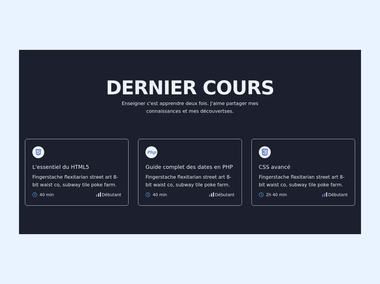
The preview of Card course ui component
To create a card course UI component with Tailwind CSS, we will use a combination of flexbox and grid classes. The result will be a responsive component that looks great on all devices.
Free download of the Card course's source code
The source code of Card course ui component
To create a card course UI component with Tailwind CSS, you will need to use HTML and CSS. The HTML code will define the structure of the component, while the CSS code will style it.
<!-- This is an example component -->
<div>
    <section class=" text-gray-200 bg-gray-900">
      <div class="max-w-6xl mx-auto px-5 py-24 ">
        <div class="flex flex-wrap w-full mb-20 flex-col items-center text-center">
          <h1 class=" title-font mb-2 text-4xl font-extrabold leading-10 tracking-tight text-left sm:text-5xl sm:leading-none md:text-6xl"> DERNIER COURS</h1>
          <p class="lg:w-1/2 w-full leading-relaxed text-base">
            Enseigner c'est apprendre deux fois. J'aime partager mes connaissances et mes découvertses.
          </p>
        </div>
        <div class="flex flex-wrap -m-4">
          <div class="xl:w-1/3 md:w-1/2 p-4">
            <div class="border border-gray-300 p-6 rounded-lg">
              <div class="w-10 h-10 inline-flex items-center justify-center rounded-full bg-indigo-100 text-indigo-500 mb-4">
                <svg class=" fill-current h-6 w-6" xmlns="http://www.w3.org/2000/svg" viewBox="0 0 384 512"><path d="M0 32l34.9 395.8L191.5 480l157.6-52.2L384 32H0zm308.2 127.9H124.4l4.1 49.4h175.6l-13.6 148.4-97.9 27v.3h-1.1l-98.7-27.3-6-75.8h47.7L138 320l53.5 14.5 53.7-14.5 6-62.2H84.3L71.5 112.2h241.1l-4.4 47.7z"/></svg>
              </div>
              <h2 class="text-lg  font-medium title-font mb-2">L'essentiel du HTML5 </h2>
              <p class="leading-relaxed text-base">Fingerstache flexitarian street art 8-bit waist co, subway tile poke farm.</p>

              <div class="text-center mt-2 leading-none flex justify-between w-full">
                <span class=" mr-3 inline-flex items-center leading-none text-sm  py-1 ">
                  <svg class=" fill-current w-4 h-4 mr-2 text-blue-500" xmlns="http://www.w3.org/2000/svg" viewBox="0 0 512 512"><path d="M256 8C119 8 8 119 8 256s111 248 248 248 248-111 248-248S393 8 256 8zm0 448c-110.5 0-200-89.5-200-200S145.5 56 256 56s200 89.5 200 200-89.5 200-200 200zm61.8-104.4l-84.9-61.7c-3.1-2.3-4.9-5.9-4.9-9.7V116c0-6.6 5.4-12 12-12h32c6.6 0 12 5.4 12 12v141.7l66.8 48.6c5.4 3.9 6.5 11.4 2.6 16.8L334.6 349c-3.9 5.3-11.4 6.5-16.8 2.6z"/></svg>
                  40 min
                </span>
                <span class=" inline-flex items-center leading-none text-sm">
                  <svg width="22" height="22" xmlns="http://www.w3.org/2000/svg">
                    <g fill="none" fill-rule="evenodd">
                    <path fill="#D8D8D8" d="M9.2 6.583v11.08h3.5V6.583zm6.4 11.084h3.5V3h-3.5z"/>
                    <path fill="#667EEA" d="M2.6 17.667h3.5v-7.334H2.6z"/></g></svg>
                    Débutant
                </span>
              </div>

            </div>
          </div>

          <div class="xl:w-1/3 md:w-1/2 p-4">
            <div class="border border-gray-300 p-6 rounded-lg">
              <div class="w-10 h-10 inline-flex items-center justify-center rounded-full bg-indigo-100 text-indigo-500 mb-4 italic">
                <span class="font-bold text-sm ">
                  Php
                </span>
              </div>
              <h2 class="text-lg  font-medium title-font mb-2">Guide complet des dates en PHP</h2>
              <p class="leading-relaxed text-base">Fingerstache flexitarian street art 8-bit waist co, subway tile poke farm.</p>

              <div class="text-center mt-2 leading-none flex justify-between w-full">
                <span class=" mr-3 inline-flex items-center leading-none text-sm  py-1 ">
                  <svg class=" fill-current w-4 h-4 mr-2 text-blue-500" xmlns="http://www.w3.org/2000/svg" viewBox="0 0 512 512"><path d="M256 8C119 8 8 119 8 256s111 248 248 248 248-111 248-248S393 8 256 8zm0 448c-110.5 0-200-89.5-200-200S145.5 56 256 56s200 89.5 200 200-89.5 200-200 200zm61.8-104.4l-84.9-61.7c-3.1-2.3-4.9-5.9-4.9-9.7V116c0-6.6 5.4-12 12-12h32c6.6 0 12 5.4 12 12v141.7l66.8 48.6c5.4 3.9 6.5 11.4 2.6 16.8L334.6 349c-3.9 5.3-11.4 6.5-16.8 2.6z"/></svg>
                  40 min
                </span>
                <span class=" inline-flex items-center leading-none text-sm">
                  <svg width="22" height="22" xmlns="http://www.w3.org/2000/svg">
                    <g fill="none" fill-rule="evenodd">
                    <path fill="#D8D8D8" d="M9.2 6.583v11.08h3.5V6.583zm6.4 11.084h3.5V3h-3.5z"/>
                    <path fill="#667EEA" d="M2.6 17.667h3.5v-7.334H2.6z"/></g></svg>
                    Débutant
                </span>
              </div>
            </div>
          </div>
          <div class="xl:w-1/3 md:w-1/2 p-4">
            <div class="border border-gray-300 p-6 rounded-lg">
              <div class="w-10 h-10 inline-flex items-center justify-center rounded-full bg-indigo-100 text-indigo-500 mb-4">
                <svg class=" fill-current h-6 w-6 " viewBox="0 0 24 24" xmlns="http://www.w3.org/2000/svg"><title>CSS3 icon</title><path d="M1.5 0h21l-1.91 21.563L11.977 24l-8.565-2.438L1.5 0zm17.09 4.413L5.41 4.41l.213 2.622 10.125.002-.255 2.716h-6.64l.24 2.573h6.182l-.366 3.523-2.91.804-2.956-.81-.188-2.11h-2.61l.29 3.855L12 19.288l5.373-1.53L18.59 4.414z"/></svg>
              </div>
              <h2 class="text-lg  font-medium title-font mb-2">CSS avancé</h2>
              <p class="leading-relaxed text-base">Fingerstache flexitarian street art 8-bit waist co, subway tile poke farm.</p>

              <div class="text-center mt-2 leading-none flex justify-between w-full">
                <span class=" mr-3 inline-flex items-center leading-none text-sm  py-1 ">
                  <svg class=" fill-current w-4 h-4 mr-2 text-blue-500" xmlns="http://www.w3.org/2000/svg" viewBox="0 0 512 512"><path d="M256 8C119 8 8 119 8 256s111 248 248 248 248-111 248-248S393 8 256 8zm0 448c-110.5 0-200-89.5-200-200S145.5 56 256 56s200 89.5 200 200-89.5 200-200 200zm61.8-104.4l-84.9-61.7c-3.1-2.3-4.9-5.9-4.9-9.7V116c0-6.6 5.4-12 12-12h32c6.6 0 12 5.4 12 12v141.7l66.8 48.6c5.4 3.9 6.5 11.4 2.6 16.8L334.6 349c-3.9 5.3-11.4 6.5-16.8 2.6z"/></svg>
                  2h 40 min
                </span>
                <span class=" inline-flex items-center leading-none text-sm">

                  <svg width="22" height="22" xmlns="http://www.w3.org/2000/svg">
                    <g fill="none" fill-rule="evenodd">
                      <path fill="#D8D8D8" d="M15.6 17.667h3.5V3h-3.5z"/>
                      <path fill="#667EEA" d="M9.2 6.583v11.08h3.5V6.583z"/>
                      <path fill="#667EEA" d="M2.6 17.667h3.5v-7.334H2.6z"/>
                    </g>
                  </svg>
                    Débutant
                </span>
              </div>

            </div>
          </div>
        </div>
      </div>
    </section>

</div>
How to create a Card course with Tailwind CSS?
To create a card course UI component with Tailwind CSS, follow these steps:
Step 1: Set up your project
To get started, you will need to set up a new project and install Tailwind CSS. You can do this by following the instructions on the Tailwind CSS website.
Step 2: Create the HTML structure
Next, you will need to create the HTML structure for your card course UI component. Here is an example:
<div class="bg-white rounded-lg overflow-hidden shadow-lg">
  <img class="w-full" src="course-image.jpg" alt="Course Image">
  <div class="p-4">
    <h2 class="text-lg font-bold mb-2">Course Title</h2>
    <p class="text-gray-700 text-base mb-4">Course Description</p>
    <a href="#" class="bg-blue-500 hover:bg-blue-700 text-white font-bold py-2 px-4 rounded">
      Enroll Now
    </a>
  </div>
</div>
In this example, we have used the bg-white, rounded-lg, overflow-hidden, and shadow-lg classes to create a card-like container. We have also used the w-full class to make the image fill the container's width.
Step 3: Style the component with CSS
Now that we have created the HTML structure, we can style it using Tailwind CSS classes. Here is an example:
/* Set the width of the container */
.bg-white {
  width: 300px;
}

/* Style the image */
img {
  height: 200px;
  object-fit: cover;
}

/* Style the title */
h2 {
  color: #333;
}

/* Style the description */
p {
  color: #666;
}

/* Style the button */
a {
  display: inline-block;
  background-color: #3490dc;
  color: #fff;
  padding: 0.5rem 1rem;
  border-radius: 0.25rem;
  text-decoration: none;
}

a:hover {
  background-color: #2779bd;
}
In this example, we have used CSS to set the width of the container, style the image, title, description, and button.
Step 4: Make the component responsive
Finally, we can make the component responsive by using Tailwind CSS's responsive classes. Here is an example:
/* Set the width of the container on small screens */
@media (max-width: 640px) {
  .bg-white {
    width: 100%;
  }
}

/* Style the image on small screens */
@media (max-width: 640px) {
  img {
    height: 150px;
  }
}

/* Style the title on small screens */
@media (max-width: 640px) {
  h2 {
    font-size: 1.25rem;
  }
}

/* Style the description on small screens */
@media (max-width: 640px) {
  p {
    font-size: 0.875rem;
  }
}

/* Center the button on small screens */
@media (max-width: 640px) {
  a {
    display: block;
    margin: 0 auto;
  }
}
In this example, we have used media queries to adjust the width of the container, style the image, title, description, and button on small screens.
Conclusion
In conclusion, creating a card course UI component with Tailwind CSS is a quick and easy process. By following the steps outlined in this article, you can create a responsive component that looks great on all devices. With Tailwind CSS's pre-defined classes and customization options, you can maintain consistency across your website while creating unique and engaging user interfaces.