- Published on
A Complete Guide To Make A Card With Tailwind CSS
- What is Tailwind CSS?
- The description of Card ui component
- Why use Tailwind CSS to create a Card ui component?
- The preview of Card ui component
- The source code of Card ui component
- How to create a Card with Tailwind CSS?
- Step 1: Create the HTML structure
- Step 2: Add Tailwind CSS classes
- Step 3: Customize the design
- Conclusion
What is Tailwind CSS?
Tailwind CSS is a utility-first CSS framework that helps you quickly build custom user interfaces. It provides a set of pre-defined CSS classes that can be used to style HTML elements. Tailwind CSS is highly customizable and allows you to create unique designs without writing any CSS code.
The description of Card ui component
A card is a user interface component that is used to display content in a structured and organized manner. It usually consists of an image, a title, a description, and some buttons or links. Cards are commonly used in e-commerce websites, social media platforms, and news websites.
Why use Tailwind CSS to create a Card ui component?
Tailwind CSS makes it easy to create a card UI component without writing any CSS code. It provides a set of pre-defined classes that can be used to style the card. Tailwind CSS also allows you to customize the design of the card by adding your own classes or modifying the existing ones.
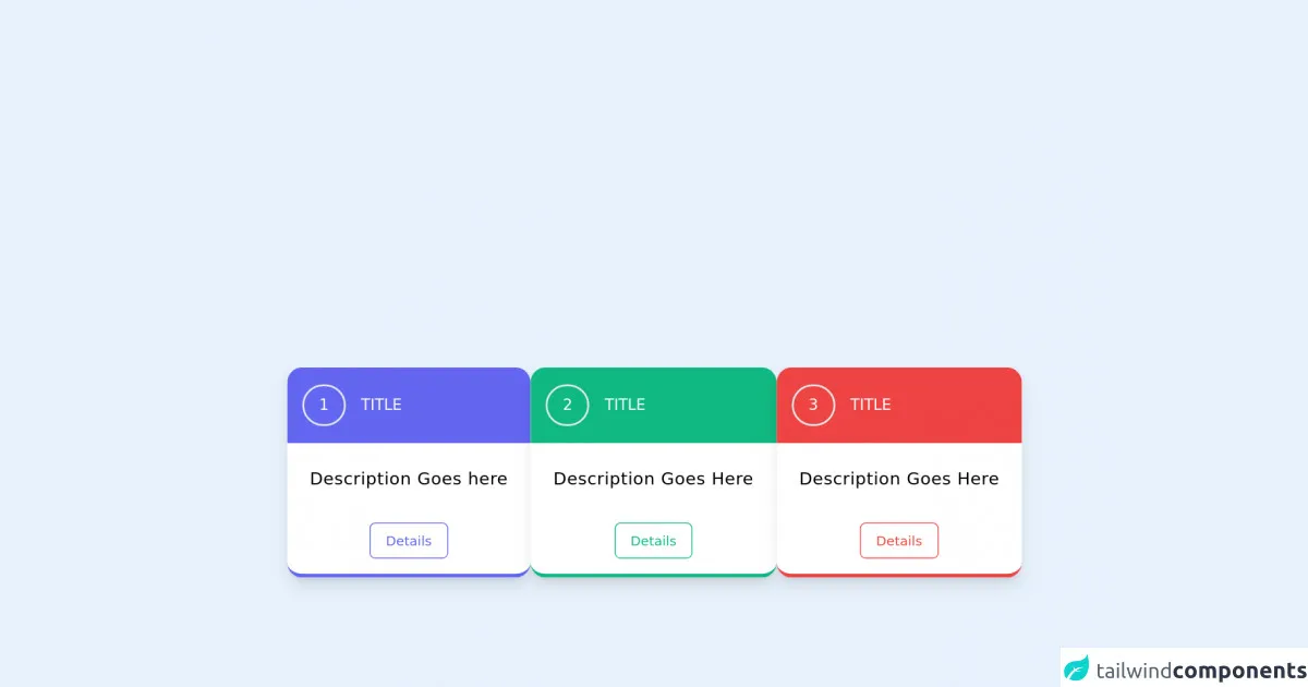
The preview of Card ui component
To create a card UI component with Tailwind CSS, we will use a combination of classes to style the different elements of the card. Here is a preview of what the final card will look like:
Free download of the Card's source code
The source code of Card ui component
Here is the HTML and Tailwind CSS code that we will use to create the card UI component:
<!-- component -->
<div class=" flex  flex-col  md:flex-row justify-center  flex-wrap gap-3 mt-10  ">
  <div class="">
<div class="bg-white max-w-xs shadow-lg   mx-auto border-b-4 border-indigo-500 rounded-2xl overflow-hidden  hover:shadow-2xl transition duration-500 transform hover:scale-105 cursor-pointer" >
<div class="bg-indigo-500  flex h-20  items-center">
<h1 class="text-white ml-4 border-2 py-2 px-4 rounded-full">1</h1>
<p class="ml-4 text-white uppercase">Title</p>
</div>
  <p class="py-6 px-6 text-lg tracking-wide text-center">Description Goes here</p>
                        <!-- <hr > -->
    <div class="flex justify-center px-5 mb-2 text-sm ">
      <button type="button" class="border border-indigo-500 text-indigo-500 rounded-md px-4 py-2 m-2 transition duration-500 ease select-none hover:text-white hover:bg-indigo-600 focus:outline-none focus:shadow-outline">
            Details
      </button>
    </div>
</div>
</div>

<div class="">
 <div class="bg-white max-w-xs mx-auto rounded-2xl  border-b-4 border-green-500 overflow-hidden shadow-lg hover:shadow-2xl transition duration-500 transform hover:scale-105 cursor-pointer">
    <div class="h-20 bg-green-500 flex items-center ">
      <h1 class="text-white ml-4 border-2 py-2 px-4 rounded-full">2</h1>
      <p class=" text-white text-base ml-4 uppercase">
        Title
      </p>
    </div>
      <p class="py-6 px-6 text-lg tracking-wide text-center">Description Goes Here</p>
                        <!-- <hr > -->
                        <div class="flex justify-center px-5 mb-2 text-sm ">
                            <button type="button"
                                class="border border-green-500 text-green-500 rounded-md px-4 py-2 m-2 transition duration-500 ease select-none hover:text-white hover:bg-green-600 focus:outline-none focus:shadow-outline">
                                 Details
                            </button>
                        </div>
 </div>
 </div>

 <div class="">
 <div class="bg-white max-w-xs mx-auto rounded-2xl  border-b-4 border-red-500 overflow-hidden shadow-lg hover:shadow-2xl transition duration-500 transform hover:scale-105 cursor-pointer">
    <div class="h-20 bg-red-500 flex items-center ">
      <h1 class="text-white ml-4 border-2 py-2 px-4 rounded-full">3</h1>
      <p class=" text-white text-base ml-4 uppercase">
        Title
      </p>
    </div>
      <p class="py-6  px-6 text-lg tracking-wide text-center">Description Goes Here</p>
                        <!-- <hr > -->
        <div class="flex justify-center px-5 mb-2 text-sm ">
          <button type="button"class="border border-red-500 text-red-500 rounded-md px-4 py-2 m-2 transition duration-500 ease select-none hover:text-white hover:bg-red-600 focus:outline-none focus:shadow-outline">
               Details
            </button>
                        </div>
 </div>
 </div>
</div>
How to create a Card with Tailwind CSS?
To create a card UI component with Tailwind CSS, follow these steps:
Step 1: Create the HTML structure
The first step is to create the HTML structure of the card. Here is an example:
<div class="max-w-sm rounded overflow-hidden shadow-lg">
  <img class="w-full" src="https://source.unsplash.com/random/400x200" alt="Sunset in the mountains">
  <div class="px-6 py-4">
    <div class="font-bold text-xl mb-2">The Coldest Sunset</div>
    <p class="text-gray-700 text-base">
      Lorem ipsum dolor sit amet, consectetur adipisicing elit. Voluptatibus quia, nulla! Maiores et perferendis eaque, exercitationem praesentium nihil.
    </p>
  </div>
  <div class="px-6 pt-4 pb-2">
    <button class="bg-blue-500 hover:bg-blue-700 text-white font-bold py-2 px-4 rounded-full">
      Read More
    </button>
  </div>
</div>
In this example, we have used the max-w-sm class to set the maximum width of the card to sm (small) size. We have also used the rounded class to add rounded corners to the card. The overflow-hidden class is used to hide any content that overflows the card.
Inside the card, we have an image element with the w-full class to make it full-width. We have also used the px-6 and py-4 classes to add padding to the card content.
The title of the card is wrapped inside a div element with the font-bold and text-xl classes to make it bold and extra-large. The description of the card is wrapped inside a p element with the text-gray-700 and text-base classes to set the text color and size.
Finally, we have a button element with the bg-blue-500, hover:bg-blue-700, text-white, font-bold, py-2, px-4, and rounded-full classes to style the button.
Step 2: Add Tailwind CSS classes
The second step is to add Tailwind CSS classes to style the card. Here is an example:
<div class="max-w-sm rounded overflow-hidden shadow-lg">
  <img class="w-full" src="https://source.unsplash.com/random/400x200" alt="Sunset in the mountains">
  <div class="px-6 py-4">
    <div class="font-bold text-xl mb-2 text-gray-800">The Coldest Sunset</div>
    <p class="text-gray-700 text-base">
      Lorem ipsum dolor sit amet, consectetur adipisicing elit. Voluptatibus quia, nulla! Maiores et perferendis eaque, exercitationem praesentium nihil.
    </p>
  </div>
  <div class="px-6 pt-4 pb-2">
    <button class="bg-blue-500 hover:bg-blue-700 text-white font-bold py-2 px-4 rounded-full">
      Read More
    </button>
  </div>
</div>
In this example, we have added the text-gray-800 class to the title of the card to change the text color to gray-800. We have also added the text-gray-700 class to the description of the card to change the text color to gray-700.
Step 3: Customize the design
The third step is to customize the design of the card by adding your own classes or modifying the existing ones. Here is an example:
<div class="max-w-sm rounded overflow-hidden shadow-lg">
  <img class="w-full h-48 object-cover" src="https://source.unsplash.com/random/400x200" alt="Sunset in the mountains">
  <div class="px-6 py-4">
    <div class="font-bold text-xl mb-2 text-gray-800">The Coldest Sunset</div>
    <p class="text-gray-700 text-base">
      Lorem ipsum dolor sit amet, consectetur adipisicing elit. Voluptatibus quia, nulla! Maiores et perferendis eaque, exercitationem praesentium nihil.
    </p>
  </div>
  <div class="px-6 pt-4 pb-2">
    <button class="bg-blue-500 hover:bg-blue-700 text-white font-bold py-2 px-4 rounded-full">
      Read More
    </button>
  </div>
</div>
In this example, we have added the h-48 and object-cover classes to the image element to set the height of the image to 48 and to make it cover the entire container. We have also removed the text-base class from the description of the card to make the text size smaller.
Conclusion
In this article, we have learned how to create a card UI component with Tailwind CSS. We have seen how Tailwind CSS makes it easy to style HTML elements without writing any CSS code. We have also seen how to customize the design of the card by adding your own classes or modifying the existing ones. With Tailwind CSS, you can create beautiful and responsive user interfaces in no time.