- Published on
6 Tips To Create A Card With Tailwind CSS
- What is Tailwind CSS?
- The description of Card UI component
- Why use Tailwind CSS to create a Card UI component?
- The preview of Card UI component
- The source code of Card UI component
- How to create a Card with Tailwind CSS?
- 1. Define the card container
- 2. Add a title
- 3. Add an image
- 4. Add some text
- 5. Customize the card
- 6. Use the card in your project
- Conclusion
What is Tailwind CSS?
Tailwind CSS is a utility-first CSS framework that provides a set of pre-defined CSS classes to help you quickly build custom user interfaces. It is designed to be highly customizable, allowing you to create unique designs without writing any CSS code.
The description of Card UI component
A card is a UI component that is commonly used to display information in a structured and visually appealing way. Cards are often used to display product information, user profiles, or news articles. They typically include a title, image, and some text.
Why use Tailwind CSS to create a Card UI component?
Tailwind CSS makes it easy to create a card UI component because it provides a set of pre-defined classes that you can use to style your cards. This means that you don't need to write any custom CSS code to create a card. Instead, you can simply apply the pre-defined classes to your HTML elements.
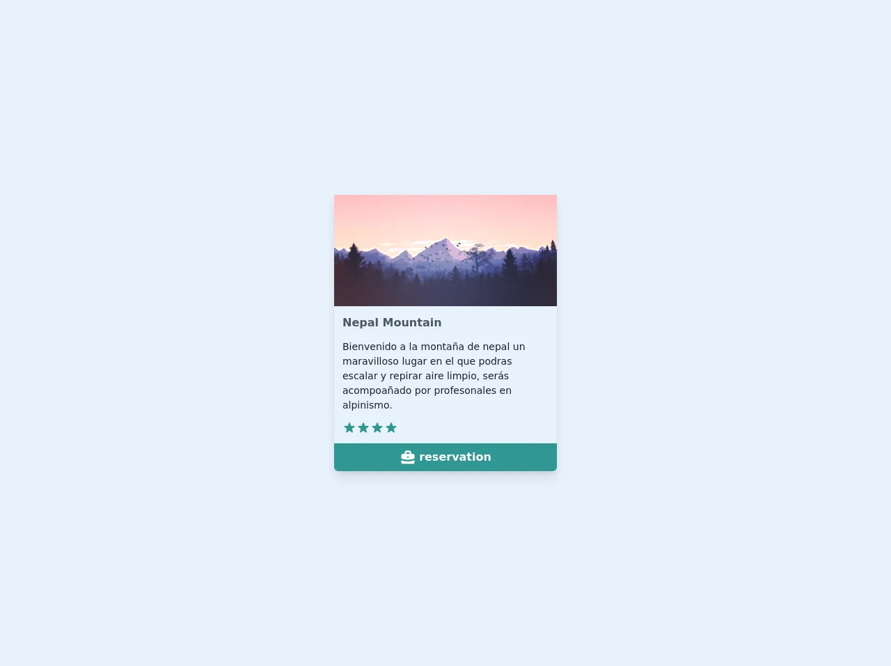
The preview of Card UI component
To create a card UI component with Tailwind CSS, you can use the following classes:
bg-white: sets the background color of the card to white.rounded-lg: rounds the corners of the card.shadow-md: adds a shadow to the card.p-6: adds padding to the card.border: adds a border to the card.border-gray-300: sets the color of the border to gray.
Free download of the Card's source code
The source code of Card UI component
To create a card UI component with Tailwind CSS, you can use the following HTML code:
<div class="bg-white rounded-lg shadow-md p-6 border border-gray-300">
  <h2 class="text-lg font-medium mb-2">Title</h2>
  <img src="image.jpg" alt="Image" class="w-full mb-4">
  <p class="text-gray-700">Lorem ipsum dolor sit amet, consectetur adipiscing elit. Sed euismod, nibh eget blandit lacinia, ante metus ullamcorper erat, eu faucibus turpis ipsum id lorem.</p>
</div>
<!DOCTYPE html>
<html lang="es">
   <head>
      <meta charset="UTF-8" />
      <meta name="viewport" content="width=device-width, initial-scale=1.0" />
      <link rel="stylesheet" href="card.css" />
      <link rel="stylesheet" href="../css/estilos.css" />
      <title>Card</title>
   </head>
   <body>
      <section class="w-screen h-screen flex justify-center items-center px-2">
         <div
            class="wrapper max-w-xs bg-gray-50 rounded-b-md shadow-lg overflow-hidden"
         >
            <div>
               <img src="https://cdn.pixabay.com/photo/2016/05/24/16/48/mountains-1412683_1280.png" alt="montaña" />
            </div>
            <div class="p-3 space-y-3">
               <h3 class="text-gray-700 font-semibold text-md">
                  Nepal Mountain
               </h3>
               <p class="text-sm text-gray-900 leading-sm">
                  Bienvenido a la montaña de nepal un maravilloso lugar en el
                  que podras escalar y repirar aire limpio, serás acompoañado
                  por profesonales en alpinismo.
               </p>
               <p>
                  <span class="flex">
                     <svg
                        fill="currentColor"
                        viewBox="0 0 20 20"
                        class="h-5 text-teal-600"
                     >
                        <path
                           d="M9.049 2.927c.3-.921 1.603-.921 1.902 0l1.07 3.292a1 1 0 00.95.69h3.462c.969 0 1.371 1.24.588 1.81l-2.8 2.034a1 1 0 00-.364 1.118l1.07 3.292c.3.921-.755 1.688-1.54 1.118l-2.8-2.034a1 1 0 00-1.175 0l-2.8 2.034c-.784.57-1.838-.197-1.539-1.118l1.07-3.292a1 1 0 00-.364-1.118L2.98 8.72c-.783-.57-.38-1.81.588-1.81h3.461a1 1 0 00.951-.69l1.07-3.292z"
                        ></path>
                     </svg>
                     <svg
                        fill="currentColor"
                        viewBox="0 0 20 20"
                        class="h-5 text-gray-200"
                     >
                        <path
                           d="M9.049 2.927c.3-.921 1.603-.921 1.902 0l1.07 3.292a1 1 0 00.95.69h3.462c.969 0 1.371 1.24.588 1.81l-2.8 2.034a1 1 0 00-.364 1.118l1.07 3.292c.3.921-.755 1.688-1.54 1.118l-2.8-2.034a1 1 0 00-1.175 0l-2.8 2.034c-.784.57-1.838-.197-1.539-1.118l1.07-3.292a1 1 0 00-.364-1.118L2.98 8.72c-.783-.57-.38-1.81.588-1.81h3.461a1 1 0 00.951-.69l1.07-3.292z"
                        ></path>
                     </svg>
                  </span>
               </p>
            </div>
            <button
               class="bg-teal-600 w-full flex justify-center py-2 text-white font-semibold transition duration-300 hover:bg-teal-500"
            >
               <svg
                  fill="currentColor"
                  viewBox="0 0 20 20"
                  class="h-6 mr-1 text-white"
               >
                  <path
                     d="M6 6V5a3 3 0 013-3h2a3 3 0 013 3v1h2a2 2 0 012 2v3.57A22.952 22.952 0 0110 13a22.95 22.95 0 01-8-1.43V8a2 2 0 012-2h2zm2-1a1 1 0 011-1h2a1 1 0 011 1v1H8V5zm1 5a1 1 0 011-1h.01a1 1 0 110 2H10a1 1 0 01-1-1z"
                     clip-rule="evenodd"
                     fill-rule="evenodd"
                  ></path>
                  <path
                     d="M2 13.692V16a2 2 0 002 2h12a2 2 0 002-2v-2.308A24.974 24.974 0 0110 15c-2.796 0-5.487-.46-8-1.308z"
                  ></path></svg
               >reservation
            </button>
         </div>
      </section>
   </body>
</html>
How to create a Card with Tailwind CSS?
Here are 6 tips to help you create a card UI component with Tailwind CSS:
1. Define the card container
The first step in creating a card UI component is to define the container that will hold the card. You can use a div element with the bg-white, rounded-lg, shadow-md, p-6, border, and border-gray-300 classes to create a basic card container.
2. Add a title
Next, you can add a title to the card by using an h2 element with the text-lg and font-medium classes.
3. Add an image
If your card includes an image, you can add it using an img element with the w-full and mb-4 classes. The w-full class ensures that the image fills the width of the card, while the mb-4 class adds some margin to the bottom of the image.
4. Add some text
You can add some text to the card using a p element with the text-gray-700 class. This will ensure that the text is displayed in a readable color.
5. Customize the card
Once you have created the basic card, you can customize it further by adding or modifying classes. For example, you can change the background color of the card by using a different bg-* class.
6. Use the card in your project
Finally, you can use the card in your project by copying the HTML code and pasting it into your project. You can then modify the code as needed to fit your specific requirements.
Conclusion
Creating a card UI component with Tailwind CSS is easy and straightforward. By using the pre-defined classes provided by Tailwind CSS, you can quickly create a visually appealing card without writing any custom CSS code. With these 6 tips, you can create a card that fits your specific requirements and use it in your project.