- Published on
6 Critical Skills To Make A Calendar Date With Tailwind CSS Remarkably Well
- What is Tailwind CSS?
- The description of Calendar Date ui component
- Why use Tailwind CSS to create a Calendar Date ui component?
- The preview of Calendar Date ui component
- The source code of Calendar Date ui component
- How to create a Calendar Date with Tailwind CSS?
- 1. Understanding the HTML structure
- 2. Styling the header
- 3. Styling the grid of dates
- 4. Styling the navigation buttons
- 5. Customizing the design
- 6. Using Tailwind CSS configuration
- Conclusion
What is Tailwind CSS?
Tailwind CSS is a utility-first CSS framework that helps developers to quickly build custom user interfaces. It provides a set of pre-defined CSS classes that can be used to style HTML elements. Tailwind CSS is highly customizable and allows developers to create unique designs without writing any CSS code.
The description of Calendar Date ui component
A Calendar Date is a user interface component that displays a calendar with dates. It is commonly used in applications that require users to select a date, such as booking systems, event calendars, and scheduling applications. A Calendar Date component typically includes a header with the month and year, a grid of dates, and navigation buttons to move between months.
Why use Tailwind CSS to create a Calendar Date ui component?
Tailwind CSS is an excellent choice for creating a Calendar Date component because it provides a wide range of utility classes that can be used to style the various elements of the component. It also allows developers to easily customize the design of the component using its configuration file.
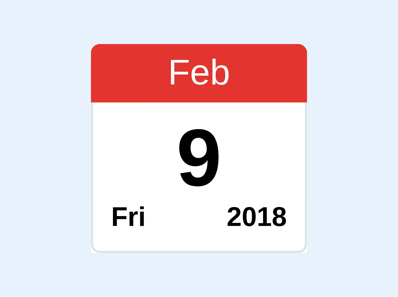
The preview of Calendar Date ui component
To create a Calendar Date component with Tailwind CSS, we will use a combination of HTML and CSS. Here is a preview of what the final component will look like:
Free download of the Calendar Date's source code
The source code of Calendar Date ui component
To create the Calendar Date component, we will use the following HTML and CSS code:
<div class="block rounded-t overflow-hidden bg-white text-center w-24">
    <div class="bg-red text-white py-1">
      	Feb
    </div>
    <div class="pt-1 border-l border-r">
      	<span class="text-4xl font-bold">9</span>
    </div>
    <div class="pb-2 px-2 border-l border-r border-b rounded-b flex justify-between">
      	<span class="text-xs font-bold">Fri</span>
      	<span class="text-xs font-bold">2018</span>
    </div>
</div>
How to create a Calendar Date with Tailwind CSS?
To create a Calendar Date component with Tailwind CSS, you will need to have a basic understanding of HTML and CSS. Here are the six critical skills you will need to master:
1. Understanding the HTML structure
The first step in creating a Calendar Date component is to understand its HTML structure. The component typically consists of a header, a grid of dates, and navigation buttons. You will need to create the appropriate HTML elements to represent each of these components.
2. Styling the header
The header of the Calendar Date component typically displays the month and year. You can use Tailwind CSS utility classes to style the header and make it visually appealing.
3. Styling the grid of dates
The grid of dates is the most important part of the Calendar Date component. You will need to use Tailwind CSS utility classes to style the grid and make it easy to read and use.
4. Styling the navigation buttons
The navigation buttons allow users to move between months. You can use Tailwind CSS utility classes to style the buttons and make them easy to use.
5. Customizing the design
Tailwind CSS provides a wide range of utility classes that you can use to customize the design of the Calendar Date component. You can modify the colors, fonts, and spacing to create a unique design.
6. Using Tailwind CSS configuration
Tailwind CSS allows you to customize the design of the component using its configuration file. You can use this file to modify the default styles and create a custom design.
Conclusion
Creating a Calendar Date component with Tailwind CSS is an excellent way to improve the user experience of your application. By mastering the six critical skills outlined in this article, you can create a visually appealing and easy-to-use Calendar Date component that will delight your users. With Tailwind CSS, you can create custom user interfaces quickly and efficiently, without writing any CSS code.